

The most important principle in Dashboard design 2026 do’s and don’ts is simple: begin with the decision a user needs to make.
A dashboard should not display every metric available in the database. It should help someone recognize what changed, understand why it happened, and determine what to do next. Before creating cards or charts, define the audience, the business question, the reporting period, and the action connected to each KPI.
For example, an ecommerce dashboard may prioritize revenue, gross margin, conversion rate, average order value, and fulfillment issues. Supporting charts can then explain changes by product, channel, location, or customer segment.
What Modern Dashboard Design Must Deliver
A successful dashboard in 2026 combines visual clarity, reliable data, accessible interaction, and contextual guidance. Microsoft recommends designing dashboards as concise overviews, prioritizing essential information, maintaining consistent time frames, and choosing visualizations according to the analytical task rather than for visual variety.
AI adds another layer. Modern analytics platforms can now generate natural-language explanations, detect trends and outliers, answer follow-up questions, and help users explore dashboard data conversationally. However, these features are only valuable when users can verify the source, metric definition, filters, and calculation behind each answer.
Do: Establish a Clear Information Hierarchy
Place the most important KPIs where users will see them first. Give every metric a clear label, value, comparison period, and status.
A card showing “Revenue: $84,200” becomes more useful when it also includes “+8.4% vs. previous month” and a short explanation of the reporting period. Additional detail should be available through drill-downs, filters, or secondary pages instead of being forced onto the main canvas.
Use size, spacing, position, and contrast to communicate importance. Do not make every card equally prominent.
Do: Match the Chart to the Question
Use bar charts to compare categories, line charts to show change over time, scatter plots to examine relationships, and tables when users need exact values. A gauge may work for progress toward a defined target, while a pie chart should be reserved for a simple part-to-whole relationship with very few categories.
Avoid selecting a chart because it looks impressive. Tableau and Microsoft both recommend beginning with the analytical purpose and using familiar visual forms that make comparisons easy. Three-dimensional charts, excessive decoration, and inconsistent scales usually make interpretation harder.
Do: Design for Accessibility From the Beginning
Color should never be the only way to communicate status. Combine it with labels, shapes, icons, line patterns, or markers. A red and green comparison, for example, should also include text such as “Above Target” and “Below Target.”
Provide meaningful titles, logical keyboard navigation, alternative text for important visualizations, and access to the underlying data in a readable table. Text should generally reach a contrast ratio of at least 4.5:1, while important controls and graphical boundaries should maintain sufficient non-text contrast.
Do: Make AI Recommendations Traceable
An AI insight should include more than a confident sentence. Show the data source, refresh time, active filters, metric definition, and reasoning behind the result.
When a user asks, “Why did conversion fall last week?”, the dashboard could identify the affected channel, display the relevant trend, and explain which comparison period was used. The user should then be able to inspect the chart or calculation rather than being asked to trust an unsupported conclusion.
Looker’s conversational analytics, for example, grounds questions in a governed semantic model, while current Tableau tools can produce natural-language dashboard insights from the visualizations and data available in the view.
Don’t Confuse Density With Usefulness
A dashboard containing twenty charts does not automatically provide twenty useful insights. Too many filters, labels, borders, legends, and competing colors increase cognitive load and make anomalies harder to notice.
Group related information, remove duplicated metrics, and reveal detailed analysis only when it supports the current task. A clear overview with optional exploration is more effective than a crowded wall of data.
Don’t Let Branding Reduce Readability
Brand colors and distinctive typography can make an analytics product memorable, but functional data must remain easy to scan. Decorative fonts should not be used for small chart labels, tables, filters, or long explanations.
Use expressive typography for report covers, dashboard titles, section headings, campaign modules, and branded empty states. Pair it with a neutral, highly readable UI typeface for numbers and operational content.
Jump to Recommended Fonts
Blooming Pages | Twisly | Maison Veloria | Liquid Mirage | Bellique | Elarion | Deco Vogue
1. Blooming Pages Spring Font
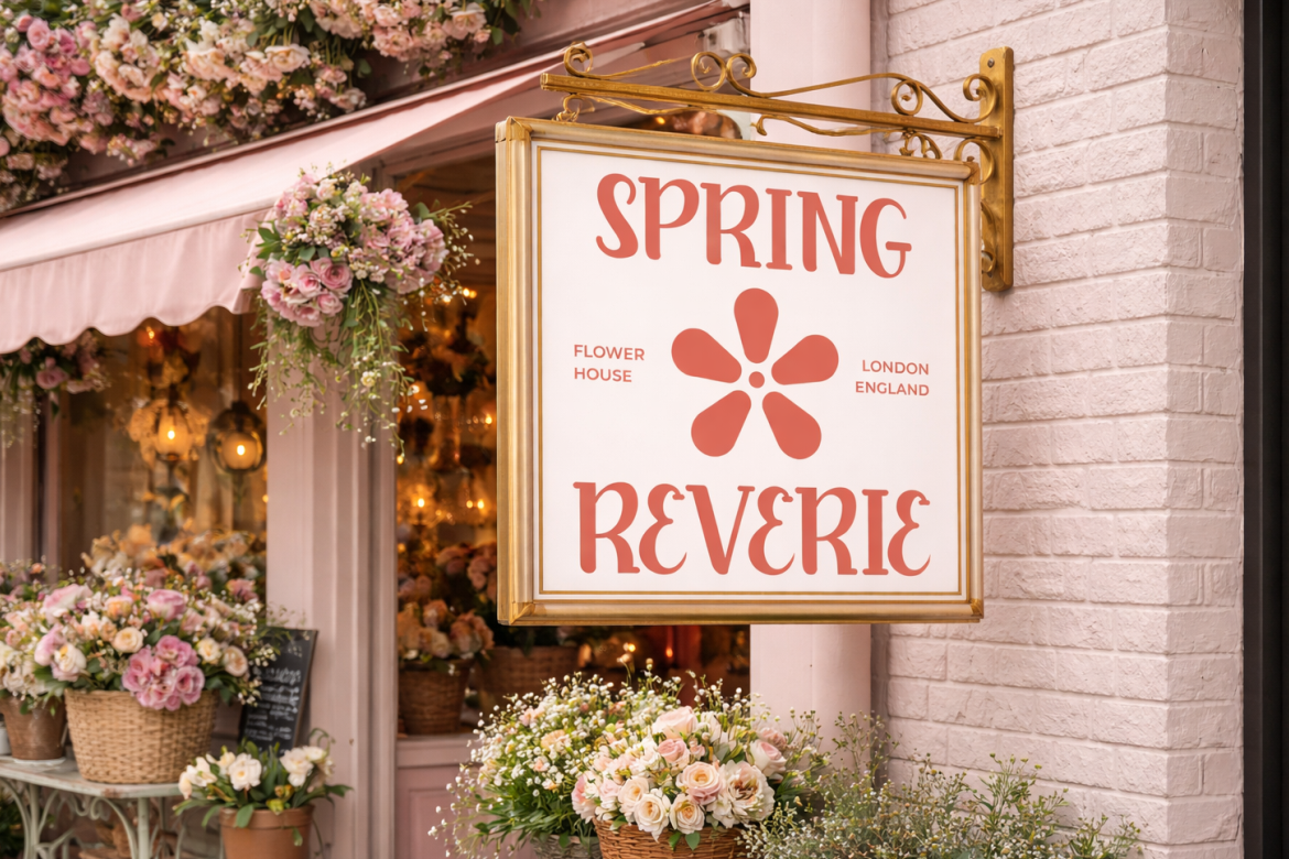
Blooming Pages combines graceful serif character with a fresh seasonal mood. It can bring warmth to wellness dashboards, lifestyle reports, campaign summaries, and branded onboarding screens without making the presentation feel overly corporate.
PROS: Elegant, approachable, and visually distinctive.
BEST FOR: Wellness, lifestyle, floral, beauty, and seasonal analytics.
2. Twisly Twisted Serif Font

Twisly uses tall proportions, strong stroke contrast, and unconventional serif details. Its editorial personality works well for trend reports, fashion analytics, premium presentations, and creative-industry dashboard titles.
PROS: Experimental structure, premium mood, and strong headline impact.
BEST FOR: Fashion, editorial, culture, beauty, and trend forecasting.
3. Maison Veloria Condensed Font
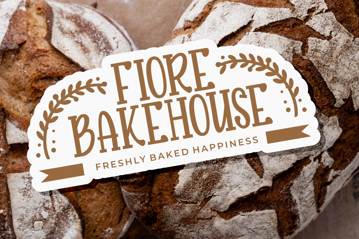
Maison Veloria offers tall, narrow letterforms with smooth construction and subtle vintage warmth. Its condensed proportions are useful for branded headers, narrow side panels, report covers, and dashboard titles where horizontal space is limited.
PROS: Space-efficient, polished, and versatile.
BEST FOR: Hospitality, retail, food, boutique, and business reporting.
4. Liquid Mirage Psychedelic Style Font
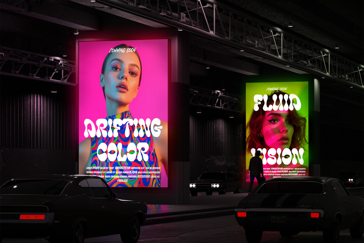
Liquid Mirage brings liquid-inspired shapes and a modern retro psychedelic personality. It can transform a creative campaign dashboard or entertainment report into a memorable branded experience when used selectively for major headings.
PROS: Expressive movement, high visual impact, and original character.
BEST FOR: Music, festivals, entertainment, beverages, and creative campaigns.
5. Bellique Logo Script Font
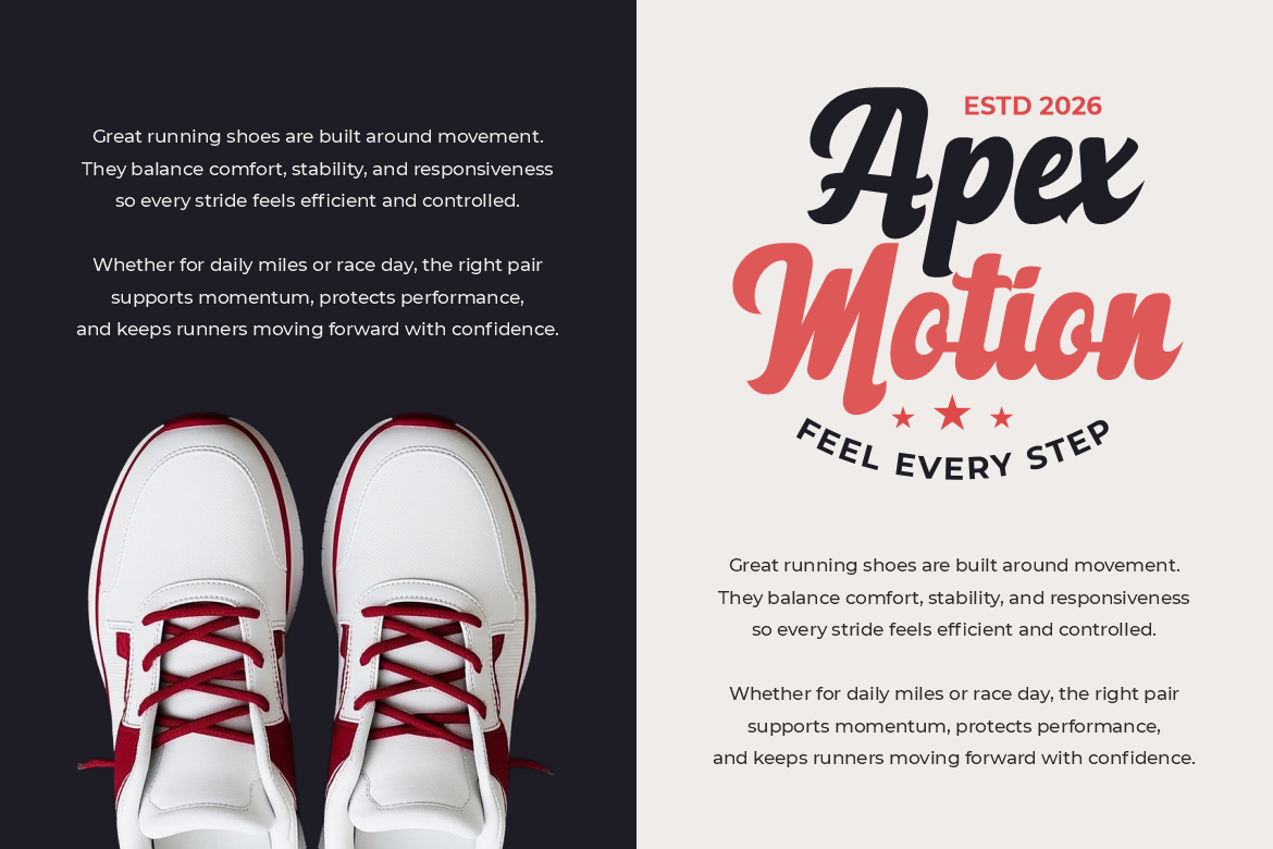
Bellique features expressive lettering, thick strokes, and a strong logotype composition. Its energetic movement suits performance summaries, sports campaigns, creator dashboards, and promotional report covers.
PROS: Dynamic rhythm, bold personality, and memorable branding.
BEST FOR: Sports, fitness, creators, fashion, and active lifestyle brands.
6. Elarion Elegant Serif Font

Elarion communicates heritage, calm, and trust through an elegant serif structure. It is a strong choice for executive dashboards, luxury market reports, investor presentations, and premium business intelligence portals.
PROS: Refined authority, timeless character, and professional presence.
BEST FOR: Luxury, finance, hospitality, architecture, and executive reporting.
7. Deco Vogue Art Deco Line Font
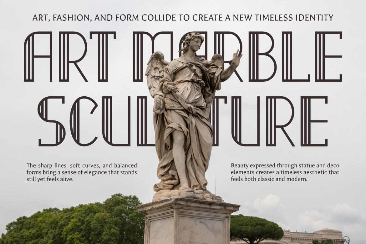
Deco Vogue uses tall, sleek letterforms shaped by classic Art Deco geometry. Its structured line-based appearance adds architectural elegance to dashboard covers, property reports, cultural analytics, and high-end presentation titles.
PROS: Geometric elegance, light visual weight, and premium distinction.
BEST FOR: Real estate, hospitality, exhibitions, architecture, and luxury events.
Comparison
| Font | Visual Direction | Strongest Dashboard Role | Ideal Industry |
|---|---|---|---|
| Blooming Pages | Soft and elegant | Lifestyle report titles | Wellness and beauty |
| Twisly | Editorial and experimental | Trend-analysis headings | Fashion and culture |
| Maison Veloria | Condensed and refined | Space-efficient headers | Hospitality and retail |
| Liquid Mirage | Psychedelic and fluid | Campaign dashboard heroes | Music and entertainment |
| Bellique | Energetic and expressive | Performance report branding | Sports and lifestyle |
| Elarion | Classic and authoritative | Executive dashboard titles | Finance and luxury |
| Deco Vogue | Geometric and glamorous | Premium report covers | Property and hospitality |
Common Mistakes in Dashboard Design
A common mistake is building the dashboard before interviewing its users. Designers may create attractive visualizations that answer questions nobody regularly asks. Begin with real decisions, reporting routines, and pain points. A sales manager, data analyst, and executive may use the same dataset but require very different levels of detail.
Another mistake is relying on color, tooltips, or hover interactions to carry essential information. These elements may be inaccessible to keyboard users, screen-reader users, people with color-vision deficiencies, or anyone viewing a static export. Important context should remain visible through labels, markers, summaries, and accessible data alternatives.
The final mistake is presenting AI output as unquestionable truth. Predictions and recommendations depend on data quality, definitions, filters, and modeling assumptions. Show uncertainty where relevant, explain how the result was produced, and let users inspect or override the recommendation. AI should support judgment, not conceal the reasoning required to make a responsible decision.
Conclusion
The central lesson of Dashboard design 2026 do’s and don’ts is that modern dashboards must turn data into understandable and trustworthy action.
Use a clear KPI hierarchy, select charts according to the question, maintain visual consistency, and make accessibility part of the initial design process. Add AI where it improves exploration, forecasting, or explanation, but keep every recommendation grounded in transparent data.
Fonts from PutraCetol Studio can strengthen the branded layer of the experience across dashboard titles, report covers, presentations, and campaign summaries. Used with restraint and paired with readable UI typography, they help analytical products feel both functional and distinctive.
Explore these fonts and many more at PutraCetol.com to build a business identity that looks professional, trustworthy, and memorable.
Additionally, if you want to explore some free typography options, you can check out Putracetol Studio on Dafont. Happy reading and designing!