
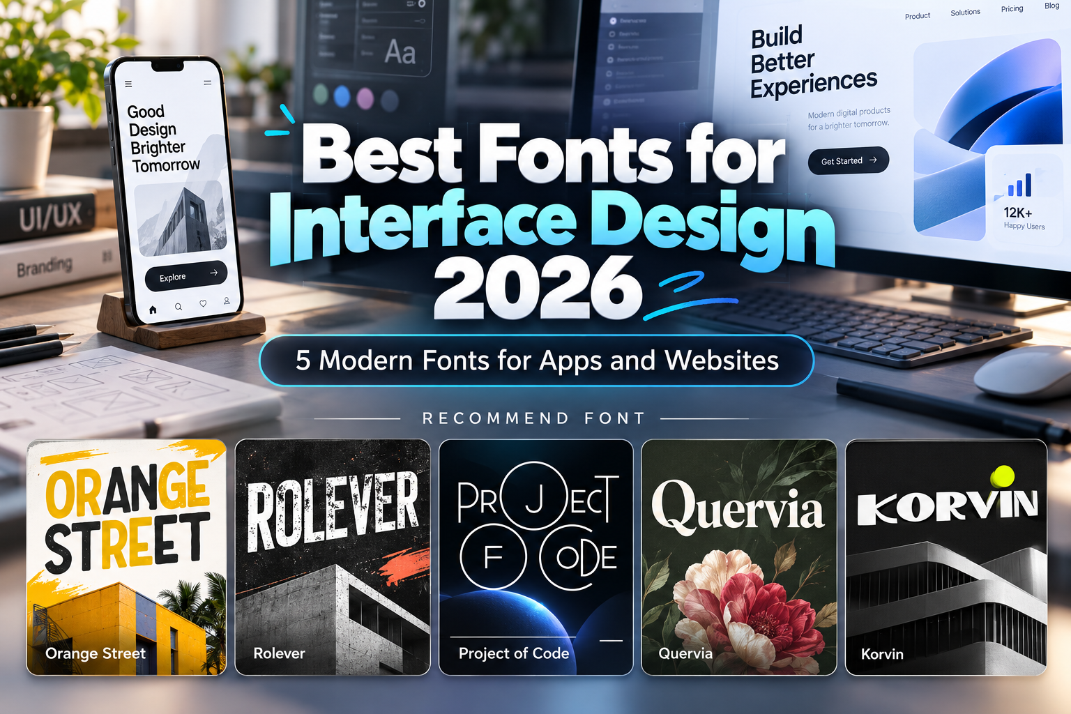
Best Fonts for Interface Design 2026: Typography for Better Digital Experiences
Typography is one of the most frequently used components in an interface. Users depend on it to understand navigation, buttons, instructions, prices, notifications, form labels, and content.
That makes choosing the best fonts for interface design 2026 different from selecting typography for posters or packaging. UI typography must remain understandable across different screen sizes while creating enough hierarchy to guide users through the product.
Accessibility matters too. WCAG 2.2 requires a minimum 4.5:1 contrast ratio for normal text and requires text to remain functional when resized up to 200%. W3C Apple similarly recommends testing custom fonts at different sizes and notes that system fonts can remain preferable for body copy and captions because they are optimized for small-screen legibility. Apple Developer
The best solution is often a hybrid typography system: expressive custom fonts for brand-facing interface moments and highly readable typography for dense functional content.
Initial Suggestion: Choose Fonts by UI Role
Before choosing a font, divide interface typography into functional roles.
Body text, form fields, settings, tables, and detailed instructions need maximum clarity. Hero titles, onboarding screens, dashboard headings, category names, and promotional cards can accommodate stronger personality.
For example, a technology app could use a distinctive display sans for its welcome screen and feature headings while using a quieter UI typeface for account settings and documentation.
Also test real strings instead of alphabet specimens. Try numbers, prices, error messages, buttons such as “Continue to Payment,” and longer translated labels.
Interfaces should also survive user-controlled spacing. WCAG requires web content to remain functional when users increase line, letter, word, and paragraph spacing. W3C
Jump to Recommended Fonts
1. Orange Street Rounded Modern Sans Font
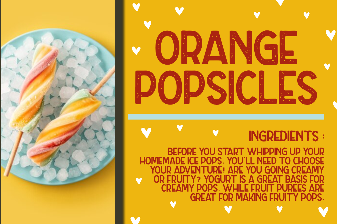
Orange Street is an all-caps sans serif available in clean, rough, and textured versions. Its broad, friendly forms create an approachable digital personality, while the three treatments allow the same visual identity to shift between modern, retro, and playful applications. PutraCetol recommends it primarily for logos, headlines, titles, and branding rather than long reading text. PutraCetol Studio
For interface design, the clean version is the most practical. Use it selectively for category titles, onboarding headlines, navigation highlights, or branded dashboard sections.
PROS: Rounded personality, three visual versions, strong headline visibility.
BEST FOR: Social apps, children’s platforms, community products, friendly SaaS interfaces.
2. Rolever Modern Sans Serif Font

Rolever is the most practical general-purpose interface option in this collection. It provides regular, semibold, and bold weights in clean and textured versions, allowing designers to establish hierarchy while maintaining a contemporary sans-serif foundation. Its clean version has also been recommended by PutraCetol for information-heavy content and digital applications. PutraCetol Studio
Regular can support descriptive content, Semibold can handle interface labels, and Bold can establish stronger headings.
PROS: Multiple weights, clean structure, professional tone, flexible hierarchy.
BEST FOR: Business apps, educational platforms, productivity tools, dashboards.
3. Project of Code Display Sans Font
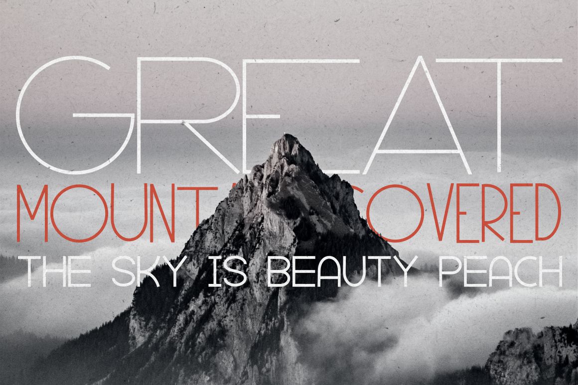
Project of Code introduces more personality through a contemporary geometric foundation combined with unusual ligatures, alternates, stylistic sets, and other OpenType features. This makes it useful when a technology interface needs a recognizable brand voice instead of completely neutral typography. PutraCetol Studio
Because it is deliberately expressive, reserve its more unusual forms for short text. It works better for branded headings, feature cards, or technical landing screens than for continuous interface instructions.
PROS: Modern technical character, extensive alternatives, strong digital identity.
BEST FOR: Developer tools, AI products, gaming interfaces, startup websites.
4. Quervia Elegant Serif Font
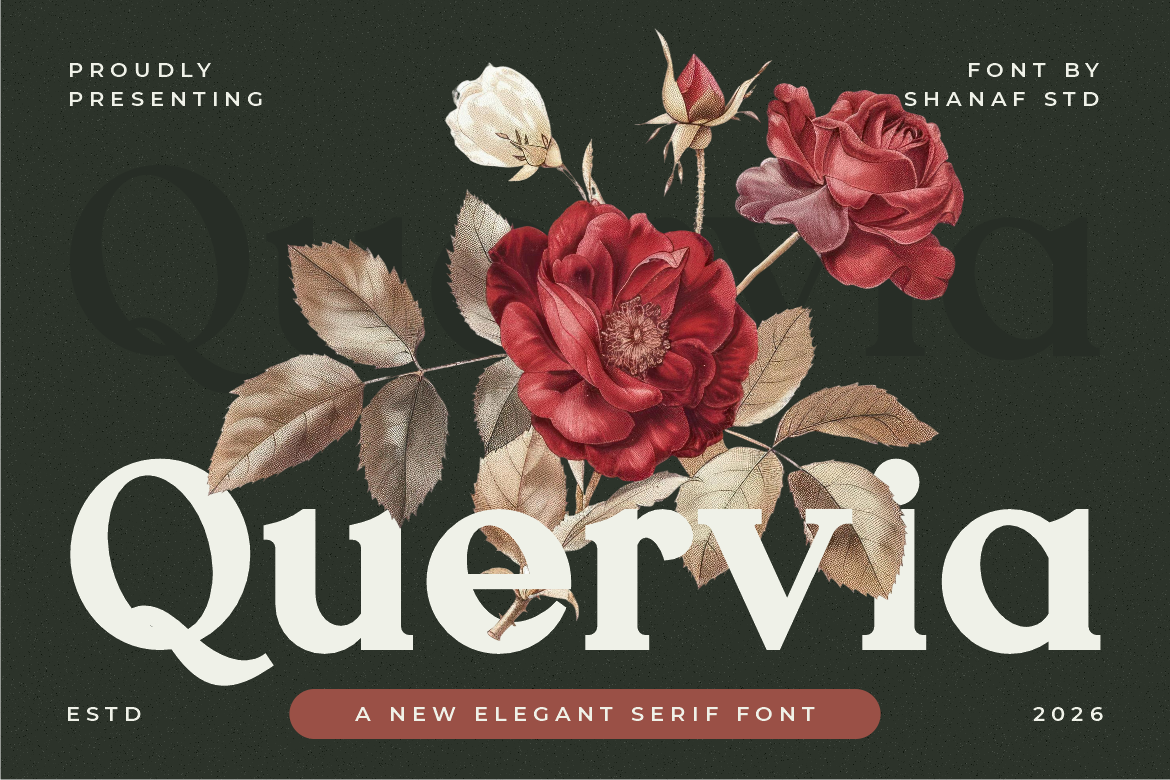
Quervia brings serif typography into the interface with balanced proportions, medium stroke contrast, smooth curves, firm stems, and sharp serif terminals. Its polished appearance gives digital products a more editorial or premium personality and works particularly well when a conventional sans serif would feel too utilitarian. PutraCetol Studio
Use Quervia selectively for editorial headings, premium product titles, quotations, or brand-focused screens rather than dense menus and small controls.
PROS: Elegant hierarchy, refined silhouette, premium editorial character.
BEST FOR: Luxury ecommerce, editorial platforms, hospitality, fashion and beauty interfaces.
5. Korvin Expanded Display Sans Font

Korvin uses expanded proportions, substantial weight, open spacing, clean strokes, and selected angled cuts. Its wide silhouette creates authority and a slightly futuristic visual language that works especially well for short digital headings. PutraCetol Studio
The expanded construction needs horizontal space, so Korvin is strongest on desktop hero sections, dashboard headers, product introductions, and campaign-oriented interface areas rather than narrow mobile controls.
PROS: Wide proportions, geometric clarity, bold visibility, contemporary character.
BEST FOR: Automotive platforms, architecture, tech startups, agency websites, large UI headlines.
Comparison: Which Interface Font Fits Your Product?
| Font | Interface Character | Recommended UI Role |
|---|---|---|
| Orange Street | Friendly, rounded | Onboarding and headings |
| Rolever | Clean, professional | General UI and information |
| Project of Code | Technical, expressive | Tech branding and feature titles |
| Quervia | Elegant, editorial | Premium interface headings |
| Korvin | Wide, authoritative | Hero areas and dashboards |
Among these options, Rolever is the safest starting point for broader interface typography, while the other four are particularly valuable for creating branded hierarchy.
Common Mistakes in Interface Typography
One common mistake is using a visually distinctive display font throughout the entire interface. A font may look excellent in a hero section but become tiring in notifications, settings, tables, or form instructions. Apple specifically suggests that custom typography can work well for headings and subheadings while system fonts remain useful for body copy and captions. Apple Developer Build hierarchy instead of forcing one typeface into every role.
Another mistake is designing typography at only one screen size. Mobile layouts, desktop dashboards, accessibility text enlargement, localization, and long user-generated content can dramatically change available space. Apple recommends accommodating larger Dynamic Type sizes rather than allowing text to become cropped or overlap interface elements. Apple Developer Test buttons and containers with longer real-world strings before launch.
Finally, do not treat font appearance as the only criterion. Check webfont performance, available weights, glyph coverage, accessibility, rendering, and licensing for the actual implementation. A font used as live text on a website or embedded inside software may require different licensing coverage than static promotional artwork.
Conclusion
The best fonts for interface design 2026 balance brand personality with functional clarity.
Rolever provides the strongest general UI foundation in this collection, Orange Street adds friendliness, Project of Code introduces a technological personality, Quervia creates premium editorial contrast, and Korvin delivers bold expanded impact.
The strongest interface does not need every piece of text to look distinctive. Use expressive typography where users should notice the brand, then prioritize readability where they need to complete a task.
Explore these fonts at PutraCetol Studio and build a typography system that remains recognizable, scalable, accessible, and comfortable across websites, apps, dashboards, and modern digital products.
Explore these fonts and many more at PutraCetol.com to build a business identity that looks professional, trustworthy, and memorable.
Additionally, if you want to explore some free typography options, you can check out Putracetol Studio on Dafont. Happy reading and designing!