
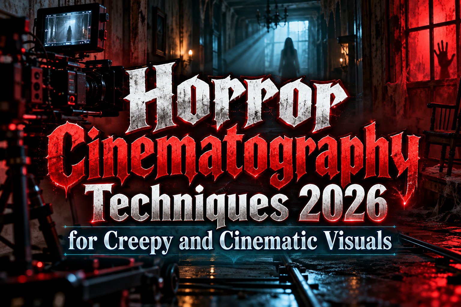
Horror Movie Photography Tricks 2026: How to Create Cinematic Fear
Horror does not need a monster in every frame. Sometimes an empty hallway, partially illuminated face, or doorway hidden in shadow can create more tension than an elaborate visual effect.
That is what makes horror movie photography tricks 2026 so useful for filmmakers, photographers, YouTubers, and Halloween content creators. Horror photography is largely about controlling what the audience can see, what remains hidden, and where they expect danger to appear.
Lighting, framing, perspective, color, focus, and camera movement can turn an ordinary room into something disturbing. The strongest horror visuals also avoid relying entirely on post-production. Creating atmosphere during the shoot gives editors much stronger material to work with later.
Initial Suggestion: Build Fear Before Adding Effects
Before adding smoke, blood effects, glitches, or color grading, photograph the scene without them.
Ask whether the composition already feels uncomfortable.
Look for architectural lines, empty corners, long corridors, windows, doors, mirrors, staircases, and objects that can create uncertainty inside the frame. Horror works especially well when the viewer senses that something could appear without immediately knowing where.
A bedroom, for example, becomes more threatening when most of the frame is dark and a partially open door occupies the background.
If the shot already creates tension, lighting and effects can strengthen it rather than compensate for weak composition.
Use Low-Key Lighting for Controlled Darkness
One of the most recognizable horror cinematography techniques is low-key lighting.
Instead of illuminating the entire scene evenly, use a limited number of light sources and allow substantial areas to fall into shadow.
A lamp beside a character can expose only one side of the face. Light coming through a doorway can create a silhouette. A narrow beam through blinds can break a room into alternating areas of visibility and darkness.
The objective is not simply making the image dark.
If the entire frame becomes black, the audience loses useful visual information. Preserve enough highlight detail to guide attention while letting shadows conceal important areas.
A practical technique is to light the subject from the side rather than directly from the camera position. Side lighting emphasizes facial texture and creates stronger shadow separation.
Try Lighting From Below
People normally experience light from above: the sun, ceiling fixtures, and streetlights.
Lighting a face from below reverses that familiar pattern.
Place a small light source below the subject’s chin and angle it upward. The resulting shadows around the eyes, nose, and cheekbones can make an otherwise ordinary face feel unnatural.
This technique works particularly well for possession scenes, ghost stories, Halloween portraits, and supernatural content.
Keep the light controlled. Extremely bright underlighting can quickly become theatrical or comedic. Horror usually benefits from partial illumination rather than exposing every facial detail.
Use Extreme Camera Angles to Distort Power
Camera height changes how a character feels.
A low-angle shot looking upward can make someone appear dominant, dangerous, or physically overwhelming.
A high-angle shot can make a subject look isolated, vulnerable, or trapped.
Dutch angles, where the horizon is intentionally tilted, introduce instability. Even a modest tilt can make an ordinary hallway feel psychologically wrong.
These techniques become more effective when used selectively. If every shot is tilted or extreme, the audience adapts and the visual discomfort disappears.
Save unusual angles for moments where the story becomes less stable.
Use Wide Lenses Close to the Subject
Wide-angle lenses can create subtle distortion when positioned close to a face or object.
Features nearest the camera appear larger while the background stretches away, producing an exaggerated sense of depth.
This works especially well when a character is moving toward the viewer or when you want a room to feel unnaturally large.
For example, placing the camera close to a frightened person’s face with a wide lens can make their expression feel more immediate while allowing the threatening environment behind them to remain visible.
Avoid excessive distortion unless the surreal appearance is intentional.
Let Negative Space Create Suspense
One of the simplest horror photography tricks costs nothing: leave part of the frame empty.
If a person stands on the far left while a dark doorway fills the right side, viewers naturally begin watching that empty space.
They expect something to happen there.
This technique is called negative space, and horror filmmakers can use it to manipulate anticipation.
The trick becomes even stronger when nothing actually appears.
Repeatedly suggesting danger without immediately revealing it trains the audience to scan the background, making later appearances more effective.
Use Silhouettes Instead of Showing Everything
A recognizable human shape with no visible face is often more unsettling than a fully exposed character.
Place the subject between the camera and a stronger background light. Reduce exposure until facial and clothing details disappear.
Doors, windows, fog, curtains, and narrow corridors work particularly well for silhouette compositions.
The viewer understands that someone or something is present but lacks enough information to determine identity or intention.
That uncertainty is valuable.
Horror often becomes weaker when the threat is visually explained too early.
Experiment With Reflections and Foreground Objects
Mirrors are naturally useful in horror because they allow photographers to show two visual spaces simultaneously.
A character may face the camera while something unexpected appears only in the reflection.
Glass, polished metal, water, and dark screens can create similar effects.
Foreground objects can also partially block the frame. Photographing through curtains, branches, doorframes, furniture, or translucent material makes the audience feel as though they are observing the subject from somewhere they should not be.
This can create the perspective of an unseen observer without needing an elaborate setup.
Use Color to Suggest Different Types of Fear
Horror does not always need desaturated gray imagery.
Color can define the emotional direction of the scene.
Cold blue or green tones can suggest isolation, illness, nighttime, or supernatural environments. Warm orange and red lighting can create danger, heat, violence, or ritualistic atmosphere.
Mixing temperatures can be especially effective.
Imagine a character illuminated by a warm lamp while a distant hallway remains blue. The color difference separates the apparently safe area from the threatening unknown space.
Choose a limited palette rather than adding many competing colors.
Add Practical Atmosphere Before Post-Production
Fog, condensation, wet pavement, dust, textured glass, old fabric, and moving curtains can introduce depth directly into the photograph.
Atmospheric material catches light and makes beams visible, helping the scene feel dimensional.
Practical effects also provide natural irregularities that can be difficult to recreate convincingly afterward.
For Halloween content, even simple materials can dramatically change a room when combined with directional lighting and careful framing.
Keep effects safe, especially when working with smoke, heat, liquids, breakable materials, or electrical equipment. Controlled visual atmosphere is more useful than a risky set.
Create Horror Typography Around the Image
A horror poster, thumbnail, trailer frame, or Halloween campaign is not finished when the photograph is complete.
Typography determines how the visual communicates outside the film itself.
Use distressed lettering, sharp display fonts, dripping styles, distorted typography, or unsettling serif designs for titles while keeping dates, credits, and supporting information readable.
Creators developing horror posters, thumbnails, merchandise, and promotional graphics can explore PutraCetol Studio for horror, graffiti, rough, Gothic, experimental, and display fonts that complement dark cinematic imagery.
The typography should extend the mood of the photograph rather than cover it.
Comparison: Horror Photography Techniques
| Technique | Visual Effect | Best Use |
|---|---|---|
| Low-key lighting | Mystery and shadow | Psychological horror |
| Underlighting | Unnatural faces | Supernatural scenes |
| Dutch angle | Instability | Suspense and paranoia |
| Wide lens | Distortion and depth | Intense close-ups |
| Negative space | Anticipation | Slow-burn horror |
| Silhouette | Mystery | Threat reveals |
| Reflections | Hidden information | Ghost and thriller scenes |
| Colored lighting | Emotional atmosphere | Stylized horror |
Combining two or three techniques usually creates stronger results than applying every trick simultaneously.
Common Mistakes
A common mistake is making every image extremely dark. Horror depends on controlled visibility, not simply low exposure. If viewers cannot identify the subject, environment, or important visual clues, tension becomes confusion. Preserve highlights and guide the eye toward specific information.
Another mistake is revealing too much too soon. A detailed monster or frightening character may lose impact after several clear shots. Shadows, silhouettes, partial framing, reflections, and shallow focus can delay visual information and allow the audience’s imagination to contribute to the fear.
Finally, avoid adding effects without narrative purpose. Excessive red lighting, artificial grain, glitches, smoke, and dramatic camera tilts can turn a serious horror scene into a collection of clichés. Choose techniques according to the type of fear you want to create.
Conclusion
The strongest horror movie photography tricks 2026 are based on controlling information.
Low-key lighting hides details, extreme angles destabilize perspective, wide lenses exaggerate space, negative space builds anticipation, and silhouettes encourage the audience to imagine what they cannot see.
You do not need an enormous film budget to create effective horror visuals. Thoughtful composition, carefully placed lights, atmosphere, and restrained effects can transform ordinary locations into unsettling cinematic environments.
Combine those images with strong typography and consistent visual branding, and the same techniques can support horror films, Halloween campaigns, YouTube thumbnails, event posters, social media, and other creative projects.
Explore these fonts and many more at PutraCetol.com to build a business identity that looks professional, trustworthy, and memorable.
Additionally, if you want to explore some free typography options, you can check out Putracetol Studio on Dafont. Happy reading and designing!