
Cute Mono Fonts 2026: Playful Typography for Friendly Modern Brands
Cute typography has moved far beyond children’s birthday cards. In 2026, rounded and monoline-inspired lettering appears across snack packaging, cafés, educational products, cosmetics, stationery, social media branding, merchandise, and lifestyle businesses.
The appeal of cute mono fonts 2026 comes from their balance of simplicity and personality. Consistent strokes can create a clean visual rhythm, while rounded corners, unusual terminals, alternates, or decorative details make the typography feel warmer and more memorable.
One terminology distinction is important. In technical typography, monospace means every character occupies the same horizontal width. Many of the fonts in this guide are better described as monoline or playful display fonts, meaning their strokes have a relatively consistent visual weight. They are not necessarily coding-style fixed-width fonts.
Initial Suggestion: Match “Cute” With the Product Personality
A cute font should support the brand rather than simply make everything look childish.
For baby products, soft rounded forms may communicate warmth. A confectionery brand can use more energetic lettering to suggest sweetness and fun. Educational products often need something playful enough to attract children while remaining clear enough for parents and teachers.
Also consider where the type will appear.
A decorative font can work beautifully for a logo, package name, poster title, or book cover but become tiring across long paragraphs. Use expressive typography as the visual voice, then pair it with a simpler sans serif or serif for instructions, ingredients, descriptions, and longer reading.
Jump to Recommended Fonts
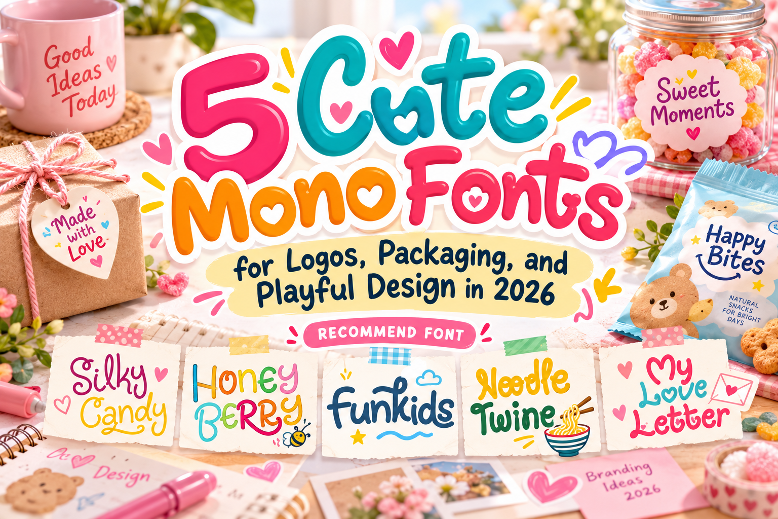
1. Silky Candy

Silky Candy is a sweet, cheerful display font designed around a fun and approachable personality. It includes uppercase and lowercase letters, numerals, punctuation, multilingual support, and alternate characters, giving designers flexibility for playful logos and branded graphics. PutraCetol recommends it for applications including books, greeting cards, toys, posters, baby clothing, and picture books. Putra Cetol
Its soft visual character makes it especially suitable when a brand needs to feel friendly rather than loud or aggressive.
PROS: Cute personality, alternate characters, multilingual support, flexible display use.
BEST FOR: Candy branding, baby products, children’s books, greeting cards, playful packaging.
2. Honey Berry

Honey Berry is a playful display font with rounded forms and cute berry-like terminals that give individual letters extra character. PutraCetol describes it as suitable for quotes, comics, books, toys, posters, baby clothing, and picture books, while its broader styling makes it useful for youthful lifestyle and food branding as well. Putra Cetol
The rounded construction feels approachable, making it particularly effective for brands that want to communicate sweetness, friendliness, and happiness.
PROS: Rounded personality, decorative terminals, alternates, cheerful branding value.
BEST FOR: Sweets, children’s fashion, lifestyle products, packaging, social media graphics.
3. Fun Kids Playful Font

Fun Kids is designed specifically around energetic children’s typography. It includes alternate characters and an additional decorative version, allowing designers to introduce variation without switching to an unrelated typeface. Its playful forms are intended for toys, posters, comics, books, baby clothing, and other projects where an expressive childhood atmosphere is important. Creative Market
This versatility makes it useful for complete children’s branding systems rather than only isolated headlines.
PROS: Alternates, decorative version, energetic shapes, strong child-friendly personality.
BEST FOR: Educational toys, classroom graphics, children’s publishing, events, kids’ packaging.
4. Noodle Twine Playful Monoline Font
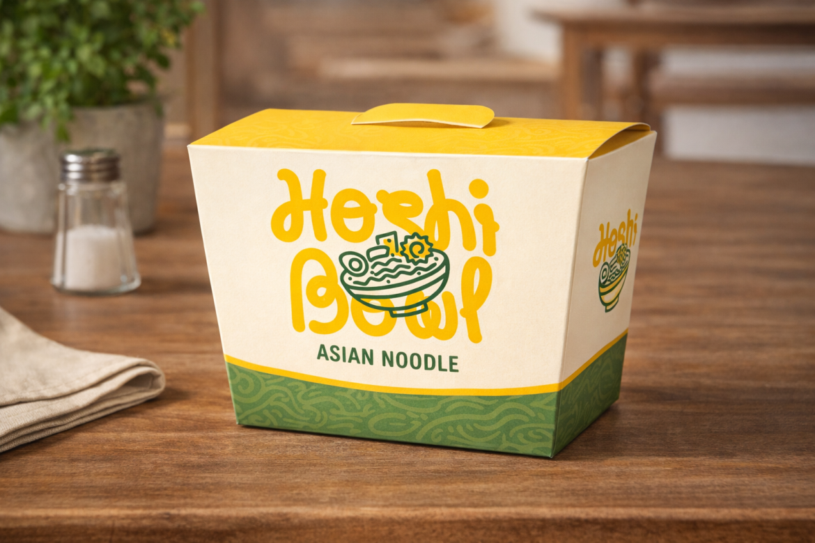
Noodle Twine is the clearest monoline choice in this collection. Its rounded letterforms are built from smooth, consistent single-weight strokes, producing a relaxed and balanced appearance that feels handmade without becoming visually messy. Creative Market
Its approachable structure works particularly well for food branding, cafés, casual packaging, menu titles, family-oriented businesses, and lifestyle identities. PutraCetol also highlights it for noodle and Asian-food branding where friendly typography can help a product feel accessible. Putra Cetol
PROS: Consistent monoline construction, rounded forms, simple silhouette, versatile personality.
BEST FOR: Food packaging, cafés, noodle brands, family products, casual lifestyle branding.
5. My Love Letter

My Love Letter is a quirky monoline font with three coordinated versions distinguished by different heart decorations. Its rounded edges and consistent thickness create a soft, friendly foundation, while the heart-shaped alternates add an unmistakably romantic character. Putra Cetol
It is especially useful when a brand wants cute typography with a stronger emotional or affectionate direction rather than a purely children’s aesthetic.
PROS: Three versions, monoline structure, heart details, strong emotional identity.
BEST FOR: Valentine products, weddings, gifts, stationery, romantic packaging, social media.
Comparison: Which Cute Mono Font Fits Your Project?
| Font | Main Personality | Strongest Use |
|---|---|---|
| Silky Candy | Sweet and cheerful | Kids and confectionery |
| Honey Berry | Rounded and charming | Lifestyle and packaging |
| Fun Kids | Energetic and youthful | Education and toys |
| Noodle Twine | Clean and monoline | Food and casual brands |
| My Love Letter | Romantic and playful | Gifts and celebrations |
For a true monoline aesthetic, Noodle Twine and My Love Letter are the most direct choices. Silky Candy, Honey Berry, and Fun Kids lean more strongly toward playful display typography.
Why Cute Monoline Typography Works for Branding
Consistent stroke weight can make expressive typography feel more organized. This is useful in packaging, where a font needs personality but must still compete with illustrations, product photography, labels, and regulatory information.
Monoline forms also scale naturally across different brand touchpoints. A logo can appear on a package, social post, sticker, signage panel, or merchandise while maintaining a recognizable silhouette.
However, consistency does not mean using the same font everywhere. Use the cute display font for identity and pair it with quieter typography for supporting information.
Common Mistakes
One common mistake is assuming that every “mono” font is monospace. A monoline font describes visual stroke construction, while monospace refers to equal character widths. This distinction matters when selecting typography for coding interfaces, data tables, or technical UI, where actual fixed-width behavior may be required.
Another mistake is overusing cute typography. A playful font may create an excellent package name or children’s book title but become difficult to read in ingredients, instructions, paragraphs, or navigation. Use decorative fonts to establish personality and simpler supporting fonts to maintain hierarchy.
Finally, always test the font with the real product name. Unusual alternates, rounded shapes, or decorative hearts can behave very differently depending on the letters involved. Review spacing, small-size readability, printing quality, and the appropriate PutraCetol license coverage before final production.
Conclusion
The best cute mono fonts 2026 combine friendly character with controlled visual structure.
Silky Candy offers sweetness, Honey Berry adds rounded charm, Fun Kids delivers youthful energy, Noodle Twine provides a cleaner monoline direction, and My Love Letter brings romantic personality through heart-based variations.
Explore these fonts at PutraCetol Studio for logos, children’s products, food packaging, stationery, publishing, merchandise, and other brands that need typography to feel approachable, memorable, and genuinely fun.
Explore these fonts and many more at PutraCetol.com to build a business identity that looks professional, trustworthy, and memorable.
Additionally, if you want to explore some free typography options, you can check out Putracetol Studio on Dafont. Happy reading and designing!