

The strongest Christmas logo design examples do not completely replace a brand’s established identity. Instead, they introduce seasonal details while preserving the shape, name, proportions, or visual character that customers already recognize.
A retail brand might add a small snowflake above its wordmark. A bakery could transform one letter into a Christmas ornament. A creative studio might add a star, ribbon, or winter texture around its existing symbol. These additions make the identity feel festive without forcing customers to learn a new logo.
Before designing, decide whether the Christmas logo will appear on packaging, storefronts, social media, email campaigns, websites, merchandise, or event materials. A detailed logo may look impressive on a poster but become unreadable inside a small profile image. Build several responsive versions so the seasonal identity works across every required size.
What Makes a Christmas Logo Effective?
A successful Christmas logo normally combines one recognizable seasonal idea with a clear brand personality. Snowflakes, stars, bells, ornaments, ribbons, evergreen trees, gift boxes, and winter patterns can all communicate the season. However, using several of them at once may turn the logo into an illustration rather than a functional identity.
Choose one dominant motif, two or three primary colors, and one distinctive typographic direction. The final composition should remain recognizable in full color, monochrome, small digital formats, and simple print applications.
The design should also reflect the business. A luxury hotel may need fine lines, an elegant serif, and restrained gold accents. A children’s shop can use playful lettering, bright ornaments, and rounded shapes. A handmade bakery might benefit from warm cream, forest green, burgundy, and nostalgic typography.
Seven Christmas Logo Design Examples
1. Minimal Snowflake Monogram
Place a geometric snowflake inside or around the initials of the business. Keep the surrounding layout simple so the winter symbol becomes a recognizable accent rather than decorative clutter.
A navy, silver, and white palette can create a clean contemporary mood. This direction suits technology companies, professional services, corporate events, and brands that want seasonal relevance without appearing overly playful.
2. Christmas Ornament Lettermark
Transform the first letter of the brand name into a hanging ornament. A small line can represent the string, while a star, snowflake, or simple highlight adds depth to the circular shape.
Red, gold, and cream create a traditional festive feeling, while burgundy and champagne offer a more premium alternative. This concept works well for retail shops, gift businesses, cafés, and holiday product collections.
3. Evergreen Tree in Negative Space
Use the empty space between letters or inside a symbol to form a simplified Christmas tree. This approach gives the logo seasonal meaning without adding a separate illustration.
Forest green, ivory, and muted gold support a natural and refined identity. The concept is especially suitable for sustainable products, outdoor brands, artisan businesses, home décor stores, and organic food packaging.
4. Gift-Ribbon Script Wordmark
Choose a flowing script that resembles a curling gift ribbon. One extended stroke can underline the brand name, form a bow, or connect the lettering to a small star.
This direction feels personal, warm, and celebratory. It can support boutiques, beauty businesses, handmade products, gift shops, wedding professionals, and lifestyle brands. Pair the script with a simple sans serif for dates, offers, and supporting information.
5. Vintage Christmas Badge
Build the logo as a circular or shield-shaped emblem containing the business name, a seasonal icon, and a short message such as “Holiday Collection” or “Christmas Market.”
Burgundy, parchment, dark green, and copper can create a nostalgic appearance inspired by traditional packaging and winter signage. This style works particularly well for bakeries, coffee shops, markets, restaurants, craft products, and community events.
6. Luxury Star Emblem
Place a fine eight-pointed star above an elegant wordmark or integrate it into the crossbar of a letter. Keep the ornamentation controlled and leave generous space around the composition.
Black, ivory, deep navy, and soft gold can communicate seasonal elegance without depending on conventional bright red and green. This concept suits jewelry, hospitality, cosmetics, premium gifting, fashion, and luxury food products.
7. Playful Holiday Character Logo
Add small snow caps, candy-cane stripes, baubles, smiling stars, or irregular winter shapes to a bold display wordmark. The personality should come primarily from the letterforms, with icons acting as supporting details.
Bright red, green, white, pink, or icy blue can create an energetic family-friendly identity. This direction is ideal for children’s products, seasonal snacks, parties, toy shops, entertainment campaigns, and Christmas merchandise.
Choosing a Christmas Color Palette
Traditional red and green remain effective, but they are not the only options. The palette should match the brand position and the emotional experience the campaign needs to create.
For a classic identity, combine deep red, evergreen, and cream. For premium Christmas branding, use black, champagne gold, and ivory. A playful campaign may use candy red, mint, pink, and white, while a winter-focused concept can use navy, pale blue, silver, and soft grey.
Color should not be the only element carrying important meaning. Use labels, icons, shapes, and sufficient light-dark contrast so digital campaign content remains understandable for people who perceive colors differently.
Using Festive Typography Without Losing Readability
Decorative Christmas fonts are most effective in short phrases, logo names, packaging titles, promotional headlines, and event graphics. They should not be used for long product descriptions, terms, prices, opening hours, or small interface labels.
A practical combination is one expressive display font for the logo and one neutral supporting font for functional information. This gives the campaign personality while keeping every important message easy to read.
Jump to Recommended Fonts
Modern Bauble Bliss | Happy Christmas Party | Snow Flow | Toasty Curve | Spark Jingle
1. Modern Bauble Bliss Quirky Christmas Font

Modern Bauble Bliss is an expressive display family designed for playful Christmas branding. It includes nine styles decorated with seasonal elements such as snowflakes, stars, candy canes, and holly, allowing designers to select one treatment or combine several variations. This flexibility is useful for building related logos, packaging titles, stickers, and campaign graphics without making every asset look identical.
PROS: Nine decorative styles, strong seasonal character, playful variation, and memorable display impact.
BEST FOR: Children’s products, gift shops, festive merchandise, social campaigns, packaging, and family events.
2. Happy Christmas Party

Happy Christmas Party has a cheerful, quirky display structure created specifically for Christmas and holiday projects. The family includes regular, decor, deer, snow, and star versions, giving designers several ways to adapt the same visual voice across a seasonal identity. Its energetic personality works especially well when a logo needs to communicate celebration immediately.
PROS: Five themed versions, joyful personality, multilingual support, and flexible decorative options.
BEST FOR: Christmas parties, greeting cards, family brands, event posters, holiday newsletters, and festive retail.
3. Snow Flow Christmas Font

Snow Flow combines bold strokes, rounded terminals, gentle curves, and flowing forms that resemble soft winter movement. Its handcrafted script personality feels friendly and expressive, while the substantial letter weight helps short names remain visible in packaging and promotional layouts. It is a strong choice for brands seeking a cozy Christmas mood rather than a formal luxury direction.
PROS: Warm flowing shapes, bold visibility, handcrafted character, and multilingual coverage.
BEST FOR: Winter cafés, holiday food packaging, gift products, invitations, social graphics, and seasonal events.
4. Toasty Curve Christmas Font

Toasty Curve is a festive serif display font built around plump terminals, thick strokes, soft edges, and slightly exaggerated curves. Its combination of serif structure and rounded warmth creates a nostalgic Christmas personality that feels appropriate for both traditional and playful branding. Use it for short wordmarks where the letter shapes can remain large and prominent.
PROS: Cozy serif personality, rounded readability, nostalgic charm, and strong headline presence.
BEST FOR: Bakeries, hot drink brands, Christmas markets, confectionery, restaurants, and vintage packaging.
5. Spark Jingle Christmas Font
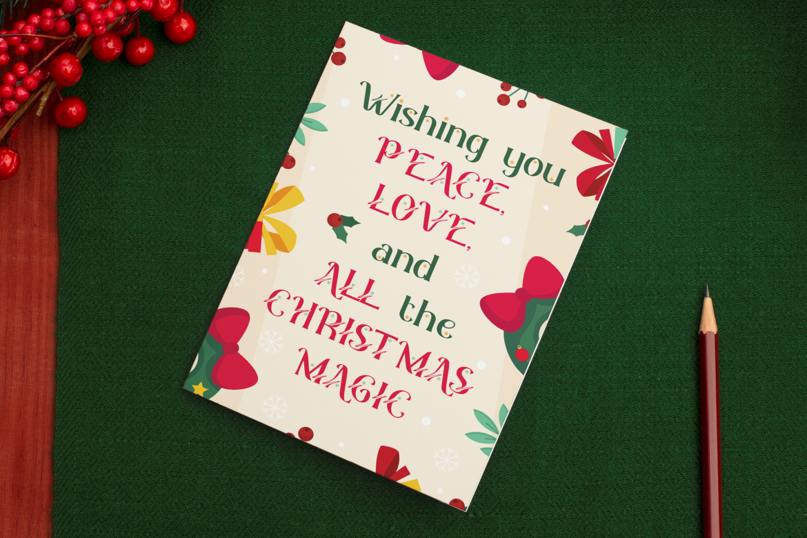
Spark Jingle balances a classic serif foundation with curved swashes, candy-cane-inspired details, soft shapes, and decorative snowflakes. The result feels playful but still polished enough for elegant seasonal branding, particularly when placed on light, warm, or premium backgrounds. Its ornamental details can turn a simple wordmark into a complete Christmas centerpiece.
PROS: Decorative swashes, elegant festive character, distinctive ornaments, and strong digital and print versatility.
BEST FOR: Premium gift packaging, holiday invitations, boutique retail, greeting cards, wrapping paper, and New Year campaigns.
Comparison
| Font | Visual Personality | Strongest Logo Direction | Ideal Brand Category |
|---|---|---|---|
| Modern Bauble Bliss | Quirky and highly decorative | Playful ornament logo | Kids, gifts, and merchandise |
| Happy Christmas Party | Energetic and celebratory | Party-focused wordmark | Events and family brands |
| Snow Flow | Warm and handcrafted | Flowing winter script | Food, cafés, and gifts |
| Toasty Curve | Cozy and nostalgic | Vintage serif logo | Bakeries and markets |
| Spark Jingle | Elegant and festive | Premium ornamental wordmark | Retail, gifting, and invitations |
Common Mistakes in Christmas Logo Design
The first mistake is adding too many seasonal details. A logo containing a tree, bell, gift box, snowman, ribbon, star, and several snowflakes will struggle to remain clear at small sizes. Select one dominant motif and allow typography, spacing, and color to create the rest of the festive atmosphere. Supporting illustrations can appear elsewhere in the campaign without becoming permanent parts of the logo.
Another mistake is changing the original brand so heavily that customers no longer recognize it. The Christmas version should preserve at least one established element, such as the wordmark, symbol, silhouette, color relationship, or layout. Designers should also prepare simplified, monochrome, horizontal, stacked, and icon-sized versions rather than expecting one detailed composition to work everywhere.
The final mistake is prioritizing decoration over readability. Thin gold lettering may disappear against cream, snow effects can cover important letter details, and elaborate scripts may become difficult to read in small social media images. Test the logo at actual output sizes, check it on both light and dark backgrounds, and pair decorative typography with a simpler supporting font. Before commercial use, confirm that the selected font license covers the intended logo, trademark, merchandise, website, or campaign application.
Conclusion
The most effective Christmas logo design examples combine recognizable brand elements with one clear seasonal idea. A snowflake monogram can feel modern, an ornament lettermark can feel cheerful, a vintage badge can create nostalgia, and an elegant star emblem can support premium positioning.
Color, typography, and seasonal icons should work together rather than compete for attention. Preserve the brand’s core identity, prepare responsive logo variations, and keep functional information easy to read.
Christmas fonts from PutraCetol Studio can help transform a basic holiday variation into a distinctive seasonal identity. Whether the project needs quirky ornaments, party energy, flowing winter warmth, nostalgic curves, or elegant decorative details, the right typeface gives the campaign a consistent personality across logos, packaging, social content, merchandise, and promotional materials.
Explore these fonts and many more at PutraCetol.com to build a business identity that looks professional, trustworthy, and memorable.
Additionally, if you want to explore some free typography options, you can check out Putracetol Studio on Dafont. Happy reading and designing!