
Best Business Card Fonts 2026: Typography for Professional First Impressions
Design for Actual Card Size
The best business card fonts 2026 must accomplish two different jobs. They need enough character to make a name or brand memorable while keeping small contact information easy to read.
Begin by assigning clear typographic roles. Use one expressive font for the logo, name, or professional title, then choose a simpler companion for email addresses, phone numbers, URLs, and other details. Avoid reducing decorative scripts or high-contrast display fonts until their distinctive forms become difficult to recognize.
Business cards in 2026 are also becoming more expressive. MOO highlights directions including ultra-minimal layouts, nostalgic typography, Gothic influences, futuristic treatments, and premium finishes such as foil and raised gloss. Adobe similarly emphasizes that typography contributes strongly to brand recognition and recommends matching fonts and colors to the wider visual identity.
Typography Should Match Brand Positioning
Different business-card fonts communicate different personalities.
A tall classic serif can suggest prestige. A clean modern sans communicates contemporary professionalism. A signature font introduces a personal, boutique feeling, while a serif-and-script duo gives designers an immediate way to establish hierarchy.
The right choice should support the person behind the card rather than simply follow a trend.
Jump to Recommended Fonts
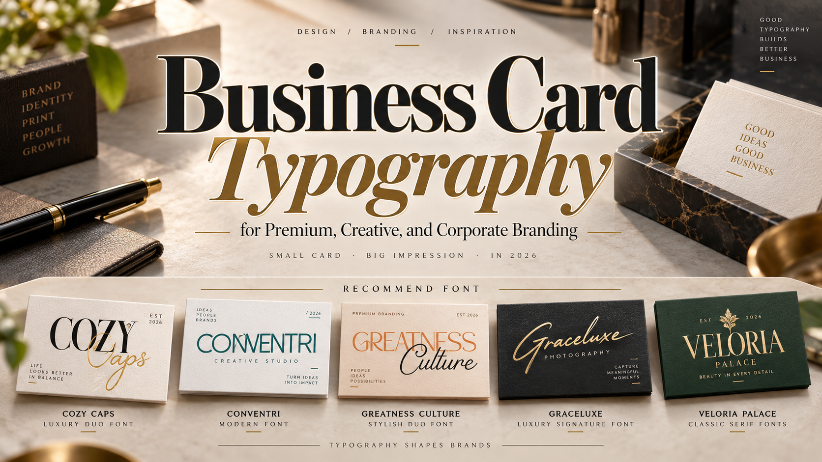
1. Cozy Caps Luxury Duo Font

Cozy Caps combines a sophisticated serif with a smooth script, creating two coordinated voices inside one font package. The serif provides confidence and structure, while the handwritten component adds warmth and personality. This combination works especially well on business cards where a professional name needs to coexist with a more personal signature or accent.
PROS: Built-in pairing, elegant contrast, professional yet personal.
BEST FOR: Luxury consultants, wedding professionals, photographers, boutiques, beauty brands, and creative entrepreneurs.
2. Conventri Modern Font

Conventri is a modern display sans serif with clean construction, curled decorative details, two styles, and ligatures. Its contemporary foundation keeps the typography organized, while the unusual curves add enough personality to help a small business card stand apart from conventional corporate designs.
PROS: Modern structure, decorative curves, two styles, useful ligatures.
BEST FOR: Creative agencies, architecture studios, startups, fashion brands, designers, and modern personal identities.
3. Greatness Culture Stylish Duo Font
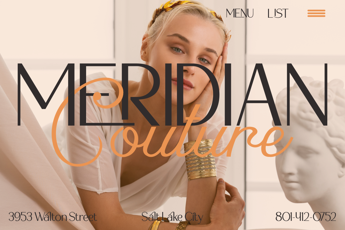
Greatness Culture pairs a sleek sans serif with a flowing script, making it particularly flexible for business-card hierarchy. Designers can use the clean component for the main identity and supporting information, then reserve the script for a name, tagline, or short accent. Its extensive glyph and ligature selection also gives wordmarks more room for customization.
PROS: Sans-and-script combination, strong hierarchy, extensive ligatures, versatile personality.
BEST FOR: Creative studios, lifestyle businesses, consultants, fashion, hospitality, and premium personal branding.
4. Graceluxe Luxury Signature Font
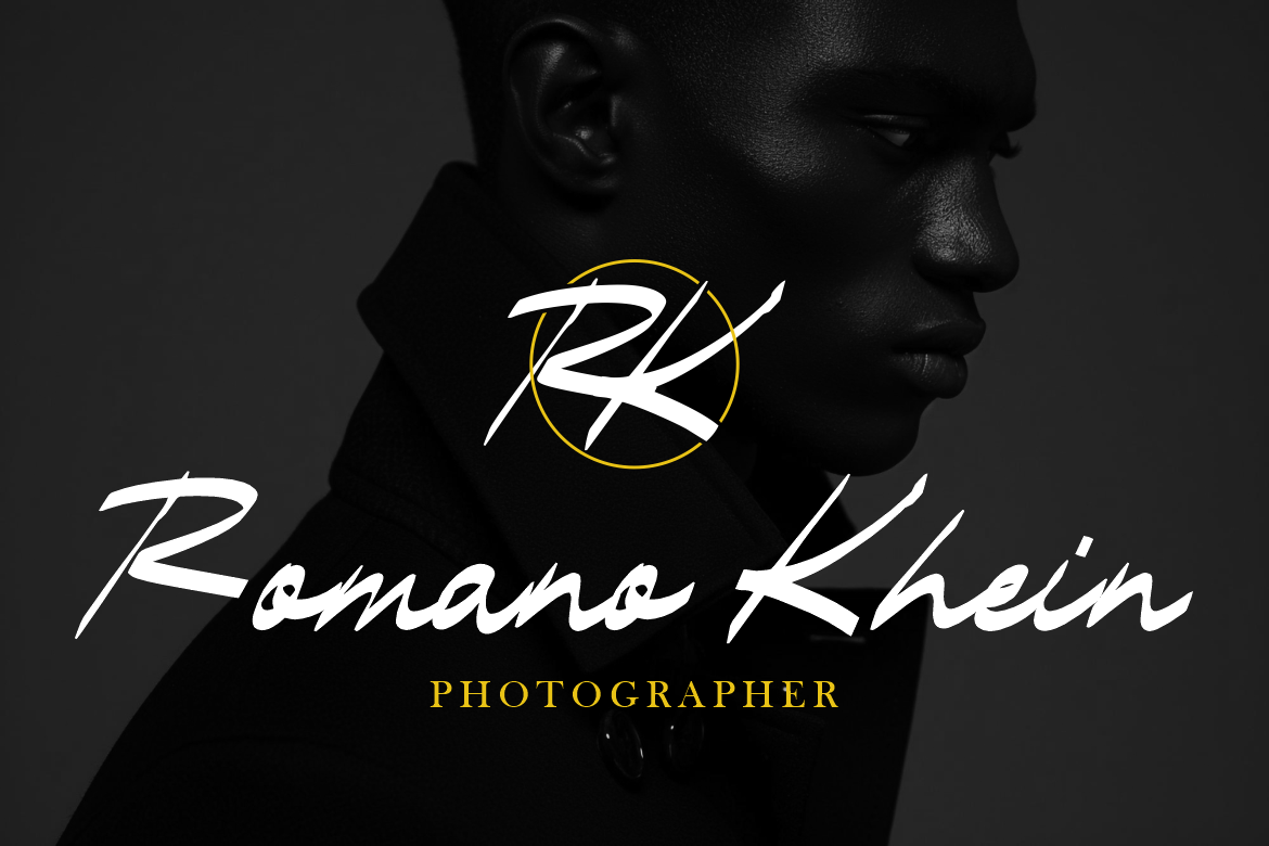
Graceluxe offers a slightly slanted handwritten style with confident, medium-to-thick strokes and smooth connections. Its signature character can make a personal name feel exclusive without appearing fragile, giving independent professionals a distinctive visual mark. Use it prominently and pair it with restrained supporting typography for small contact details.
PROS: Confident signature style, smooth rhythm, personal luxury character.
BEST FOR: Photographers, fashion professionals, beauty specialists, wedding businesses, consultants, and personal brands.
5. Veloria Palace Classic Serif Font
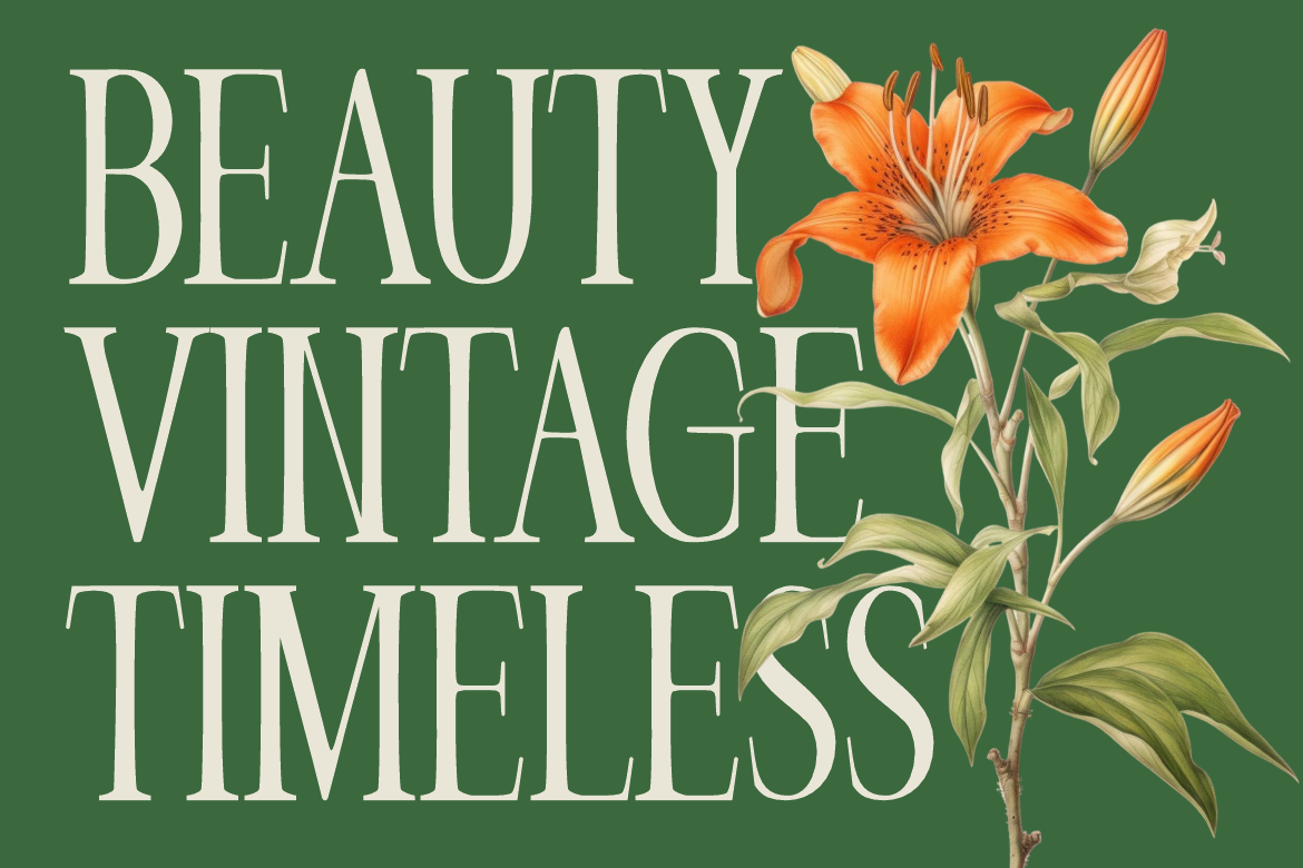
Veloria Palace uses tall condensed proportions, strong contrast, slim vertical rhythm, and graceful curves. Its narrow construction is valuable on a small card because a professional or brand name can feel substantial without occupying excessive horizontal space. The overall personality is classic, editorial, and sophisticated.
PROS: Condensed proportions, elegant contrast, refined readability, premium editorial mood.
BEST FOR: Luxury services, fashion, beauty, hotels, consultants, editorial professionals, and premium boutiques.
Using Fonts With Premium Print Finishes
Typography should be tested together with the material. Foil can emphasize a serif logo, letterpress can make restrained typography feel tactile, and raised gloss can strengthen selected initials or a monogram.
Do not apply premium finishing to every word. A single typographic focal point usually looks more sophisticated.
Adobe recommends clean typography, balanced spacing, and suitable paper or finishing choices for professional cards.
Comparison
| Font | Style | Brand Personality | Strongest Business Card Role |
|---|---|---|---|
| Cozy Caps | Serif + script duo | Luxurious and warm | Premium identity |
| Conventri | Modern display sans | Contemporary and creative | Agency branding |
| Greatness Culture | Sans + script duo | Stylish and flexible | Creative professionals |
| Graceluxe | Signature script | Personal and exclusive | Personal branding |
| Veloria Palace | Condensed serif | Classic and refined | Luxury corporate identity |
Common Mistakes
The first mistake is choosing a font because it looks impressive at poster size. Business cards are small, so thin details, extreme contrast, complex swashes, or tightly spaced characters can disappear after printing. Always test the card at 100% physical size and print a proof before approving production.
Another mistake is using the same expressive font for every information level. A beautiful script may work for a photographer’s name but become frustrating when used for an email address. Let distinctive typography create recognition, then use a readable companion for functional information.
The final mistake is ignoring production and licensing. Foil, embossing, textured paper, and unusual stocks can affect fine strokes and spacing. If the typography becomes part of a registered logo or broader brand system, also select the appropriate PutraCetol license coverage for the actual commercial use.
Conclusion
The best business card fonts 2026 balance personality with practical readability. Cozy Caps and Greatness Culture provide flexible font pairings, Conventri brings modern creative character, Graceluxe adds a personal signature, and Veloria Palace delivers classic sophistication.
Use these PutraCetol Studio fonts to make the name or brand memorable, but allow simpler typography to handle smaller information. Combined with deliberate spacing, premium materials, and disciplined finishing, the right font can turn a tiny business card into a powerful expression of professional identity.
Explore these fonts and many more at PutraCetol.com to build a business identity that looks professional, trustworthy, and memorable.
Additionally, if you want to explore some free typography options, you can check out Putracetol Studio on Dafont. Happy reading and designing!