
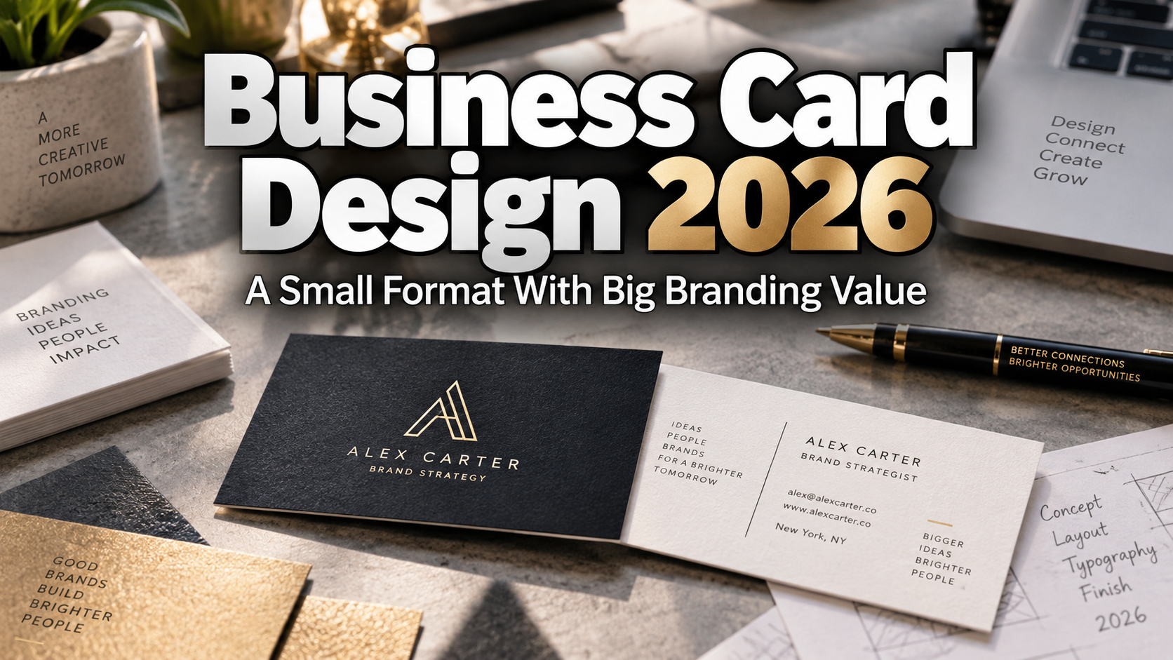
Design the Card as a Brand Experience
The strongest business card design 2026 is not simply contact information reduced to pocket size. Treat the card as a compact brand experience. Decide what someone should remember after receiving it: your name, specialty, visual style, or a clear next step.
Physical cards still have value in a digital-first world. Adobe Express reported in a 2025 survey of 1,000 consumers and business owners that 62% of consumers were more likely to use a business or service after receiving a physical card, while 70% described physical card exchanges as personal. The same research also found strong interest in QR-enabled follow-up.
Why Business Cards Still Matter for Designers
For designers, a business card is almost a rite of passage because it compresses an identity system into a tiny space. Logo, typography, hierarchy, color, spacing, paper, and production must work together.
That constraint is useful. A potential client can quickly understand whether your identity feels refined, experimental, playful, or corporate. Unlike a portfolio viewed in a browser tab, a card also becomes a physical object people can keep.
Typography Should Lead the Hierarchy
Start with what matters most: name or brand, role, primary contact method, and portfolio.
A display font can make the name memorable, while a cleaner supporting typeface handles email, URL, phone, or other small details. Avoid forcing an expressive face into tiny text where unusual shapes become difficult to read.
One strong typographic decision is usually more effective than several decorative effects. A custom wordmark on one side and organized contact information on the other can already create a complete visual statement.
PutraCetol Studio offers display, serif, script, experimental, and bold fonts that can help create a distinctive front face while supporting information remains functional.
Use Layout to Control Attention
Business cards have little room, which makes hierarchy essential. Decide what should be seen first, second, and third.
Negative space is not wasted space. It separates information and gives typography authority. A vertical layout can feel editorial or fashion-oriented, while the familiar horizontal format offers immediate usability.
Adobe’s current guidance emphasizes hierarchy, readability, white space, materials, print requirements, and careful proofing. These fundamentals matter more than following a temporary visual trend.
Materials Can Become Part of the Identity
Paper choice changes how the card feels before anyone reads it. Uncoated stock can feel tactile and understated, while thick or textured stock can suggest durability, craft, or premium positioning.
Foil, embossing, debossing, edge treatments, or spot finishes can add impact, but they should support the brand rather than compete with it. A luxury consultant might use restrained foil, while an illustrator could choose textured paper that complements handmade artwork.
Always request the printer’s bleed, trim, safe-area, and finishing specifications before production.
Connect Print to Digital With QR Codes
A business card no longer needs to contain every link. A QR code can open a portfolio, vCard, booking page, social profile, or focused landing page. MOO describes QR business cards as a bridge between print and digital, with destinations including URLs and contact information.
Give the code enough clear space and add a simple instruction such as “View portfolio” or “Save contact.” Test it from an actual printed proof before ordering a large quantity.
Some generators create static codes. Adobe Express, for example, states that its generated QR codes are static, meaning a changed destination requires a new code.
Create a Mini Portfolio
Designers can use the reverse side as a visual sample rather than another block of information. Try a typographic composition, illustration fragment, pattern, photograph, or a small series of different card backs.
The card should create curiosity. Let the portfolio URL or QR code reveal the complete body of work.
Comparison
| Traditional Card | Business Card 2026 |
|---|---|
| Contact information dominates | Brand recognition and next action dominate |
| One static destination | QR-enabled digital connection |
| Generic typography | Distinctive brand typography |
| Standard paper by default | Material supports identity |
| Designed mainly for storage | Designed for interaction and recall |
Common Mistakes
The first mistake is trying to include everything. Multiple phone numbers, several social accounts, long addresses, service lists, slogans, and decorative icons quickly destroy hierarchy. Decide what the recipient actually needs after the meeting. A name, role, primary contact, portfolio destination, and one clear action are often enough.
Another mistake is designing only on screen. Thin type, subtle colors, tiny details, and complex QR codes may look excellent at high zoom but fail after printing. Check actual-size proofs, contrast, edge clearance, paper behavior, QR scanning, and finishing before production.
The final mistake is treating premium production as a substitute for branding. Foil and unusual shapes cannot rescue weak typography or inconsistent visual direction. Establish the identity first, then choose materials and finishes that reinforce it.
Conclusion
Business card design 2026 shows that physical networking and digital identity do not need to compete. A strong card combines typography, hierarchy, tactile production, and a simple digital bridge into one memorable object.
For designers, agencies, creators, and startups, the format remains an excellent test of branding discipline. Use a distinctive PutraCetol Studio font where personality matters, keep functional information readable, and let materials strengthen the concept.
When every detail has a purpose, a business card can become a miniature portfolio, conversation starter, and lasting reminder of the person or brand behind it.
Explore these fonts and many more at PutraCetol.com to build a business identity that looks professional, trustworthy, and memorable.
Additionally, if you want to explore some free typography options, you can check out Putracetol Studio on Dafont. Happy reading and designing!