
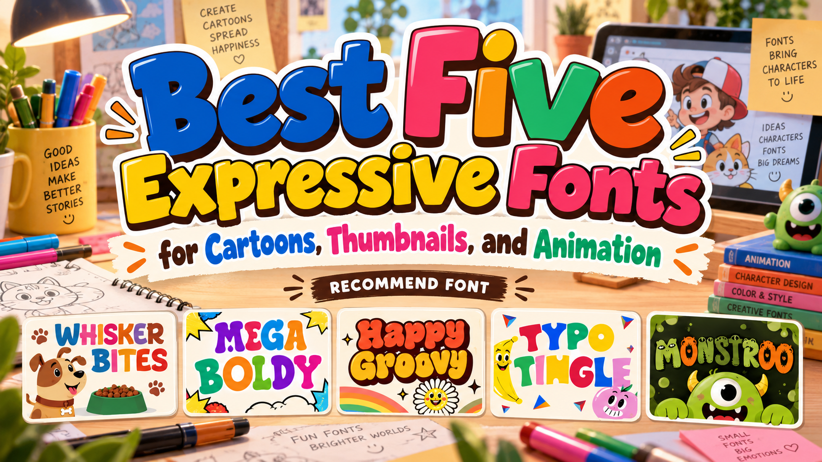
Best Cartoon Fonts 2026: Give Your Visual Story a Distinctive Voice
Match the Lettering to the Story
The best cartoon fonts for 2026 should express a particular personality, not simply make every headline louder. Decide whether your project needs friendly warmth, superhero confidence, nostalgic charm, handmade mischief, or monster-inspired humor.
A pet bakery may benefit from welcoming curves, while a mischievous cartoon series can support stranger, more illustrated letterforms. Let the story guide the choice.
Use an expressive display font for the title, logo, or product name. Pair it with simpler lettering for dialogue, captions, instructions, and longer descriptions.
What to Check Before Choosing
Test the actual words, including numerals, punctuation, and required accented characters. Compare the title on a poster, a small package, and a phone-sized preview.
Begin in one color. Check letter spacing and the open spaces inside characters before adding shadows or outlines. Ask someone to read it and describe its mood. Revise anything unclear.
Jump to Recommended Fonts
1. Whisker Bites Animal Food Font
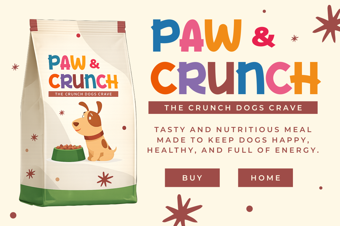
Whisker Bites combines thick strokes, rounded corners, and gently irregular shapes with a balanced cartoon-inspired structure. Its soft curves suggest a friendly, handcrafted personality rather than exaggerated comic drama. Try it for a pet-bakery identity, pairing the wordmark with a simple animal mascot and restrained product information.
PROS: Friendly curves, substantial strokes, balanced display structure.
BEST FOR: Pet brands, snack packaging, animal comics, and family campaigns.
2. Mega Boldy Playful Bold Font
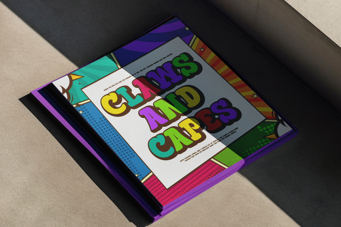
Mega Boldy features chunky, rounded letters, bubbly strokes, and an exaggerated bounce influenced by comics and retro pop art. Its energetic construction gives short titles a confident voice without depending on detailed illustrations inside the letters. For a superhero-themed cover, use a compact headline and one contrasting burst shape rather than several competing effects.
PROS: Bold presence, lively rhythm, rounded comic character.
BEST FOR: Comic covers, children’s books, thumbnails, event posters, and merchandise.
3. Happy Groov Layered Retro Font
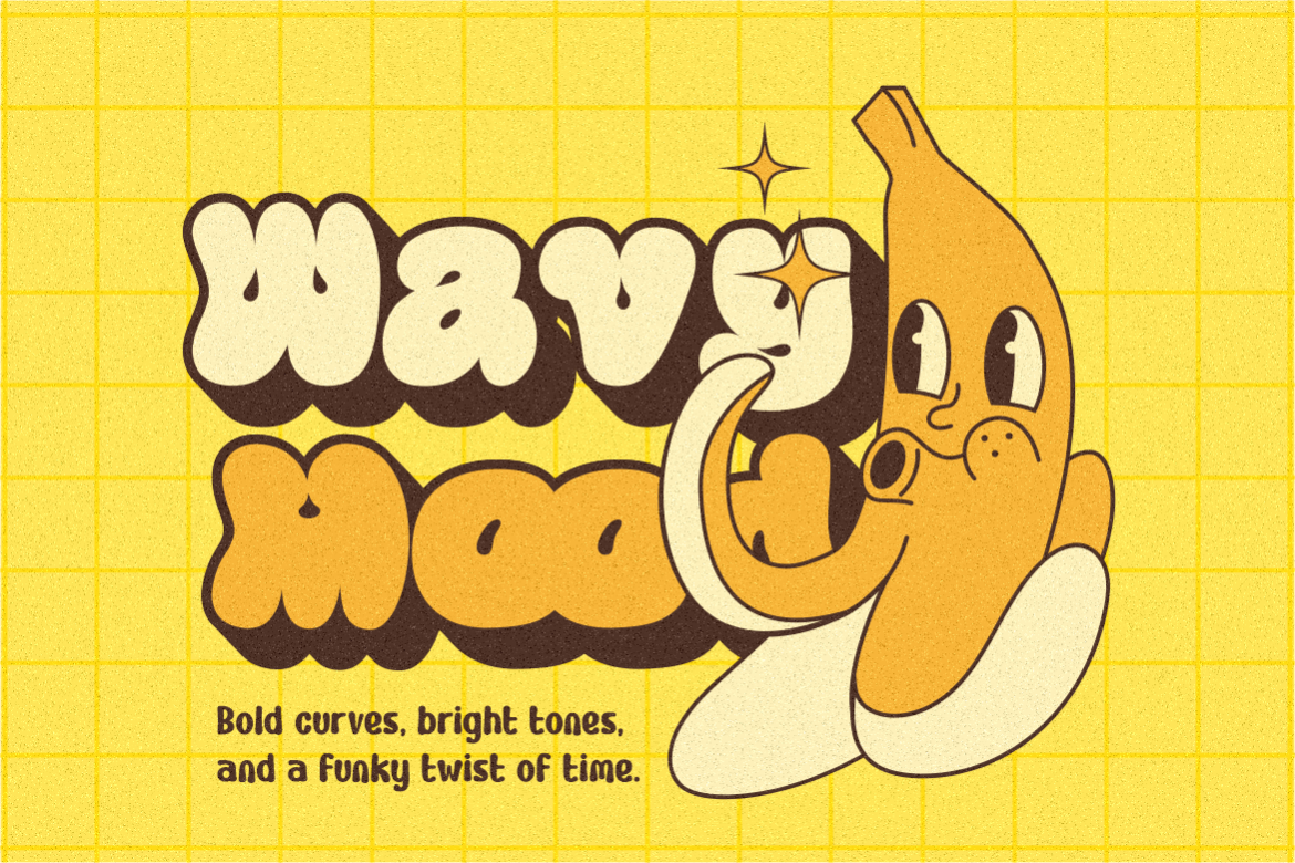
Happy Groov combines inflated curves, generous counters, and a layered structure inspired by the cheerful graphics of the 1960s and 1970s. Its substantial outline adds dimension and a cartoon-like rhythm, offering a warmer alternative to action-comic lettering. Try a cream-and-orange treatment for a nostalgic animation title or playful ice-cream campaign.
PROS: Layered dimension, expressive outlines, distinctive retro warmth.
BEST FOR: Animation titles, nostalgic packaging, music posters, and lifestyle branding.
4. Typo Tingle Quirky Fun Font
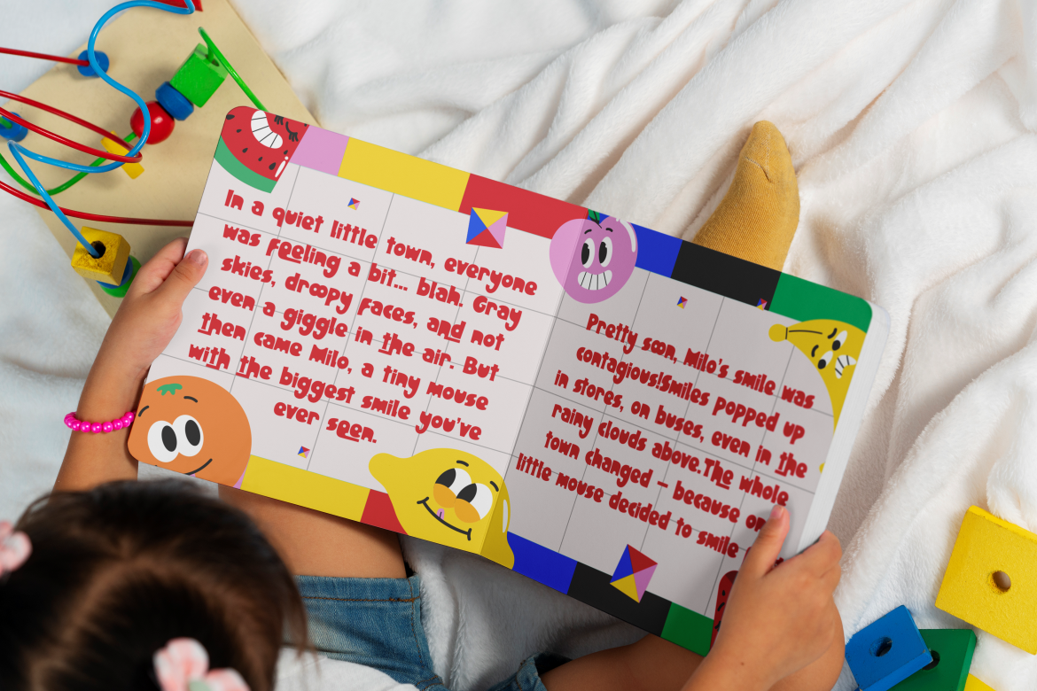
Typo Tingle uses bold, irregular shapes and asymmetrical letterforms that recall cut-and-paste building blocks. Its contrasting uppercase stance and curved lowercase forms create an offbeat, handmade personality rather than uniform geometric order. Use it for an art workshop poster or playful book cover where the lettering can reinforce imaginative, slightly mischievous storytelling.
PROS: Inventive proportions, collage-like character, expressive asymmetry.
BEST FOR: Creative workshops, children’s publishing, party invitations, and youthful campaigns.
5. Monstroo Funny Monster Display Font

Monstroo turns letters into miniature characters through monster-inspired details such as eyes, claws, bite marks, and textured accents. Thick irregular strokes and varied widths give words a mischievous silhouette with built-in illustration. For a monster-party invitation, keep the title short and the background simple so the creature details remain visible.
PROS: Character-filled glyphs, distinctive silhouettes, integrated visual humor.
BEST FOR: Monster comics, Halloween graphics, party invitations, and character-based packaging.
Comparison
| Font | Main Personality | Suggested Starting Project |
|---|---|---|
| Whisker Bites | Warm and approachable | Pet bakery label |
| Mega Boldy | Energetic and confident | Superhero comic cover |
| Happy Groov | Nostalgic and dimensional | Retro animation title |
| Typo Tingle | Irregular and imaginative | Children’s art workshop |
| Monstroo | Mischievous and illustrative | Monster-party invitation |
Build a Consistent Cartoon Brand
Create a small system rather than one isolated title. Repeat the headline font, color relationships, mascot proportions, and supporting typeface across packaging, posters, and social posts.
For motion, test a brief reveal or gentle bounce. Review the exported clip and give viewers enough time to read.
Common Mistakes
The first mistake is treating display lettering as a universal reading font. A dramatic title can work beautifully while the same styling overwhelms dialogue or product instructions. Separate expressive moments from information that readers need to understand quickly.
Another mistake is adding every playful element at once. Multiple mascots, rainbow fills, layered shadows, and patterned backgrounds compete with the words. Choose one dominant idea and simplify everything that distracts from it.
The final mistake is skipping production and licensing checks. Print a proof, review small previews, and confirm the characters you need. Check your purchase terms against the planned users, merchandise, advertising, webfont embedding, or game use before publication.
Conclusion
The best cartoon fonts 2026 offer more than one interpretation of fun. Choose the personality that belongs to your story, then build a readable supporting system around it.
Explore these five PutraCetol Studio options using your actual title or brand name. Thoughtful spacing, restrained effects, and realistic testing can turn expressive lettering into a consistent creative identity.
Explore these fonts and many more at PutraCetol.com to build a business identity that looks professional, trustworthy, and memorable.
Additionally, if you want to explore some free typography options, you can check out Putracetol Studio on Dafont. Happy reading and designing!