
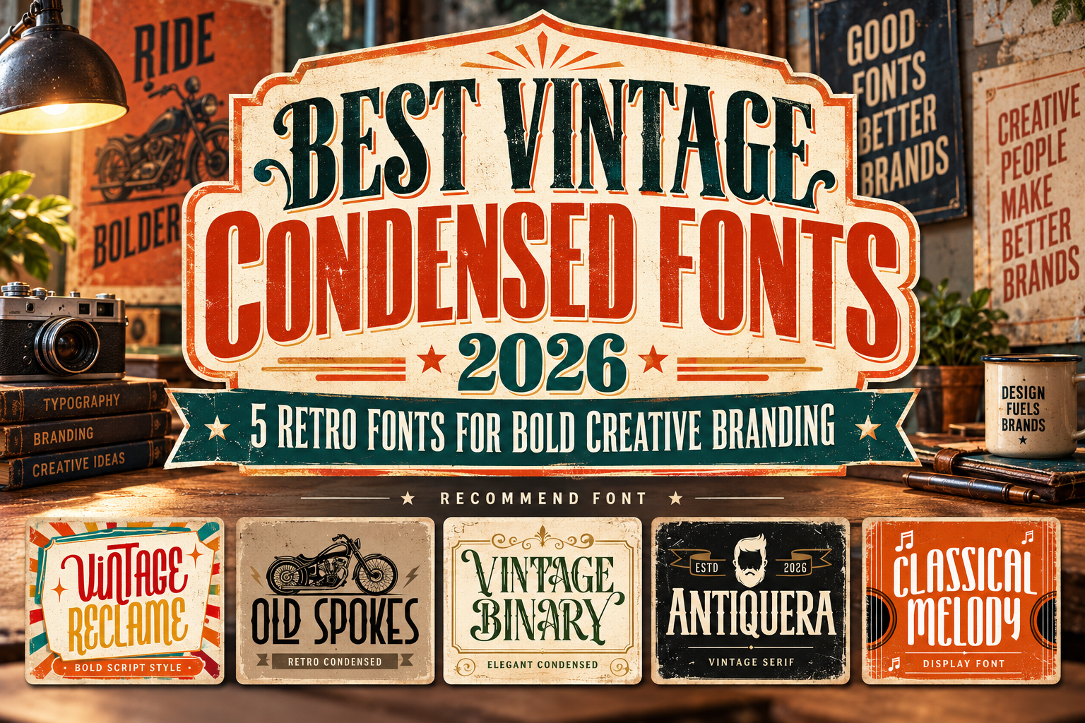
Best Vintage Condensed Fonts 2026 for Strong Retro Branding
Vintage typography continues to attract designers because it gives modern brands something highly polished geometric fonts sometimes lack: history, personality, and emotional character.
Condensed typography adds another advantage. Tall, narrow letterforms can create dramatic headlines while fitting more visual information into limited horizontal space. This makes the style especially useful for magazine covers, packaging panels, posters, labels, merchandise, and vertical social graphics.
The best vintage condensed fonts 2026 do not simply imitate old lettering. They reinterpret familiar retro proportions, ornamental details, handcrafted irregularities, and classic display structures in ways that still work inside contemporary branding.
It is also important to distinguish terminology. “Condensed” describes narrow proportions, not a historical period. Among the fonts below, some are strongly condensed while others work as complementary vintage display or script faces within the same retro identity system.
Use Condensed Fonts Where Vertical Impact Matters
Condensed typography works best when space is narrow but visual impact needs to remain high.
Imagine a coffee package with “ROASTED DAILY” running vertically, a concert poster with a tall headline, or an editorial cover where the title needs to sit beside a portrait without covering the subject.
That is where condensed forms become especially effective.
However, avoid forcing long paragraphs into narrow decorative lettering. Use vintage condensed fonts for logos, headlines, labels, titles, or short statements, then pair them with a calmer serif or sans serif for body copy.
Jump to Recommended Vintage Fonts
1. Classical Melody Vintage Display Font
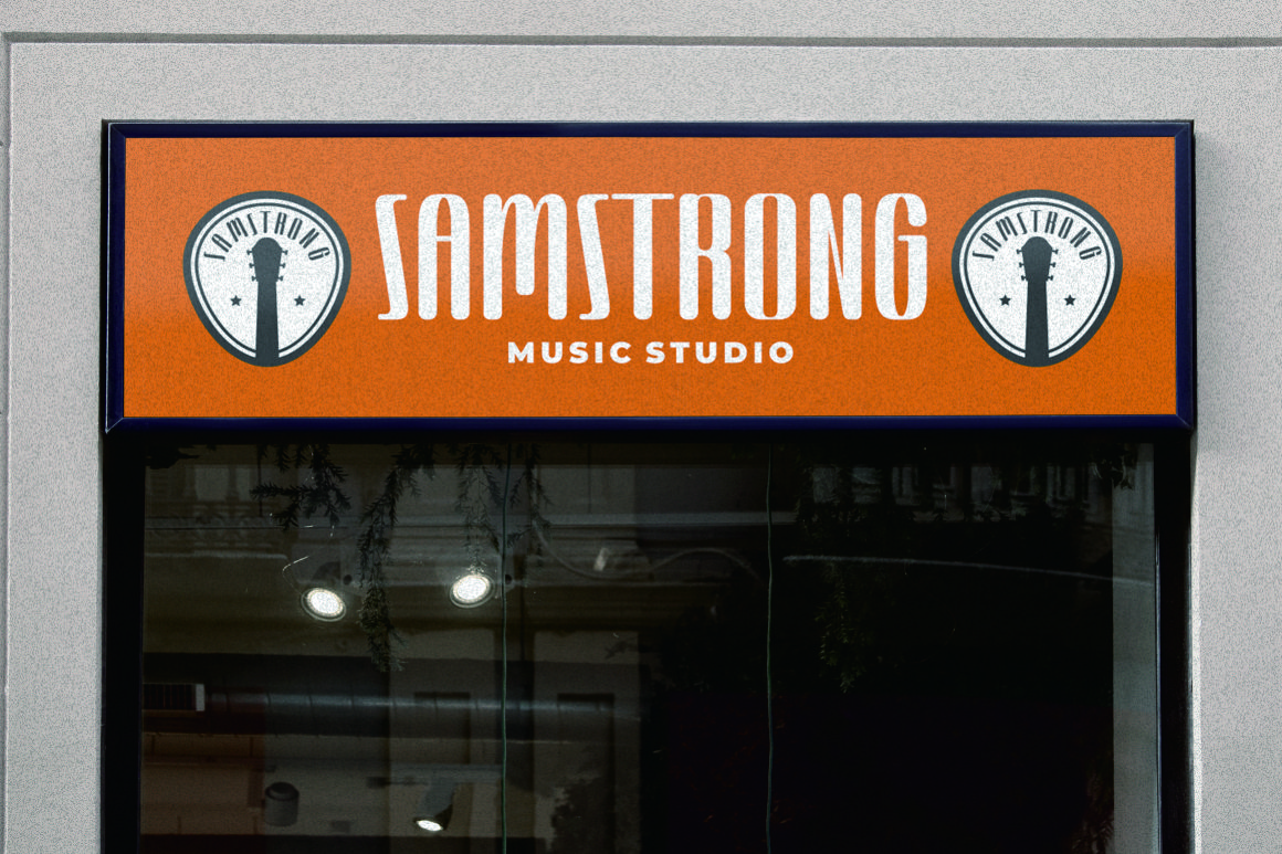
Classical Melody is the strongest true condensed choice in this collection. It is described as a tall and skinny vintage sans serif inspired by music and handcrafted display design, making it particularly suitable for vertical compositions and large headline typography. It also includes OpenType features such as swashes, stylistic alternates, contextual alternates, and ligatures, giving designers more freedom to personalize short words and titles.
Its narrow proportions make it ideal when you want strong vintage character without consuming excessive horizontal space.
PROS: Tall condensed structure, OpenType alternates, ligatures, strong nostalgic personality.
BEST FOR: Music posters, editorial covers, café branding, apparel, event graphics, vintage labels.
2. Old Spokes Vintage Display Font

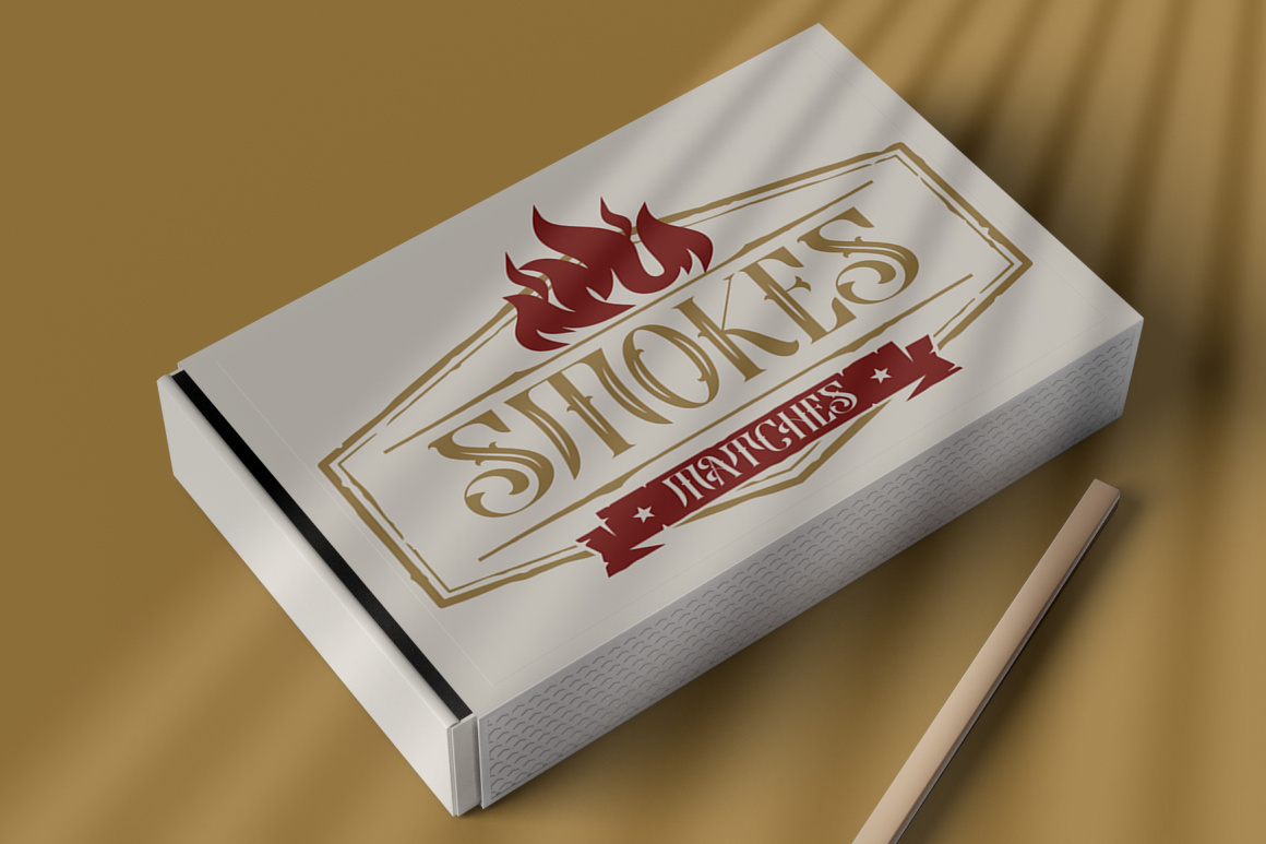
Old Spokes takes inspiration from traditional vintage poster lettering and combines bold, sharp forms with a handmade personality. It includes alternate characters, stylistic sets, swashes, contextual alternates, and ligatures, helping designers create more distinctive logos and display compositions.
While it is less strictly condensed than Classical Melody, its assertive display construction works well inside retro branding systems that need authenticity and a slightly rugged character.
PROS: Handcrafted feeling, multiple OpenType features, strong vintage poster identity.
BEST FOR: Motorcycle branding, apparel, posters, signage, album artwork, heritage products.
3. Vintage Binary Display Typeface
Vintage Binary emphasizes ornamental retro typography. The family includes Regular and Decorative styles, allowing designers to move between cleaner display lettering and a more embellished treatment depending on the project. Its classic visual language is particularly effective for logos, badges, emblems, packaging labels, and posters where typography becomes part of the illustration.
Vintage Binary is not primarily a narrow utility font. Instead, it is a strong complementary choice when a condensed layout needs a more decorative focal element.
PROS: Two styles, ornamental details, memorable retro character, strong branding potential.
BEST FOR: Badges, beverage labels, vintage packaging, posters, logos, emblems.
4. Antiquera Classic Vintage Serif Font
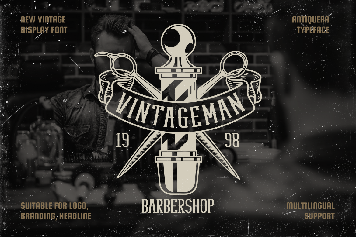
Antiquera brings a more controlled and sophisticated interpretation of vintage typography. Its letterforms use tall, solid proportions with medium-to-bold weight, producing strong visual rhythm at display sizes. That makes it particularly useful for brands that want historical character without looking overly distressed or theatrical.
Compared with Old Spokes or Vintage Binary, Antiquera feels cleaner and more premium, making it easier to incorporate into fashion, editorial, hospitality, or refined product branding.
PROS: Tall proportions, confident serif structure, balanced vintage character, strong large-size presence.
BEST FOR: Editorial branding, premium packaging, hospitality, book covers, fashion campaigns.
5. Vintage Reclame

Vintage Reclame takes the collection in a different direction. It is a vintage script inspired by classic billboard lettering, with a slightly irregular and bouncy rhythm plus an unusually rich set of ligatures. The font includes around 140 ligatures, which can be enabled for expressive vintage lettering or disabled when a cleaner appearance is needed.
Because it is a script rather than a true condensed display font, it works best as a secondary accent alongside taller block typography.
PROS: Strong billboard nostalgia, extensive ligatures, expressive rhythm, distinctive script character.
BEST FOR: Retro logos, packaging accents, apparel, advertisements, restaurant branding, signage.
Comparison: Which Vintage Font Fits Your Project?
| Font | Main Character | Strongest Use |
|---|---|---|
| Classical Melody | Tall, condensed, handcrafted | Editorial and posters |
| Old Spokes | Rugged, handmade | Heritage branding |
| Vintage Binary | Decorative, ornamental | Packaging and badges |
| Antiquera | Refined, classic | Premium branding |
| Vintage Reclame | Bouncy vintage script | Logo accents and signage |
If the priority is genuinely condensed typography, Classical Melody is the clearest choice. Antiquera provides a taller refined alternative, while Old Spokes delivers stronger handcrafted nostalgia. Vintage Binary is better for ornamental compositions, and Vintage Reclame works as an expressive companion font.
How to Make Vintage Condensed Typography Feel Modern
The easiest way to prevent retro typography from feeling outdated is to modernize everything around it.
Combine a vintage font with generous whitespace, simple photography, restrained colors, and contemporary grid layouts. A tall 1970s-inspired headline paired with minimalist product photography can feel more current than combining every retro element at once.
Designers can explore these fonts through PutraCetol Studio and use them across logos, posters, packaging, editorial graphics, event promotions, apparel, and broader visual branding.
Common Mistakes
A common mistake is assuming every tall vintage font is automatically condensed. A genuine condensed typeface uses deliberately narrow horizontal proportions. A font may look tall or dramatic without actually being narrow, so always test how much horizontal space the real brand name occupies.
Another mistake is adding too much nostalgia at once. A decorative vintage font combined with distressed textures, sepia colors, retro illustrations, heavy shadows, and ornamental borders can quickly feel like costume design rather than modern branding. Usually one strong vintage element is enough to establish the era.
Finally, do not use condensed display typography for long paragraphs. Narrow letterforms and decorative details are most effective in short, prominent messages. Pair them with a simpler supporting family so the visual identity remains distinctive without sacrificing readability.
Conclusion
The best vintage condensed fonts 2026 combine nostalgic personality with practical modern composition.
Classical Melody delivers the strongest condensed structure, Old Spokes adds handcrafted Americana, Vintage Binary brings decorative retro flair, Antiquera provides refined vintage authority, and Vintage Reclame introduces expressive script energy.
The strongest result comes from choosing the font according to its actual proportions and personality, then combining it with contemporary spacing, photography, color, and layout.
That balance allows vintage typography to feel nostalgic without becoming stuck in the past.
Explore these fonts and many more at PutraCetol.com to build a business identity that looks professional, trustworthy, and memorable.
Additionally, if you want to explore some free typography options, you can check out Putracetol Studio on Dafont. Happy reading and designing!