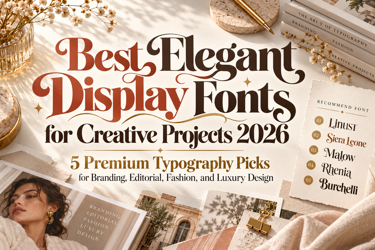
Elegant Display Fonts for Creative Projects 2026
Elegant typography does not have to be quiet.
In modern branding, a display font can feel refined while still becoming the strongest visual element in a composition. Unusual curves, dramatic proportions, sharp details, stylistic alternates, and carefully constructed letterforms can turn a simple word into a recognizable creative asset.
That is why elegant display fonts for creative projects 2026 are particularly valuable for designers working across fashion, beauty, editorial, weddings, premium packaging, social campaigns, and sophisticated brand identities.
Unlike neutral text fonts, display typography is designed to attract attention. The challenge is choosing a font with enough personality to feel memorable without allowing decoration to overpower the message.
Give Elegant Display Fonts Room to Perform
Display fonts work best when they are allowed to become part of the composition.
Instead of squeezing a decorative headline between multiple images and interface elements, use generous whitespace and let the typography establish the visual direction.
Keep headlines relatively short. A phrase such as “Modern Ritual,” “Pure Elegance,” or “New Romance” gives distinctive letterforms more opportunity to create a memorable silhouette.
For supporting paragraphs, prices, navigation, or detailed information, pair the display face with a simpler serif or sans serif. This keeps the expressive font special while preserving readability.
Jump to Recommended Elegant Display Fonts
1. Linust Display Modern Font

Linust combines contemporary elegance with enough visual individuality to make logos and large headlines recognizable. Its polished structure is supported by alternate characters and ligatures, allowing designers to customize selected letter combinations rather than relying on a completely standard wordmark. It works particularly well across hospitality, beauty, ecommerce, editorial covers, product labels, invitations, and sophisticated digital campaigns.
Its balance between modern structure and decorative flexibility makes Linust one of the most versatile choices in this collection.
PROS: Contemporary elegance, stylistic alternates, ligatures, versatile branding potential.
BEST FOR: Luxury hospitality, beauty brands, ecommerce, logos, editorial covers, modern campaigns.
2. Siera Leone Display Font
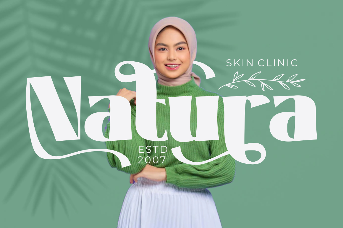
Siera Leone brings a more retro-inspired personality to elegant display typography. It combines bold construction and graceful curves with visual influences associated with 1960s and 1970s display lettering, creating a style that can feel nostalgic without becoming purely vintage. Its clean forms also keep the design approachable when used at large sizes.
This makes Siera Leone particularly useful when a project needs warmth and personality rather than minimalist luxury.
PROS: Bold silhouette, elegant curves, retro character, strong headline presence.
BEST FOR: Music branding, posters, lifestyle campaigns, album artwork, retro-modern identities.
3. Malow Display Font
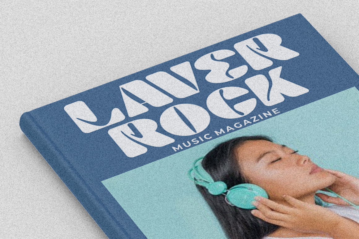
Malow is built around the intersection of contemporary design and timeless sophistication. Its clean lines and strong display presence make it suitable for prominent titles, while OpenType alternates and ligatures allow designers to introduce more character into logos and short headlines. The typeface also includes multilingual support, making it adaptable across a broader range of branding projects.
Malow is especially effective when you want elegance without excessive ornamentation. It feels polished enough for premium applications while remaining flexible enough for modern commercial design.
PROS: Clean construction, contemporary-classic balance, alternates and ligatures, multilingual support.
BEST FOR: Premium branding, packaging, logos, posters, fashion campaigns, product launches.
4. Rhenia Elegant Display Font
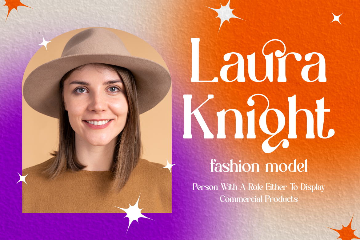
Rhenia takes a more artistic approach. Its tall letterforms, distinctive curved strokes, refined cuts, and decorative flourishes create graceful movement while retaining a structured appearance. The font is designed to balance traditional sophistication with a fresher contemporary attitude, making it particularly effective where typography needs to become an obvious visual centerpiece.
Rhenia also comes in two styles, giving designers additional flexibility when building coordinated editorial or branding layouts.
PROS: Tall elegant forms, artistic curves, two styles, premium visual personality.
BEST FOR: Fashion magazines, weddings, luxury packaging, editorial headlines, sophisticated logos.
5. Burchelli Bold Display Sans Font

Burchelli proves that elegant display typography does not always need thin strokes or delicate serifs. It uses bold letterforms, clean lines, sharp edges, and a contemporary structure to create a confident form of sophistication. Stylistic alternates and ligatures add customization opportunities, while its two styles allow designers to develop more varied compositions within the same visual language.
Compared with Rhenia or Malow, Burchelli feels stronger and more assertive, making it particularly useful when premium branding also needs high visual impact.
PROS: Bold visibility, clean contemporary structure, alternates, ligatures, two coordinated styles.
BEST FOR: Fashion branding, magazine covers, luxury campaigns, advertising, bold packaging.
Comparison: Which Elegant Display Font Should You Choose?
| Font | Main Personality | Strongest Creative Direction |
|---|---|---|
| Linust | Modern, polished | Contemporary luxury branding |
| Siera Leone | Retro, expressive | Lifestyle and creative campaigns |
| Malow | Refined, versatile | Premium commercial design |
| Rhenia | Artistic, graceful | Fashion and sophisticated editorial |
| Burchelli | Bold, stylish | High-impact luxury branding |
Linust is the most balanced option for modern branding. Siera Leone works when nostalgia and personality matter, while Malow provides a more timeless commercial elegance. Rhenia is particularly strong for artistic fashion and editorial work, and Burchelli delivers the greatest boldness.
How to Make Display Typography Feel Premium
Premium typography depends as much on composition as the typeface itself.
Use large scale, controlled spacing, restrained color palettes, and strong photography. Elegant fonts often work beautifully with neutral backgrounds, black and white compositions, muted earth tones, or carefully selected accent colors.
Avoid using the same expressive font for every element. Let it dominate the logo, campaign headline, magazine title, packaging name, or hero section, then introduce a quieter supporting typeface for functional information.
Designers can explore these fonts through PutraCetol Studio and build a broader visual system around the selected typeface, including logos, packaging, promotional graphics, social campaigns, editorial layouts, and digital brand assets.
Common Mistakes
One common mistake is assuming that elegant automatically means thin, delicate, or minimal. Fonts such as Burchelli demonstrate that bold typography can still feel sophisticated when its proportions, spacing, and surrounding layout are controlled carefully. Choose elegance according to the personality of the brand rather than following a single visual formula.
Another mistake is overusing alternates and decorative characters. Ligatures and unusual letterforms can make a logo feel customized, but using them everywhere can reduce clarity. Start with the standard word, then replace only the characters that genuinely improve its silhouette or rhythm.
Finally, avoid using display typography for extended paragraphs simply because the font looks attractive. Display fonts achieve their strongest effect in logos, titles, short phrases, editorial headlines, packaging names, and campaign messages. Pair them with a more readable supporting family when longer communication is required.
Conclusion
The best elegant display fonts for creative projects 2026 combine personality with enough restraint to remain usable across real branding applications.
Linust offers polished modern versatility, Siera Leone introduces retro elegance, Malow balances contemporary and timeless character, Rhenia brings artistic refinement, and Burchelli delivers sophisticated boldness.
Explore these fonts at PutraCetol Studio, test them with the actual words your project requires, and consider how the typography behaves alongside photography, color, spacing, and supporting type.
The strongest display font does more than attract attention. It gives the audience a sense of the brand’s personality before they have read the rest of the message.
Explore these fonts and many more at PutraCetol.com to build a business identity that looks professional, trustworthy, and memorable.
Additionally, if you want to explore some free typography options, you can check out Putracetol Studio on Dafont. Happy reading and designing!