
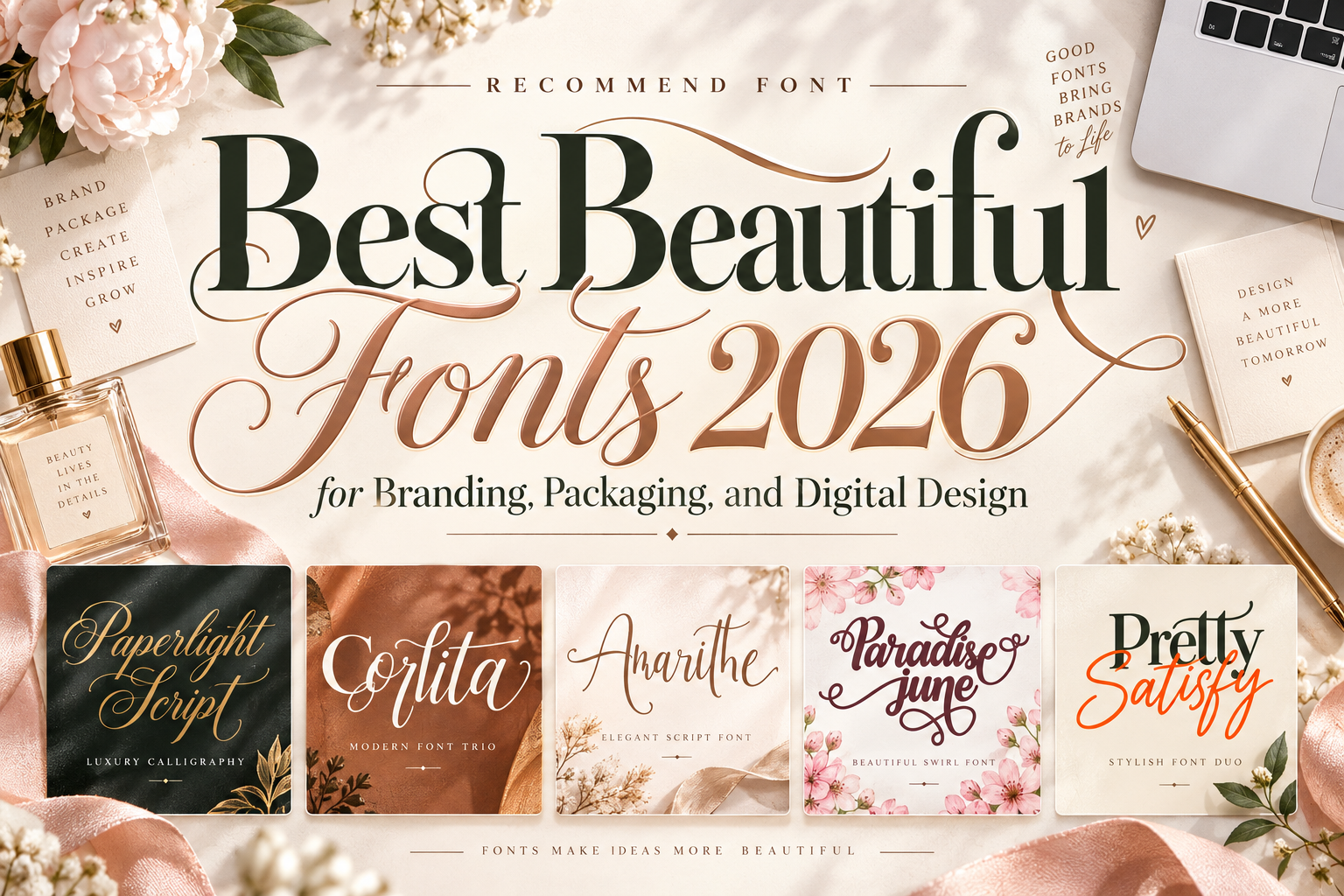
Best Beautiful Fonts 2026: Where Style Meets Purpose
Give Beauty a Specific Job
A beautiful typeface should support the message, not compete with it. Start by deciding whether your project needs a personal signature, romantic headline, confident wordmark, or coordinated campaign identity.
For this best beautiful fonts 2026 selection, consider the recommendations as display and branding options rather than automatic choices for paragraph text. Assign the expressive font to names, titles, or selected accents, then test a simpler companion for descriptions, prices, navigation, and instructions.
For example, a skincare brand could use calligraphic lettering for a collection name while keeping ingredients and purchasing information straightforward.
What to Check Before Choosing
Test the actual brand name, longest headline, numerals, punctuation, and required language characters. Review the design in monochrome, on a small screen, and at its intended printed size.
Ask someone unfamiliar with the project to read the wording. Check whether flourishes obscure adjacent letters or collide with illustrations. Judge beauty through the complete layout, not just the alphabet specimen.
Jump to Recommended Fonts
1. Paperlight Script Calligraphy Font
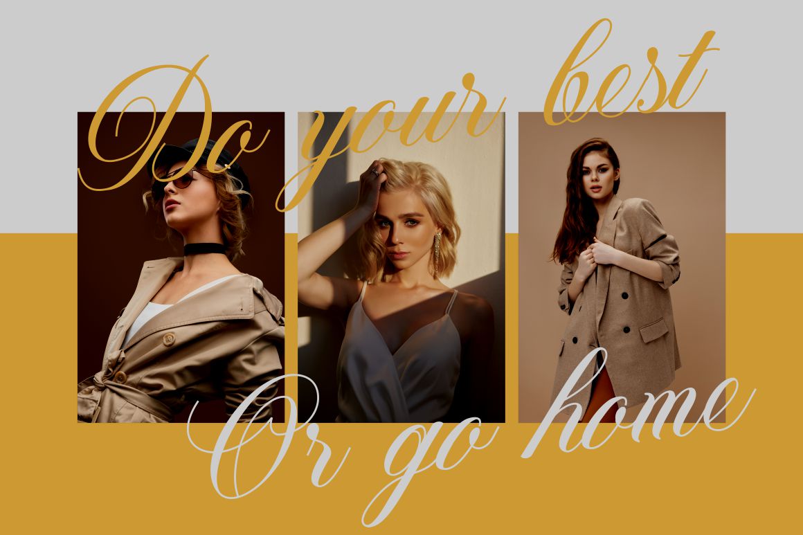
Paperlight combines flowing calligraphic connections with defined strokes, giving it both delicacy and confidence. Its alternate characters and ligatures offer ways to vary short names or create a more personal title treatment. Try it on a wedding-stationery header or boutique logo, leaving generous space around the lettering rather than surrounding it with additional ornament.
PROS: Fluid connections, expressive alternates, confident calligraphic character.
BEST FOR: Wedding stationery, boutique identities, packaging titles, and personal branding.
2. Corlita Font Trio

Corlita is listed as a font trio, making it a candidate for projects where the relationship between styles matters as much as the headline itself. Explore its individual styles across a cover, product label, and campaign graphic before deciding which role each should serve. Keep extended reading in a separately tested text family rather than assuming every component suits body copy.
PROS: Multi-style exploration within one named collection.
BEST FOR: Boutique branding concepts, editorial covers, campaign layouts, and creative presentations.
3. Amarithe

Amarithe is a modern script with alternate glyphs, ligatures, and swashes that support expressive lettering. Those options make it worth exploring when a short name needs a customized arrangement rather than a default typed treatment. For a personal brand, compare a restrained wordmark with a more decorative campaign version, preserving the same recognizable letter shapes.
PROS: Script personality, alternate characters, ligatures, decorative swashes.
BEST FOR: Personal identities, wedding materials, greeting cards, and lifestyle campaigns.
4. Paradise June
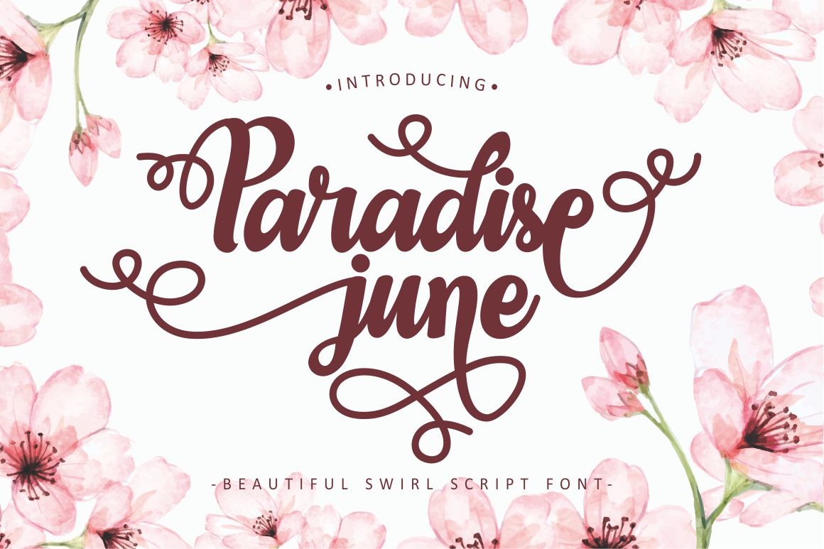
Paradise June is a swirl script with an informal, modern character and numerous OpenType alternates. Its ornamental movement offers a more exuberant direction for expressive names and celebratory lettering. Try it for a floral gift label or invitation headline, keeping nearby typography simple so the swirls remain a feature rather than a barrier to reading.
PROS: Swirling details, flexible alternates, expressive handwritten mood.
BEST FOR: Florists, invitations, gift packaging, romantic covers, and stationery.
5. Pretty Satisfy Luxury Font Duo

Pretty Satisfy pairs a bold serif with a monoline script, creating contrast between substantial lettering and lighter handwritten movement. The family also includes ligatures for more varied compositions. Try the serif for a beauty-brand title and the script for a brief personal accent, then test small supporting text independently rather than relying on the duo everywhere.
PROS: Serif-and-script pairing, contrasting weights, coordinated visual character.
BEST FOR: Beauty branding, premium packaging, editorial covers, and boutique campaigns.
Comparison
| Font | Suggested Creative Direction | First Application to Test |
|---|---|---|
| Paperlight | Flowing calligraphic identity | Wedding brand name |
| Corlita | Multi-style exploration | Coordinated campaign layouts |
| Amarithe | Personalized script lettering | Founder-led brand identity |
| Paradise June | Decorative handwritten movement | Floral gift label |
| Pretty Satisfy | Bold and delicate contrast | Premium packaging title |
Common Mistakes
The first mistake is equating beauty with maximum decoration. Select one or two distinctive details, then refine spacing and hierarchy. Avoid forcing scripts into long descriptions or small buttons simply because they appear in the logo.
Another mistake is reviewing only enlarged mockups. Check narrow labels, mobile headlines, exported presentations, and dark backgrounds. Keep a readable version of important wording when ornate lettering loses clarity. Ask reviewers what they can read before asking which treatment they prefer.
The final mistake is overlooking usage permissions. PutraCetol’s selector distinguishes printed and static artwork from live webfont, app, and ebook embedding. Match coverage to the actual project rather than assuming one purchase includes every medium.
Conclusion
The best beautiful fonts 2026 should help you build an identity that is attractive and understandable. Choose the mood deliberately, assign clear roles, and test the actual words across your intended formats.
Explore these PutraCetol Studio options for your next logo, cover, or campaign. Beauty becomes more useful when expressive lettering and practical reading work together.
Explore these fonts and many more at PutraCetol.com to build a business identity that looks professional, trustworthy, and memorable.
Additionally, if you want to explore some free typography options, you can check out Putracetol Studio on Dafont. Happy reading and designing!