
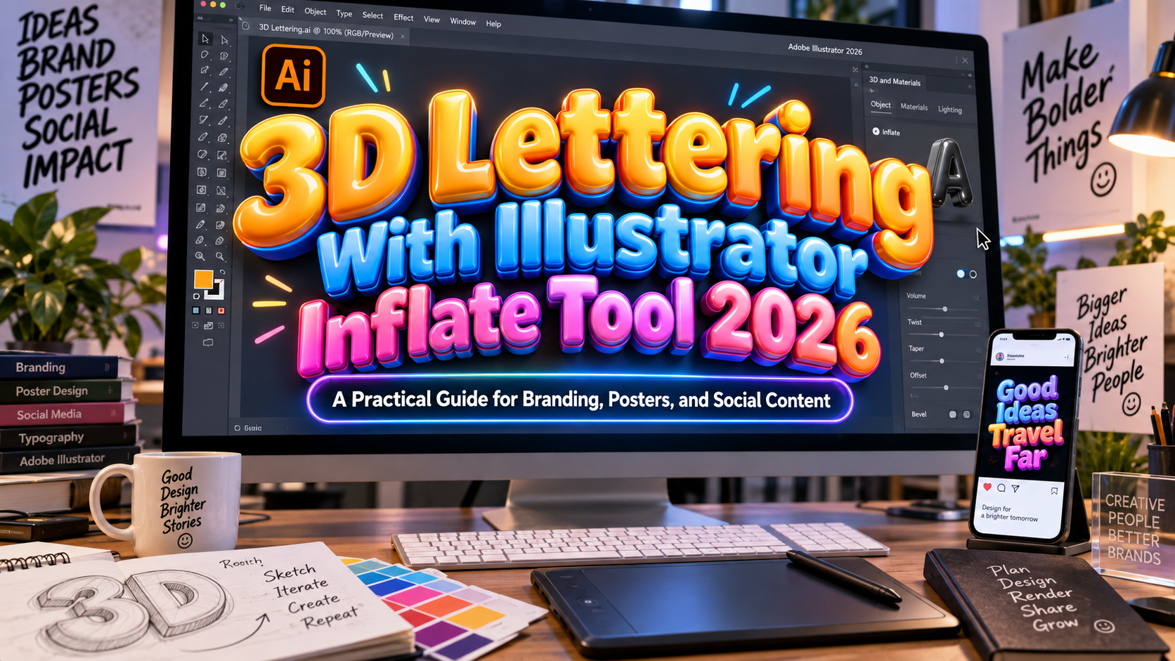
3D Lettering With Illustrator Inflate Tool 2026: Give Words a New Dimension
Make the Flat Lettering Work First
Begin with a short word, a clear silhouette, and a defined purpose. A product launch, festival poster, and beauty campaign need different treatments, even when they share the same effect.
In Illustrator on desktop, Inflate is a 3D effect that creates a rounded, balloon-like appearance. It belongs to the 3D and Materials workflow rather than being a separate drawing tool.
Start with sturdy lettering and open spaces inside the characters. Refine spacing before adding depth. Keep prices, dates, and descriptions flat and readable instead of inflating every line.
A Step-by-Step Illustrator Inflate Workflow
1. Prepare Your Text and Preserve a Master
Create an artboard for the intended placement and type a short headline. Try bold or rounded lettering first, then test more elaborate styles once the basic workflow feels comfortable.
Keep a hidden copy of the live text. For a shape-based workflow, select a duplicate and choose Create Outlines, converting the lettering into editable vector shapes. Use this working copy for individual letter adjustments.
2. Apply Inflate and Refine the View
Select the working artwork and open Window > 3D and Materials. In the Object section, choose Inflate. Adjust Depth for the object’s thickness, then use the rotation controls to reveal its rounded form.
Begin close to a front-facing view. Make small changes and check whether every letter remains recognizable. Avoid choosing an extreme perspective simply because it looks more dramatic.
3. Choose a Material That Fits the Brand
In Materials, begin with the default base material. The properties include Roughness and Metallic, which control the surface treatment.
For a proposed glossy-plastic look, test low roughness with little metallic influence. For a softer, clay-inspired direction, compare a higher roughness setting. Change one property at a time rather than adding complex textures immediately.
4. Shape the Light and Shadow
Open Lighting and begin with a preset such as Top Left. Adjust the light’s position, intensity, and softness, then enable Shadows when a grounding shadow supports the composition. Adobe provides controls for shadow position, distance, and bounds.
Check the whole word: highlights should reveal the letterforms rather than hide them. When placing lettering beside photography, compare the apparent light direction before approving the composite.
5. Render After the Composition Is Stable
Use lower-quality previews while experimenting. For final review, open Render Settings, enable Ray Tracing, choose High, and select Render. Adobe notes that higher-quality rendering uses more CPU resources.
Inspect edges, reflections, and shadows at the final viewing size. Resolve spacing and composition before repeatedly rendering minor variations.
6. Export for the Actual Destination
Keep the editable Illustrator master. For a transparent graphic, hide background artwork, export PNG, and choose a transparent background, appropriate resolution, and anti-aliasing. PNG is raster output, not editable vector lettering.
A 3D-model handoff is different: Illustrator supports formats including OBJ, GLTF, USDA, and USDZ through its 3D export workflow. Confirm the receiving application’s requirements before delivery.
Turn the Effect Into a Brand Asset
For a fictional skincare launch, try inflated lettering reading “SOFT START,” a muted peach material, and a simple cream background. Keep the product description in a restrained companion typeface.
Explore PutraCetol Studio for distinctive display typography, then test your chosen font in both flat and inflated versions. Repeat the approved angle, lighting, and material across campaign graphics instead of reinventing the treatment for every post.
Comparison
Illustrator’s 3D options create different structures. Choose according to the intended letterform, not the effect’s novelty.
| Method | Main Result | Suggested Use |
|---|---|---|
| Inflate | Rounded, puffed surfaces | Playful titles and soft product campaigns |
| Extrude | Added depth behind the shape | Block lettering and architectural titles |
| Flat typography | Original two-dimensional treatment | Supporting copy and small brand applications |
Common Mistakes
The first mistake is expecting depth to repair weak typography. Review the original word, fix spacing, and simplify awkward decorative details. If letter interiors become difficult to distinguish, reduce the visual complexity rather than adding stronger shadows.
Another mistake is treating every surface as polished metal. Compare materials against the brand’s intended personality and keep one dominant visual idea. Avoid crowded backgrounds that compete with the inflated lettering.
The final mistake is delivering only a flattened export. Preserve the live-text backup, working shapes, and editable effect settings. Verify font permissions for the intended campaign, and test the finished asset in its actual layout rather than judging only an enlarged preview.
Conclusion
Effective 3D lettering with Illustrator Inflate in 2026 starts with clear typography and controlled art direction. Build the word first, refine its shape, choose a suitable material, and use lighting to support recognition.
Combine the technique with thoughtful PutraCetol Studio font choices for posters, packaging concepts, and digital campaigns. The strongest result gives the message dimension without making it harder to read.
Explore these fonts and many more at PutraCetol.com to build a business identity that looks professional, trustworthy, and memorable.
Additionally, if you want to explore some free typography options, you can check out Putracetol Studio on Dafont. Happy reading and designing!