
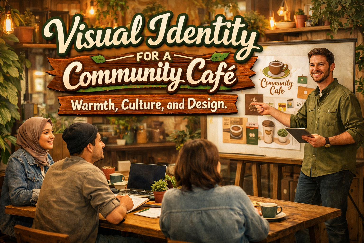
Across global coffee culture, cafés have evolved beyond places to drink coffee. They now serve as informal workplaces, reading corners, meeting hubs, and social spaces where people experience a shared sense of belonging. With this shift, visual identity plays a bigger role than ever. It signals what the café stands for, invites customers to stay, and helps build long-term community engagement.
This article explores a visual identity project developed for a café whose mission is to blur the line between hospitality and community building. The design direction focuses on warmth, approachability, and a human touch—creating an environment where guests feel welcome, connected, and inspired.
The Café as a Social Environment
The core concept behind the project began with a simple insight: cafés are social infrastructures. People come not only to purchase coffee, but also to share ideas, relax, and engage in micro-communities. Book clubs, students, freelancers, friends catching up, and even strangers who meet by chance—these interactions define café culture.
Visual identity had to support this social purpose. Instead of feeling commercial or overly conceptual, the café needed to appear friendly, open, and locally rooted. Warmth and accessibility became the guiding design principles.
Brand Strategy: Designing for Community
The strategic question driving the project was:
How can a visual identity encourage social interaction?
Three brand attributes shaped the answer:
- Warm – The café should feel inviting, comfortable, and unpretentious.
- Approachable – Communication must be clear, kind, and human-centered.
- Community-oriented – The brand should express togetherness and local character.
From these attributes, the visual identity system took form.
Visual Identity System Components
The design work was structured into four key pillars: typography, color, logo, and applications.
1. Typography: Clean, Friendly, and Readable
Typography influences how customers visually “hear” the brand. For a café, the tone needed to balance modernity with warmth—avoiding both luxury stiffness and playful exaggeration.
The final type system used a clean sans serif for legibility paired with a softer display type for headers and signage. To support lifestyle tone and brand personality, several font options from Putracetol.com were evaluated for stylistic fit, including:
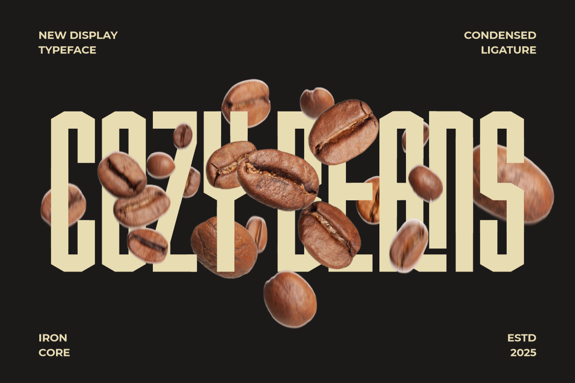
- Ironcore (for modern condensed signage and wayfinding)
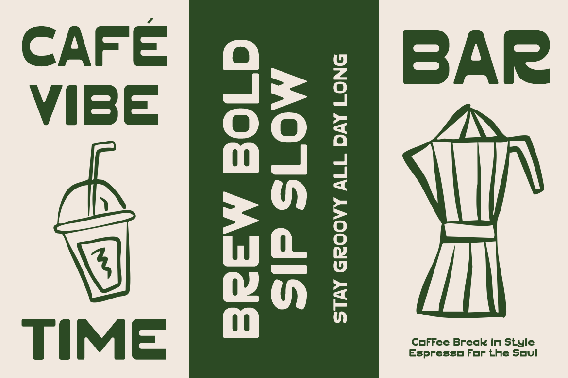
- Moltar (retro warmth with contemporary details)
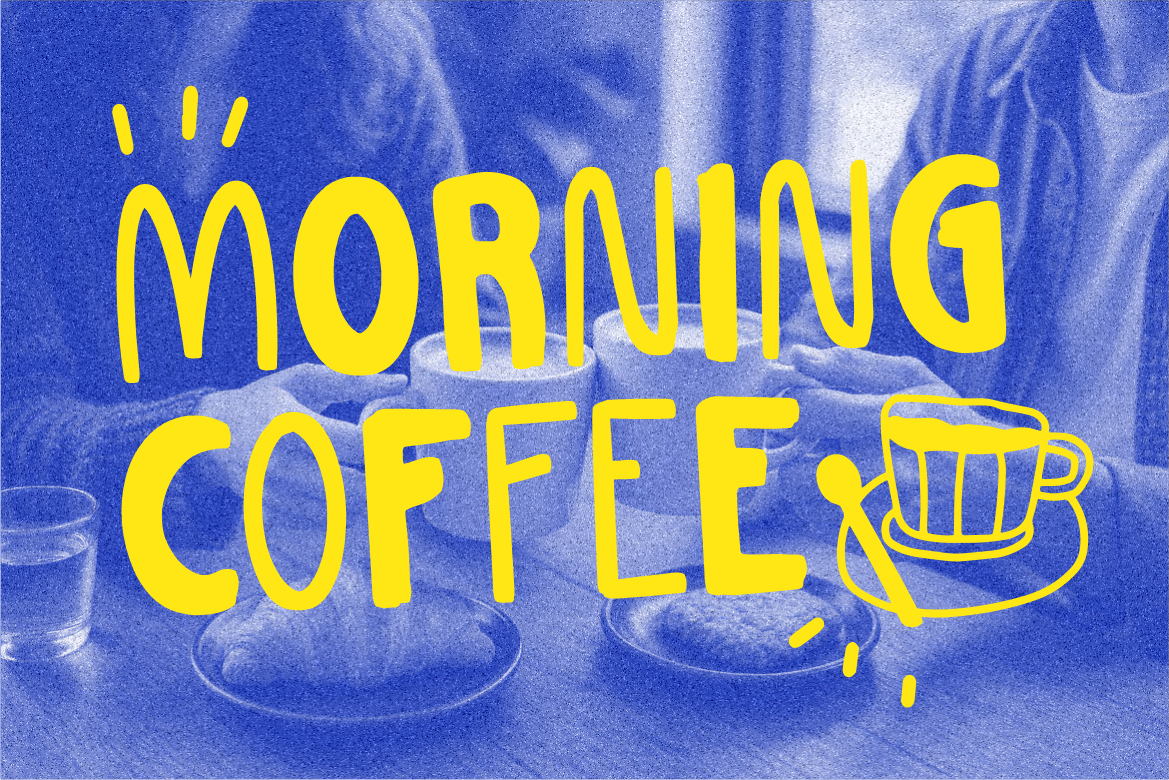
- Mellowish (hand-drawn feel for café specials and menus)
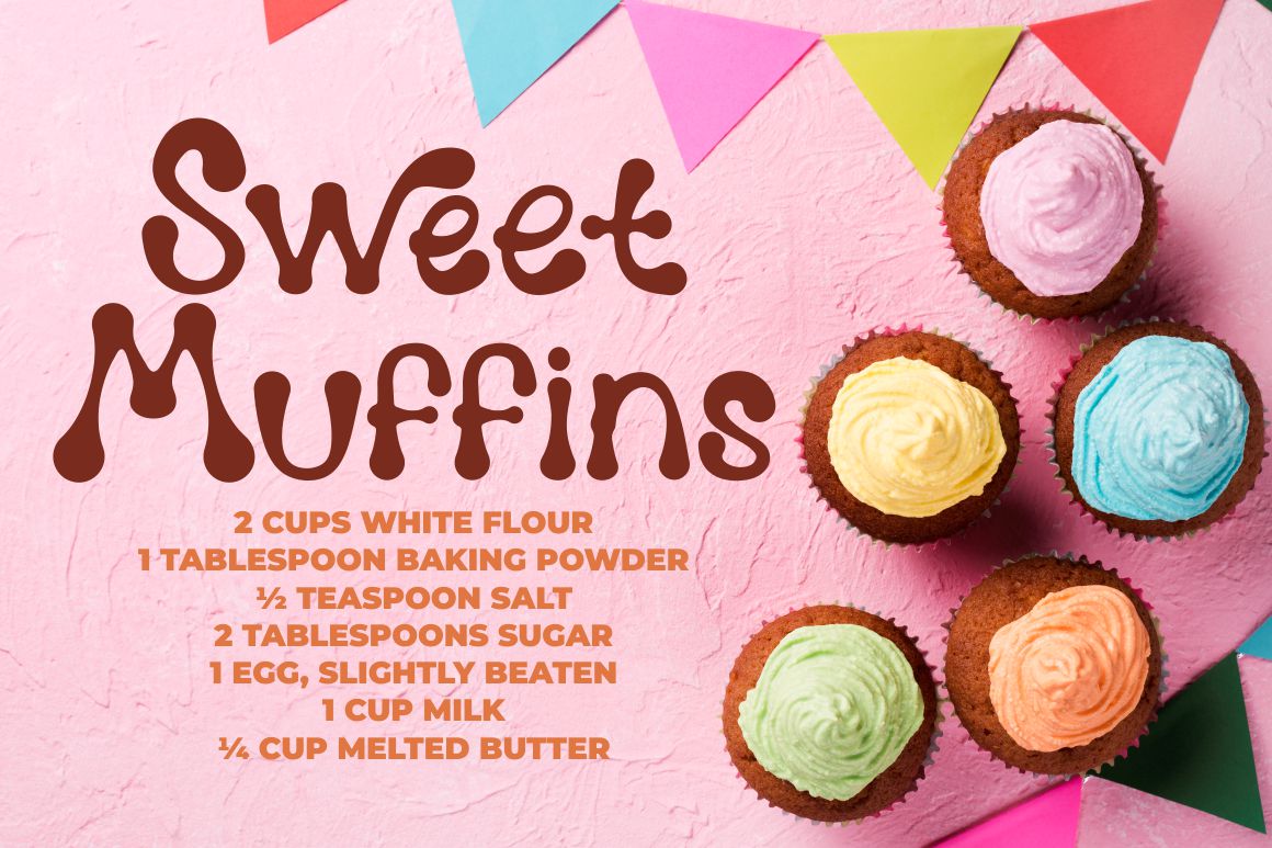
- Melting Dessert (playful display for packaging and merchandise)

- Pizzalia (food-centric script suitable for menu storytelling)
These fonts helped communicate that the café is not purely functional, it has character, taste, and social charm.
2. Color Palette: Natural, Earthy, and Calming
Colors form emotional context. The palette leaned toward natural tones commonly found in café environments:
- Brown – Represents coffee, wood, and warmth
- Cream – Adds lightness without clinical sterility
- Green – Signals nature, freshness, and relaxation
This palette fosters a warm ambiance with enough contrast to build visual hierarchy. Earth tones also align with café materials: wooden tables, ceramic cups, brick walls, and plants.
For digital applications, accessibility checks ensured adequate contrast for readability and user comfort.
3. Logo: Minimal, Recognizable, and Flexible
The logo development prioritized simplicity and usability. A café logo must handle small surfaces (stickers, lids), medium spaces (menus), and large formats (signage). The final approach used a modern monogram paired with modular typography, allowing multiple layouts without losing identity.
Flexibility enabled:
- stacked logos for vertical signage
- horizontal marks for packaging
- icon use for social media avatars
- imprinting on merchandise
This adaptability strengthens brand cohesion across physical and digital touchpoints.
4. Visual Application System
A visual identity comes to life through application. For the café project, brand elements were implemented across:
- coffee cups and lids
- reusable tote bags
- menu layouts
- loyalty cards
- coffee packaging
- storefront signage
- interior wayfinding
- social media templates
Each execution reinforces the idea that cafés are lived spaces, visited frequently and remembered through daily contact rather than large billboards.
Communication Tone: Friendly and Open
Beyond visual assets, language plays a crucial branding role. The café’s tone of voice was designed to feel:
- conversational
- warm
- inclusive
- lightly humorous
- human-centered
For example, instead of saying:
“Collect 10 stamps and receive a free drink.”
the café communicates:
“10 cups = your next one is on us.”
The shift is subtle yet meaningful. It removes friction, invites engagement, and builds familiarity.
Business Impact of Visual Identity for Cafés
Investors, operators, and designers often underestimate how much visual identity influences business performance in hospitality. A strong system contributes to:
1. Higher perceived value
Cafés with intentional design attract customers willing to spend more for quality and experience.
2. Longer dwell time
Warm and thoughtfully branded spaces encourage customers to stay, increasing revenue per visit.
3. Stronger community loyalty
Consistent identity fosters recognition, belonging, and repeat visits.
4. Social media appeal
Aesthetic environments naturally become user-generated content ecosystems—valuable organic marketing.
5. Franchise scalability
Brand clarity makes expansion easier, consistent, and less dependent on training individuals to “interpret the brand.”
Why Visual Identity Matters in Café Culture
Today’s café culture merges hospitality, lifestyle, and creative industries. A café without brand identity becomes forgettable. A café with strong identity becomes a cultural touchpoint.
Across cities like Melbourne, Tokyo, Seoul, London, Copenhagen, and Singapore, café aesthetics often travel faster than the menu itself. Typography, interior moods, and packaging become part of the product.
Design is not decoration it is market positioning.
Conclusion
This visual identity project illustrates how branding is more than selecting fonts and colors. It is about shaping social environments, encouraging connection, and enriching everyday experiences. Through warm typography, natural palettes, and flexible applications, the café presents itself as a welcoming community hub professional enough to build trust, yet casual enough to feel human.
For designers, the lesson is clear: hospitality brands thrive when identity aligns with the lived experiences of their customers. For café operators and investors, identity is not a luxury, it is a strategic foundation for differentiation and customer retention.
Thank you for taking the time to read this article. If you are looking for more great articles, feel free to visit Putracetol Blog
Additionally, if you want to explore some free typography options, you can check out Putracetol Studio on Dafont. Happy reading and designing!