
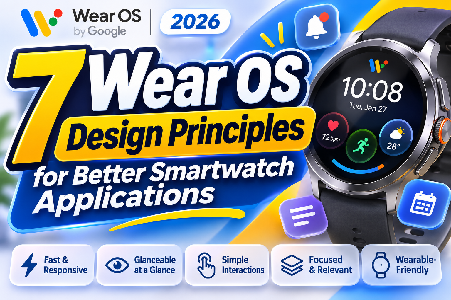
Wear OS Design Principles 2026: 7 Essential Guidelines for Better Smartwatch Apps
Smartwatch applications are changing how people interact with technology throughout their daily routines. Unlike smartphones, wearable devices prioritize immediate information, convenient interactions, and essential tasks that can be completed within seconds.
Understanding Wear OS design principles 2026 helps UI/UX designers and developers create applications that feel natural, responsive, and useful on smaller screens.
Google’s Wear OS design philosophy emphasizes glanceable information, contextual relevance, efficient interactions, and experiences designed specifically for the wrist.
Whether you’re developing a fitness tracker, productivity application, or notification system, these principles provide a practical foundation for creating better wearable experiences.
What Makes Wear OS Design Different?
Wear OS applications operate within a unique environment where screen size, interaction time, and physical movement influence usability.
Users frequently interact with their watches while walking, exercising, commuting, or performing other activities.
Unlike traditional mobile applications, smartwatch interfaces should prioritize essential information rather than extensive navigation and complicated workflows.
Google’s Material 3 Expressive design system also introduces updated typography, adaptive layouts, expressive shapes, and motion patterns optimized for round smartwatch displays.
Start With One Essential User Task
Before designing a smartwatch application, identify the most important action users need to complete.
A fitness application might prioritize starting a workout, while a productivity tool could focus on checking upcoming appointments.
Avoid transferring an entire smartphone interface onto a smaller screen.
Instead, create focused experiences that provide immediate value through clear information, convenient controls, and minimal interaction.
Test your design while users are moving or distracted to understand whether important information remains accessible.
7 Essential Wear OS Design Principles for 2026
1. Design for Critical Tasks
Wear OS applications should focus on a small number of meaningful actions.
Rather than reproducing every smartphone feature, prioritize interactions that benefit from immediate wrist access.
For example, a fitness tracker might provide workout controls, elapsed time, and heart rate information without displaying extensive analytics.
More complicated activities can remain available through a companion smartphone application.
KEY BENEFIT: Faster task completion, reduced complexity, and more purposeful wearable experiences.
2. Create Glanceable and Relevant Interfaces
Glanceability means users can understand important information after looking at their watch briefly.
Wear OS provides Tiles and watch face complications that display essential information without requiring lengthy navigation.
A weather Tile might show the current temperature and upcoming conditions, while a complication could display daily activity progress.
Use concise labels, clear hierarchy, and relevant information rather than overcrowded layouts.
KEY BENEFIT: Faster information recognition, better accessibility, and reduced interaction effort.
3. Optimize Layouts for Round Screens
Most Wear OS smartwatches feature circular displays, making traditional rectangular interface layouts less suitable.
Designers should consider curved screen boundaries, content margins, and available touch areas.
Material 3 Expressive supports adaptive components and shapes that complement round interfaces.
Place important controls in accessible positions and avoid squeezing essential content near screen edges.
Test layouts across different watch sizes and font scaling settings.
KEY BENEFIT: Better readability, comfortable interaction, and consistent visual presentation.
4. Make Interactions Fast and Predictable
Smartwatch interactions should feel natural and require minimal effort.
Use recognizable icons, visible controls, straightforward navigation, and immediate feedback.
For example, a music application should make play, pause, and volume adjustment easy to discover.
Avoid complicated gestures that require memorization.
Thoughtful animations can clarify transitions, but unnecessary visual effects may interrupt quick interactions.
KEY BENEFIT: Improved usability, easier navigation, and reduced user frustration.
5. Support Contextual Information and Offline Use
Wearable devices accompany users throughout different activities and environments.
Applications should provide information that reflects relevant context, such as activity, location, or time, when appropriate and permitted.
Offline functionality is equally important because smartwatches may temporarily lose network connectivity.
A workout application, for example, should continue tracking supported activities without requiring continuous internet access.
Use efficient background processing and avoid unnecessary data requests.
KEY BENEFIT: Greater reliability, contextual relevance, and more dependable everyday functionality.
6. Follow Material 3 Expressive Design Guidelines
Material 3 Expressive provides a modern visual framework for Wear OS applications.
It emphasizes adaptable shapes, thoughtful motion, richer color systems, and typography optimized for compact displays.
Google’s updated wearable typography uses Roboto Flex within its design system.
Designers should prioritize consistent components and readable interface text while using visual expression to highlight important actions.
For promotional graphics and smartwatch product branding, explore distinctive display fonts at PutraCetol Studio to complement the application’s visual identity.
KEY BENEFIT: Consistent interfaces, recognizable visual hierarchy, and modern wearable aesthetics.
7. Prioritize Accessibility and Device Continuity
Accessible smartwatch applications should support readable text, adequate contrast, screen readers, and comfortable touch interactions.
Wear OS also supports rotary input on compatible devices, allowing users to navigate without relying entirely on touchscreen gestures.
Test interfaces using different accessibility settings and realistic interaction scenarios.
When appropriate, connect smartwatch experiences with companion mobile applications so users can continue more complicated tasks on larger screens.
KEY BENEFIT: Inclusive experiences, easier navigation, and improved cross-device usability.
Comparison: Wear OS Interfaces vs. Smartphone Applications
Understanding the differences between wearable and mobile interfaces helps designers choose appropriate interaction patterns.
| Design Aspect | Wear OS Applications | Smartphone Applications |
|---|---|---|
| Screen space | Compact, often circular | Larger, rectangular |
| Primary interaction | Quick actions and glances | Detailed interaction |
| Information density | Minimal and focused | More extensive |
| Navigation | Short, simple flows | Multiple screens and menus |
| Input methods | Touch, voice, rotary input | Touch, keyboard, voice |
| Typical experience | Immediate information | Extended task completion |
Which Wear OS Surface Should You Use?
Choose complications for small pieces of information displayed directly on the watch face.
Use Tiles for quick access to frequent tasks and concise summaries.
Full Wear OS applications are more appropriate when users need additional controls, navigation, or detailed interactions.
Selecting the correct surface helps maintain a focused and predictable experience.
Common Mistakes When Designing Wear OS Apps
One common mistake is treating smartwatch applications as smaller versions of smartphone interfaces. Transferring complicated menus, lengthy forms, and excessive information onto a circular display creates unnecessary interaction difficulties. Designers should identify essential tasks and simplify content according to the wearable context. Small text, crowded buttons, and insufficient margins can further reduce usability, particularly while users are moving. Effective Wear OS design requires deliberate prioritization rather than simply shrinking existing layouts.
Another mistake is overlooking battery efficiency, accessibility, and connectivity limitations. Applications that depend on frequent network requests or unnecessary background processing may consume additional resources and perform poorly when connectivity becomes unreliable. Designers should consider offline functionality, appropriate update frequencies, and clear loading feedback. Accessibility testing is equally important because users may rely on larger text, screen readers, or rotary navigation. Consistent interaction patterns and realistic device testing help prevent avoidable usability problems.
Conclusion
The Wear OS design principles 2026 emphasize creating smartwatch applications that are glanceable, responsive, relevant, and comfortable to use.
Successful wearable experiences prioritize critical tasks, intuitive navigation, adaptive layouts, accessibility, and dependable performance.
Material 3 Expressive provides a modern foundation for visually consistent smartwatch applications while supporting natural interactions on round displays.
By designing specifically for the wrist, development teams can create technology that supports everyday activities without demanding unnecessary attention.
For creative teams developing smartwatch branding and promotional materials, explore professional typography at PutraCetol Studio to complement modern wearable products with memorable visual communication.
Explore these fonts and many more at PutraCetol.com to build a business identity that looks professional, trustworthy, and memorable.
Additionally, if you want to explore some free typography options, you can check out Putracetol Studio on Dafont. Happy reading and designing!