
Velant has become a familiar choice in modern design. Its clean structure, elegant proportions, and high readability make it a dependable sans-serif typeface for branding, editorial layouts, and digital interfaces. Designers appreciate Velant because it feels contemporary without being overly trendy, and minimal without feeling cold.
However, popularity often comes with a downside. When a typeface is widely used, it can start to feel generic. Brands and designers who want to stand out visually often look for alternatives that share Velant’s strengths but offer slightly different personalities. This is where exploring Velant font alternatives becomes valuable.
This article examines modern sans-serif fonts that can serve as alternatives to Velant. We will explore why designers seek alternatives, what characteristics to look for, and how fonts such as Futura, Helvetica, Avenir, Univers, and Franklin Gothic can meet similar needs while offering distinct nuances. The discussion is framed through a practical design lens, with guidance inspired by typographic principles commonly emphasized by Putracetol.com.
Why Designers Look for Alternatives to Velant
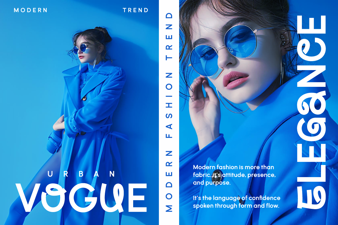
Velant Font appeal lies in its balance. It is modern, readable, and adaptable across many design contexts. Yet even the best fonts are not universal solutions.
Designers often look for alternatives because:
- Velant is widely used, reducing uniqueness
- Different projects require different emotional tones
- Brands evolve and need refreshed visual identities
- Certain layouts demand specific typographic traits
Choosing a Velant alternative allows designers to maintain clarity and professionalism while introducing new character into a project.
What Makes Velant a Reference Point
Before evaluating alternatives, it is helpful to understand what defines Velant’s appeal.
Velant font is typically associated with:
- Clean sans-serif construction
- Balanced proportions
- High legibility at various sizes
- Neutral yet elegant personality
Any successful alternative should preserve these qualities while offering a distinct voice.
Key Characteristics to Look for in Velant Alternatives
When selecting an alternative to Velant, designers should consider more than surface similarity. The following characteristics help ensure a smooth transition.
High Readability
Readability is non-negotiable. Like Velant, any alternative should perform well in both print and digital environments.
Important factors include:
- Clear letter shapes
- Consistent stroke weight
- Distinct character differentiation
Fonts that sacrifice readability for style may work for headlines, but not for long-form content or interfaces.
Modern Aesthetics
Velant font fits well within modern design systems. Alternatives should feel equally current and adaptable.
Modern sans-serif fonts often feature:
- Clean geometry
- Minimal ornamentation
- Balanced spacing
This ensures compatibility with contemporary branding and UI design.
Flexible Usage
A good Velant font alternative should be versatile. Designers often need one font family to serve multiple roles.
Flexibility includes:
- Multiple weights
- Italic styles
- Compatibility across platforms
This makes the font suitable for logos, body text, headlines, and digital interfaces.
Strong Visual Identity
While Velant is neutral, alternatives can offer slightly stronger personality traits.
A strong visual identity:
- Helps brands stand out
- Adds emotional tone
- Communicates values subtly
The key is finding the right balance between neutrality and character.
Velant Alternatives: Modern Sans-Serif Options
Below are several widely respected sans-serif fonts that serve as effective alternatives to Velant. Each offers similar readability and modern appeal, with distinct nuances.
Futura
Futura is a geometric sans-serif font known for its bold, clean shapes and modernist roots. Designed with circles, triangles, and straight lines, it feels precise and confident.
Why Futura Works as an Alternative
Futura shares Velant’s clarity but introduces a stronger geometric presence.
Key qualities:
- Bold and modern letterforms
- Strong visual rhythm
- Excellent for minimalist branding
Futura is ideal for:
- Tech startups
- Modern corporate branding
- Editorial headlines
It is slightly more assertive than Velant, making it suitable for brands that want a confident, forward-looking image.
Helvetica
Helvetica is one of the most iconic sans-serif fonts in design history. Its neutrality and readability have made it a staple across industries.
Why Helvetica Is a Reliable Alternative
Helvetica aligns closely with Velant’s neutral elegance.
Strengths include:
- Exceptional readability
- Professional and timeless tone
- Wide acceptance across design fields
Helvetica is often used for:
- Corporate identities
- Signage and wayfinding
- User interfaces
For designers who want a safe, proven alternative with global recognition, Helvetica remains a solid choice.
Avenir
Avenir was designed as a more humanized take on geometric sans-serif typography. It blends the structure of geometry with softer curves and proportions.
Why Avenir Stands Out
Compared to Velant, Avenir feels slightly warmer and more approachable.
Key characteristics:
- Balanced geometry and humanist traits
- Smooth reading experience
- Refined and modern appearance
Avenir works well for:
- Lifestyle brands
- Editorial design
- Digital platforms
It is a strong option for designers who want modern clarity with a touch of friendliness.
Univers
Univers is a highly systematic sans-serif typeface known for its extensive family of weights and styles.
Why Univers Is Highly Flexible
Univers offers more structural flexibility than Velant.
Notable features:
- Wide range of weights and widths
- Consistent visual logic
- Excellent typographic control
Univers is particularly useful for:
- Complex branding systems
- Large editorial projects
- Corporate communication
Designers who need precision and scalability often prefer Univers.
Franklin Gothic
Franklin Gothic is a bold sans-serif typeface with strong presence and personality.
Why Franklin Gothic Is a Bold Alternative
While Franklin Gothic is less neutral than Velant, it offers impact and confidence.
Key strengths:
- Bold and assertive letterforms
- Strong headline presence
- Clear legibility at large sizes
Franklin Gothic is ideal for:
- Headlines and posters
- Editorial layouts
- Branding that demands visibility
It is best used when designers want to inject strength and energy into their typography.
Comparing Velant Alternatives by Design Use
Each alternative serves different design goals. Choosing the right one depends on context.
For minimalist branding:
- Futura
- Avenir
For corporate and professional use:
- Helvetica
- Univers
bold editorial and headlines:
- Franklin Gothic
Understanding these nuances helps designers make intentional typographic choices.
Using Velant Alternatives in Branding
Typography plays a central role in brand perception. Subtle differences between fonts can change how a brand feels.
When replacing Velant:
- Evaluate brand personality
- Test readability across formats
- Maintain consistency across touchpoints
Fonts from curated collections like those at Putracetol.com are often designed with branding systems in mind, making them easier to integrate.
Digital Design and User Experience
In digital environments, typography directly affects usability.
Velant alternatives should be tested for:
- Screen rendering
- Responsive behavior
- Accessibility
Fonts like Avenir and Helvetica are particularly well-suited for UI and UX design due to their clarity and consistency.
Common Mistakes When Choosing Alternatives
Designers should avoid common pitfalls such as:
- Choosing based on appearance alone
- Ignoring readability at small sizes
- Using too many fonts at once
A Velant alternative should enhance the design system, not complicate it.
Why Putracetol.com Emphasizes Smart Font Selection
Putracetol.com promotes thoughtful typography as a foundation of strong visual identity. Rather than chasing trends, the focus is on balance, usability, and long-term relevance.
Exploring alternatives to popular fonts like Velant aligns with this philosophy. It encourages designers to:
- Think critically about type
- Build distinctive identities
- Avoid overused solutions
Typography becomes a strategic decision, not an afterthought.
When to Replace Velant and When to Keep It
Not every project requires a change. Velant remains an excellent choice in many contexts.
Consider alternatives when:
- A brand needs differentiation
- The project demands stronger personality
- Visual refresh is required
Keep Velant when:
- Neutral clarity is the priority
- Consistency is essential
- The font already aligns with brand values
Typography decisions should always serve the project’s goals.
Conclusion
Velant font alternatives provide designers with modern sans-serif options that maintain readability, elegance, and flexibility while offering distinct personalities. Fonts such as Futura, Helvetica, Avenir, Univers, and Franklin Gothic each bring unique strengths, allowing designers to tailor typography to specific branding, editorial, or digital needs.
By understanding the nuances of each option, designers can move beyond default choices and create visual identities that feel intentional and original. Inspired by principles often highlighted by Putracetol.com, thoughtful font selection becomes a powerful tool for differentiation and clarity.
Velant may be a strong starting point, but exploring alternatives opens the door to more expressive, adaptable, and memorable design solutions.
Thank you for taking the time to read this article. If you are looking for more great articles, feel free to visit Putracetol Blog
Additionally, if you want to explore some free typography options, you can check out Putracetol Studio on Dafont. Happy reading and designing!