
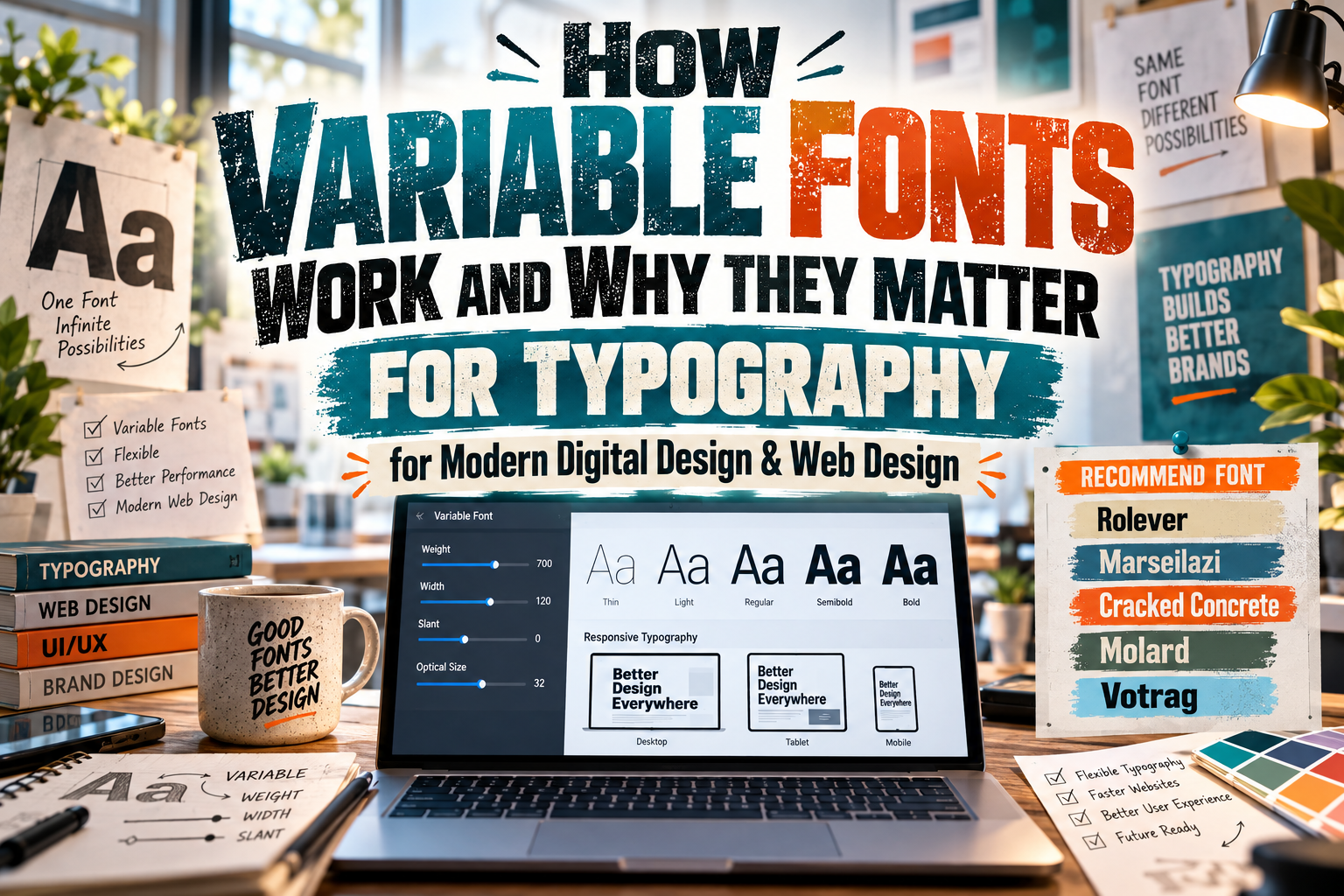
Variable Fonts Explained 2026: Flexible Typography for Modern Digital Design
Traditional font families usually divide typography into individual files: Light, Regular, Medium, Bold, Condensed, Italic, and so on. Variable fonts approach the same problem differently.
A variable font can contain a continuous range of typographic variations within a single font resource. Instead of moving only from Regular to Bold, a designer may be able to select intermediate weights such as 430, 575, or 680, provided those values exist within the font’s defined design space.
Understanding variable fonts explained 2026 is increasingly useful for graphic designers, developers, brand teams, and digital publishers because variable typography connects creative flexibility with responsive design and potentially more efficient font delivery.
Microsoft’s OpenType specification describes variable fonts as font resources that support multiple faces through one or more designer-defined axes of variation. Those axes can operate independently or together, creating a multidimensional design space. Microsoft Learn
Initial Suggestion: Think in Ranges Instead of Styles
The easiest way to understand variable fonts is to stop thinking only in named styles.
Imagine a conventional family containing:
Light 300
Regular 400
Medium 500
Semibold 600
Bold 700
A variable version might instead provide a continuous weight range from 300 to 700. The designer can still define familiar named instances such as Regular or Bold, but compatible software may also access values between them. Microsoft Learn
That flexibility becomes even more powerful when a font combines several axes. Weight and width, for example, could change independently so that one font produces light-condensed, medium-normal, bold-expanded, and thousands of intermediate combinations.
What Are Variable Font Axes?
An axis represents one characteristic of the typeface that can change.
OpenType defines five well-known registered axes:
| Axis | Tag | What It Controls |
|---|---|---|
| Weight | wght | Thin to heavy strokes |
| Width | wdth | Condensed to expanded forms |
| Italic | ital | Roman to italic state |
| Slant | slnt | Upright to angled forms |
| Optical Size | opsz | Designs optimized for different text sizes |
The OpenType specification also permits designers to create custom axes for characteristics unique to a particular typeface. Microsoft Learn
That means an experimental family might theoretically vary characteristics such as roundedness, contrast, grade, or another design parameter, assuming the font creator builds that behavior into the family.
Variable Fonts Are More Than Adjustable Weight
Weight is usually the easiest feature to demonstrate, but width can be equally useful.
A responsive website could use slightly narrower typography when space becomes limited and more expansive lettering on larger screens. The registered wdth axis represents width relative to the typeface’s normal design, with 100 corresponding to the normal width. Microsoft Learn
Optical size introduces another interesting possibility. Instead of simply scaling identical outlines, a font with an opsz axis can change letterform details for different viewing sizes.
Microsoft’s Segoe UI Variable, for example, uses optical sizing to adjust details such as counters to support legibility at smaller sizes while allowing more personality at larger sizes. Microsoft Learn
This is typography adapting structurally rather than merely becoming bigger or smaller.
How Variable Fonts Work on the Web
Modern CSS provides several ways to access variable-font capabilities.
Developers can define ranges within @font-face, such as:
@font-face {
  font-family: "BrandVariable";
  src: url("brand-variable.woff2") format("woff2");
  font-weight: 300 800;
  font-stretch: 75% 125%;
}
The browser can then select values from the supported ranges. MDN documents variable-font support through familiar CSS properties such as font-weight and font-stretch, alongside low-level access through font-variation-settings. MDN Web Docs
For example:
.hero-title {
  font-weight: 650;
}
A custom or less directly supported axis can be controlled with:
.hero-title {
  font-variation-settings: "wght" 650, "wdth" 110;
}
MDN recommends using normal CSS properties such as font-weight and font-style when suitable, reserving font-variation-settings for lower-level control that does not have an equivalent property. MDN Web Docs
Variable Fonts and Web Performance
One of the most repeated claims about variable fonts is that they automatically make websites faster.
The reality is more nuanced.
A single variable font can represent an entire family more efficiently than downloading many separate static font resources. The OpenType specification specifically notes that variable fonts can represent multiple faces in an efficient format. Microsoft Learn
However, one variable font is not automatically smaller than one static Regular font.
If your website only needs Regular and nothing else, downloading a large variable file containing extensive axes could be unnecessary. If the design requires Regular, Medium, Semibold, Bold, and several widths, one variable resource may offer a more efficient solution than loading numerous separate files.
Performance should therefore be measured based on the actual project, not assumed from the technology alone.
Responsive Typography Creates New Creative Possibilities
Variable typography is particularly interesting when values respond to context.
Imagine a magazine website where headline width becomes slightly narrower on tablets, weight increases subtly on small screens, and optical sizing responds to text size. Instead of jumping between predefined font files, the typography can transition through a continuous design space.
Brands can also use variable axes for animation.
A campaign headline might smoothly transition from light to black or condensed to expanded. Because the animation changes the font’s design parameters rather than scaling a static image, the lettering retains genuine typographic structure.
The effect should remain purposeful. Constantly moving typography may be visually impressive but distracting when users are trying to read.
Variable Fonts vs. Static Fonts
| Area | Static Fonts | Variable Fonts |
|---|---|---|
| Styles | Separate font files | Ranges within a font resource |
| Weight choices | Usually predefined | Potentially continuous |
| Width choices | Separate condensed/expanded files | Can be adjustable |
| Responsive design | Switch between styles | Continuous adaptation possible |
| File strategy | Multiple files for many styles | One file can cover many instances |
| Creative control | Fixed instances | Fine-grained axis control |
| Compatibility workflow | Very predictable | Requires testing in target software |
| Best use | Simple typography systems | Flexible digital systems |
Static fonts are not obsolete. They remain entirely appropriate when a project needs only a small number of predictable styles.
Variable fonts simply provide another, more flexible architecture.
When Should You Use Variable Fonts?
Variable fonts make particular sense for responsive websites, design systems, digital publishing, large brand families, interactive projects, and applications that need several typographic weights or widths.
They can also help maintain brand consistency. Rather than supplying numerous unrelated font files, a brand team can define approved points within the variable design space, such as 400 for body copy, 580 for interface emphasis, and 720 for headlines.
Designers exploring typography at PutraCetol Studio should distinguish between a font family containing several static styles and an actual variable font. A family with Regular, Bold, Rough, Outline, or other separate files is not automatically variable. Check the included file formats and documented axes before planning a variable-font workflow.
Common Mistakes With Variable Fonts
One common mistake is assuming that every value inside an axis will look equally good. Technically available does not always mean visually appropriate. A width of 78% or weight of 635 may be possible, but brand teams should still establish intentional typography rules. Too much freedom can create inconsistency when every designer chooses different values.
Another mistake is treating variable fonts purely as a performance optimization. File size depends on glyph coverage, number of axes, design complexity, subsetting, compression, and how many static files would otherwise be required. Test actual WOFF2 resources and network performance rather than assuming that “one file” automatically means “faster.”
Finally, test the font in the software, browsers, devices, and export environments your audience uses. While variable-font technology is well established across modern web environments, individual applications may expose axes differently. MDN notes that variable-font CSS functionality is broadly available but also recommends careful testing of specific syntax and implementations. MDN Web Docs
Conclusion
The simplest version of variable fonts explained 2026 is this: a variable font turns a font family from a collection of fixed styles into an adjustable design space.
Weight, width, slant, italics, optical size, and custom characteristics can exist as controllable axes, giving designers more precision and developers more options for responsive typography.
The real advantage is not simply putting many fonts into one file. It is creating typography that can respond more intelligently to brands, layouts, screens, and content.
Whether you choose variable or static typography, start with readability and visual identity. Explore PutraCetol Studio for distinctive font families for branding, websites, digital campaigns, packaging, and creative projects, then select the font technology that best fits how your design will actually be used.
Explore these fonts and many more at PutraCetol.com to build a business identity that looks professional, trustworthy, and memorable.
Additionally, if you want to explore some free typography options, you can check out Putracetol Studio on Dafont. Happy reading and designing!