
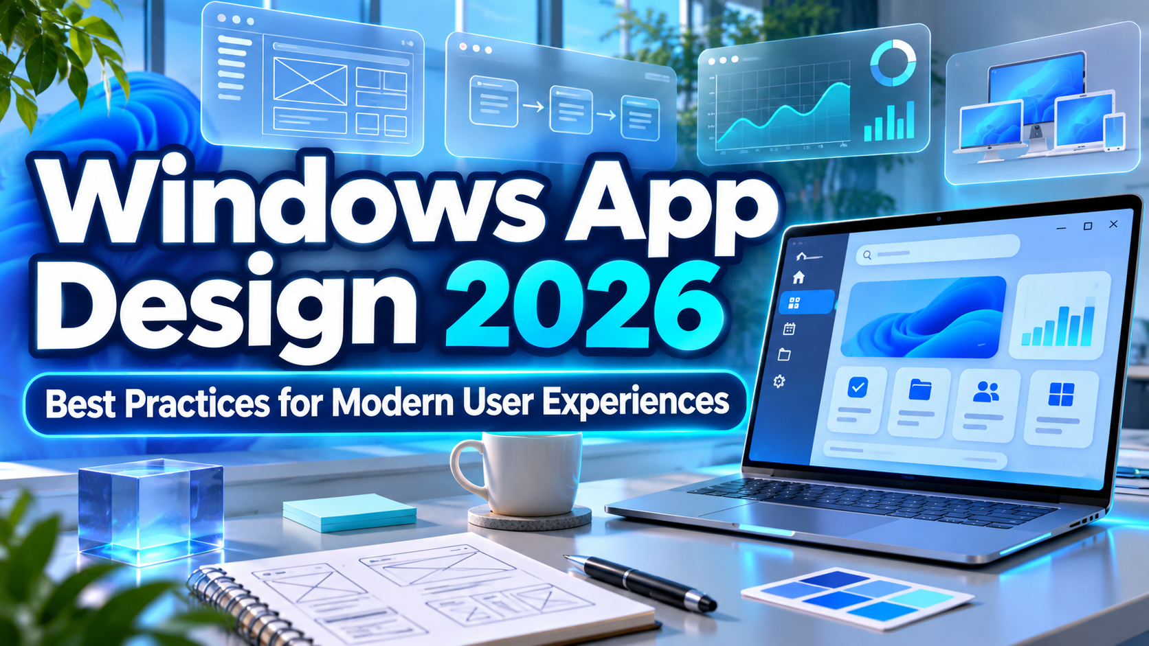
Windows Store App Design Principles 2026: 7 Essential Guidelines for Modern Applications
Great application design goes beyond attractive interfaces. Users expect Windows applications to feel responsive, intuitive, reliable, and consistent with their operating system.
Understanding Windows Store app design principles 2026 helps designers and developers create applications that combine visual quality with practical usability.
Microsoft’s design philosophy has evolved from earlier Windows Store principles, including craftsmanship, fast interactions, authentic digital experiences, simplicity, and system integration.
Today, these ideas continue through Windows 11’s Fluent Design approach, emphasizing effortless interactions, calm interfaces, personalization, familiarity, and visual consistency.
Whether you’re building productivity software, enterprise applications, or creative tools, these principles provide a foundation for better desktop experiences.
Design Around the User’s Primary Task
Before creating interface components, identify what users need to accomplish.
A financial application should prioritize readable data and efficient navigation, while a creative editor might emphasize canvas space and accessible editing tools.
Begin with simple wireframes that define navigation, essential actions, and content hierarchy.
Test your layouts with realistic tasks before investing heavily in visual effects.
For modern Windows development, Microsoft’s WinUI 3 framework provides native controls and Fluent Design styling through the Windows App SDK.
7 Essential Windows Store App Design Principles for 2026
1. Prioritize Craftsmanship and Attention to Detail
Craftsmanship means developing interfaces that feel complete, polished, and dependable.
Pay attention to spacing, alignment, typography, icon consistency, and interaction feedback.
Small details such as properly aligned buttons, understandable error messages, and predictable window behavior contribute to a professional experience.
For example, a productivity application should maintain consistent spacing and visual hierarchy across dashboards, settings, and dialog windows.
BEST FOR: Professional software, enterprise applications, and productivity tools.
2. Create Fast and Responsive Experiences
Speed is essential to modern Windows application design.
Interfaces should respond promptly to user actions while communicating when processing takes additional time.
Use progress indicators for lengthy operations, avoid blocking the interface, and optimize unnecessary background activity.
Meaningful animations can clarify transitions, but excessive motion may distract users or affect performance.
A file management application, for example, should remain interactive while processing large transfers.
BEST FOR: File managers, business software, multimedia applications, and data-intensive tools.
3. Embrace Authentic Digital Design
Authentically digital design emphasizes the possibilities of software rather than imitating physical objects unnecessarily.
Modern Windows applications can use dynamic layouts, interactive feedback, subtle motion, and adaptable interface elements.
Fluent Design materials such as Mica and Acrylic can introduce visual depth when used appropriately.
However, decorative effects should support the interface instead of competing with important content.
BEST FOR: Creative applications, technology platforms, dashboards, and modern desktop utilities.
4. Keep Interfaces Simple and Purposeful
One of the strongest design principles is reducing unnecessary complexity.
Prioritize essential functions and place secondary actions where users can discover them without cluttering the main interface.
Use clear labels, organized navigation, and consistent controls.
For example, a note-taking application should make writing, searching, and organizing notes straightforward rather than overwhelming users with excessive options.
A focused interface can improve productivity while reducing the learning curve.
BEST FOR: Note-taking apps, educational software, SaaS tools, and everyday utilities.
5. Maintain Consistency With the Windows Ecosystem
Applications should feel familiar to people who already use Windows.
Follow established interaction patterns for menus, keyboard shortcuts, window controls, dialogs, and system settings.
Microsoft’s Fluent Design guidance supports consistent layouts, iconography, typography, and interface behavior.
WinUI 3 provides modern controls that help developers follow these conventions.
Familiar experiences reduce unnecessary learning and help users complete tasks confidently.
BEST FOR: Windows desktop applications, enterprise platforms, and software development teams.
6. Design for Accessibility and Different Input Methods
Accessible interfaces benefit everyone, including users with visual, motor, or cognitive disabilities.
Support keyboard navigation, readable text, sufficient contrast, screen readers, and adaptable display settings.
Test interfaces with different window sizes, display scaling, and input methods such as mouse, touch, and pen.
Respect system accessibility preferences, including reduced-motion settings where applicable.
BEST FOR: Educational applications, workplace software, public services, and inclusive digital products.
7. Use Typography and Visual Hierarchy Effectively
Typography influences how easily users understand information and navigate an application.
Microsoft recommends Segoe UI Variable for modern Windows interfaces because it supports the platform’s visual language and readability requirements.
Use consistent heading sizes, readable body text, and purposeful spacing to create clear information hierarchy.
Decorative fonts can enhance promotional materials, but essential interface elements should prioritize accessibility and legibility.
For creative app branding, launch graphics, and Microsoft Store promotional visuals, explore distinctive display fonts at PutraCetol Studio.
BEST FOR: Application branding, dashboard interfaces, software presentations, and promotional graphics.
Comparison: Traditional Windows Store Design vs. Modern Windows Design
Windows interface design has evolved while retaining many of its original usability goals.
| Design Aspect | Earlier Windows Store Approach | Windows Design in 2026 |
|---|---|---|
| Visual style | Flat, content-focused | Fluent Design, subtle depth |
| Navigation | Simplified app navigation | Adaptive, familiar patterns |
| Typography | Strong typographic hierarchy | Segoe UI Variable and Fluent |
| Interaction | Touch-focused experiences | Mouse, keyboard, touch, and pen |
| Motion | Fluid animated transitions | Purposeful contextual feedback |
| Customization | Limited visual personalization | Themes and adaptable layouts |
| Accessibility | Foundational support | Inclusive design throughout |
Why Fluent Design Matters in 2026
Fluent Design provides a consistent visual and interaction framework for modern Windows applications.
It combines layout, typography, color, materials, and motion to help developers create interfaces that feel integrated with Windows.
Using familiar components also reduces unnecessary design inconsistencies across different applications.
Common Mistakes in Windows App Design
One common mistake is prioritizing visual effects over usability. Although sophisticated animations, translucent backgrounds, and decorative controls can make an application attractive, excessive styling may introduce distractions and performance problems. Designers should focus on clear navigation, readable content, and predictable interactions before adding visual enhancements. Testing applications across different screen resolutions and hardware configurations is essential because an interface that looks excellent on one monitor may perform poorly elsewhere.
Another mistake is ignoring established Windows conventions and accessibility requirements. Custom navigation systems, inconsistent keyboard shortcuts, unclear buttons, and unsupported screen readers can make otherwise functional software difficult to use. Designers should evaluate accessibility throughout development, use familiar interface patterns, and conduct usability testing with realistic workflows. Neglecting error handling, loading feedback, and window resizing can also reduce user confidence in the application.
Conclusion
Understanding Windows Store app design principles 2026 helps creative teams build software that feels intuitive, reliable, and professionally crafted.
Strong Windows applications combine craftsmanship, responsive performance, authentic digital experiences, simplicity, ecosystem consistency, and accessible interaction.
Fluent Design and modern development tools provide a practical foundation for turning these principles into polished desktop experiences.
By prioritizing usability while maintaining a recognizable visual identity, developers can create applications that serve users effectively.
For teams developing app branding and promotional graphics, explore creative typography at PutraCetol Studio to complement modern interface design with distinctive visual communication.
Explore these fonts and many more at PutraCetol.com to build a business identity that looks professional, trustworthy, and memorable.
Additionally, if you want to explore some free typography options, you can check out Putracetol Studio on Dafont. Happy reading and designing!