
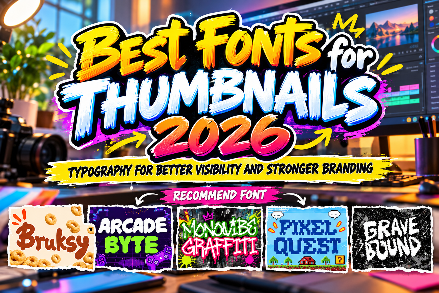
Best Fonts for Thumbnails 2026: Typography That Gets Noticed Fast
A thumbnail has very little time to compete for attention. Viewers often see several videos, articles, or social posts at once, frequently on a small mobile screen. Typography therefore needs to communicate almost instantly.
The best fonts for thumbnails 2026 are not simply the loudest fonts available. They combine strong silhouettes, short-word readability, contrast, and enough personality to make a creator recognizable.
Bold experimental fonts can work for entertainment channels, while pixel typography immediately signals gaming or retro culture. Graffiti lettering creates urban energy, and hardcore styles can establish an aggressive identity for music, horror, or action content.
The key is matching the font to the subject and keeping the message short enough to remain readable.
Initial Suggestion: Design at Thumbnail Size First
Do not judge a thumbnail only while viewing it at full size in Photoshop, Canva, or another design application.
Reduce it until it resembles how viewers will actually encounter it. If the headline becomes difficult to read, simplify it.
Three or four strong words often perform visually better than a complete sentence. Instead of writing “Here Are the Best Retro Games You Need to Play This Year,” a gaming creator could use “BEST RETRO GAMES” and let the video title provide the additional context.
Use strong contrast between typography and background. Shadows, outlines, color blocks, and slightly darkened image areas can help, but typography should still have a recognizable silhouette without excessive effects.
Jump to Recommended Fonts
1. Bruksy Bold Experimental Logo Font
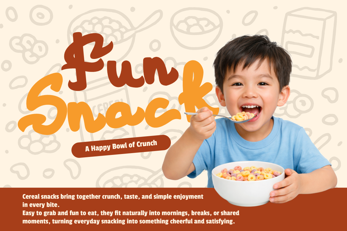
Bruksy uses thick rounded strokes, chunky weight, soft corners, and an energetic hand-drawn rhythm. Its compact shapes give short headlines immediate visual mass while retaining a friendly, contemporary personality. The font is designed for branding, packaging, advertising, social media titles, and other high-impact applications, making it especially useful for thumbnails that need to feel playful rather than aggressive. Creative Market
Try it for food reviews, challenge videos, lifestyle content, colorful product comparisons, or creator channels where an approachable personality matters.
PROS: Thick construction, friendly energy, strong headline visibility.
BEST FOR: Lifestyle videos, food content, entertainment, product reviews, colorful creator branding.
2. Arcade Byte Pixel Game Font
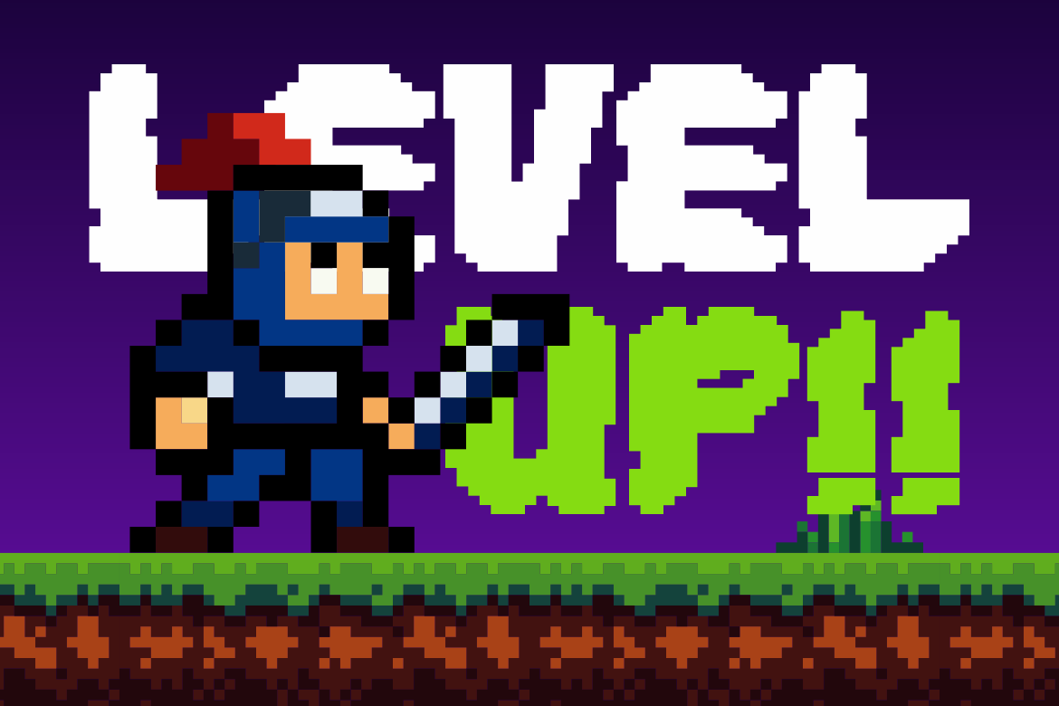
Arcade Byte uses compact block forms, thick pixel strokes, square edges, and stepped corners inspired by classic arcade graphics. Its grid-based construction gives thumbnails an instantly recognizable gaming character while remaining bold enough for modern digital titles. PutraCetol specifically highlights Arcade Byte for gaming, esports, and retro-inspired creative work. PutraCetol Studio
It works particularly well when paired with screenshots, pixel art, neon colors, or game-console imagery.
PROS: Strong arcade identity, compact letterforms, clear digital personality.
BEST FOR: Gaming channels, retro games, esports, coding videos, technology content.
3. Monovibe Graffiti Font

Monovibe Graffiti is a bold monoline graffiti typeface built around hand-drawn forms, smooth curves, sharp tag-like details, and an outline-style structure. PutraCetol specifically lists YouTube thumbnails among its intended applications, alongside streetwear, music events, skate culture, and urban promotional work. PutraCetol Studio
That makes it an excellent option for thumbnails that need street culture energy without relying on a generic heavy sans serif.
PROS: Authentic graffiti personality, outline styling, youthful visual energy.
BEST FOR: Hip-hop channels, streetwear, music content, skate videos, urban culture.
4. Pixel Quest Pixel Font

Pixel Quest combines an 8-bit structure with bold, rounded pixel edges inspired by classic arcade games and old-school RPGs. Unlike harsher pixel fonts, its shapes have a playful, adventurous quality that works particularly well for fantasy gaming, family-friendly creator content, and nostalgic digital themes. PutraCetol explicitly recommends it for YouTube thumbnails, Twitch overlays, esports branding, and gaming projects. PutraCetol Studio
Use it when the thumbnail should immediately communicate “game,” “retro,” or “adventure.”
PROS: Rounded pixel forms, nostalgic style, playful readability.
BEST FOR: RPG videos, retro gaming, Twitch content, game reviews, nostalgic campaigns.
5. Gravebound Hardcore Font

Gravebound takes the opposite direction. Its heavy forms, jagged edges, sharp spikes, torn contours, and rough textures create a dense, aggressive silhouette suited to darker subjects. The font is designed around hardcore, black-metal, horror, underground, and extreme entertainment aesthetics, and its strong short-word impact also suits streaming thumbnails and gaming covers. PutraCetol Studio
Because the shapes are intentionally intense, use Gravebound for short titles rather than long explanations.
PROS: Heavy visual mass, jagged silhouette, powerful underground character.
BEST FOR: Horror, metal music, action gaming, underground media, extreme entertainment.
Comparison: Which Thumbnail Font Fits Your Content?
| Font | Visual Style | Best Thumbnail Use |
|---|---|---|
| Bruksy | Bold, playful | Lifestyle and entertainment |
| Arcade Byte | Blocky, retro | Arcade and gaming |
| Monovibe Graffiti | Urban, energetic | Music and street culture |
| Pixel Quest | Playful, pixelated | RPG and retro gaming |
| Gravebound | Dark, aggressive | Horror and hardcore content |
The best choice depends on what viewers should understand before reading the full title.
Build a Repeatable Thumbnail Typography System
Consistency matters more than constantly changing fonts.
Choose one primary display font, establish two or three brand colors, define your outline or shadow treatment, and keep headline placement reasonably consistent. Viewers may begin recognizing the visual system even before noticing the channel name.
You can still change photographs, subjects, backgrounds, and headline wording while preserving typography.
This is also where distinctive fonts from PutraCetol Studio can help creators move away from generic templates and develop a more recognizable visual identity across videos, social posts, blog covers, and promotional graphics.
Common Mistakes in Thumbnail Typography
A common mistake is using too much text. Even an excellent font becomes ineffective when eight or ten words are squeezed into a small image. Let the thumbnail deliver the strongest visual idea and let the video or article title explain the details. Large text, short phrases, and clear hierarchy usually create a stronger first impression.
Another mistake is choosing style over readability. Graffiti, hardcore, and pixel fonts create powerful personalities, but complicated letterforms need more space. Test difficult characters, avoid overly tight spacing, and check how the design appears on a phone before publishing.
Finally, avoid adding every possible effect. Thick outlines, multiple shadows, gradients, glows, strokes, and textures can turn strong lettering into visual noise. Start with the typeface itself, then add only the contrast treatment necessary to separate it from the image.
Conclusion
The best fonts for thumbnails 2026 help viewers understand both the content and the creator’s personality within seconds.
Bruksy delivers playful boldness, Arcade Byte creates classic gaming energy, Monovibe Graffiti brings street-inspired expression, Pixel Quest provides nostalgic adventure, and Gravebound introduces extreme hardcore impact.
Choose a font that matches your niche, keep headlines short, test everything at small size, and develop a repeatable visual system.
With distinctive typography from PutraCetol Studio, creators can turn individual thumbnails into a recognizable content identity rather than another generic image competing in the feed.
Explore these fonts and many more at PutraCetol.com to build a business identity that looks professional, trustworthy, and memorable.
Additionally, if you want to explore some free typography options, you can check out Putracetol Studio on Dafont. Happy reading and designing!