
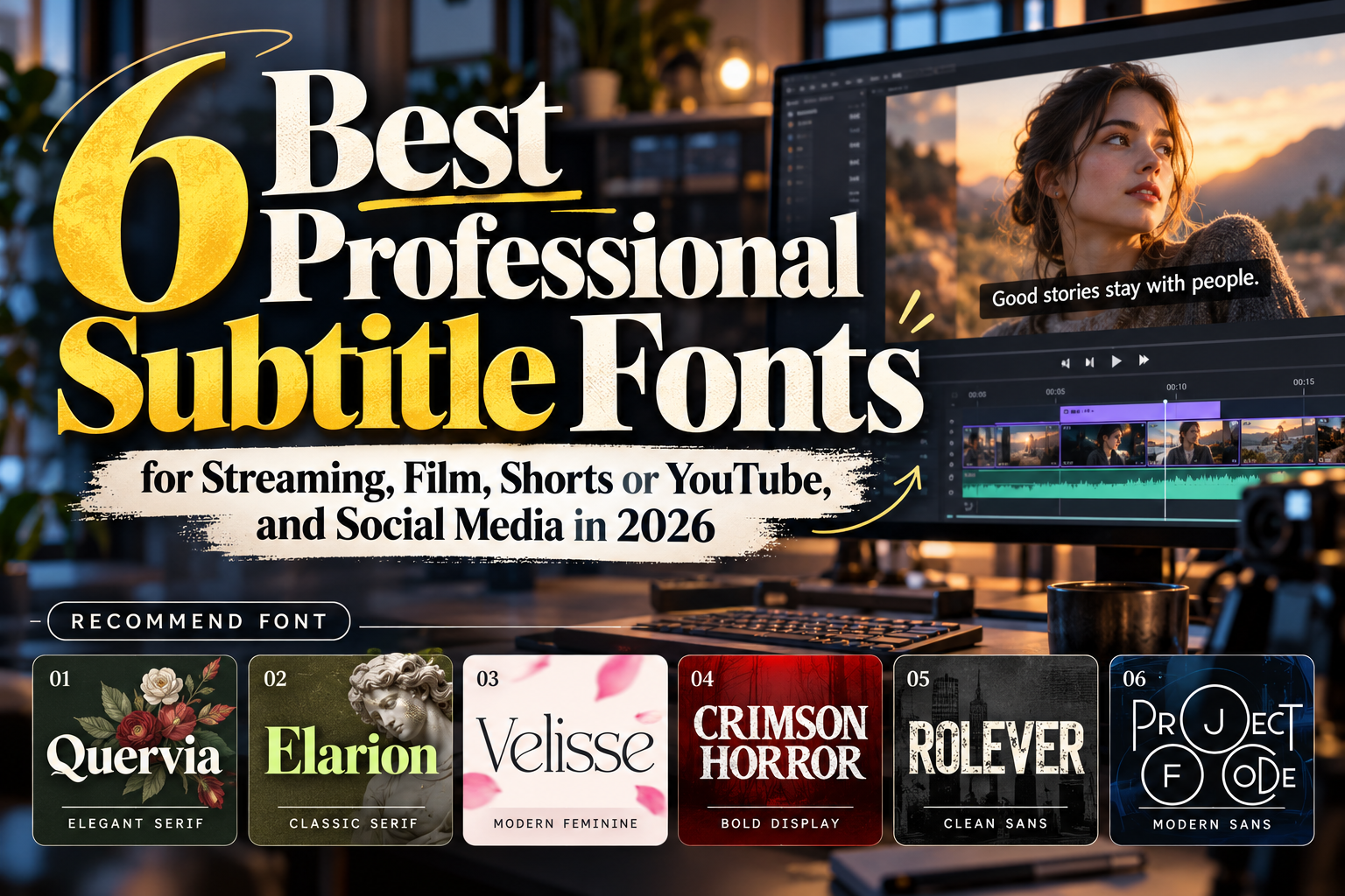
Best Fonts for Subtitles 2026: Readability Meets Visual Identity
A subtitle has only a few seconds to communicate information before it disappears. That makes subtitle typography different from choosing a font for a poster, logo, or headline. Letterforms need to remain recognizable over moving backgrounds, compression, small smartphone screens, and changing lighting conditions.
The best fonts for subtitles 2026 balance readability with visual personality. Clean sans serifs remain practical for general dialogue, while carefully selected serif or display fonts can support cinematic, editorial, luxury, horror, and branded video content.
Accessibility should remain the foundation. W3C guidance emphasizes sufficient text-to-background contrast and notes that captions should not obscure important visual information. Its accessibility resources also recognize that some video players allow viewers to customize caption size, color, style, and placement.
Initial Suggestion: Test the Font on Real Footage
Never choose subtitle typography from a static alphabet preview alone.
Create several lines using realistic dialogue and test them over bright, dark, detailed, and fast-moving footage. View the video on both a desktop monitor and a phone. A font that feels elegant at 72 pixels in a specimen may lose clarity when reduced to subtitle size.
For burned-in subtitles, use strong foreground/background separation. White or near-white lettering with a dark outline, shadow, or semi-opaque background is a common practical solution. WCAG 2.2 specifies a minimum 4.5:1 contrast ratio for normal-sized text, making contrast a useful benchmark when designing accessible on-screen typography.
Also avoid extremely tight letter spacing. Subtitles must be scanned rapidly, so recognizable character shapes and comfortable word spacing matter more than decorative complexity.
Jump to Recommended Fonts
1. Rolever Modern Sans Serif Font
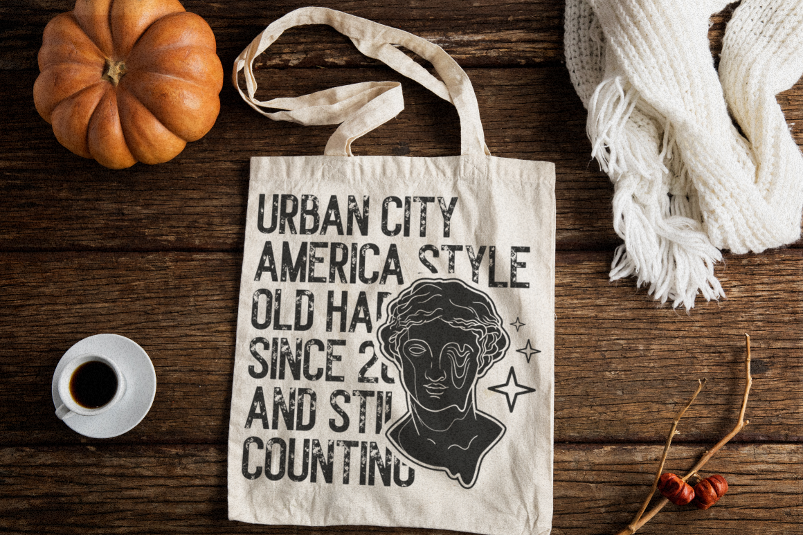
Rolever is the most straightforward option here for general subtitle applications. It includes regular, semibold, and bold weights, plus clean and textured versions, giving editors control over emphasis while maintaining a contemporary sans-serif foundation. For subtitle work, the clean version is the practical choice because it avoids unnecessary texture and can remain visually consistent across YouTube videos, documentaries, interviews, and branded content.
PROS: Three weights, clean sans-serif structure, adaptable contemporary character.
BEST FOR: YouTube, interviews, documentaries, corporate video, general captions.
2. Elarion Elegant Serif Font

Elarion uses tall letterforms, controlled contrast, balanced proportions, and polished serif construction. It is better suited to cinematic subtitles and short narrative text than rapid-fire social captions, particularly when a production needs an editorial or sophisticated atmosphere. Its calmer lowercase rhythm can work well for documentaries, cultural films, premium hospitality videos, or slower-paced storytelling when used at a sufficiently generous size.
PROS: Refined structure, controlled spacing, sophisticated visual voice.
BEST FOR: Documentary films, cultural content, luxury videos, cinematic subtitles.
3. Quervia Elegant Serif Font
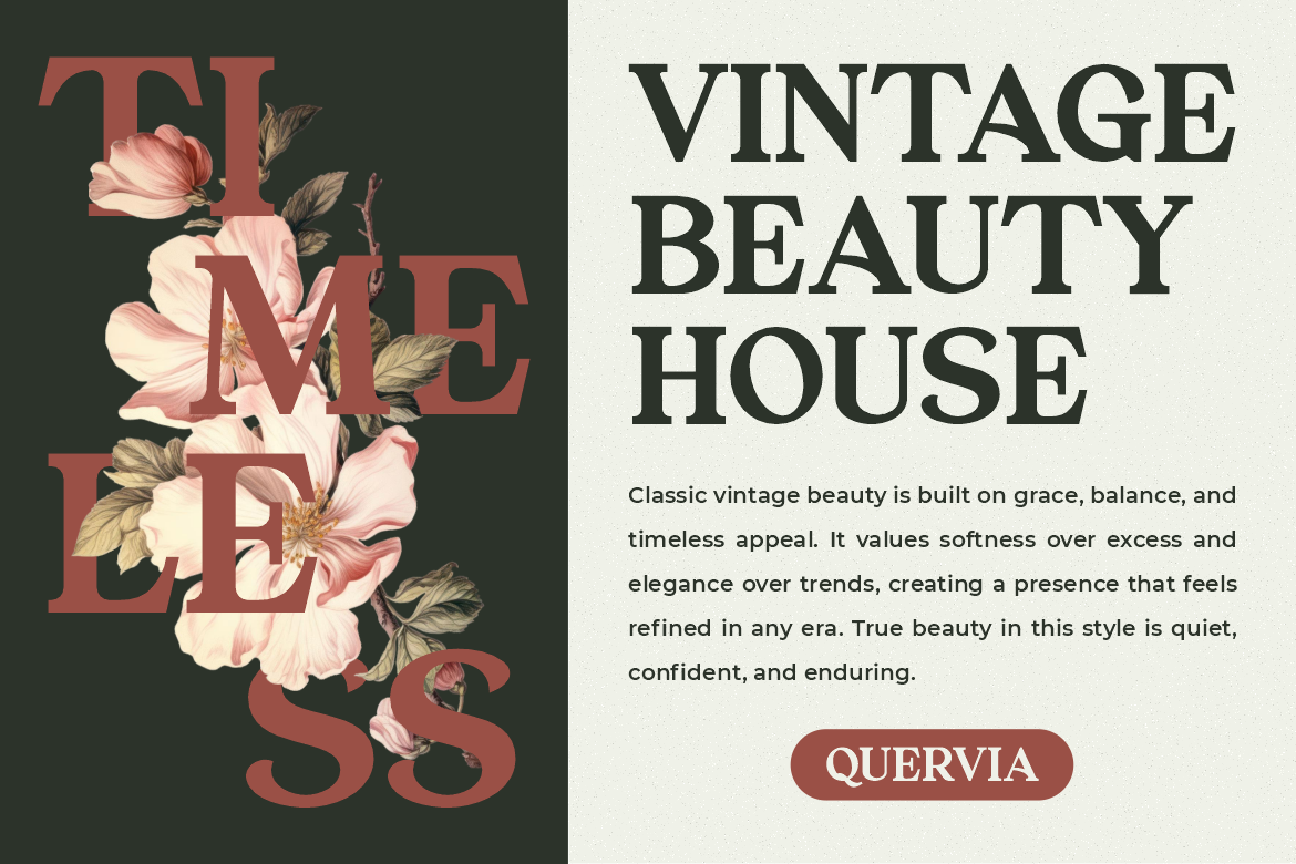
Quervia combines classic serif construction with medium stroke contrast, firm stems, smooth curves, and sharp terminals. These characteristics give subtitles a more authoritative editorial character without requiring highly ornamental forms. It is most effective for selective subtitle styling, quotation sequences, premium brand films, and short-form storytelling rather than dense dialogue running continuously for an entire feature.
PROS: Refined personality, distinctive silhouette, polished classic appearance.
BEST FOR: Brand films, editorial videos, quotations, premium campaigns.
4. Velisse Feminine Serif Font
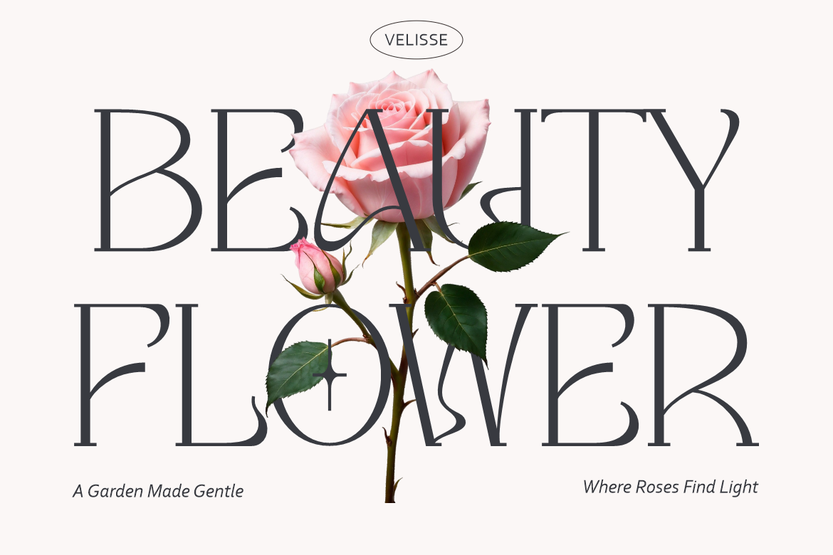
Velisse offers tall proportions, gently tapered serifs, open rounded counters, and balanced thick-to-thin contrast. Its softer personality can complement fashion, beauty, wedding, skincare, lifestyle, and boutique video content where subtitles are expected to reinforce the visual mood. The font also supports multilingual characters, an important consideration when adapting branded videos for different audiences.
PROS: Open counters, graceful structure, multilingual support, refined tone.
BEST FOR: Fashion reels, beauty videos, wedding films, lifestyle campaigns.
5. Project of Code Display Sans Font
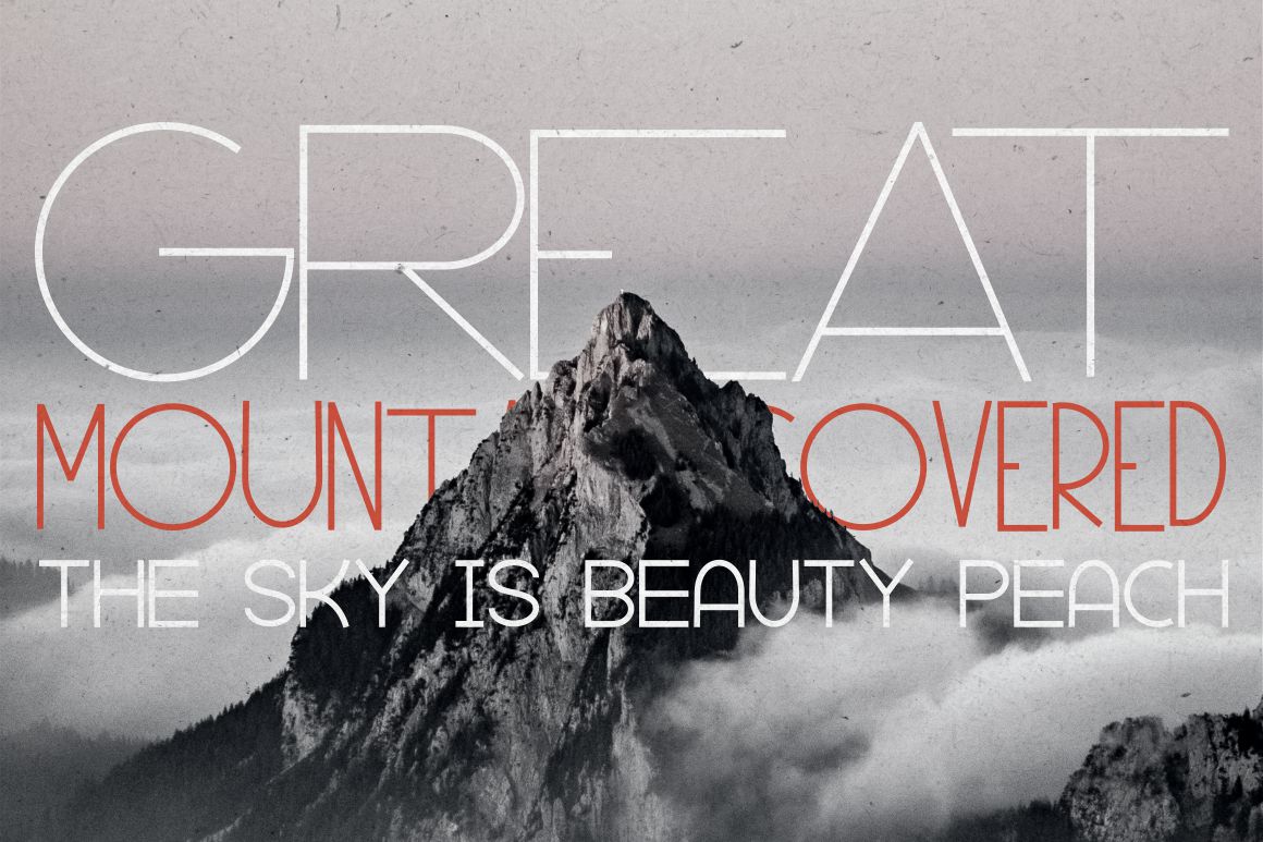
Project of Code brings a more expressive display-sans direction, including ligatures and stylistic alternatives. Because it is intentionally characterful, it works better for short, designed captions than continuous accessibility subtitles. Consider it for tech reels, gaming promotions, motion graphics, lyric-style text, or social videos where subtitles double as a visual branding element.
PROS: Modern display personality, OpenType alternatives, distinctive visual identity.
BEST FOR: Tech content, short-form social video, gaming, stylized captions.
6. Crimson Horror Horror Font

Crimson Horror is a specialized choice rather than a universal subtitle font. The family includes four styles and uses a dramatic horror-oriented aesthetic, making it useful when subtitle typography itself contributes to tension or atmosphere. It can work for horror trailers, Halloween promotions, supernatural shorts, or selected dialogue moments, but ordinary long-form subtitles should remain simpler when reading speed is the priority.
PROS: Four styles, strong thematic personality, distinctive horror atmosphere.
BEST FOR: Horror trailers, Halloween videos, supernatural films, dramatic captions.
Comparison: Which Subtitle Font Fits Your Video?
| Font | Visual Direction | Recommended Use |
|---|---|---|
| Rolever | Clean, modern | General subtitles |
| Elarion | Elegant, cinematic | Documentary and film |
| Quervia | Classic, editorial | Premium brand video |
| Velisse | Soft, refined | Beauty and lifestyle |
| Project of Code | Modern, expressive | Social and tech content |
| Crimson Horror | Dramatic, thematic | Horror video |
For accessibility-led applications, Rolever is the most conventional direction in this group. The more expressive choices are better treated as creative subtitle systems for specific projects rather than default caption fonts.
Common Mistakes in Subtitle Typography
One common mistake is prioritizing personality over reading speed. Thin strokes, extreme contrast, excessive texture, unusual ligatures, or highly decorative forms may look attractive in a title card but become difficult to process during fast dialogue. Keep important dialogue simple, use adequate sizing, and test subtitle positioning so it does not cover faces, graphics, or other relevant information. W3C guidance specifically notes that captions should not obstruct meaningful video content.
Another problem is assuming one subtitle treatment works on every device. A subtitle that looks comfortable on a 27-inch monitor may become cramped on a smartphone. Test line breaks, spacing, contrast, and safe positioning across several screen sizes. For localization, confirm that the chosen font actually contains all characters required by the target language rather than discovering missing glyphs late in production.
Finally, distinguish between closed captions and burned-in typography. Player-controlled captions may allow users to customize appearance, while open or burned-in subtitles give the editor more visual control. W3C notes that player support for caption styling varies, so the delivery format should influence how much creative typography you rely on.
Conclusion
The best fonts for subtitles 2026 are not defined by style alone. They need to survive movement, compression, small screens, varied backgrounds, and limited reading time.
Rolever provides a practical modern foundation, while Elarion, Quervia, and Velisse offer more cinematic alternatives. Project of Code suits expressive digital content, and Crimson Horror can turn subtitles into part of a specific horror atmosphere.
Explore these typefaces at PutraCetol Studio, test them with your actual dialogue, and build subtitle systems that support both the visual identity of your video and the people who need to read it.
Explore these fonts and many more at PutraCetol.com to build a business identity that looks professional, trustworthy, and memorable.
Additionally, if you want to explore some free typography options, you can check out Putracetol Studio on Dafont. Happy reading and designing!