

The Benefits of Sports Fonts in Design
Typography plays a major role in shaping visual communication, especially in industries driven by emotion, energy, and competition. In sports branding and athletic design, fonts are far more than decorative elements. They become visual tools that communicate strength, movement, passion, and determination.
Sports typography is designed to feel dynamic and powerful. Most sports fonts feature bold structures, strong letterforms, sharp edges, and energetic proportions that instantly capture attention. This is why sports fonts are commonly used in:
- Team branding
- Match posters
- Fitness campaigns
- Athletic apparel
- Social media promotions
- Sports merchandise
Understanding the benefits of sports fonts helps designers create visuals that feel more impactful, competitive, and memorable.
Whether used for a professional sports club, local tournament, gym branding, or sportswear campaign, the right typography helps establish emotional connection with audiences while strengthening brand identity.
In this article, we’ll explore the major benefits of sports fonts and how they enhance branding, promotion, and visual communication.
Why Sports Typography Matters
Sports design depends heavily on emotion and visual intensity.
Typography helps communicate:
- Energy
- Competition
- Strength
- Movement
- Motivation
Without strong typography, sports visuals can feel flat or forgettable.
Sports Fonts Create Emotional Impact
Bold sports typography immediately creates excitement.
This emotional effect is important because sports audiences respond strongly to:
- Passion
- Team identity
- Competitive spirit
- Motivation
Typography becomes part of the emotional experience itself.
Characteristics of Sports Fonts
Sports fonts usually share several key visual traits.
1. Bold Letterforms
Sports typography often uses:
- Thick strokes
- Heavy structures
- Geometric proportions
This improves visibility and impact.
2. Dynamic Shapes
Many sports fonts include:
- Slanted forms
- Angular cuts
- Speed-inspired structures
These details create movement and energy.
3. High Readability
Sports visuals are often viewed from a distance.
Fonts must remain readable on:
- Jerseys
- Banners
- Scoreboards
- Posters
- Mobile screens
1. Sports Fonts Boost Visual Energy
One of the biggest advantages of sports fonts is their ability to create visual intensity.
Strong typography instantly makes designs feel:
- More powerful
- More energetic
- More competitive
This is especially important in sports marketing and event promotion.
Why Energy Matters in Design
Sports audiences expect visuals that feel exciting and motivational.
Energetic typography helps:
- Capture attention quickly
- Increase emotional engagement
- Reinforce action-oriented messaging
Best Font Example: Magna Bold

Magna Bold is a strong geometric font that communicates:
- Power
- Confidence
- Athletic spirit
Its bold structure works perfectly for:
- Match posters
- Fitness branding
- Sports campaigns
2. Sports Fonts Build Strong Brand Identity
Typography is a core part of sports branding.
Strong sports fonts help teams and brands appear:
- Professional
- Determined
- Memorable
- Competitive
Typography Reflects Team Personality
Different font styles communicate different athletic identities.
For example:
- Aggressive bold fonts → Competitive intensity
- Retro athletic fonts → Nostalgic team spirit
- Minimal sporty fonts → Modern professionalism
Best Font Example: Rust Barrel
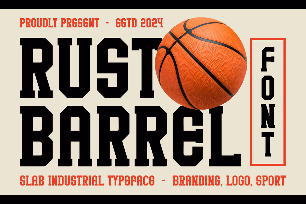
Rust Barrel combines masculine structure with bold vintage-inspired styling.
It works especially well for:
- Premium sports teams
- Outdoor brands
- Athletic merchandise
The font creates rugged and durable visual identity.
3. Sports Fonts Strengthen Promotional Messages
Sports marketing relies heavily on visibility and impact.
Bold typography helps promotional content stand out in:
- Social media feeds
- Posters
- Event banners
- Advertising campaigns
Typography Increases Attention
Strong fonts improve:
- Headline visibility
- Message clarity
- Audience recall
This is important for promotions competing in crowded visual spaces.
Best Font Example: Bold Move

Bold Move features thick and playful letterforms that immediately attract attention.
Its energetic personality works well for:
- Casual sports events
- Youth tournaments
- Community campaigns
4. Sports Fonts Improve Readability
Sports communication often requires fast readability.
This is especially important for:
- Scoreboards
- Jerseys
- Event signage
- Athletic branding
Why Readability Matters
Audiences frequently view sports graphics from:
- Long distances
- Mobile devices
- Fast-moving environments
Clear typography improves communication effectiveness.
Best Font Example: Sportive Allstar
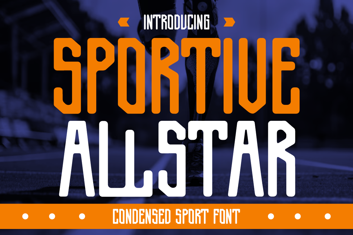
Sportive Allstar combines:
- Modern styling
- Clean geometry
- Athletic energy
Its balanced structure keeps typography readable while maintaining sporty aesthetics.
5. Sports Fonts Offer Flexible Usage
Sports typography works effectively across both digital and print media.
Good sports fonts adapt well to:
- Merchandise
- Websites
- Social media
- Apparel
- Packaging
- Posters
Multi-Platform Branding
Modern sports brands need typography systems that remain consistent across:
- Digital campaigns
- Physical products
- Live event visuals
Flexible sports fonts support long-term branding strategies.
Best Font Example: Vintage Victory

Vintage Victory combines retro athletic aesthetics with modern usability.
The font works beautifully for:
- Merchandise
- Sports packaging
- Creative apparel branding
while maintaining strong visual personality.
Quick Summary Table
| Benefit of Sports Fonts | Explanation | Example Font |
|---|---|---|
| Visual Energy | Strong, bold, spirited | Magna Bold |
| Brand Identity | Reflects determination | Rust Barrel |
| Promotional Impact | Bold, attention-grabbing | Bold Move |
| Readability | Clear, easy to read | Sportive Allstar |
| Flexibility | Works in digital & print | Vintage Victory |
Why Sports Fonts Work in Branding
Sports typography helps brands create:
- Emotional connection
- Strong recognition
- Visual consistency
- Competitive identity
Typography often becomes one of the most recognizable elements of sports branding.
Industries That Benefit from Sports Fonts
Sports typography is not limited to athletic teams.
Fitness Industry
Gyms and fitness brands use sports typography to communicate:
- Motivation
- Strength
- Energy
Sportswear Brands
Athletic apparel relies heavily on bold typography for:
- Logos
- Packaging
- Merchandise
Gaming & Esports
Esports branding often combines:
- Sports typography
- Futuristic design
- Aggressive visuals
to create competitive identity.
Event Promotion
Sports fonts improve visibility for:
- Tournaments
- Athletic competitions
- School sports events
- Community campaigns
Best Practices for Sports Typography
Prioritize Visibility
Sports typography should remain readable at:
- Large sizes
- Small mobile screens
- Fast viewing distances
Use Strong Contrast
Bold typography performs best with:
- High contrast backgrounds
- Clear spacing
- Minimal clutter
Combine with Dynamic Layouts
The fonts work especially well with:
- Angular composition
- Motion-inspired graphics
- Energetic color palettes
Common Mistakes in Sports Typography
Overcomplicated Fonts
Too many decorative elements reduce readability.
Weak Hierarchy
Poor typography hierarchy weakens communication flow.
Inconsistent Branding
Changing typography styles too frequently reduces brand recognition.
Sports Typography Trends in Modern Design
Modern sports branding increasingly combines:
- Bold geometric typography
- Minimal layouts
- Retro athletic aesthetics
- Streetwear influence
- Digital-first branding systems
This creates more versatile and modern athletic visuals.
Final Thoughts
Understanding the benefits of sports fonts helps designers create stronger visual identity systems for athletic branding, event promotion, and competitive marketing campaigns.
Fonts like Rust Barrel, Bold Move, Magna Bold, Sportive Allstar, and Vintage Victory demonstrate how sports typography can adapt to different branding styles, from premium athletic identity and retro merchandise to energetic social media campaigns and modern sportswear branding.
The best sports typography balances:
- Energy
- Readability
- Boldness
- Brand personality
When used strategically, the fonts become powerful communication tools that reinforce movement, determination, and competitive spirit across both digital and print media.
For more inspiration, creative resources, and practical design tips, visit Putracetol.com and explore creative resources that can elevate your next web project. Thank you for taking the time to read this article. If you are looking for more great articles, feel free to visit Putracetol Blog.
Additionally, if you want to explore some free typography options, you can check out Putracetol Studio on Dafont. Happy reading and designing!