

The best social media font is not simply the most decorative typeface in your library. It is the typeface that helps people recognize your content, understand the message quickly, and connect the visual style with your brand.
A beauty company may need soft script accents and refined serif headlines. A youth-focused beverage brand could use bold, wavy display lettering, while a professional media company may prefer structured typography with one distinctive editorial accent.
Before designing another post, define three qualities your content should communicate:
- Bold, energetic, and youthful
- Romantic, warm, and personal
- Fresh, botanical, and elegant
- Modern, playful, and experimental
- Professional, confident, and accessible
Then build a repeatable system containing:
- One display font for hooks, covers, and campaign headlines
- One functional font for supporting information and captions inside graphics
- One optional accent style for a keyword, quotation, or signature element
This system gives your content variety without making the account look like a collection of unrelated templates.
What Is a Social Media Font?
A social media font is a typeface used to shape the visual identity of content published across platforms such as Instagram, TikTok, LinkedIn, Pinterest, YouTube, Facebook, and Threads.
It may appear in:
- Feed posts
- Carousel covers
- Story graphics
- Reel and video covers
- On-screen hooks
- Subtitles
- Advertisements
- Product announcements
- Quotes
- Infographics
- Event promotions
- Profile branding
- Highlight covers
- YouTube thumbnails
The term does not describe one specific font category. Script, serif, sans serif, rounded, retro, decorative, and experimental display fonts can all become effective social media typography when they match the audience and content.
The font’s role is not only decorative. It influences how quickly people identify the subject, where they look first, and whether the content feels playful, premium, urgent, trustworthy, or personal.
Why Typography Influences Scrolling Behavior
Typography Creates the First Visual Signal
Before users read the complete message, they notice its shape.
Large, heavy letters may communicate urgency or confidence. Flowing script can feel intimate and emotional. A decorative serif may suggest beauty and craftsmanship, while a rounded display typeface can appear youthful and approachable.
This first impression helps viewers make a rapid decision:
Is this content relevant to me?
A strong typographic hook gives them a reason to slow down long enough to understand the message.
Visual Contrast Creates a Scroll Stop
A headline becomes noticeable when it differs from the content around it.
Contrast may come from:
- Larger scale
- Heavier weight
- Different letter structure
- A distinctive color
- Generous surrounding space
- An unusual alignment
- A decorative accent
- A controlled change in background
The typeface does not need to be extremely loud. An elegant serif headline surrounded by white space may create more attention than a bright bubble font inside a crowded composition.
Salience depends on contrast with the surrounding design.
Familiar Typography Builds Recognition
When the same typographic personality appears repeatedly, followers begin to associate it with the account.
They may recognize:
- A consistent Reel-cover font
- The same carousel-heading style
- A repeated quote treatment
- A distinctive script accent
- A recognizable title position
- A stable combination of font and color
This recognition can happen before the viewer notices the profile name.
Consistency does not require every post to look identical. The photography, topic, and colors may change while the typography continues to connect the content to the same brand.
Readability Reduces Cognitive Effort
People scroll quickly and often view content on small screens. A font that requires too much interpretation can cause the message to disappear before it is understood.
Common readability problems include:
- Thin strokes over photography
- Decorative letters used at small sizes
- Excessively tight spacing
- Long headlines in script fonts
- Low contrast
- Too many typefaces
- Text placed near interface controls
- Several messages competing for attention
The goal is not to remove personality. It is to place personality where it produces the most value.
Build a Three-Layer Social Media Typography System
Layer 1: The Hook Font
The hook font is the most expressive part of the system.
Use it for:
- Reel-cover titles
- Carousel-cover headlines
- Product names
- Campaign themes
- Event titles
- Short quotations
- Promotional statements
The hook should usually be concise.
Examples include:
- 5 Branding Mistakes
- New Summer Drop
- Design That Sells
- Before You Rebrand
- Soft but Powerful
- Create More Joy
Short copy gives the display typeface enough space to remain large and recognizable.
Layer 2: The Supporting Font
The supporting font explains the message.
Use it for:
- Carousel explanations
- Dates
- Prices
- Product details
- Short instructions
- Calls to action
- Captions inside a video
- Infographic labels
A neutral sans serif is often a practical companion because it can balance an expressive script, serif, or wavy display typeface.
The supporting font should be visually quieter, but it should not be pale, tiny, or difficult to read.
Layer 3: The Accent Style
An accent can introduce emotional contrast without requiring a third full typeface family.
Possible accents include:
- Script lettering for one word
- Italic emphasis
- An outline treatment
- A highlighted color
- An alternate glyph
- A handwritten signature
- A textured version of the display font
Use the accent sparingly.
When every word receives a different treatment, the design loses hierarchy.
Choosing a Social Media Font by Brand Personality
Beauty and Wellness
Beauty and wellness accounts often benefit from graceful serifs, monoline scripts, warm neutrals, and spacious layouts.
Use decorative typography for:
- Product names
- Emotional campaign phrases
- Testimonials
- Collection titles
Keep ingredients, instructions, prices, and CTAs in a more functional style.
A script can communicate personal care, while a refined serif adds authority and premium positioning.
Fashion and Lifestyle
Fashion branding can use editorial serifs, experimental display fonts, oversized typography, and stronger cropping.
The design may feel minimalist or highly expressive depending on the collection.
A modern fashion account could combine:
- Large decorative headline
- Monochrome photography
- Wide margins
- Small geometric supporting text
- One restrained accent color
Typography can become the central visual element rather than an addition placed over the image.
Kids and Family Brands
Rounded, playful, and bold fonts can make content feel cheerful and approachable.
Suitable applications include:
- Educational carousels
- Birthday promotions
- Toy launches
- Family events
- Children’s clothing
- Craft activities
Adults may still make the purchasing decision, so prices, product information, age guidance, and safety details should remain organized and credible.
Food and Beverage
Social media typography for food should communicate flavor and personality quickly.
Rounded display fonts can feel sweet and friendly. Wavy typefaces may suggest juice, summer, music, or movement, while handcrafted scripts can support bakeries, cafés, and artisan products.
Use the display font for the product or flavor name and a simpler companion for ingredients, promotions, and ordering information.
Creative Studios and Content Creators
Creators can choose more expressive typography because their personal style is often part of the product.
A duo font can be especially valuable because it provides both a strong headline and a more personal accent inside one coordinated family.
Use the same system across:
- Portfolio announcements
- Tutorials
- Behind-the-scenes posts
- Client case studies
- Quotes
- Service promotions
Professional and B2B Brands
Professional social content does not need to use generic corporate typography.
A bold display face can make a LinkedIn carousel or industry report more recognizable, provided supporting information remains clear.
Use distinctive typography for:
- Report titles
- Key findings
- Statistics
- Campaign concepts
- Webinar announcements
Keep technical details, charts, quotations, and source information in a clean companion font.
Social Media Fonts for Feed Posts and Carousels
Make the Cover Promise Specific
The first slide should tell viewers what they will gain.
Compare:
Weak:
“Some Design Thoughts”
Stronger:
“5 Reasons Your Packaging Looks Generic”
The second headline creates a clearer reason to continue.
The font should support that promise. A bold rounded typeface can make the topic feel energetic, while an elegant serif can make it feel more editorial or premium.
Create a Repeatable Carousel Structure
A practical carousel may use:
- Cover headline
- Short introduction
- Main insight
- Example
- Comparison
- Practical action
- Conclusion
- CTA
Use the same heading position, margins, number style, and supporting typography throughout the sequence.
The display font can appear on the cover and section-transition slides. The functional font should handle explanatory content.
Limit Text Per Slide
A social slide is not a full article page.
When a slide contains too much text, the designer is forced to reduce the type size, tighten spacing, and weaken hierarchy.
Instead, divide the message into smaller units and use the caption or linked article for additional depth.
Use Pattern Breaks Carefully
One different slide can restore attention during a longer carousel.
A pattern break might use:
- Full-width quotation
- Large statistic
- Different background color
- Oversized keyword
- Before-and-after comparison
- Product close-up
Do not redesign every slide independently. A pattern break only works when the surrounding pattern is stable.
Social Media Fonts for Stories, Reels, and Short Videos
Keep the Opening Hook Short
Video viewers need enough time to read the first message while also processing motion, sound, and imagery.
Use short hooks such as:
- Watch This Change
- Logo Mistake #1
- New Collection
- Try This Layout
- Do Not Skip This
- Before and After
The hook font can be expressive, but it should remain clear at a glance.
Separate Branding From Subtitles
A decorative font can establish the visual identity of a Reel, but it should not necessarily handle every spoken sentence.
Use:
- Display font for opening hooks and section markers
- Functional sans serif for subtitles
- Accent font for names or selected phrases
This creates personality while protecting comprehension.
Keep Text Away From Interface Areas
Platform controls, captions, account names, and navigation elements may cover parts of a video.
Keep essential text away from the extreme top, bottom, and sides. Preview the content inside the platform before publishing rather than approving it only inside the design application.
Maintain Enough Display Time
A beautiful phrase cannot influence the audience when it disappears before they finish reading it.
Longer text requires:
- More screen time
- Less animation
- Simpler typography
- Fewer competing elements
Use motion to guide attention, not to make every word constantly move.
Typography for LinkedIn and Professional Content
LinkedIn users frequently encounter case studies, reports, business carousels, data summaries, and event announcements.
Typography should make the content feel credible without becoming visually anonymous.
A strong professional system might use:
- Bold display font for the cover
- Neutral sans serif for explanations
- Semibold style for data
- Monospace or tabular figures where appropriate
- Small accent serif for quotations
Keep source information and chart labels readable.
LinkedIn allows creators to add alternative text to shared images so people using screen readers can understand the visual content.
This is particularly important when the image contains a chart, diagram, or key message that is not fully repeated in the post text.
Typography for YouTube Thumbnails and Video Covers
YouTube thumbnails need immediate topic recognition.
Use:
- Few words
- Strong scale
- High light-dark contrast
- Clear separation from the subject
- One repeated brand typeface
- Consistent title positioning
Examples include:
- Branding Breakdown
- Font Pairing Guide
- Packaging Redesign
- Design Review
- What Went Wrong?
Avoid using a long video title inside the thumbnail. The thumbnail should create interest, while the platform title provides the complete description.
Typography for Pinterest
Pinterest content often includes tutorials, checklists, recipes, inspiration boards, and long vertical graphics.
A distinctive serif or script can create emotional appeal, but informational content needs strong hierarchy.
Use:
- Large title near the top
- Clear section headings
- Readable steps
- Consistent branding near the bottom
- Enough spacing between visual groups
Because pins may circulate independently from the original profile, include a recognizable brand name or visual signature without allowing it to overpower the useful content.
Social Media Font Pairing Strategies
Bold Display + Neutral Sans Serif
This is one of the most flexible combinations.
The display font creates the hook, while the sans serif handles supporting information.
Best for: Product launches, food brands, youth campaigns, and creator content.
Elegant Serif + Modern Sans Serif
This pairing creates editorial sophistication with practical readability.
Best for: Beauty, fashion, wellness, luxury, and professional media.
Script + Structured Sans Serif
The script introduces emotion and personality. The sans serif provides organization.
Best for: Weddings, personal brands, florists, cafés, photography, and handmade products.
Decorative Display + Simple Serif
This creates an unusual contrast between expressive branding and a more literary supporting voice.
Best for: Culture, publishing, art, and lifestyle campaigns.
Duo Font Family
A coordinated duo reduces the risk of mismatched typography because both styles were designed to work together.
Best for: Accounts that need frequent variation across promotions, quotes, invitations, and editorial content.
Creating Better Visual Hierarchy
Use Size Before Adding More Colors
A headline should lead because it is larger or heavier, not only because it uses a bright color.
Begin with a monochrome layout. When the hierarchy works in black and white, color can reinforce it.
Give Important Text Enough Space
Crowding a headline with icons, stickers, photographs, and decorative shapes reduces its impact.
White space is not empty. It gives the viewer time to distinguish the message from surrounding visual noise.
Use Alignment Consistently
Choose a dominant alignment for the content series:
- Left aligned for editorial and educational content
- Centered for announcements and quotations
- Asymmetrical for experimental campaigns
Switching alignment randomly can make the design feel unstable.
Control Line Breaks
Do not let design software decide every line break automatically.
Compare:
NEW SUMMER
COLLECTION
with:
NEW
SUMMER COLLECTION
The stronger version depends on the font’s width, the content, and the desired emphasis.
Treat line breaks as part of the composition.
Accessibility and Social Media Typography
Maintain Sufficient Contrast
Decorative fonts often contain thin, irregular, or unusual details that can appear weaker than standard text.
WCAG 2.2 specifies a minimum contrast ratio of 4.5:1 for normal text and 3:1 for qualifying large text. These criteria also apply to images containing meaningful text, although brand logotypes receive a specific exception.
For text over photography, use:
- Solid text panels
- Dark or light overlays
- Controlled shadows
- Outlines
- Simpler image areas
- Stronger font weight
Do not assume that bold text automatically has enough contrast.
Repeat Essential Information in the Caption
When important information appears only inside an image, some users may not be able to access it comfortably.
Repeat dates, locations, prices, instructions, and major conclusions in the written caption or accompanying post text.
W3C recommends using actual text instead of images of text whenever the same visual presentation can reasonably be achieved with text, because live text is easier to resize and adapt.
Add Alternative Text
Instagram allows users to write and edit alternative text for image posts, while LinkedIn also supports creator-written alt text for shared images and articles.
Useful alternative text should explain the purpose of the image rather than listing every decorative detail.
For example:
Carousel cover reading “Five Packaging Mistakes,” followed by slides comparing crowded and simplified label designs.
This is more useful than:
Pink image with black text.
Keep Functional Information Simple
A brand logo can be highly decorative. A product price, event location, safety instruction, or application deadline should not require the same effort to decode.
Use the expressive typeface where personality matters and the functional typeface where accuracy matters.
Testing Social Media Fonts
Run a Thumbnail Test
Reduce the post until it resembles the size seen in a crowded feed.
Ask:
- Is the main subject still clear?
- Can the headline be read?
- Does the brand remain recognizable?
- Do decorative details merge?
- Does the background compete with the text?
Run a Five-Second Test
Show the cover to someone for five seconds, then hide it.
Ask what they remember.
A successful design should communicate:
- The main topic
- The emotional tone
- The brand or creator
- The expected content type
Compare Typography, Not Unrelated Concepts
When testing performance, change one typographic variable at a time.
For example:
- Serif headline versus bold sans serif
- Five-word hook versus ten-word hook
- Text on solid background versus text over photography
- Centered versus left-aligned layout
- Script accent versus no script accent
Do not compare two completely different topics and conclude that the font caused the difference.
Measure Business-Relevant Outcomes
Depending on the campaign, useful metrics may include:
- View retention
- Carousel completion
- Saves
- Shares
- Profile visits
- Link clicks
- Comments
- Leads
- Purchases
- Event registrations
A typeface may attract attention but still fail to communicate the offer. Evaluate whether typography supports the intended action rather than likes alone.
Build a Reusable Social Media Brand Kit
Document the rules so content remains consistent across designers, freelancers, and internal teams.
Your kit can include:
- Main display font
- Supporting font
- Accent style
- Approved colors
- Headline sizes
- Minimum text size
- Standard margins
- Carousel grid
- Reel-cover layout
- Subtitle style
- Highlight-cover rules
- Logo placement
- Examples of incorrect use
Consistency becomes much easier when the team works from predefined decisions instead of reinventing the visual system for each campaign.
Jump to Recommended Fonts
Happy Comby Duo Font | Summer Rhythm Decorative Wavy Font | Blooming Pages Spring Font | Tender Blossom Monoline Girly Script Font | Nomza Modern Bold Display Font
1. Happy Comby Duo Font

Happy Comby combines a heavy display sans with a flowing script companion, giving creators two coordinated voices inside one flexible family. The bold style uses thick strokes, rounded corners, and compact proportions, while the script introduces fluid connections and expressive movement. This built-in contrast makes it especially practical for social campaigns that need clear headline hierarchy without searching for a separate accent font.
PROS: Coordinated display and script styles, immediate hierarchy, strong headline visibility, rounded personality, and flexible campaign use.
BEST FOR: Creator branding, product launches, lifestyle businesses, invitations, promotional carousels, Reel covers, greeting campaigns, and modern social identities.
2. Summer Rhythm Decorative Wavy Font

Summer Rhythm uses wide, rounded letterforms with playful wave-cut edges that create visible movement across a word. Its sturdy strokes preserve display readability, while the uneven contours bring a cheerful retro-modern coastal personality. It can turn a simple social headline into the central graphic, especially for colorful seasonal or lifestyle content.
PROS: Dynamic wavy structure, bold readability, cheerful personality, strong seasonal energy, and memorable thumbnail performance.
BEST FOR: Travel creators, beach brands, festivals, summer campaigns, beverages, food promotions, photography, lifestyle posts, and youth-oriented content.
3. Blooming Pages Spring Font
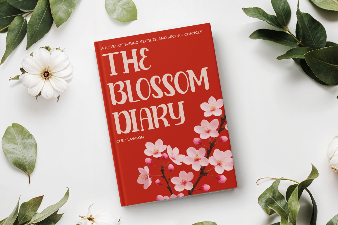
Blooming Pages blends tall, slim serif forms with soft curves, rounded terminals, and decorative botanical details. Its floral personality brings warmth and storytelling value to content without losing the structured silhouette needed for polished branding. It is particularly effective when a campaign should feel fresh, romantic, artistic, or closely connected to nature.
PROS: Floral-inspired character, graceful serif structure, decorative flexibility, warm emotional tone, and strong seasonal appeal.
BEST FOR: Florists, botanical beauty, wellness, spring campaigns, wedding businesses, feminine lifestyle accounts, event graphics, and elegant social carousels.
4. Tender Blossom Monoline Girly Script Font
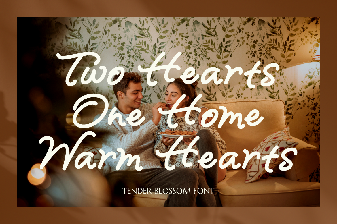
Tender Blossom uses consistent monoline strokes, rounded terminals, connected characters, and gentle looping swashes to create a soft handwritten rhythm. Its slight slant adds movement while the even stroke weight keeps large display phrases cleaner than many highly contrasted scripts. The result feels romantic, personal, and approachable, making it useful for brands that rely on emotional connection.
PROS: Smooth monoline construction, flowing connections, warm personality, gentle swashes, and strong personal-brand appeal.
BEST FOR: Beauty salons, skincare, wedding creators, maternity and family photography, candles, cafés, florists, quotations, and boutique lifestyle campaigns.
5. Nomza Modern Bold Display Font
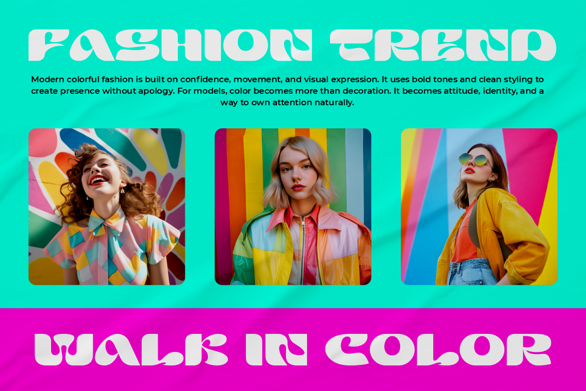
Nomza uses chunky, rounded, and experimental letterforms with substantial weight and playful negative spaces. Its bold silhouette creates immediate visibility for fast-moving social content, while the softer geometry prevents it from feeling excessively aggressive. It is a strong choice for brands that want contemporary energy, high recognition, and an unconventional but friendly voice.
PROS: Heavy display impact, rounded experimental geometry, memorable silhouette, youthful energy, and strong short-headline performance.
BEST FOR: Ecommerce launches, entertainment, creative technology, youth campaigns, modern food brands, event promotions, bold carousel covers, and product drops.
Comparison
| Font | Main Personality | Strongest Social Media Role | Ideal Brand Direction | Best Companion |
|---|---|---|---|---|
| Happy Comby | Modern, playful, and expressive | Complete headline-and-accent system | Creator, lifestyle, and campaign branding | Use its own coordinated duo |
| Summer Rhythm | Wavy, cheerful, and seasonal | High-impact covers and promotions | Travel, food, festivals, and youth content | Neutral geometric sans serif |
| Blooming Pages | Botanical, romantic, and refined | Editorial covers and seasonal storytelling | Floral, beauty, wellness, and weddings | Clean modern sans serif |
| Tender Blossom | Personal, soft, and handwritten | Quotations, signatures, and emotional accents | Beauty, photography, cafés, and boutiques | Structured sans serif |
| Nomza | Bold, experimental, and energetic | Scroll-stopping short headlines | Ecommerce, entertainment, and modern pop branding | Quiet humanist sans serif |
Best All-Purpose Social Media System
Happy Comby provides the most immediate flexibility because its display and script styles already create a coordinated hierarchy.
Best for Scroll-Stopping Seasonal Content
Summer Rhythm offers strong movement and a clear visual personality for travel, summer, food, and event campaigns.
Best for Elegant Botanical Branding
Blooming Pages brings floral character into polished editorial and lifestyle layouts.
Best for Personal and Romantic Content
Tender Blossom works naturally for intimate quotations, personal brands, and emotionally led campaigns.
Best for Bold Modern Covers
Nomza creates the strongest chunky silhouette for launches, announcements, and youth-focused content.
Common Mistakes
The first mistake is using a different font for every trend, topic, or post format. A creator may use an elegant serif for one carousel, a cartoon typeface for the next Reel, and an unrelated script for a Story because each looks attractive individually. The account gradually loses recognition because there is no consistent visual voice. Choose one primary display direction and one functional companion, then create variety through scale, color, photography, composition, and carefully selected alternates.
The second mistake is treating decorative typography as more important than the message. A beautiful script may be unsuitable for a long Reel hook, while a wavy display font can become difficult to understand when reduced inside a crowded carousel. Test the real words on an actual phone, simplify long headlines, maintain sufficient contrast, and leave practical information in a clearer typeface. A scroll stop is valuable only when viewers can quickly understand why they should remain.
The final mistake is overlooking accessibility and licensing. Important information should also appear in captions or alternative text rather than existing only inside a graphic. Organic posts, monetized channels, paid advertising, logos, webfont use, and customer-editable templates may also require different font coverage. PutraCetol’s current license selector distinguishes organic social use, monetized social media, digital advertising, logo or trademark use, and embedded or interactive applications, so the selected coverage should match the campaign’s real distribution.
Conclusion
The right social media font helps a brand do three things at once: attract attention, communicate personality, and build recognition over time.
Typography influences whether content feels playful, elegant, energetic, trustworthy, personal, or experimental. It can slow the scroll through strong contrast, but its longer-term value comes from consistency across posts, carousels, Stories, Reels, thumbnails, and campaigns.
Build a clear system instead of choosing a new style for every post. Use one expressive font for hooks, one functional family for supporting information, and one optional accent treatment. Keep headlines concise, maintain strong contrast, protect subtitles and practical details, and test every composition at realistic mobile sizes.
Happy Comby offers a flexible duo for instant hierarchy. Summer Rhythm creates playful movement, while Blooming Pages introduces botanical elegance. Tender Blossom adds a personal handwritten voice, and Nomza provides the bold modern impact needed for product launches and fast-moving campaigns.
Fonts from PutraCetol Studio can help designers, marketers, creators, and online brands build content that feels more intentional and recognizable.
The objective is not to make every post visually louder.
It is to create a typographic voice that people can notice quickly, understand comfortably, and remember after they continue scrolling.
Explore these fonts and many more at PutraCetol.com to build a business identity that looks professional, trustworthy, and memorable.
Additionally, if you want to explore some free typography options, you can check out Putracetol Studio on Dafont. Happy reading and designing!