
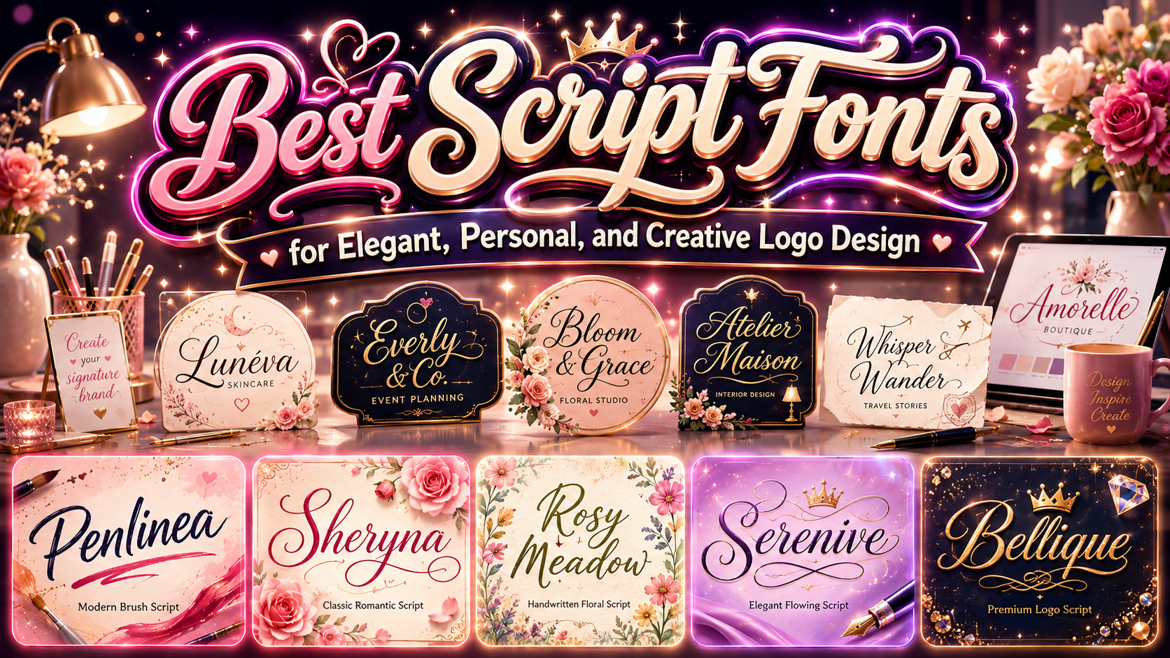
The best script logo fonts are not simply the most decorative options. A successful script typeface reflects how a brand should feel before customers read its full message.
A smooth calligraphic script may communicate romance, refinement, and exclusivity. A loose handwritten font can feel warm and personal, while a heavy brush script may suggest confidence, movement, or creative energy. Begin by defining three qualities the brand should express, then choose typography that naturally supports those qualities.
The final logo should also remain recognizable on packaging, websites, social profiles, business cards, signs, and small mobile screens. A beautiful script that only works in a large presentation is not yet a practical logo solution.
Why Script Fonts Work So Well in Logo Design
Script typography can make a digital design feel more human. Curves, changing stroke weights, connected letters, and natural baseline movement resemble handwriting or hand lettering, giving a wordmark a sense of personality that rigid typefaces may not provide.
This makes script fonts useful for businesses that depend on emotional connection, craftsmanship, individuality, or personal service. Beauty brands can use them to communicate elegance. Cafés and bakeries can create a handcrafted tone. Photographers, florists, and wedding professionals can build a softer signature-style identity.
However, not every script font communicates the same message. The difference between a refined calligraphic script and a bold brush typeface can completely change how customers interpret the brand.
Choosing the Right Script Logo Style
Modern Brush Scripts
Brush scripts usually feature visible stroke contrast, energetic movement, and slightly irregular forms. They work well for lifestyle businesses, creative studios, personal brands, apparel, and campaigns that need confidence without looking overly formal.
Choose this direction when the brand should feel expressive, active, and approachable. Avoid it when the identity requires a highly conservative or institutional tone.
Classic Calligraphic Scripts
Calligraphic scripts use controlled curves, elegant connections, and carefully shaped swashes. They can support premium, romantic, and ceremonial identities.
This style is particularly effective for weddings, luxury services, beauty labels, florists, jewelry, and boutique hospitality. The main challenge is restraint. Too many flourishes can make a short brand name difficult to recognize.
Monoline Handwritten Scripts
Monoline scripts use strokes with relatively consistent thickness. They often feel clean, calm, and contemporary while preserving the warmth of handwriting.
They are useful for wellness brands, gift businesses, stationery, cafés, skincare, and lifestyle products. Their simpler construction can also make them easier to reproduce at moderate sizes.
Bold Logo Scripts
Bold scripts combine handwritten movement with strong visual weight. They can create a recognizable silhouette on sports products, apparel, packaging, signage, and energetic campaign graphics.
This direction works best when the brand needs momentum, confidence, or youthful character. Generous spacing and a clear background are important because heavy connected forms can quickly become crowded.
How to Build a Strong Script Wordmark
Start by typing the real brand name rather than judging a font from its promotional alphabet. Letter combinations behave differently, and a typeface that looks attractive in a sample may create awkward connections in the actual name.
Review the uppercase initial, repeated letters, ascenders, descenders, and any collisions between swashes. Test available ligatures or alternates, but use decorative characters only where they improve rhythm or distinction.
A script logo also benefits from a simpler supporting typeface. Pair the expressive wordmark with a clean sans serif or restrained serif for taglines, product descriptions, navigation, and contact details. This creates hierarchy while protecting readability.
Prepare several versions of the logo, including a full wordmark, simplified version, monochrome version, and compact icon or initial. Test each one on light and dark backgrounds and at realistic production sizes.
Before registering or commercially deploying a logo, confirm the correct font coverage. PutraCetol presents logo and trademark use as a dedicated licensing category, allowing buyers to select coverage according to the number of registered marks and the scale of the brand.
Jump to Recommended Fonts
Penlinea Modern Brush Script Font | Sheryna Classic Romantic Script Font | Rosy Meadow Handwritten Font | Serenive Script Font | Bellique Logo Script Font
1. Penlinea Modern Brush Script Font
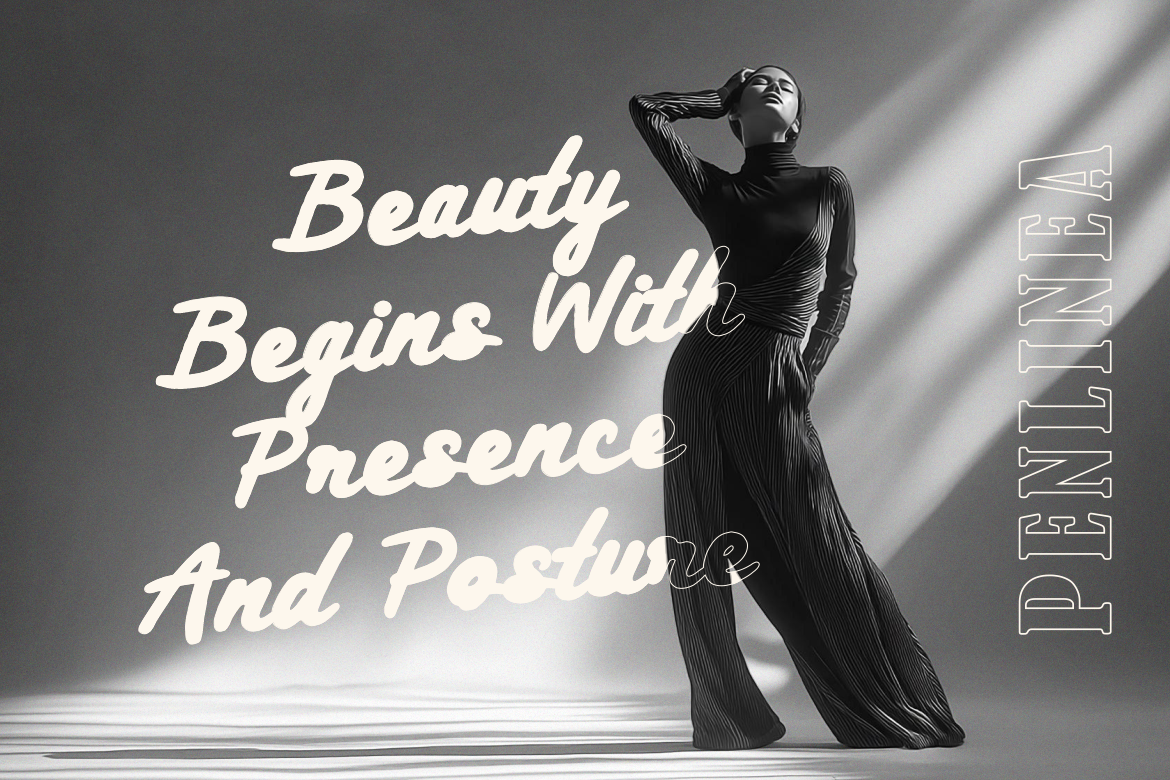
Penlinea uses flowing brush strokes with noticeable contrast between strong downstrokes and lighter upward movements. Its slightly shifting baseline, extended letterforms, and soft textured endings create a confident hand-painted effect that feels personal without losing structure. It can give short brand names an expressive signature and works particularly well when a logo needs movement and creative energy.
PROS: Dynamic brush rhythm, cohesive connections, balanced spacing, and strong visual personality.
BEST FOR: Lifestyle brands, beauty businesses, personal branding, creative studios, packaging, and editorial campaigns.
2. Sheryna Classic Romantic Script Font
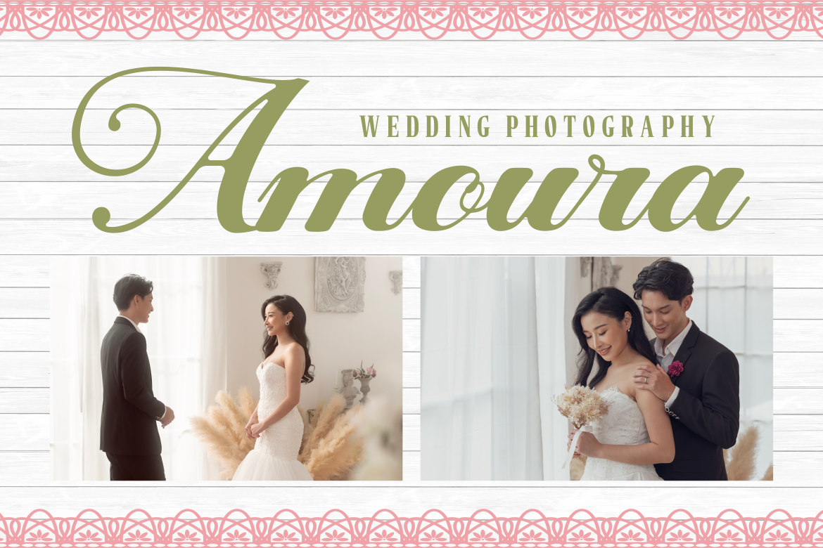
Sheryna combines traditional calligraphic influence with cleaner contemporary construction. Graceful curves, moderate thick-to-thin contrast, rounded terminals, and extended swashes create a refined and intimate appearance. Its natural connections help preserve readability while giving logos a romantic, formal, and emotionally expressive character.
PROS: Elegant calligraphic structure, soft terminals, graceful swashes, and polished romantic character.
BEST FOR: Wedding professionals, florists, beauty services, boutiques, event branding, and premium stationery.
3. Rosy Meadow Handwritten Font
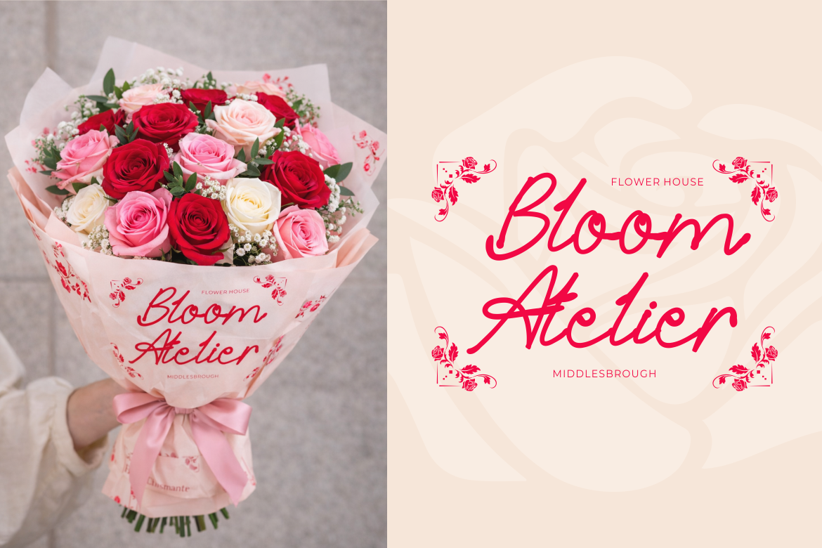
Rosy Meadow uses smooth monoline strokes, relaxed spacing, and naturally connected characters to create an airy handwritten identity. Long swashes and rounded turns add personality without making every letter feel heavily decorated. Its calm rhythm can help a brand appear thoughtful, warm, and personal across logos, labels, and social content.
PROS: Light monoline construction, graceful curves, relaxed spacing, and approachable elegance.
BEST FOR: Floral boutiques, gift brands, wedding logos, beauty labels, stationery, and feminine lifestyle products.
4. Serenive Script Font

Serenive balances flowing handwriting with a clean modern branding style. Its tall ascenders, rounded counters, long entry strokes, and controlled contrast give logos movement while keeping them polished at display sizes. The spacious letterforms also pair naturally with simple sans serif typography in contemporary identity systems.
PROS: Modern elegance, clean connections, refined vertical rhythm, and strong pairing flexibility.
BEST FOR: Skincare, jewelry, salons, candle brands, cafés, florists, boutiques, and creative studios.
5. Bellique Logo Script Font
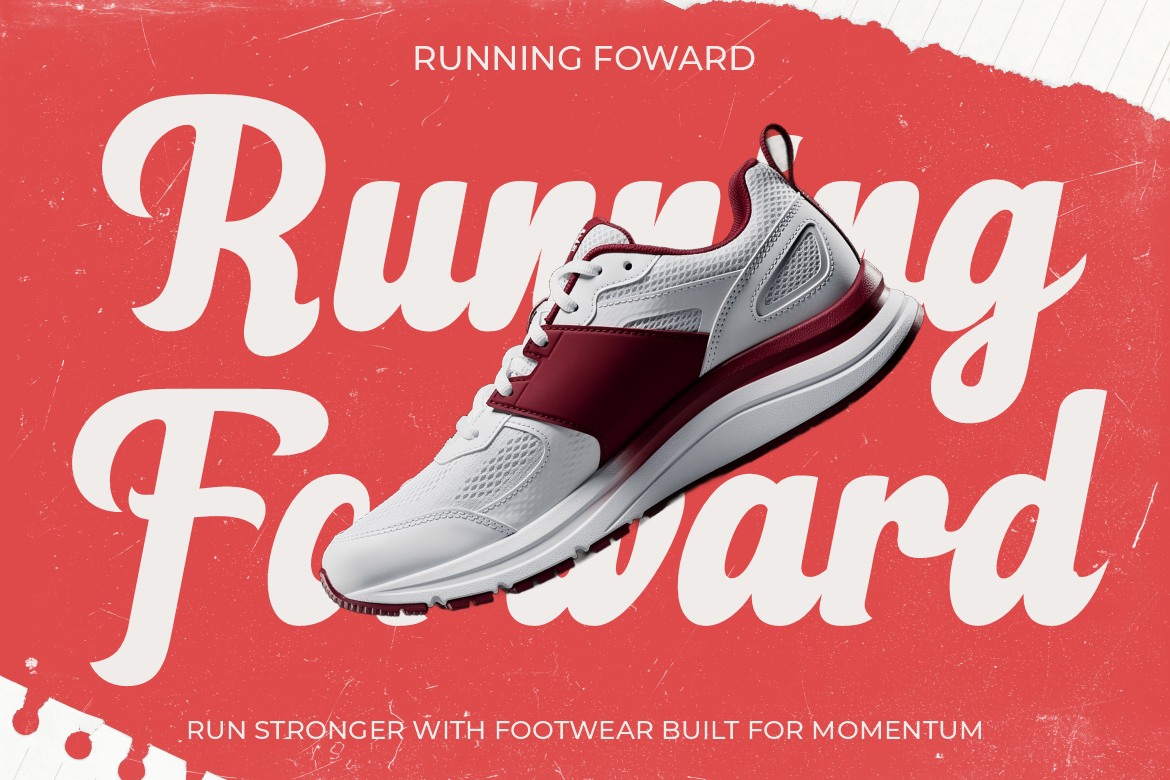
Bellique uses thick strokes, sweeping curves, tapered endings, and a naturally moving baseline to create a powerful script wordmark. Its bold connected forms provide visual strength while remaining recognizable in large headlines and product branding. The energetic construction makes it especially effective for identities built around motion, performance, and confidence.
PROS: Bold silhouette, seamless letter connections, energetic rhythm, and high display impact.
BEST FOR: Sports brands, footwear, fitness businesses, active lifestyle products, apparel, and promotional campaigns.
Comparison
| Font | Script Direction | Brand Personality | Strongest Logo Application |
|---|---|---|---|
| Penlinea | Modern brush script | Expressive and creative | Lifestyle and personal brands |
| Sheryna | Classic calligraphy | Romantic and refined | Weddings and premium services |
| Rosy Meadow | Monoline handwriting | Soft and approachable | Beauty, gifts, and floral brands |
| Serenive | Modern elegant script | Polished and contemporary | Skincare and boutique identities |
| Bellique | Bold logo script | Energetic and confident | Sports and performance brands |
Common Mistakes When Using Script Logo Fonts
The first mistake is selecting a script font because it looks attractive in a promotional preview without testing the real business name. Certain capitals may overpower the other letters, repeated characters may look awkward, and long swashes can collide with nearby text. Always test the complete wordmark, review alternative glyphs, and compare several spacing arrangements before making the final decision. A script logo should feel intentionally composed rather than simply typed.
Another common problem is adding too much decoration. Multiple swashes, flourishes, ornaments, shadows, and outlines can compete for attention and weaken recognition. Choose one or two distinctive typographic moments, then let spacing and proportion support the design. A restrained script wordmark often looks more premium than one in which every letter has been customized.
The final mistake is using the script typeface everywhere. A font that works beautifully for a logo may become tiring in navigation, product information, legal text, or long paragraphs. Treat the script as the expressive voice of the identity and pair it with a more functional supporting typeface. Test the logo at small sizes, preserve strong contrast, create simplified versions, and confirm that the selected license matches logo, trademark, website, packaging, and merchandise requirements.
Conclusion
The most effective script logo fonts combine personality with practical readability. Brush scripts can communicate creative confidence, classic calligraphy can build romantic elegance, monoline handwriting can create warmth, and bold scripts can give active brands a powerful sense of motion.
Choose the style according to the brand’s audience and emotional position, not decoration alone. Test the real name, use alternates carefully, prepare responsive versions, and support the wordmark with simpler typography.
Fonts from PutraCetol Studio provide several distinct approaches to script branding, from the expressive strokes of Penlinea and romantic refinement of Sheryna to the softness of Rosy Meadow, contemporary elegance of Serenive, and energetic strength of Bellique. With the right selection and thoughtful implementation, a script wordmark can become one of the most recognizable elements of a complete brand identity.
Explore these fonts and many more at PutraCetol.com to build a business identity that looks professional, trustworthy, and memorable.
Additionally, if you want to explore some free typography options, you can check out Putracetol Studio on Dafont. Happy reading and designing!