
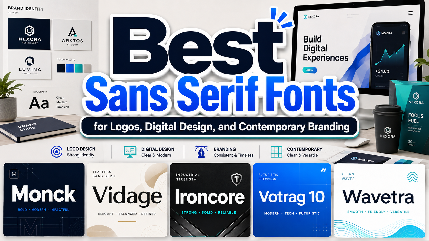
The most effective sans serif fonts are not selected only because they look minimal or contemporary. They should support the way a brand communicates, the environments in which the typography appears, and the emotional impression the business wants to create.
A technology startup may need sharp geometric forms that communicate precision. A wellness company might benefit from rounded letters that feel calm and approachable. An industrial brand can use condensed shapes and squared corners to suggest strength, while a creative studio may prefer experimental construction that appears unconventional without becoming unreadable.
Before choosing a font, define three brand qualities such as professional, futuristic, friendly, efficient, bold, or innovative. Then test whether the typeface supports those qualities through its shape, width, stroke weight, spacing, and overall rhythm.
The final decision should also consider practical performance. Type the actual business name, headline, product title, and call to action. Test them on a website, mobile screen, social media graphic, packaging label, poster, and monochrome logo. A font that looks attractive in a large specimen may not remain clear in smaller digital or printed applications.
What Are Sans Serif Fonts?
Sans serif fonts are typefaces without the small finishing strokes traditionally attached to the ends of letterforms. Their visual structure often depends on clean stems, open counters, controlled curves, and consistent geometric relationships.
The absence of decorative serifs does not mean every sans serif looks the same. Some feel neutral and functional, while others appear futuristic, corporate, rounded, industrial, humanist, or experimental.
Common sans serif characteristics include:
- Clean and simplified letter construction
- Circular, square, or triangular geometric foundations
- Consistent stroke weight
- Open counters for better clarity
- Balanced spacing
- Strong performance in digital environments
- Flexible use across logos and brand systems
- Contemporary visual personality
The strength of sans serif typography lies in its adaptability. It can remain quiet and functional in body text or become highly expressive when used in display sizes.
Major Types of Sans Serif Typography
Geometric Sans Serif Fonts
Geometric sans serif fonts are constructed around circles, rectangles, straight lines, and repeated angles. Their controlled shapes create a precise and modern appearance.
They are frequently used in technology, architecture, finance, fashion, digital products, and corporate identities. Their visual consistency can make a brand feel organized and dependable.
However, strict geometry may sometimes feel cold. Rounded corners, wider counters, or warmer colors can make a geometric identity more approachable.
The Rounded Sans Serif Fonts
Rounded fonts soften clean geometric structures through curved terminals and smooth corners. They retain a contemporary appearance while introducing warmth and accessibility.
This style works well for education, wellness, food, children’s products, digital services, community platforms, and lifestyle brands. Rounded forms can feel friendly, but excessively soft lettering may weaken brands that need authority or technical precision.
Condensed Sans Serif Fonts
Condensed typefaces use narrow proportions to fit more characters into limited horizontal space. They are especially effective for headlines, posters, packaging panels, editorial layouts, signage, and mobile promotions.
A condensed font can communicate strength and efficiency, particularly when combined with thick strokes and squared shapes. Designers should test spacing carefully because compact letters may become crowded at small sizes.
Humanist Sans Serif Fonts
Humanist sans serifs incorporate proportions and stroke movements inspired by handwriting or traditional calligraphy. They often provide more variation than strict geometric fonts, helping text feel natural and readable.
They are useful for user interfaces, healthcare, education, professional services, and brands that want clarity without appearing mechanical.
Experimental Sans Serif Fonts
Experimental sans serif typefaces alter familiar geometry through unusual curves, custom cuts, asymmetric forms, or unexpected proportions. They are designed to create distinction rather than disappear into the layout.
These fonts are valuable for logos, posters, editorial covers, packaging, creative campaigns, and brands that want to appear innovative. They should generally be reserved for larger text rather than long paragraphs.
Why Sans Serif Fonts Work in Modern Branding
They Create a Clear and Professional Appearance
Clean letterforms help brands communicate without unnecessary visual noise. This makes sans serif typography suitable for companies that value clarity, efficiency, and contemporary thinking.
A simple wordmark can also remain flexible across packaging, social media, websites, apps, and signage. When the typography has a recognizable silhouette, the brand does not need excessive decoration to attract attention.
They Perform Well in Digital Design
Sans serif fonts often work effectively on screens because their simplified forms remain clear across different sizes and resolutions. Open counters, moderate stroke contrast, and sufficient spacing make navigation, buttons, headings, and short interface text easier to scan.
However, no font is automatically readable simply because it lacks serifs. Size, contrast, line height, weight, spacing, and background conditions all affect the final result.
They Support Flexible Visual Hierarchy
A sans serif family with several weights can create a complete hierarchy without requiring multiple unrelated typefaces.
A practical system might use:
- Bold for major headlines
- Semibold for section headings
- Regular for body copy
- Medium for buttons and labels
- Light for large decorative text
Using several weights from one family can keep the design consistent while making different content levels easy to distinguish.
They Pair Well With More Expressive Fonts
Sans serif typography can act as a visual foundation for serif, script, and decorative display fonts. The sans serif handles practical information, while the contrasting typeface adds personality.
For example, a luxury brand could use an elegant serif for its logo and a geometric sans serif for product details. A creative campaign might combine an experimental display font with a neutral sans serif for dates, locations, and supporting text.
How to Use Sans Serif Fonts Effectively
Prioritize Open Letterforms
Examine letters such as a, e, c, s, and g. Open counters and clear shapes can improve recognition, especially at smaller sizes.
Avoid typefaces where similar characters become difficult to distinguish. The lowercase l, uppercase I, and number 1 should remain understandable in functional content.
Control Width and Spacing
Geometric fonts can sometimes produce uneven visual spaces because circular and angular letters interact differently. Adjust kerning in logos and major headlines instead of relying entirely on default spacing.
Condensed typefaces may require extra tracking at small sizes, while wide geometric fonts may benefit from slightly tighter spacing in short wordmarks.
Use Display Fonts for Display Purposes
A distinctive sans serif may work beautifully in a logo or headline but become distracting in paragraphs. Separate expressive typography from functional typography.
Use stronger forms for the brand name, campaign title, or product line. Choose a quieter typeface for descriptions, navigation, specifications, and legal information.
Test Real Production Conditions
Check the font on mobile screens, printed labels, textured packaging, embroidery, signage, and social media thumbnails. Thin strokes may disappear, narrow counters may close, and unusual alternates may become unclear.
A successful typographic system should remain recognizable in color, monochrome, positive, reversed, and simplified versions.
Jump to Recommended Fonts
Monck Modern Display Typeface | Vidage Elegant Serif Typeface | Ironcore Condensed Ligature Font | Votrag 10 Modern Font | Wavetra Unique Experimental Font
1. Monck Modern Display Typeface
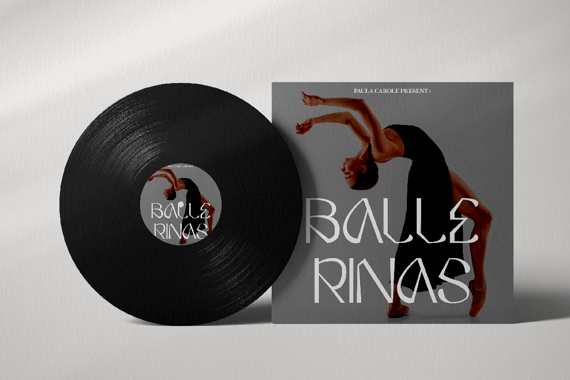
Monck combines modern display typography with influences from classic poster lettering and serif construction. Its extensive alternates and end swashes allow designers to build varied letter combinations and more personalized wordmarks. Although it is more decorative than a neutral geometric sans serif, it can introduce a distinctive modern-classic layer to logos, packaging, covers, posters, and promotional graphics.
PROS: Numerous alternates, customizable wordmarks, strong display character, and flexible OpenType features.
BEST FOR: Logos, packaging, posters, merchandise, social media graphics, editorial covers, and creative campaigns.
2. Vidage Elegant Serif Typeface
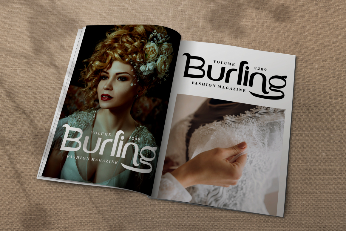
Vidage is the serif exception in this collection and works best as a contrasting companion to clean sans serif typography. Its refined serif structure, bold display presence, and alternate characters can add elegance to a logo or headline, while a geometric sans serif handles supporting details. This combination is especially effective when a brand wants modern clarity without losing a sense of luxury or tradition.
PROS: Elegant contrast, bold display value, alternative characters, and strong pairing potential.
BEST FOR: Luxury logos, beauty packaging, wedding stationery, premium invitations, editorial headings, and refined brand systems.
3. Ironcore Condensed Ligature Font
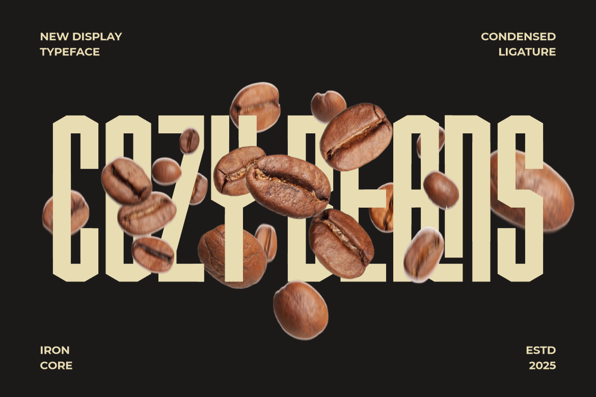
Ironcore uses tall, compact letterforms, sharp edges, squared corners, and bold geometric precision. Its condensed proportions maximize visual impact while conserving horizontal space, making it useful for narrow packaging panels, posters, editorial titles, and strong wordmarks. Ligatures add rhythm and sophistication to an otherwise industrial and authoritative structure.
PROS: Space-efficient construction, industrial strength, bold geometry, and distinctive ligatures.
BEST FOR: Coffee packaging, urban brands, industrial products, posters, editorial headlines, cafés, and strong business identities.
4. Votrag 10 Modern Font

Votrag is a rounded sans serif family containing five weights, from Thin to Bold, with clean and textured versions of each weight. This creates ten coordinated fonts that can support a complete hierarchy across logos, packaging, headlines, posters, and editorial layouts. Its rounded corners soften the geometry, helping the family feel contemporary and approachable rather than rigid.
PROS: Ten coordinated styles, five practical weights, clean and textured options, and flexible hierarchy.
BEST FOR: Startups, technology brands, lifestyle products, packaging, magazines, posters, stickers, and modern identity systems.
5. Wavetra Unique Experimental Font
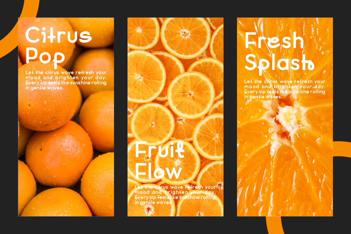
Wavetra combines smooth curves, rounded edges, open counters, and fluid letter construction. Its medium-to-bold weight gives headlines confidence, while balanced proportions and controlled spacing prevent the experimental details from overwhelming readability. The design feels modern, friendly, and creative, making it a useful option for brands that want originality without an aggressive or highly technical appearance.
PROS: Fluid construction, open counters, expressive rhythm, and balanced modern readability.
BEST FOR: Lifestyle branding, creative agencies, packaging, magazines, book covers, advertisements, posters, and contemporary campaigns.
Comparison
| Font | Typographic Direction | Visual Personality | Strongest Application |
|---|---|---|---|
| Monck | Modern decorative display | Creative and customizable | Logos and promotional graphics |
| Vidage | Elegant serif companion | Refined and luxurious | Premium branding and packaging |
| Ironcore | Condensed geometric sans | Industrial and confident | Headlines and narrow layouts |
| Votrag | Rounded multiweight sans | Modern and approachable | Complete identity systems |
| Wavetra | Experimental modern display | Fluid and creative | Lifestyle and editorial branding |
Common Mistakes When Using Sans Serif Fonts
The first mistake is assuming that every sans serif font is automatically modern, minimal, and readable. Some designs may be geometric, condensed, futuristic, rounded, industrial, or highly experimental. Each direction communicates a different personality. A friendly rounded font may not suit a serious engineering company, while an aggressive industrial typeface could feel inappropriate for a wellness brand. Choose the font according to the intended message rather than the absence of serifs alone.
Another mistake is using one expressive display font for every element of the identity. Experimental shapes and condensed proportions may create an excellent logo but reduce readability in long descriptions, navigation, prices, or product instructions. Build a hierarchy in which the display font attracts attention and a simpler companion handles functional information. When combining serif and sans serif typography, make the contrast deliberate through differences in structure, weight, and role.
The final mistake is overlooking spacing and production conditions. Geometric letters may create awkward gaps, condensed characters may merge at small sizes, and thin weights may disappear against complex backgrounds. Test the actual business name and supporting content at realistic sizes. Review the design on screens, printed packaging, signs, and monochrome applications, then adjust kerning, tracking, contrast, and font weight before finalizing the system.
Conclusion
The strongest sans serif fonts combine clean construction with a clear brand purpose. Geometric forms can communicate precision, rounded structures can feel approachable, condensed letters create efficient impact, and experimental shapes provide creative distinction.
Select the direction according to the audience and intended personality. Use display typography for logos and major headlines, build hierarchy through coordinated weights, and choose a simpler font for detailed information. Testing spacing, contrast, scale, and production conditions will ensure the design remains effective beyond the initial mockup.
PutraCetol Studio offers several approaches to modern typography. Ironcore provides condensed industrial authority, Votrag delivers a flexible rounded family, and Wavetra introduces fluid experimental character. Monck adds decorative customization, while Vidage can serve as an elegant serif contrast within a broader sans serif identity system.
Used thoughtfully, these fonts can help logos, packaging, websites, editorial layouts, and promotional campaigns feel modern, distinctive, and professionally organized.
Explore these fonts and many more at PutraCetol.com to build a business identity that looks professional, trustworthy, and memorable.
Additionally, if you want to explore some free typography options, you can check out Putracetol Studio on Dafont. Happy reading and designing!