
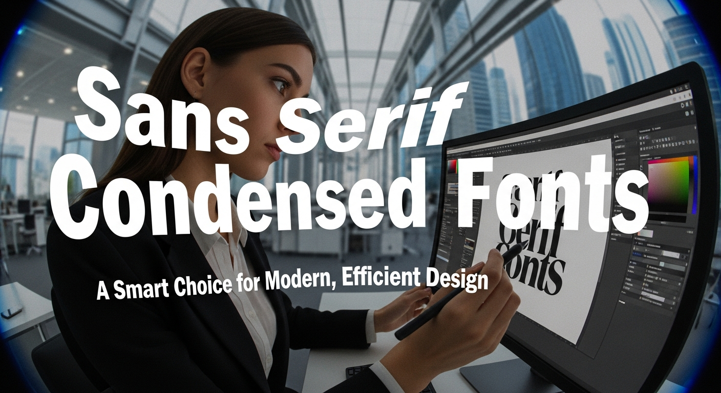
Typography shapes the way audiences interpret visual content. Whether you are designing a brand identity, creating a website, preparing a business presentation, or crafting a poster, choosing the right font plays a major role in how your message is received. Among the many typography styles available today, sans serif condensed fonts have become one of the most efficient and visually appealing choices for contemporary design.
With their slim proportions and tightly spaced structures, condensed typefaces help designers save space without compromising readability. They offer a modern, stylish look that supports both creative and professional applications. This article explores why sans serif condensed fonts matter, their design advantages, and which fonts from Putracetol.com can elevate your next project.
Why Sans Serif Condensed Fonts Matter
Sans serif condensed fonts offer a blend of efficiency and style. They are intentionally designed with narrow proportions, allowing more text to fit into limited spaces while keeping the overall layout clean and organized.
Space-Saving
One of the most valuable traits of condensed fonts is their ability to fit more content into a smaller area. This makes them ideal for:
- Posters with large headlines
- Tight UI layouts
- Product packaging
- Website banners
- Slides with limited space
Designers can convey strong messaging without overcrowding the layout.
Maintained Readability
Even with slim structures, well-crafted condensed fonts maintain clarity. Their simplified strokes and consistent spacing ensure that they remain readable across both large and small formats an essential feature for digital interfaces and print media.
Modern Appearance
Condensed sans serifs naturally carry a sleek, contemporary feel. Their tall shapes and straight lines give off a sense of professionalism and sophistication. They blend perfectly with minimalist design trends, making them popular for high-end, tech, and editorial projects.
Flexible Use
Because of their clarity and compact form, condensed fonts are suitable for a wide range of design work, including:
- Branding and logo design
- Website and UI typography
- Advertising layouts
- Editorial design
- Business presentations
They support both functional communication and aesthetic impact.
Advantages of Sans Serif Condensed Fonts from Putracetol.com
Putracetol.com offers a curated selection of high-quality condensed fonts, each crafted for modern design needs. Here are the key advantages they bring to creative professionals:
Design Efficiency
Condensed fonts draw attention without consuming excessive space. They work especially well for titles, headers, emphasis text, or any content that needs visibility while maintaining a compact footprint.
Minimalist Aesthetics
Their slim, clean letterforms contribute to a minimalist visual style. Whether paired with geometric icons, soft color palettes, or sleek photography, condensed fonts elevate modern layouts effortlessly.
Visual Consistency
Because condensed fonts have tight and stable structures, they create uniformity across design systems. This consistency helps brands and designers maintain a cohesive identity across multiple platforms.
Audience Focus
Condensed typefaces help important words stand out. Their unique proportions make them naturally eye-catching, ensuring viewers quickly notice key messages.
Applications in Design
Sans serif condensed fonts are diverse and adaptable. Here are some of the strongest use cases in modern design:
Logo and Branding
Condensed fonts help create strong, recognizable wordmarks. Their tall shapes and balanced strokes make logos look modern, bold, and space-efficient. Brands aiming for a sleek or contemporary identity benefit greatly from this style.
Posters & Advertising
When space is tight or visual hierarchy is essential, condensed fonts shine. They can create dramatic headlines that attract attention while keeping the layout clean and organized.
Websites & UI
User interfaces often require typography that is functional, compact, and readable on screens of various sizes. Condensed fonts improve clarity without overwhelming the layout, making them ideal for navigation menus, section headers, and banners.
Business Presentations
Using a condensed font in presentations makes slides look more structured and professional. These fonts create a clean visual rhythm, ensuring that information is easy to absorb.
5 Sans Serif Condensed Font Examples from Putracetol.com
Here are five standout condensed typefaces from Putracetol.com that offer modern style and strong readability.
1. Ironcore
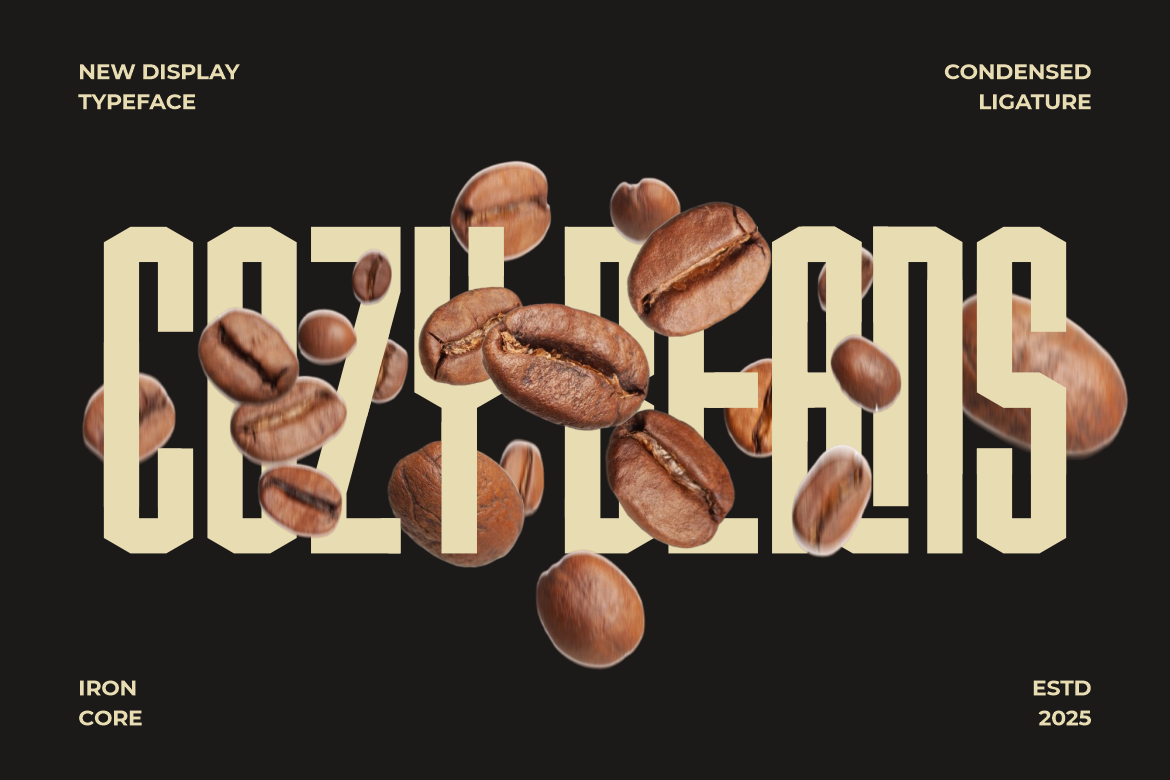
Ironcore features strong, sharp lettering that brings a tech-inspired aesthetic. Its condensed shapes make it perfect for bold titles, creative posters, and modern branding.
2. Compacture
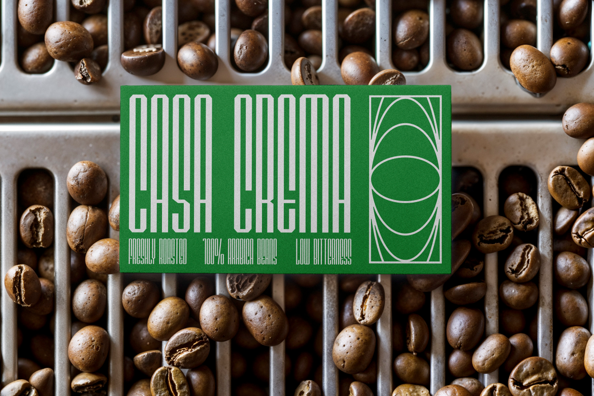
Compacture is a clean and refined condensed font ideal for corporate branding, editorial content, and presentation headers. Its balanced proportions make it reliable for both digital and print design.
3. Therlalu

Therlalu offers a unique and contemporary condensed look. With its slim yet expressive form, it’s great for creative branding, fashion projects, and minimalist layouts.
4. Country Foody

A playful and friendly condensed font, Country Foody works well for food branding, restaurant identities, packaging, or lifestyle visuals. It blends charm with readability.
5. Bold Block

Bold Block brings strong weight and tight structure. It is ideal for impactful posters, bold logos, and high-visibility digital designs where attention is crucial.
These fonts demonstrate how diverse condensed sans serif typography can be from corporate styles to creative and expressive aesthetics.
Tips for Using Sans Serif Condensed Fonts Effectively
To get the most out of condensed typography, designers should follow a few best practices:
Use for Headings or Emphasis
Condensed fonts are often most effective as display type. Use them for:
- Headlines
- Subheadings
- Key phrases
- Highlighted text
Pair with Balanced Body Fonts
Combining a condensed title font with a more open, standard-width body font improves readability and creates visual contrast.
Maintain Spacing
Because condensed fonts occupy less horizontal space, adding appropriate line spacing (leading) ensures better readability, especially in long text.
Keep Layout Clean
Condensed fonts work beautifully with minimalist design. Avoid clutter to let the typography shine.
Test Across Screen Sizes
Always check how the font appears on mobile devices, tablets, and laptops to ensure clarity remains consistent.
Conclusion
Sans serif condensed fonts are more than a stylistic choice they are a functional solution for modern design challenges. Their space-saving proportions, maintained readability, and sleek aesthetic make them essential for designers working across digital, print, branding, and presentation environments.
With the curated condensed font collection from Putracetol.com including Ironcore, Compacture, Therlalu, Country Foody, and Bold Block designers gain access to contemporary tools that help build strong visual identities and impactful layouts.
Explore more efficient and modern typefaces at Putracetol.com, and elevate your next project with typography that is clean, compact, and compelling.
Thank you for taking the time to read this article. If you are looking for more great articles, feel free to visit Putracetol Blog
Additionally, if you want to explore some free typography options, you can check out Putracetol Studio on Dafont. Happy reading and designing!