

The strongest best presentation fonts 2026 choices should not appear on every line. Use one distinctive display font for covers, section dividers, major claims, and conclusions. Pair it with a readable sans serif for charts, captions, supporting text, and practical information.
A presentation font must work on laptops, projectors, webinar windows, exported PDFs, and mobile screens. Test the real company name, longest headline, percentages, dates, and financial figures instead of judging only from a specimen.
Create hierarchy through size, weight, spacing, position, and color. Keep headlines concise so the audience understands the main point before studying supporting details. For accessible digital slides, WCAG 2.2 uses minimum contrast ratios of 4.5:1 for normal text and 3:1 for qualifying large text.
Jump to Recommended Fonts
Bold Brick | Vexorium | Korvin | Cyber Digital | Flourique
1. Bold Brick Logo Font
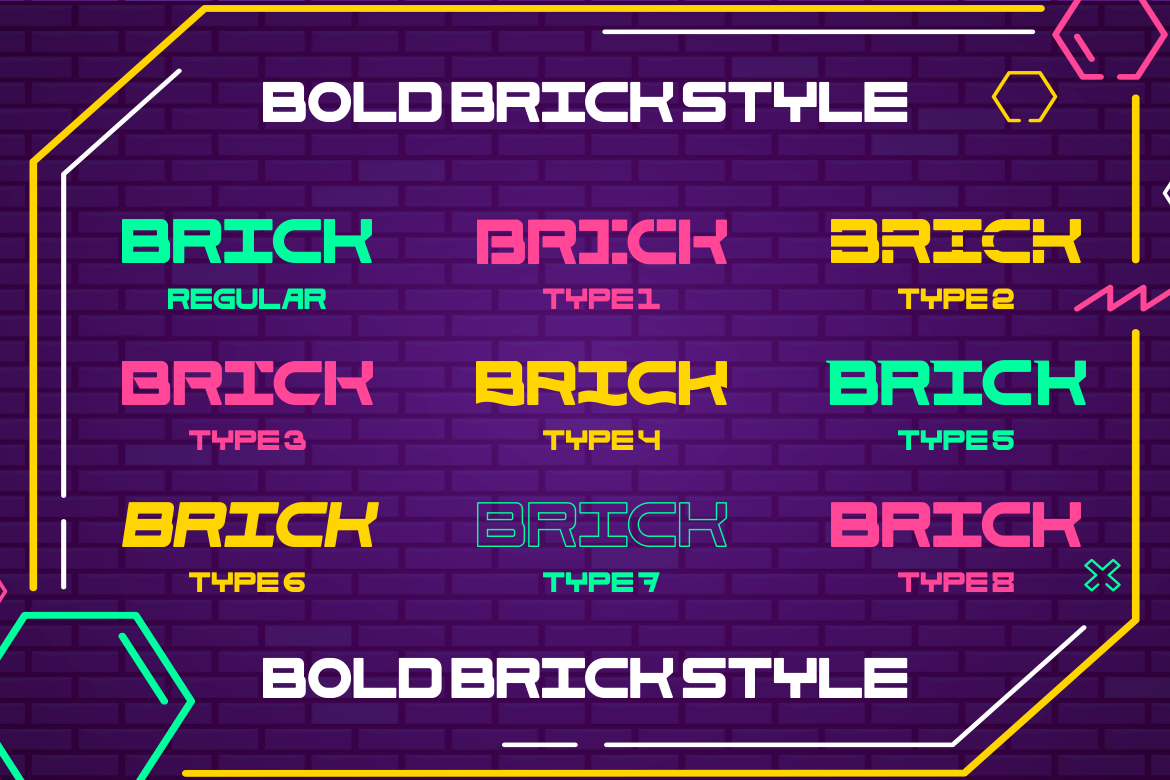
Bold Brick combines robust lines, block-like weight, and futuristic science-fiction influence. Its substantial silhouette gives short titles immediate authority and makes important statements feel energetic rather than conventionally corporate.
PROS: Strong impact, bold geometry, memorable futuristic character.
BEST FOR: Sports decks, gaming pitches, technology launches, and dramatic section dividers.
2. Vexorium Modern Experimental Font

Vexorium blends architectural precision with tall proportions, rounded corners, geometric curves, and unconventional details. It feels progressive while retaining enough structure and balanced spacing for professional presentation headlines.
PROS: Refined experimentation, clean spacing, architectural personality.
BEST FOR: Startup pitches, architecture portfolios, innovation reports, and design presentations.
3. Korvin Expanded Display Sans Font

Korvin uses expanded proportions, bold weight, clean strokes, and selected angled cuts. Its broad construction creates visual authority, while open spacing keeps large titles and key statistics organized.
PROS: Wide presence, clear geometry, polished corporate tone.
BEST FOR: Investor decks, automotive presentations, agency proposals, and business reviews.
4. Cyber Digital LED-Inspired Font
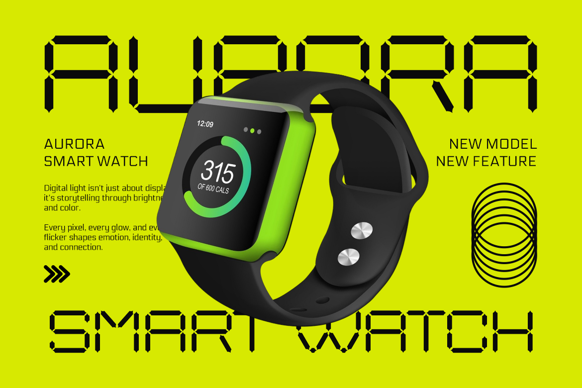
Cyber Digital uses precise segmented strokes inspired by LED display systems. Its tall modular forms, consistent numerals, and technical rhythm work naturally in presentations about data, software, and emerging technology.
PROS: Clear digital identity, consistent numerals, structured electronic style.
BEST FOR: Cybersecurity, AI, fintech, software, and digital-transformation decks.
5. Flourique Signature Font

Flourique is a refined handwritten script with natural pen movement, smooth curves, and stylish ligatures. Used sparingly, it gives quotations, founder names, or premium campaign statements a warmer and more personal voice.
PROS: Elegant flow, human personality, premium signature character.
BEST FOR: Luxury pitches, beauty presentations, hospitality, and personal portfolios.
Practical Presentation Typography Tips
Use the display font only where recognition matters. A clean companion should handle tables, explanations, timelines, and chart labels. Review every slide at normal viewing size and remove text before shrinking it.
When sharing an editable PowerPoint file, check whether collaborators can access the same typefaces. Microsoft supports custom-font embedding to help preserve layouts, although the font’s embedding permissions still apply. Embedding all characters is preferable when recipients must edit the deck.
Also prepare a PDF backup and test the presentation on the actual delivery device. Confirm that line breaks, symbols, animations, and charts remain correct after export.
Comparison
| Font | Main Personality | Strongest Slide Role |
|---|---|---|
| Bold Brick | Powerful and futuristic | High-impact titles |
| Vexorium | Architectural and experimental | Innovation storytelling |
| Korvin | Wide and professional | Corporate headlines |
| Cyber Digital | Modular and technical | Technology and data |
| Flourique | Personal and elegant | Signature accents |
Common Mistakes
The first mistake is using a display font for every text element. These five fonts are strongest when they establish identity. Long explanations, dense tables, and chart labels need a calmer companion so the audience can process information quickly.
Another mistake is choosing typography only on the designer’s monitor. A delicate script may disappear on a projector, while an expanded title may wrap badly on a smaller screen. Test realistic display conditions, maintain strong contrast, and shorten the copy before reducing type size.
The final mistake is ignoring handoff and licensing. Font substitution can change line breaks and slide layouts. Confirm installation or embedding permissions, provide a PDF backup, and choose coverage appropriate for client work, commercial presentations, branding, or wider distribution.
Conclusion
The best presentation fonts 2026 combine recognition with disciplined hierarchy. Bold Brick creates immediate power, Vexorium adds modern experimentation, Korvin delivers corporate confidence, Cyber Digital supports technology-led storytelling, and Flourique introduces an elegant personal accent.
Use these PutraCetol Studio fonts for moments that deserve attention, then support them with readable typography for data and explanation. The strongest presentation font does not decorate every slide. It helps the audience understand what matters and remember the message afterward.
Explore these fonts and many more at PutraCetol.com to build a business identity that looks professional, trustworthy, and memorable.
Additionally, if you want to explore some free typography options, you can check out Putracetol Studio on Dafont. Happy reading and designing!