
Photo manipulation is more than just editing, it’s a creative process that blends imagination with technical skill. As design standards rise across social media, branding, advertising, and digital content, designers must go beyond basic filters and adjustments to produce visuals that truly stand out.
However, many beginners overlook advanced techniques because they seem difficult or time-consuming. In reality, several high-impact manipulation methods are surprisingly accessible and can make your work look more professional almost instantly. This article highlights three powerful techniques double exposure, dispersion, and duotone all of which can upgrade the visual quality of your designs.
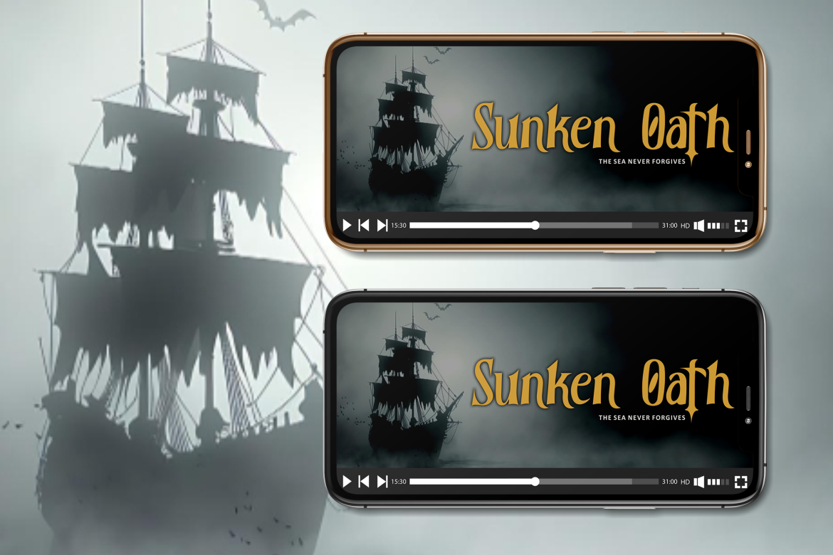
To support your creative process, you can pair these techniques with expressive typefaces from Putracetol.com, such as Ironcore, Compacture, or Black Crest, which work exceptionally well for bold graphic compositions.
1. Double Exposure: Blending Two Worlds into One
Double exposure is one of the most iconic techniques in modern digital design. It merges two images into one cohesive visual, creating an artistic and emotional effect. The technique originally came from analog photography, where two exposures overlapped on a single frame. Today, digital editing tools make this effect easier and more precise.
1.1. How Double Exposure Works
The idea is to overlay a portrait, silhouette, or object with another image, often landscapes, textures, or abstract elements. The result is a striking composition that feels cinematic and symbolic. Designers often use it to represent storytelling themes like duality, imagination, identity, or transformation.
1.2. Where It’s Used
Double exposure is popular across:
- movie posters
- book covers
- album artwork
- campaign advertisements
- editorial illustrations
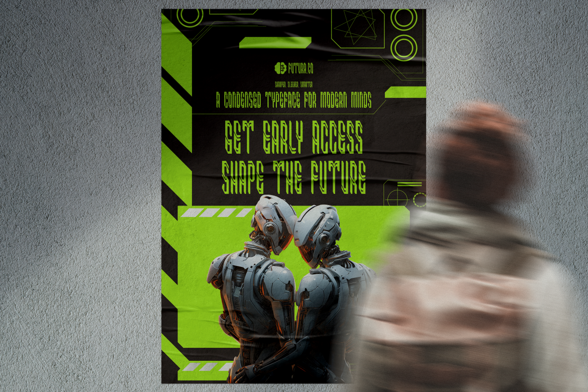
The technique works especially well when paired with strong typography. Fonts like Ironcore or Formaxis from Putracetol.com add a dramatic contrast that enhances the overall tone of the artwork.
1.3. Why Designers Love It
- visually deep and emotional
- effective for conceptual storytelling
- suitable for both minimalist and complex atmospheres
- blends well with monochrome or textured themes
Even beginner designers can create double exposure using Photoshop’s blending modes and masking tools.
2. Dispersion Effect: Motion, Energy, and Digital Drama
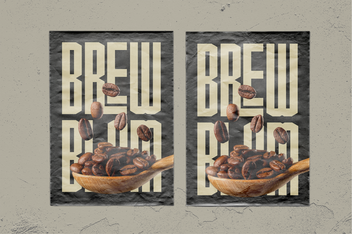
The dispersion effect creates the illusion of an object breaking into fragments or dissolving into tiny particles. It adds movement, drama, and futuristic texture to otherwise static images. Designers use this technique to convey speed, power, or transformation.
2.1. How Dispersion Works
Typically, the effect is achieved by:
- duplicating the main layer
- applying masks
- using scatter brushes
- distorting the duplicated areas
The result resembles motion or explosive movement, depending on how the particles are shaped and arranged.
2.2. Best Use Cases
The dispersion effect is particularly effective in:
- sports posters
- action-themed graphics
- music promotions
- gaming visuals
- tech startup campaigns
- dynamic social media content

When combined with bold display fonts such as Bold Block or Slimetra, the design becomes even more energetic and attention-grabbing. These tall or geometric typefaces complement the motion created by dispersion.

2.3. Why It Works
- creates a sense of speed and transformation
- adds digital, futuristic aesthetics
- breaks visual monotony and adds complexity
- great for high-impact marketing
Designers often use the effect in combination with lighting accents or gradient overlays to intensify the final look.
3. Duotone Effect: Minimalism with Modern Color Harmony
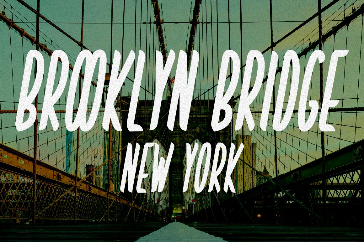
The duotone effect uses two contrasting colors to shape an image’s mood. It originates from traditional printing but has been revived in digital design because of its clean, modern feel. Many global brands use duotone visuals to refine their identity and create consistency across campaigns.
3.1. How Duotone Works
A photo is converted to grayscale, and then two colors, one for highlights, one for shadows are applied. The resulting image is simple yet striking, especially when using bold color pairs such as:
- blue and pink
- orange and navy
- red and black
- purple and cyan
The technique is easy to apply using Photoshop, Lightroom presets, or online tools.
3.2. Where It’s Used
The duotone style is widely adopted for:
- branding
- posters
- website headers
- album covers
- product campaigns
- social media aesthetics
Spotify famously popularized duotone in its early promotional campaigns, pairing imagery with graphic patterns and sharp typography.
3.3. Why Designers Use It
- instantly modern and clean
- enhances text readability
- ideal for brand unification
- works beautifully with minimalist layouts
- offers strong emotional impact through color
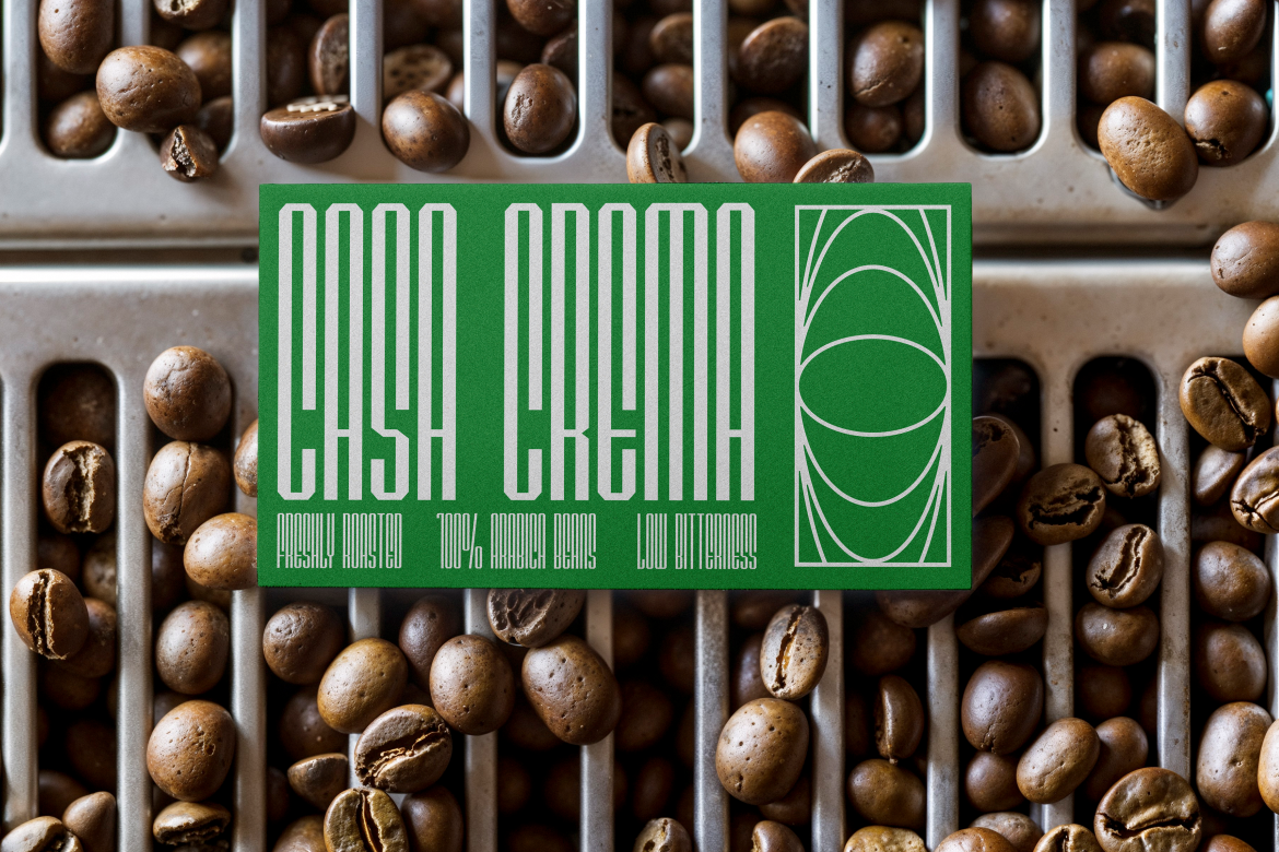
Duotone designs pair well with refined fonts like Compacture or Country Foody, both available at Putracetol.com, depending on whether you want a retro, warm, or contemporary look.
Benefits of Using These Techniques
These three photo manipulation methods help designers move beyond basic filters and into more expressive visual territory.
1. Higher Professional Quality
The techniques add sophistication, depth, and artistic intent, qualities that clients and audiences associate with expert design work.
2. Stronger Visual Identity
Whether you’re working on branding, posters, banners, or digital ads, unique effects like duotone or double exposure give your design a signature look.
3. Increased Creativity
Manipulation is a space for experimentation. Designers can combine textures, colors, images, and typography freely to discover new creative directions.
4. Better Engagement
Eye-catching visuals are more likely to stand out on social feeds, thumbnails, and digital platforms. Techniques like dispersion naturally draw the viewer’s eye.
Practical Tips for Beginners
If you’re new to photo manipulation, here are a few techniques to ensure your results are clean and professional:
- Use high-resolution images to avoid pixelation.
- Plan your composition before applying effects.
- Pair effects with complementary fonts, such as those from Putracetol.com.
- Adjust colors carefully to maintain balance.
- Don’t overdo the effects, subtlety often looks more refined.
- Maintain consistency across a design series or brand campaign.
Conclusion
Photo manipulation is a powerful way to elevate your design work, and you don’t need advanced skills to get started. Techniques like double exposure, dispersion, and duotone offer dramatic enhancements that add depth, motion, and emotion to your visuals. With practice, these methods can help you produce professional, memorable designs that stand out in today’s crowded digital space.
For more inspiration, creative tips, and font collections that pair perfectly with manipulated artwork, visit Putracetol.com.
Thank you for taking the time to read this article. If you are looking for more great articles, feel free to visit Putracetol Blog
Additionally, if you want to explore some free typography options, you can check out Putracetol Studio on Dafont. Happy reading and designing!