
PayPal Brand Identity Redesign 2026: How a Subtle Refresh Builds Digital Trust
PayPal is a useful reminder that a major brand does not always need a completely unfamiliar logo to feel new.
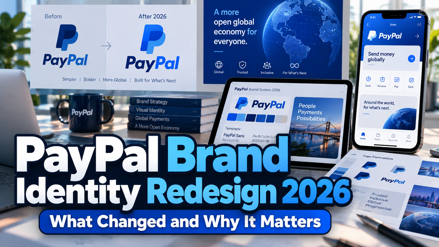
One important clarification comes first. The visual identity now associated with the PayPal brand identity redesign 2026 was originally introduced in 2024, rather than being an entirely new identity launched in 2026. PayPal said it introduced a bold new visual look in September 2024. What makes the subject relevant in 2026 is the continued rollout of that system across products, including a redesigned PayPal Business app experience that began rolling out in June 2026. PayPal Newsroom
For designers and brand strategists, the result is an interesting case study in evolutionary rebranding: preserving recognition while simplifying how a global financial brand communicates across screens, advertising, cards, and product interfaces.
Initial Suggestion: Refresh What Users Recognize Before Replacing It
Fintech branding depends heavily on familiarity and confidence. Customers interact with payment brands while transferring money, making purchases, resolving disputes, and viewing financial information. Radical visual change can create unnecessary friction when users already associate established elements with a trusted service.
PayPal’s approach demonstrates a different strategy. Pentagram retained the recognizable double-P monogram while redrawing it with sharper forms and recalibrated colors. The symbol and wordmark were also separated rather than permanently locked together, giving the identity greater flexibility across different formats. Pentagram
For startups and established businesses alike, this is a useful principle: determine which assets carry real brand equity before redesigning everything.
Typography Became a More Important Brand Asset
One of the strongest elements of the PayPal refresh is typography.
Pentagram developed PayPal Pro, a bespoke brand typeface based on Lineto’s LL Supreme, itself a contemporary interpretation of Futura. The new wordmark uses this custom typography to communicate clarity, confidence, and simplicity. Pentagram also described work on PayPal Pro Text, a companion typeface intended to perform more effectively at smaller sizes. Pentagram
That distinction matters for modern digital identity systems.
A logo font and an interface font do not always have the same job. A wordmark needs recognizability and personality, while payment screens, transaction information, navigation, and small labels require efficiency and legibility.
This is a useful lesson for other businesses developing their visual identity. Typography should function as a system, not simply as decorative lettering attached to a logo.
Independent type resources such as PutraCetol Studio can similarly help brands explore typography for logos, campaigns, websites, packaging, and digital products while creating a visual voice that does not depend entirely on generic system fonts.
A Simpler Color Strategy Makes the Brand More Flexible
Blue remains closely associated with PayPal, but the refreshed system does not depend on covering every surface in blue.
Pentagram introduced a more neutral black-and-white foundation, allowing blue to function as an accent and source of visual energy. The double-P symbol retains layered blues, while the redesigned monogram uses calibrated contrast to create greater dimensional separation. Pentagram
This creates an important branding advantage.
A restrained core palette can coexist more easily with photography, merchant brands, advertising campaigns, and partner environments. For a global payment company that frequently appears beside thousands of other brands, flexibility is particularly valuable.
The lesson for design teams is that brand recognition does not require every asset to use the maximum amount of the signature color. Strategic restraint can sometimes make distinctive colors more memorable.
Motion Extends the Identity Beyond Static Graphics
Digital brands are experienced through movement as much as through printed graphics.
PayPal’s visual system includes a motion language inspired by familiar payment actions such as tapping, flipping, and swiping. These behaviors translate everyday digital-payment interactions into branded animation. Pentagram
This is particularly relevant for UX/UI teams.
A consistent identity in 2026 can include transitions, loading states, promotional videos, card interactions, social content, and interface feedback. Motion becomes another recognizable brand characteristic alongside typography, logo, and color.
The important point is not to animate everything. Motion should reinforce the way the product behaves.
The 2026 Business App Shows Branding Moving Into UX
PayPal’s 2026 Business app update illustrates how brand refinement can continue at the product level.
Beginning in June 2026, PayPal started rolling out a redesigned Business account experience on iOS and Android. The interface organizes activity around four main areas: Home, Pay, Get Paid, and Me. PayPal says the redesign reduces steps for common tasks and provides a clearer overview of business activity, while leaving account information, transactions, fees, and core functionality unchanged. PayPal
This highlights an important distinction between visual branding and product experience.
A modern logo can signal change, but trust is reinforced when navigation becomes clearer and frequent tasks become easier. For fintech companies in particular, visual refinement and usability should support one another.
Comparison: How PayPal’s Identity Has Evolved
| Area | Earlier Direction | Current Direction |
|---|---|---|
| Wordmark | More strongly associated with blue branding | Custom PayPal Pro typography |
| Monogram | Rounded overlapping double P | Sharper, recalibrated double P |
| Logo system | Symbol and wordmark closely paired | Elements can work independently |
| Color | Blue-dominant identity | Neutral base with blue accents |
| Typography | Brand lettering as logo element | Broader bespoke type system |
| Motion | Less central to identity | Tap, flip, and swipe-inspired motion |
| Product UX | Existing Business app structure | Simplified four-area navigation in 2026 |
The overall shift is not from one recognizable PayPal to something completely different. It is from a more conventional fintech identity toward a cleaner and more adaptable visual system.
Common Mistakes When Studying the PayPal Redesign
A common mistake is describing PayPal’s current visual identity as a completely new 2026 rebrand. The major visual refresh was introduced in 2024, while 2026 brought further product-level implementation, including the Business app redesign. Keeping that timeline clear matters when using PayPal as a branding case study. PayPal Newsroom
Another mistake is reducing the project to a logo comparison. The more useful lesson is how typography, color, motion, advertising, physical payment products, and application interfaces work together. A corporate identity becomes stronger when users repeatedly encounter related visual decisions across different touchpoints.
Finally, businesses should not copy PayPal’s minimalism simply because it belongs to a successful fintech company. A black wordmark, geometric typeface, and restrained palette only work when they support the organization’s own strategy. Strong branding requires differentiation, appropriate typography, clear licensing, and a system designed for the actual audience.
Conclusion
The PayPal brand identity redesign 2026 is best understood as the ongoing evolution of the visual system introduced in 2024 and increasingly expressed through PayPal’s products in 2026.
Its strongest lesson is restraint. The recognizable monogram remains, typography becomes more systematic, color becomes more flexible, motion reflects product behavior, and the updated Business app focuses on clearer navigation.
For agencies, fintech startups, and brand teams, PayPal demonstrates that modernization does not always require abandoning familiar assets. Sometimes the more effective approach is to refine what users already recognize and build a stronger system around it.
Brands developing their own visual language can also explore original commercial typography at PutraCetol Studio for logos, digital products, advertising, packaging, and broader identity systems.
Explore these fonts and many more at PutraCetol.com to build a business identity that looks professional, trustworthy, and memorable.
Additionally, if you want to explore some free typography options, you can check out Putracetol Studio on Dafont. Happy reading and designing!