
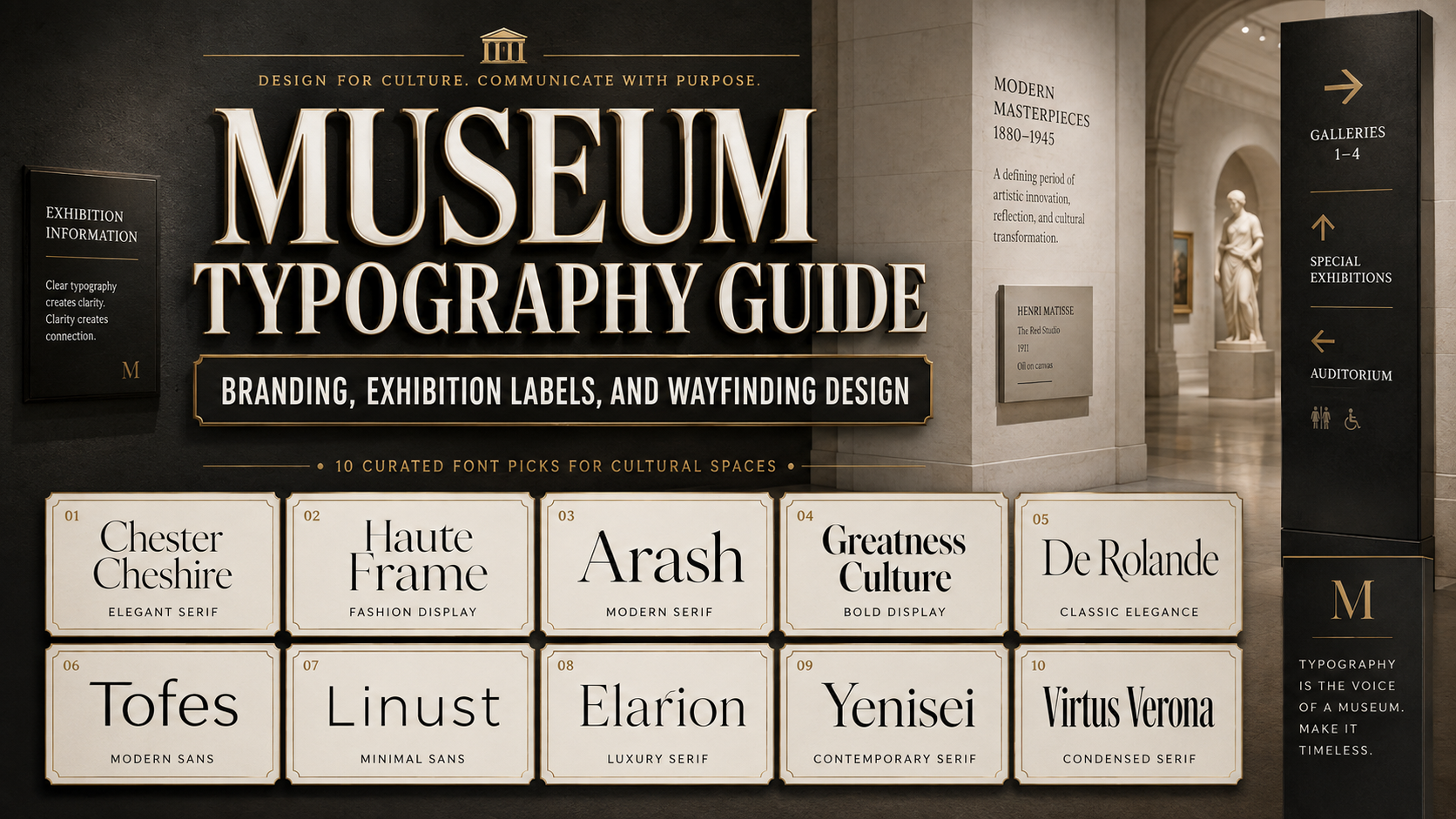
Typography in museums works at several levels at once. It gives the institution a recognizable voice, helps visitors navigate complex buildings, organizes exhibition narratives, presents research, and connects physical galleries with websites, apps, publications, and social media.
A museum typeface must therefore do more than look cultured or historical. It must remain legible across wall labels, gallery entrances, directional signs, printed catalogs, mobile screens, ticketing systems, and promotional campaigns. The typography also needs enough personality to represent the institution without competing with the objects on display.
The corporate typeface developed for the State Hermitage Museum offers a useful example. The design team researched the museum’s typographic history, studied its logo, tested existing typefaces as customization foundations, and then developed a coordinated serif and sans-serif system. The final family includes Hermitage Celestial, a recognizable display serif, and Hermitage Grotesque, a functional interface sans-serif. Both subfamilies contain six styles and were designed to support the museum’s digital communication while connecting modern use with historical references.
This case shows why typography in museums should be treated as institutional infrastructure rather than surface decoration. A successful system needs historical sensitivity, functional range, accessibility, multilingual support, and enough flexibility to represent exhibitions from very different periods.
The ten fonts below are not presented as replacements for a complete custom museum family. They are strong starting points for museum identities, temporary exhibitions, cultural campaigns, catalogs, invitations, shop products, and digital content. For body copy and wayfinding, expressive display fonts should normally be paired with a quieter, highly legible supporting typeface.
Initial Suggestion
Define the Museum’s Typographic Ecosystem
Before choosing a font, divide the institution’s communication into distinct roles.
Institutional Identity
This includes the museum logo, official documents, membership materials, donor communications, and permanent brand assets. The typeface should feel recognizable without being tied too narrowly to one exhibition or historical period.
Exhibition Identity
Temporary exhibitions can have more expressive typography. A Renaissance exhibition, contemporary photography show, fashion archive, and science installation may each require a different emotional tone. The exhibition font should support the curatorial concept while remaining connected to the wider museum identity.
Interpretation and Label Text
Object labels, wall panels, timelines, and educational content prioritize sustained reading. Decorative scripts and dramatic display serifs may work for titles, but essential information requires consistent spacing, clear letterforms, and comfortable line lengths.
Wayfinding and Signage
Directional typography must be understood quickly, often from a distance and under changing light conditions. It should remain clear at gallery thresholds, staircases, elevators, entrance halls, and major decision points. Wayfinding is most effective when typography, color, icons, placement, and digital guidance work as one coordinated system.
Digital Communication
Museum typography must also perform in responsive websites, ticketing interfaces, collection databases, apps, newsletters, and social media. A font that looks impressive on a six-meter wall may become difficult to read on a mobile screen.
Study the Institution Before Designing the Typeface
The Hermitage project demonstrates a valuable process. Instead of applying a historical-looking font to suggest cultural authority, the designers studied previous museum type choices, analyzed the existing logo, and identified recognizable details that could be translated into a broader family. They did not simply copy the logo’s shapes. They built a visual relationship through rhythm, proportions, punctuation, selected Cyrillic forms, italics, and stylistic alternatives.
A similar process can begin with:
- Museum architecture
- Archive materials
- Historic tickets and catalogs
- Collection labels
- Institutional seals
- Local scripts and languages
- Founding-era publications
- The visual character of the permanent collection
The objective is not to imitate one historical period. It is to identify enduring visual ideas that can function in a contemporary system.
Build a Paired Typeface System
One expressive font rarely solves every museum communication problem. A stronger system usually combines:
- A distinctive serif or display face for institutional identity and exhibition titles
- A functional sans-serif for labels, interfaces, schedules, and navigation
- Italics or scripts for quotes, archival references, and controlled accents
- Numerical and tabular styles for dates, measurements, prices, and timelines
The Hermitage family uses this logic. Its display serif carries historical personality, while the grotesque supports interfaces and small text. Similar proportions allow the two families to feel related despite their different functions.
Establish Accessibility Standards
Museum typography must serve visitors with different visual, cognitive, linguistic, and reading needs. As a practical benchmark, the Smithsonian accessibility guidelines recommend simple serif or sans-serif forms, clear character differentiation, type size based on viewing distance, consistent spacing, left alignment, sufficient leading, and high contrast between text and background. They also recommend keeping exhibition text to approximately 45 to 55 characters per line where possible.
Apply these principles by:
- Testing labels at their actual mounting height
- Checking text from standing and seated positions
- Avoiding thin type on illuminated or textured backgrounds
- Using matte surfaces to reduce glare
- Increasing size when a typeface has a low x-height
- Providing large-print, audio, tactile, or digital alternatives
- Separating expressive titles from essential information
Test Multilingual and Multi-Script Content
Museums often serve international audiences. Confirm the required language coverage before approving a typeface. Test diacritics, punctuation, dates, currencies, special symbols, and non-Latin scripts in real layouts.
A visual identity may require Latin, Cyrillic, Greek, Arabic, Chinese, Japanese, or other scripts. Consistency does not require every script to look identical. It requires compatible proportions, hierarchy, color, rhythm, and tone.
Jump to Recommended Fonts
1. Chester Chesire Elegant Font Duo

Chester Chesire combines an elegant serif with a flowing script, giving museum designers two complementary voices within one package. The serif can support exhibition headings, publication covers, and refined cultural branding, while the script can introduce a personal or archival tone in invitations, quotations, donor events, and campaign graphics. Its alternative characters provide additional flexibility for distinctive titles and wordmarks.
Pros
- Coordinated serif and script styles
- Elegant balance of classical and modern qualities
- Alternative characters for customized display text
- Useful for both printed and digital campaigns
Best For
- Decorative arts exhibitions
- Fashion and costume collections
- Wedding, romance, or social-history exhibitions
- Museum gala invitations
- Membership campaigns
- Premium museum shop packaging
2. Haute Frame Fashion Font
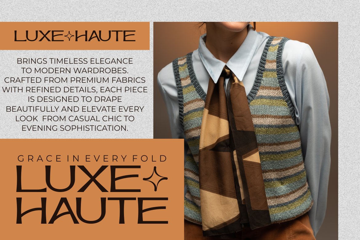
Haute Frame uses tall proportions, refined geometric construction, soft curves, and generous internal space to create an editorial appearance. It offers enough character for major exhibition titles without becoming visually chaotic. Its fashion-led personality is especially effective for museums dealing with clothing, photography, jewelry, design, cosmetics, or modern lifestyle culture.
Pros
- Tall, elegant proportions
- Strong fashion and editorial character
- Clear visual rhythm at large sizes
- Contemporary without feeling generic
Best For
- Fashion retrospectives
- Photography exhibitions
- Jewelry and decorative arts displays
- Magazine-style museum publications
- Exhibition posters
- Digital campaign headlines
3. Arash Modern Serif Font
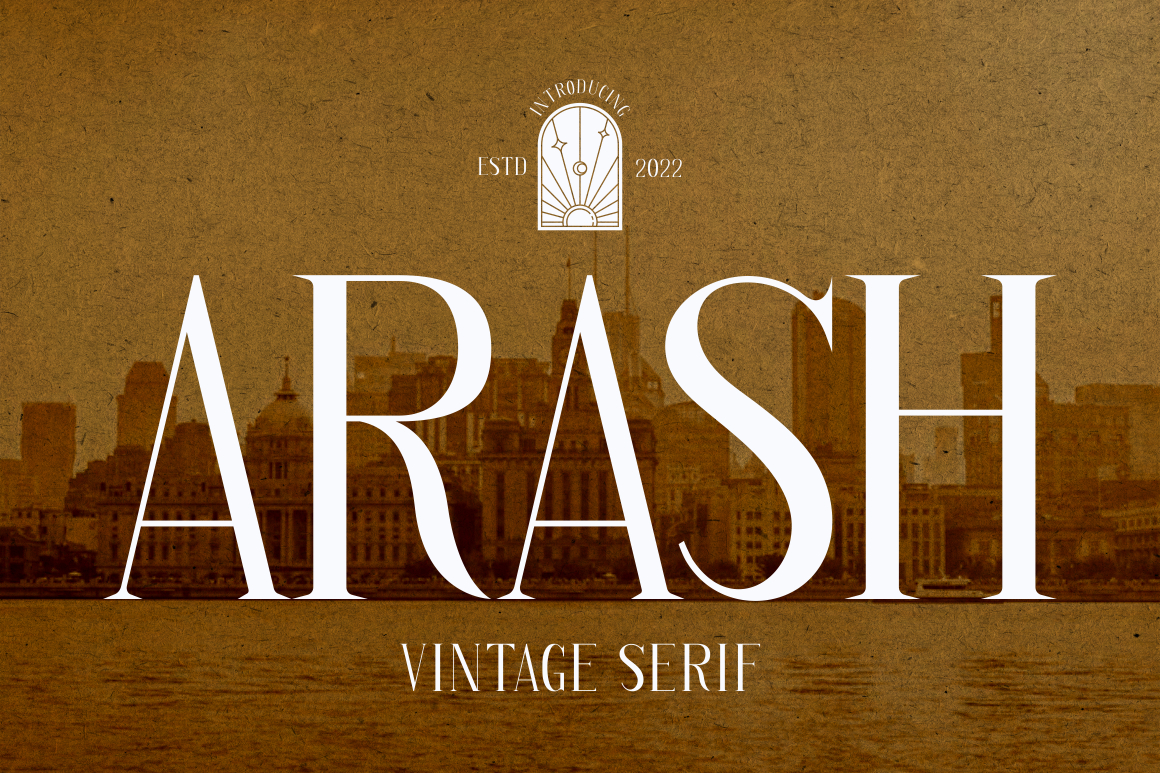
Arash is a modern serif with a polished balance between readability and visual sophistication. Its contemporary structure makes it suitable for museums that want cultural authority without relying on an overly historic or ornamental style. It can support permanent identity elements, exhibition headings, editorial covers, and institutional presentations while remaining approachable.
Pros
- Refined modern-serif appearance
- Balanced elegance and clarity
- Flexible across cultural disciplines
- Suitable for formal and contemporary contexts
Best For
- Museum identity development
- Art-history exhibitions
- Annual reports
- Exhibition catalogs
- Cultural foundation branding
- Lecture and research programs
4. Greatness Culture Stylish Duo Font
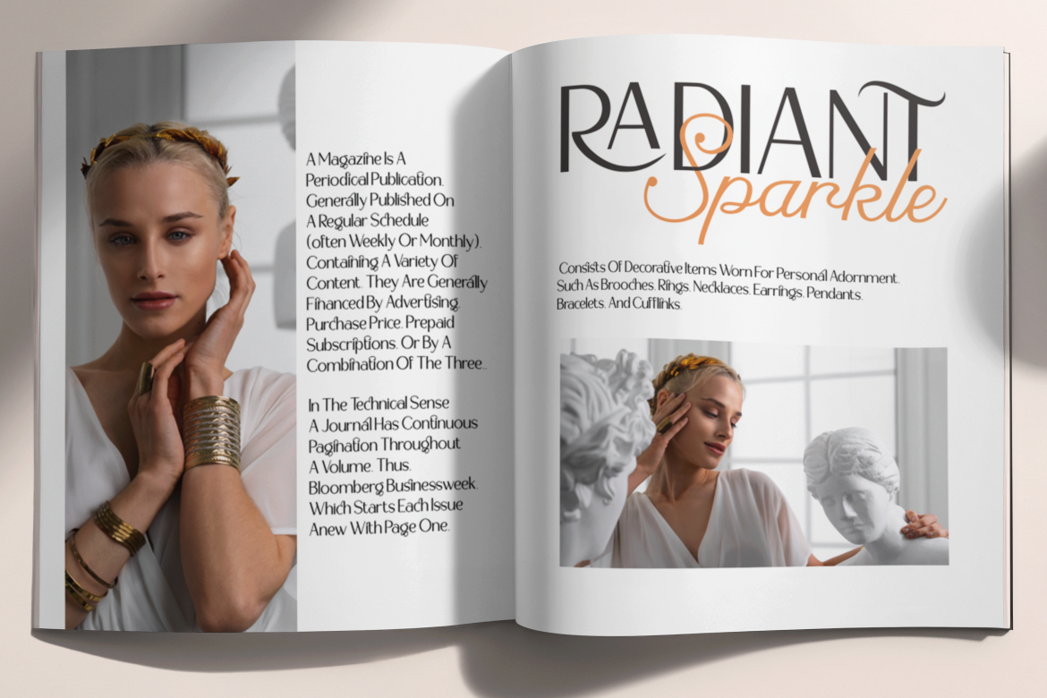
Greatness Culture pairs a sleek sans-serif with a flowing script. This gives cultural institutions a ready-made contrast between functional modernity and expressive personality. The sans-serif can organize headings and campaign information, while the script can highlight names, quotations, themes, or emotional details without taking over the entire layout.
Pros
- Script and sans-serif pairing
- Built-in contrast for visual hierarchy
- Contemporary and expressive
- Flexible for campaign-led museum communication
Best For
- Cultural festivals
- Museum education programs
- Public events
- Exhibition launch campaigns
- Social media graphics
- Museum café and shop branding
5. De Rolande Luxury Elegant Display Typeface

De Rolande is an elegant display font with fine curves, alternate glyphs, and a sophisticated visual tone. Its personality makes it more suitable for exhibition identity and promotional design than extended label copy. When used selectively, it can give historical, decorative, or luxury-focused exhibitions a distinctive voice without requiring an entirely custom wordmark.
Pros
- Classy display construction
- Alternative glyphs for visual variation
- Strong luxury and heritage associations
- Effective in large-format typography
Best For
- Renaissance and court-culture exhibitions
- Luxury decorative arts
- Historical fashion collections
- Museum invitations
- Collector programs
- Premium merchandise
6. Tofes Modern Serif Font

Tofes combines clean modern lines with an elegant serif structure. Its OpenType alternates and ligatures allow designers to refine exhibition titles and institutional wordmarks, while multilingual support makes it a practical option for museums serving international audiences. It offers a calmer and more adaptable character than highly decorative display fonts.
Pros
- Modern and elegant serif design
- OpenType alternates and ligatures
- Multilingual support
- Suitable for coherent identity systems
Best For
- Permanent museum branding
- Multilingual exhibitions
- Academic publications
- Exhibition catalogs
- Cultural conference materials
- Premium signage headlines
7. Linust Display Modern Font
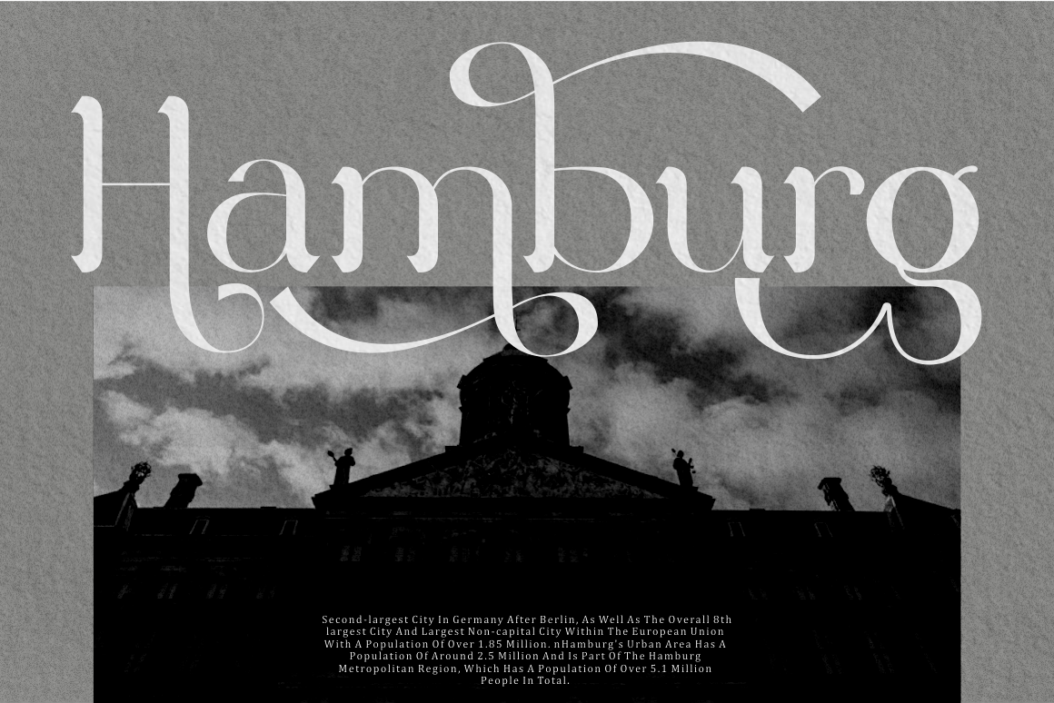
Linust is a modern display font with a wide range of alternative characters. Its clean structure works well for contemporary institutions, while the alternates provide enough distinction for exhibition identities and custom-looking titles. The font is particularly effective when architecture, graphic design, industrial objects, or digital culture form part of the curatorial concept.
Pros
- Clean contemporary appearance
- Multiple alternative characters
- Flexible logo and title customization
- Strong performance in large layouts
Best For
- Contemporary art museums
- Architecture exhibitions
- Design biennials
- Digital installations
- Technology collections
- Website hero sections
8. Elarion Elegant Serif Font

Elarion features tall letterforms, refined contrast, graceful curves, soft terminals, and balanced spacing. Its uppercase forms can create confident exhibition titles, while its lowercase characters offer a quieter editorial voice. This makes it suitable for museums seeking restrained elegance rather than decorative excess.
Pros
- Tall, refined serif construction
- Strong uppercase and lowercase relationship
- Clear spacing in display layouts
- Sophisticated but controlled personality
Best For
- Fine art museums
- Classical painting exhibitions
- Literature and manuscript displays
- Editorial publications
- Cultural institution branding
- Premium exhibition campaigns
9. Yenisei Modern Serif Font

Yenisei combines luxury-serif influences with contemporary lettering. Its OpenType features include numerous alternates, ligatures, and end swashes, allowing designers to create expressive titles with a custom appearance. Because those decorative features are visually strong, the font is most effective for exhibition names, campaign graphics, and publication covers rather than dense interpretive text.
Pros
- Rich collection of alternates
- Ligatures and end swashes
- Strong artistic personality
- High-impact display performance
Best For
- Decorative lettering exhibitions
- Fashion and textile collections
- Poster campaigns
- Book and manuscript exhibitions
- Museum shop products
- Social media announcements
10. Virtus Verona Duo Font
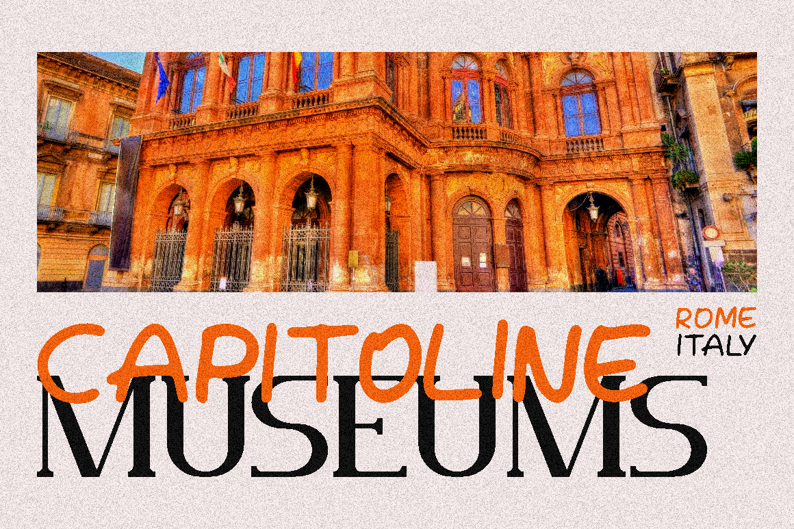
Virtus Verona combines a flowing handwritten script with a clean sans-serif. Its concept references Verona and connects classic elegance with a modern visual tone. The script can support emotional or historical storytelling, while the sans-serif provides a clearer structure for secondary information, making the duo useful for cultural programs that need both atmosphere and functional contrast.
Pros
- Coordinated script and sans-serif
- Classic elegance with modern support
- Effective contrast within one family
- Suitable for romantic and architectural storytelling
Best For
- Architecture and city-history exhibitions
- Romantic art and literature programs
- Italian cultural exhibitions
- Museum weddings and private events
- Tourism partnerships
- Branded museum merchandise
Comparison
| Font | Main Style | Strongest Museum Role | Visual Tone | Important Consideration |
|---|---|---|---|---|
| Chester Chesire | Serif and script duo | Campaign and event identity | Romantic and refined | Keep script away from essential label text |
| Haute Frame | Fashion display | Exhibition titles | Editorial and contemporary | Thin details need testing at small sizes |
| Arash | Modern serif | Institutional and editorial identity | Cultured and versatile | Pair with a functional sans-serif |
| Greatness Culture | Sans and script duo | Public programs and campaigns | Modern and expressive | Define clear roles for both styles |
| De Rolande | Elegant display | Heritage exhibition identity | Luxurious and formal | Best at large sizes |
| Tofes | Modern serif | Permanent branding and publications | Professional and elegant | Verify full language coverage required |
| Linust | Modern display | Contemporary exhibition identity | Clean and experimental | Use alternatives consistently |
| Elarion | Elegant serif | Fine-art and editorial branding | Restrained and premium | Increase size where contrast becomes delicate |
| Yenisei | Decorative modern serif | Posters and exhibition titles | Artistic and expressive | Swashes should remain selective |
| Virtus Verona | Script and sans duo | Cultural storytelling and events | Romantic and approachable | Use the sans-serif for functional information |
Best for a Permanent Museum Identity
If you want Best for Contemporary Exhibitions
Or you want Best for Historical or Decorative Arts Exhibitions
And there are Best Coordinated Font Duos
Or there are Best for Exhibition Posters and Digital Campaigns
Common Mistake
One of the most common mistakes in typography in museums is expecting one expressive typeface to handle every institutional task. A decorative serif may look excellent on an exhibition poster but fail on a small object label. A script may create an emotional invitation but become unsuitable for directions, accessibility information, or emergency signage. Museums need a hierarchy of roles, with display typography carrying identity and simpler text fonts handling reading, navigation, schedules, and interfaces.
Another mistake is treating historical appearance as a substitute for institutional research. Adding ornamental serifs or calligraphic flourishes does not automatically create cultural depth. The Hermitage project succeeded because the designers studied the museum’s archives, logo, previous typography, language requirements, and functional needs before customizing forms. Historical references were translated into rhythm and selected details rather than copied literally.
A third mistake is approving typography only on a desktop mockup. Museum text must be tested at real viewing distances, under gallery lighting, on physical surfaces, around crowds, and across different languages and devices. Excessive line length, low contrast, light weights, narrow spacing, glare, and decorative backgrounds can all reduce accessibility. The font license must also permit the intended uses, including signage, publications, apps, web embedding, merchandise, and any planned customization.
Conclusion
Typography in museums connects cultural memory with contemporary communication. It helps an institution express who it is, guides visitors through physical space, gives exhibitions a distinctive voice, and keeps digital content connected to the museum’s wider identity.
The Hermitage Type Family demonstrates the value of a complete approach. Its designers combined historical research, logo analysis, custom letterform development, functional sans-serif typography, display serif character, italics, stylistic sets, and coordinated proportions. The result was not simply a decorative museum font, but a working system capable of supporting different eras, subjects, formats, and digital experiences.
The PutraCetol fonts in this guide offer useful starting points for similar creative decisions. Arash, Tofes, and Elarion can support refined institutional identities. Linust and Haute Frame bring contemporary editorial energy. Chester Chesire, Greatness Culture, and Virtus Verona provide coordinated contrasts. De Rolande and Yenisei can give special exhibitions a stronger historical or artistic tone.
The best museum typography does not dominate the collection. It creates structure, atmosphere, and recognition while allowing visitors to focus on the objects, ideas, and stories they came to experience.
Explore these fonts at PutraCetol.com as foundations for exhibition identities, cultural publications, museum campaigns, branded merchandise, and digital communication. For permanent systems, pair expressive display typography with a highly legible text and wayfinding family, then test the complete system in the environment where visitors will actually use it.
Explore these fonts and many more at PutraCetol.com to build a business identity that looks professional, trustworthy, and memorable.
Additionally, if you want to explore some free typography options, you can check out Putracetol Studio on Dafont. Happy reading and designing!