
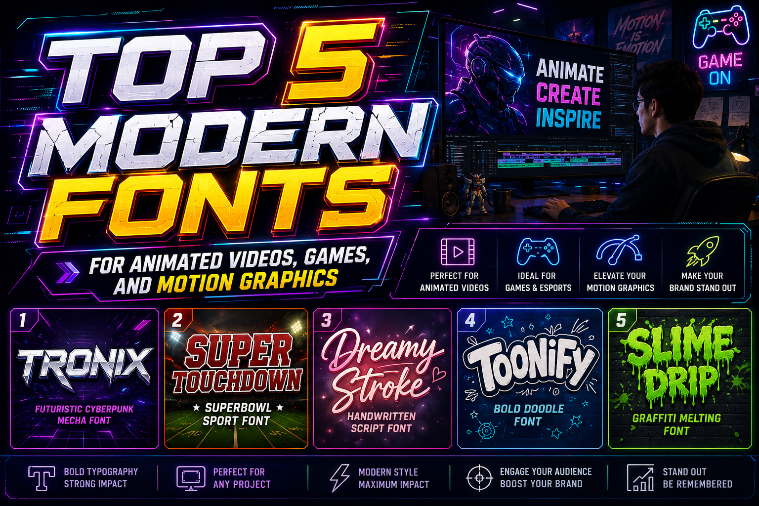
5 Best Modern Fonts for Animation Projects
Typography in animation is no longer just supporting text on a screen. Today, fonts are part of the storytelling process itself. In motion graphics, animated videos, gaming intros, film titles, and digital advertising, typography helps create emotion, rhythm, and visual identity.
The right font can make animated content feel energetic, futuristic, playful, dramatic, or cinematic. On the other hand, poor typography can weaken visual consistency and reduce audience engagement.
This is why choosing the right modern fonts for animation projects is extremely important. Fonts used in animation must remain readable during movement while still delivering strong visual personality.
In this article, we’ll explore five modern fonts ideal for animation projects and how typography helps strengthen visual storytelling across film, gaming, advertising, and digital media.
Why Typography Matters in Animation
Animation typography behaves differently from static typography. In motion design, text becomes part of the visual experience.
Typography in animation helps:
- Reinforce storytelling
- Guide audience attention
- Create emotional tone
- Improve readability in motion
- Strengthen visual identity
Animated typography is often used in:
- Film titles
- Gaming interfaces
- Motion graphics
- Advertisements
- Educational videos
- Social media content
The font itself becomes part of the motion language.
Characteristics of Good Animation Fonts
Not every font works well in animation. Typography used in motion graphics should have specific characteristics.
1. Readability in Motion
Animation often includes:
- Movement
- Scaling
- Rotation
- Transitions
Fonts must remain clear even while moving quickly.
2. Strong Visual Personality
Animation relies heavily on mood and emotion.
Typography should support:
- Fun and playful energy
- Futuristic aesthetics
- Cinematic atmosphere
- Dynamic movement
3. Flexibility Across Styles
Modern animation projects appear across:
- Games
- Films
- Social media
- Educational platforms
- Advertising campaigns
Typography needs enough versatility to adapt across different formats.
1. Slime Drip – Playful and Creative

Slime Drip is an expressive display font with dripping letterforms that create playful and energetic visuals.
Why It Works for Animation
The organic dripping shapes naturally support motion effects such as:
- Liquid animation
- Stretch transitions
- Cartoon movement
- Fun bounce effects
Its exaggerated forms create strong visual personality even in fast-moving scenes.
Best For
- Cartoon intros
- Creative advertisements
- Kids animation
- Fun social media content
Animation Tip
Pair Slime Drip with:
- Bright color palettes
- Gooey motion effects
- Rounded graphic elements
This creates highly engaging animated visuals.
2. Toonify Bold – Cheerful and Rounded

Toonify Bold features rounded edges and friendly proportions designed for approachable and playful branding.
Why It Works for Animation
Rounded typography often feels more alive and animated naturally. Toonify Bold works exceptionally well with:
- Character animation
- Bounce effects
- Friendly motion graphics
Its readability also remains strong during fast transitions.
Best For
- Packaging animation
- Family-friendly branding
- Product explainer videos
- Cartoon titles
Visual Strength
Its cheerful structure creates warmth while maintaining strong visibility.
3. Dreamy Stroke – Organic and Expressive
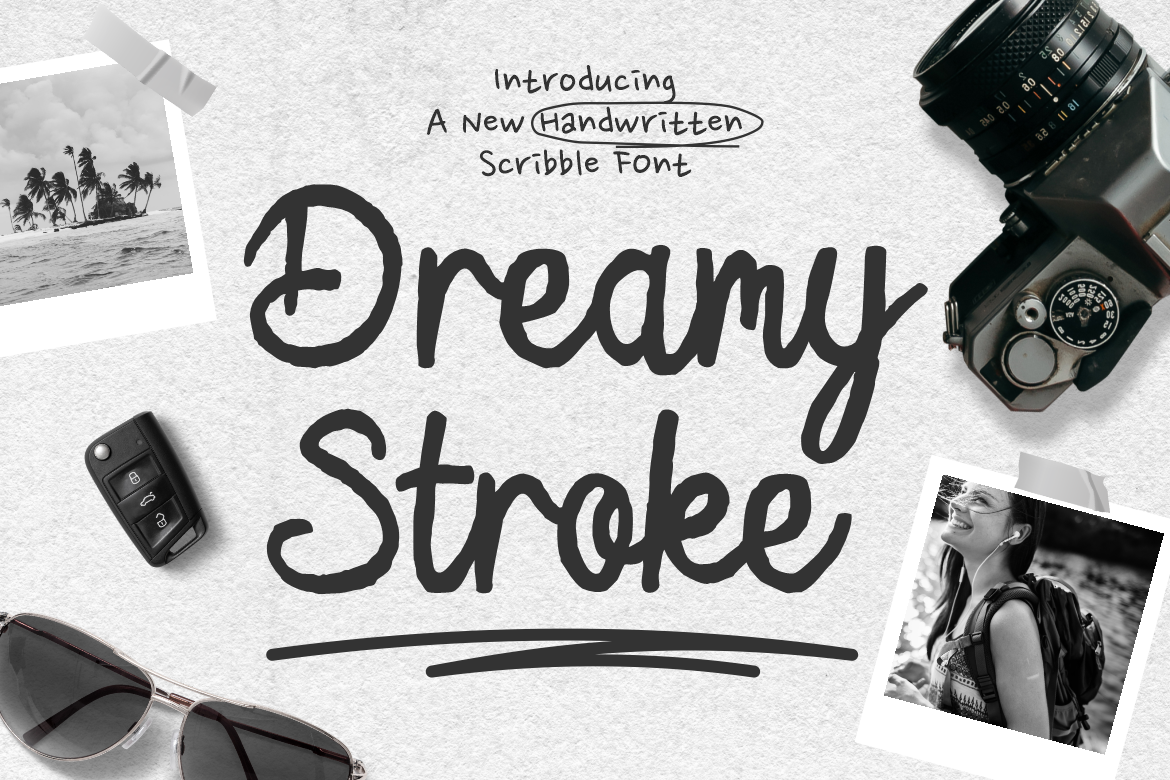
Dreamy Stroke is a handbrush-style font with flowing strokes and artistic texture.
Why It Works for Animation
Organic brush typography introduces:
- Emotional movement
- Human expression
- Artistic energy
It creates a more handcrafted and cinematic feel compared to rigid geometric fonts.
Best For
- Artistic film titles
- Creative motion graphics
- Music videos
- Emotional storytelling content
Motion Possibilities
Dreamy Stroke works beautifully with:
- Ink animations
- Brush reveals
- Organic transitions
- Handwritten effects
4. Super Touchdown – Dynamic Sports Typography

Super Touchdown is a sporty sans-serif font designed for high-energy visuals.
Why It Works for Animation
Its bold and athletic structure supports:
- Fast motion graphics
- Competitive visuals
- Dynamic transitions
- Action-oriented storytelling
The font remains readable even during aggressive animation sequences.
Best For
- Sports intros
- Gaming content
- Action trailers
- Event promotions
Visual Energy
The strong sans-serif structure creates momentum and movement naturally.
5. Tronix Futuristic – Modern and Technological
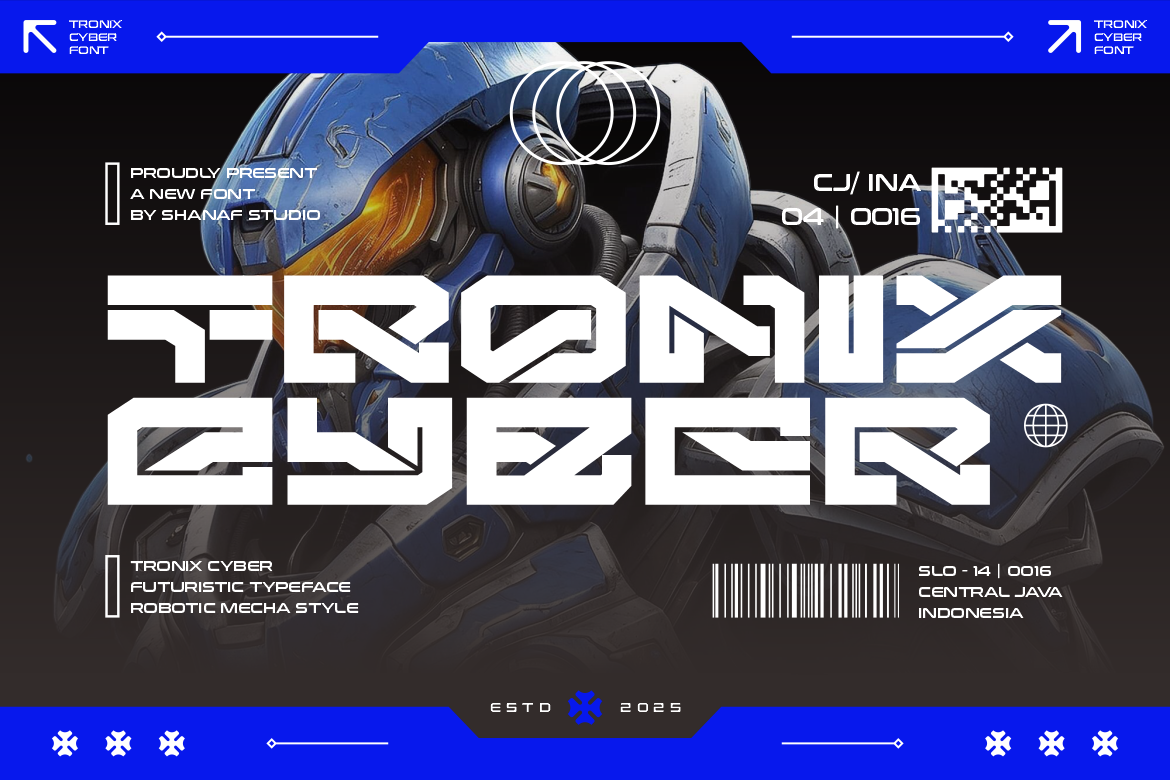
Tronix Futuristic is a geometric futuristic font with sharp cut-out details and modern balance.
Why It Works for Animation
Futuristic typography is highly effective in:
- Sci-fi visuals
- Gaming intros
- Technology branding
- Digital interfaces
Tronix works especially well with:
- Neon lighting
- Glitch effects
- Digital transitions
- Cyberpunk aesthetics
Best For
- Game titles
- Tech animations
- Sci-fi trailers
- Futuristic branding
Motion Design Strength
Its geometric construction creates clean movement and strong digital presence.
Quick Summary Table
| Font | Characteristics | Best Use |
|---|---|---|
| Slime Drip | Playful, dripping | Cartoon animation |
| Toonify Bold | Rounded, cheerful | Branding animation |
| Dreamy Stroke | Organic, expressive | Artistic motion graphics |
| Super Touchdown | Sporty, energetic | Action & sports |
| Tronix Futuristic | Futuristic, geometric | Gaming & tech |
How Typography Enhances Visual Storytelling
Typography is not just text. In animation, it becomes part of narrative pacing and emotional communication.
Different typography styles create different emotional effects:
- Rounded fonts → Friendly and playful
- Brush fonts → Emotional and artistic
- Futuristic fonts → Technological and modern
- Bold sports fonts → Energetic and intense
Choosing the right font helps audiences emotionally connect with the content.
Typography and Motion Design Trends
Modern animation increasingly combines:
- Kinetic typography
- 3D text effects
- Dynamic scaling
- Interactive transitions
This makes typography even more important in visual storytelling systems.
Best Practices for Animation Typography
Keep Readability a Priority
Even highly creative fonts should remain readable during movement.
Match Typography to Theme
Typography should align with:
- Genre
- Audience
- Brand personality
- Motion style
Avoid Overcomplicated Effects
Too many animation effects can reduce clarity and visual balance.
Combine Fonts Strategically
Pair expressive display fonts with cleaner supporting typography for better hierarchy.
Why Modern Animation Needs Strong Typography
Audiences today consume massive amounts of digital content. Strong typography helps animated projects:
- Capture attention quickly
- Improve recognition
- Create emotional impact
- Strengthen visual consistency
This is especially important for:
- Social media videos
- Streaming content
- Gaming visuals
- Digital advertisements
The Future of Typography in Animation
Typography is becoming increasingly integrated with:
- Interactive motion systems
- AI-assisted animation
- Responsive digital experiences
- Real-time visual effects
As technology evolves, typography will continue becoming a more dynamic storytelling tool.
Final Thoughts
Choosing the right modern fonts for animation projects is essential for creating visually engaging and emotionally effective content. Fonts like Slime Drip, Toonify Bold, Dreamy Stroke, Super Touchdown, and Tronix Futuristic demonstrate how typography can strengthen animation through personality, readability, and motion compatibility.
Whether designing for film, gaming, advertising, or social media, typography should never be treated as an afterthought. It is part of the visual storytelling system itself.
The key is selecting fonts that support both movement and message while remaining clear, expressive, and aligned with the overall creative direction.
For more inspiration, creative resources, and practical design tips, visit Putracetol.com and explore creative resources that can elevate your next web project. Thank you for taking the time to read this article. If you are looking for more great articles, feel free to visit Putracetol Blog.
Additionally, if you want to explore some free typography options, you can check out Putracetol Studio on Dafont. Happy reading and designing!