
A modern sans-serif font is expected to do far more than make text look clean. Professional typography must support a brand across logos, packaging, websites, presentations, editorial layouts, social media, and digital products without losing consistency. Current type design is increasingly focused on finding the right balance between functional performance and emotional character, especially as brands appear across a growing number of physical and digital touchpoints.
This demand has expanded the definition of modern sans-serif typography. Neutrality is still valuable, but a completely anonymous typeface may struggle to create recognition. The strongest contemporary fonts combine readable structures with subtle personality, giving brands enough flexibility for everyday communication while still creating distinctive headlines and visual identities.
OpenType technology also makes professional fonts more adaptable. The format can support expanded character sets and advanced typographic options such as ligatures, stylistic alternates, contextual forms, small capitals, swashes, and different numeral styles. These features give designers greater control over how a typeface behaves across branding and publishing applications.
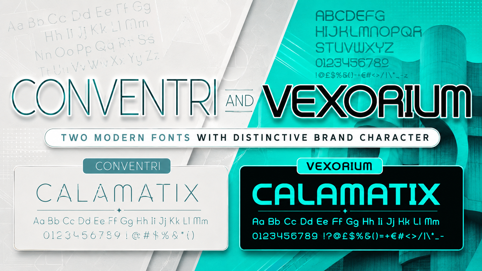
This guide focuses on two different interpretations of modern sans-serif design: Conventri Modern Font and Vexorium Modern Experimental Font. Conventri combines clean construction with playful curves and decorative ligatures, while Vexorium uses architectural geometry and unconventional forms to create a progressive visual identity.
Initial Suggestion
Decide Whether You Need a Workhorse or a Display Font
Before choosing a typeface, define its responsibility within the brand system.
A workhorse font must handle navigation, product information, paragraphs, captions, and long-form content. A display font is designed to create greater impact in logos, headlines, packaging titles, campaign graphics, and presentation covers.
Conventri and Vexorium are strongest as brand-facing display fonts. They can become the recognizable voice of a company, but they should usually be paired with a simpler supporting sans-serif when a project contains long paragraphs, complex dashboards, or dense interface content.
Audit Language and Script Coverage
A multilingual font supports several languages that may use the same writing system. A multi-script font supports entirely different scripts, such as Latin and Cyrillic. Global brands should not assume that a font supports Russian, Ukrainian, Serbian, or Bulgarian simply because it includes accented Latin characters.
When Latin and Cyrillic are required, request a complete glyph specimen or test version before finalizing the brand system. Review uppercase and lowercase forms, punctuation, currency symbols, numerals, diacritics, kerning, and the visual harmony between scripts. The public product information reviewed for Conventri confirms uppercase, lowercase, numerals, punctuation, and OpenType ligatures, but it does not explicitly document Cyrillic coverage. Vexorium’s public listing also focuses on visual characteristics and applications rather than providing a complete language-support matrix.
Use OpenType Features Intentionally
Ligatures and alternate characters can make a wordmark feel more exclusive, but they should reinforce the name rather than make it harder to read. OpenType features work best when used selectively in a logo, editorial title, package name, or campaign headline.
For example, a custom ligature may make a fashion logo memorable, while alternate glyphs can prevent repeated letters from appearing too mechanical. In functional copy, however, default characters are usually more efficient.
Test the Font in Real Applications
Do not approve a typeface based only on a promotional preview. Test it in the exact environments where the brand will appear:
- Website hero sections
- Mobile navigation
- Product packaging
- Business presentations
- Magazine covers
- Social media graphics
- Signage and environmental design
- Multilingual layouts
Multi-script typography requires particular attention to baseline relationships, proportions, diacritic placement, kerning, and rhythm. Testing should include real words and complete sentences rather than isolated alphabet samples.
Jump to Recommended Fonts
1. Conventri Modern Font
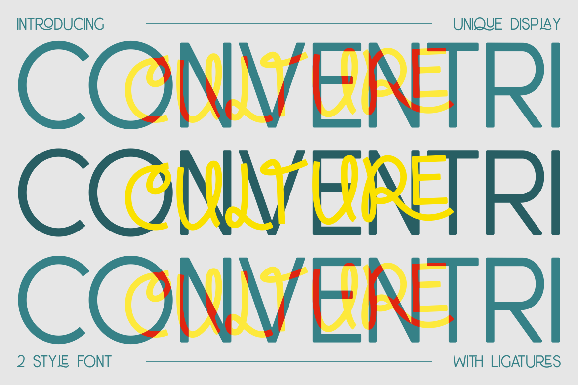
Conventri is a modern display sans-serif that combines clean construction with decorative curves and a playful sense of movement. Curled details are integrated into its letterforms, giving the font a more expressive identity than a conventional geometric sans-serif. It is available in two styles and includes ligatures, making it especially useful for designers who want to create distinctive logos, editorial titles, packaging names, and campaign typography without abandoning clarity.
The package includes OTF and TTF formats, uppercase and lowercase characters, numerals, punctuation, OpenType alternates or ligatures, and PUA-encoded characters. These features give designers greater flexibility when refining individual words or creating a branded wordmark.
Pros
- Two visual styles for greater layout flexibility
- OpenType alternates or ligatures
- Modern structure with decorative personality
- Strong readability at display sizes
- Suitable for both print and digital branding
- PUA-encoded characters for easier glyph access
Best For
- Corporate and lifestyle logos
- Fashion and beauty branding
- Magazine titles
- Book and movie covers
- Premium packaging
- Invitations and event identities
- Brand presentations
- Creative advertising
2. Vexorium Modern Experimental Font

Vexorium takes a more architectural approach to modern sans-serif typography. Its tall proportions, consistent stroke weight, rounded corners, geometric curves, and balanced spacing create a structured foundation, while unconventional details give selected letters a futuristic and experimental identity. This combination makes Vexorium distinctive without turning the entire alphabet into a visual puzzle.
Its most valuable selling point is the balance between discipline and originality. Vexorium feels calculated enough for professional branding but expressive enough to build recognition in technology, architecture, property development, creative services, and digital products. It performs particularly well at larger sizes, where its unusual construction can become a central part of the visual system.
Pros
- Strong architectural construction
- Experimental details without excessive distortion
- Tall, confident proportions
- Carefully balanced spacing
- Distinctive but controlled brand personality
- Strong performance across digital and printed display applications
Best For
- Technology branding
- Architecture and property development
- Creative agencies
- Industrial design companies
- Startup identities
- Editorial headlines
- Product packaging
- Business presentations
- Signage and exhibition graphics
- Future-focused digital campaigns
Comparison
| Feature | Conventri Modern Font | Vexorium Modern Experimental Font |
|---|---|---|
| Primary Style | Decorative modern sans-serif | Architectural experimental sans-serif |
| Overall Personality | Elegant, lively, and playful | Progressive, structured, and futuristic |
| Letter Proportions | Balanced with decorative curves | Tall and streamlined |
| Distinctive Detail | Curled forms and ligatures | Unconventional geometric construction |
| Documented OpenType Features | Alternates or ligatures | Not specified in the public product description reviewed |
| Available Styles | Two styles | One primary visual direction shown |
| Strongest Role | Logos, editorial titles, and luxury branding | Logos, campaign headlines, and innovation-led branding |
| Best Brand Sectors | Fashion, lifestyle, beauty, publishing | Technology, architecture, industrial, digital |
| Long-Form Body Copy | Better used selectively | Better used selectively |
| Latin and Cyrillic Coverage | Confirm before multilingual deployment | Confirm before multilingual deployment |
The comparison reveals that neither font is simply a generic neutral sans-serif. Conventri is the more decorative and approachable choice, while Vexorium creates a stronger sense of architecture, innovation, and technical precision. Their documented positioning and visual characteristics make them better suited to display typography than continuous body copy.
Choose Conventri When
- The brand needs elegance with an unexpected twist
- Ligatures will play an important role in the logo
- The project targets fashion, beauty, lifestyle, or publishing
- You want modern typography that does not feel cold
- The identity needs both professional and playful qualities
Choose Vexorium When
- The brand needs an architectural or industrial personality
- Innovation and forward thinking are central messages
- The font will appear mainly in large titles and logos
- The project involves technology, property, engineering, or digital products
- You want experimentation without sacrificing visual order
Use Them Within a Complete Typography System
A professional brand does not need to force one typeface into every role. Conventri or Vexorium can become the primary display voice, while a neutral supporting sans-serif handles paragraphs, navigation, technical information, and smaller interface text.
This approach reflects a broader direction in modern typography: successful brand systems increasingly combine emotional expression with practical performance instead of choosing one at the expense of the other.
Common Mistake
One common mistake is describing every clean display font as a complete corporate workhorse. Conventri and Vexorium are versatile within branding, but their strongest qualities come from their recognizable details. Using those details across long reports, dense interfaces, or small legal text can reduce reading comfort and weaken hierarchy. A better strategy is to let the display font carry the brand’s personality while assigning detailed information to a quieter companion typeface.
Another mistake is assuming that OpenType automatically means every advanced feature or every language is included. OpenType is a technical format capable of supporting extensive character sets and sophisticated substitutions, but the actual contents depend on what the type designer placed inside the file. Designers should inspect the available ligatures, alternates, diacritics, numerals, currency symbols, and script coverage instead of relying on the file extension alone.
The third mistake is launching multilingual branding without native-language testing. Latin and Cyrillic may share certain structural relationships, but each script has its own traditions, proportions, and recognizable forms. A visually attractive Latin logo does not guarantee that the Cyrillic version will carry the same tone or remain equally readable. Test real brand names and marketing copy with native readers, and verify the glyph inventory before production begins.
Conclusion
The modern sans-serif font is becoming less anonymous and more strategically expressive. Professional designers still need clarity, flexibility, and consistency, but they also need typography capable of building recognition across increasingly diverse brand touchpoints.
Conventri Modern Font is the stronger choice for brands that want contemporary elegance, decorative curvature, and OpenType ligatures that can enrich logos and editorial compositions. Vexorium Modern Experimental Font is better suited to brands seeking architectural precision, futuristic energy, and a more progressive display identity.
Both fonts demonstrate that modern typography does not have to choose between professionalism and personality. The right selection depends on the brand’s industry, audience, communication goals, and technical requirements.
For international projects, confirm Latin and Cyrillic coverage before committing to a complete identity system. For complex interfaces or long-form publishing, pair either font with a dependable body typeface. Used in the right role, Conventri and Vexorium can become distinctive assets that make branding more recognizable, controlled, and globally relevant.
Explore both fonts at PutraCetol.com to develop logos, campaigns, packaging, editorial designs, and digital identities with a stronger typographic voice.
Explore these fonts and many more at PutraCetol.com to build a business identity that looks professional, trustworthy, and memorable.
Additionally, if you want to explore some free typography options, you can check out Putracetol Studio on Dafont. Happy reading and designing!