
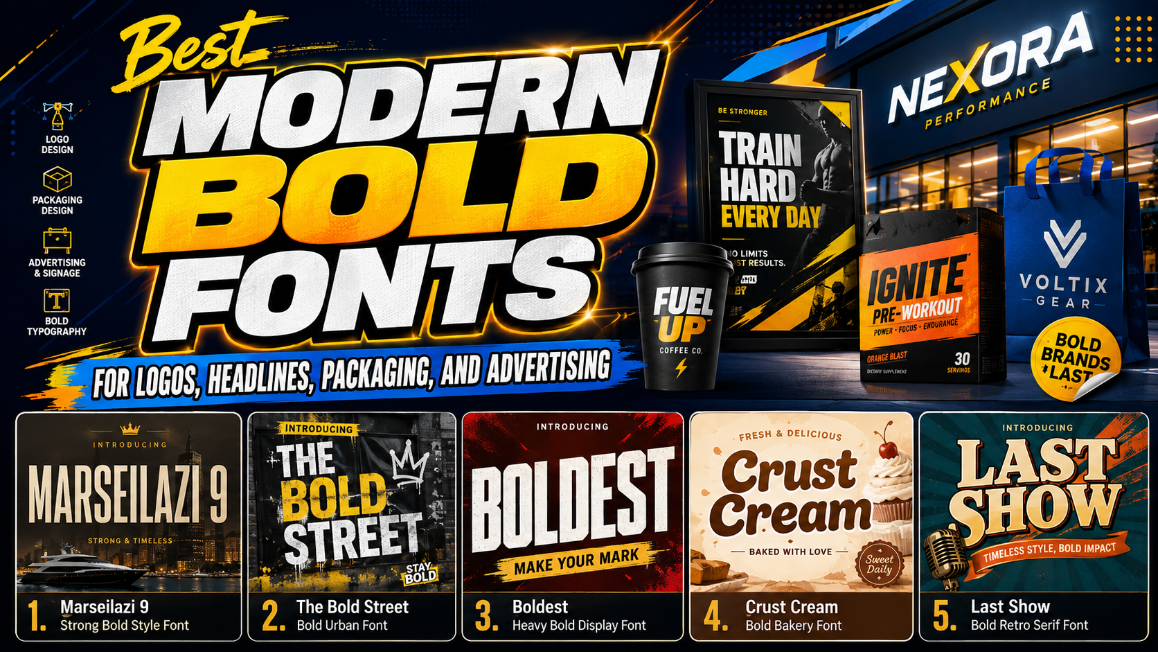
The best modern bold fonts are not simply the heaviest typefaces available. Their value comes from combining visual strength with a personality that supports the brand.
A geometric bold sans serif can make a technology company feel precise and contemporary. A chunky rounded typeface may communicate friendliness, while a rough graffiti font can express urban energy. Bold retro serifs can introduce nostalgia without sacrificing impact.
Before choosing a font, define three qualities the brand should communicate. These might include confident, energetic, approachable, premium, rebellious, or playful. The selected typeface should reinforce those qualities through its proportions, terminals, spacing, texture, and overall silhouette.
The font must also perform across real applications. Test the brand name in a logo, website hero, mobile advertisement, packaging label, social media profile, and monochrome print. A typeface that looks powerful in a large presentation may lose clarity when reduced to a small product label.
What Makes a Bold Font Feel Modern?
Modern bold typography usually combines substantial visual weight with deliberate construction. Thick strokes create presence, while clean spacing, controlled geometry, or expressive details prevent the letters from appearing heavy without purpose.
Contemporary bold fonts can be divided into several broad directions:
Geometric Bold Fonts
Geometric typefaces use circles, straight lines, consistent angles, and carefully controlled proportions. They often feel technical, efficient, and structured.
This direction works well for technology companies, digital products, sportswear, architecture, and modern corporate identities. Strong geometry can communicate stability, but excessive rigidity may make a lifestyle brand feel cold.
Rounded and Chunky Fonts
Rounded bold fonts soften heavy letterforms through curved corners, wide counters, and friendly proportions. They attract attention without always appearing aggressive.
These typefaces are especially useful for food brands, children’s products, cafés, entertainment, creative retail, and casual lifestyle businesses. Their visual weight supports strong shelf presence, while softer shapes create warmth.
Condensed Bold Fonts
Condensed typefaces place substantial weight inside narrow proportions. They allow designers to create large headlines without consuming excessive horizontal space.
They are effective for posters, editorial covers, packaging panels, event promotions, and mobile campaign graphics. Designers should monitor spacing carefully because condensed letters can become difficult to distinguish at small sizes.
Textured and Urban Bold Fonts
Rough surfaces, irregular edges, spray effects, brush marks, and distressed details can give bold typography an energetic handmade quality.
This style supports streetwear, music, skateboarding, youth culture, sports, and creative campaigns. Texture should remain secondary to letter recognition. If every edge becomes heavily distressed, the message may lose clarity.
Bold Retro Serifs
Bold retro fonts use prominent serifs, exaggerated curves, soft corners, or groovy proportions to combine historical character with contemporary display impact.
They work well for food packaging, fashion, music, cafés, hospitality, and nostalgic lifestyle branding. The surrounding layout should remain current so the identity feels intentionally retro rather than outdated.
How Modern Bold Fonts Strengthen Branding
They Create Immediate Visual Hierarchy
Bold typography naturally attracts attention, making it useful for brand names, headlines, campaign messages, prices, and calls to action. Weight, size, and color can guide viewers toward the most important information first.
However, not every element should compete at the same level. Apple’s typography guidance recommends using weight, size, and color to communicate hierarchy while limiting unnecessary typeface combinations that can reduce readability and consistency.
A practical hierarchy could include:
- Bold display font for the brand name or main headline
- Medium or semibold font for subheadings
- Regular supporting font for descriptions and details
- Bold accents for prices, statistics, or calls to action
They Improve Recognition
A distinctive bold silhouette can make a short brand name easier to remember. Customers may recognize the overall shape of a wordmark before consciously reading every letter.
Consistency is essential. Use the same typographic characteristics across packaging, social media, advertising, signage, and the website. Frequent changes in font style weaken the visual association between the typography and the brand.
They Add Emotional Direction
Bold does not communicate only strength. Shape determines emotion.
Square forms can feel industrial. Rounded forms feel more approachable. Sharp angles suggest speed or technology. Rough textures create a handmade or rebellious tone, while exaggerated retro curves introduce nostalgia and fun.
This is why two fonts with similarly heavy weights can produce completely different brand impressions.
How to Use Bold Typography Effectively
Keep Headlines Concise
Modern bold fonts work best when viewers can absorb the message quickly. Short headlines such as “Move Faster,” “Fresh Every Day,” or “Built for Impact” allow the letterforms to remain large and visually confident.
Long sentences create dense blocks that reduce the impact of the typeface. Move detailed explanations into a simpler supporting font.
Give Heavy Letters Enough Space
Bold fonts need breathing room around them. Crowded layouts can make thick letters feel even heavier and may reduce the distinction between words.
Adjust tracking according to the typeface rather than applying one spacing value to every design. Tight spacing may strengthen a short logo, while posters and digital banners may need more open spacing for readability.
Use Strong Contrast
Heavy typography still needs sufficient contrast against its background. A bold font in a low-contrast color can be less readable than a lighter typeface with clearer separation.
WCAG 2.2 requires a minimum contrast ratio of 4.5:1 for normal text and 3:1 for qualifying large text in digital content. Although logos have specific exemptions, campaign text, navigation, buttons, and promotional information should still be tested carefully.
Pair Bold Display Fonts With Simpler Typefaces
An expressive bold font should usually handle the visual personality, while a neutral sans serif or restrained serif handles practical information.
For example, use a chunky display font for a snack brand logo and a clean sans serif for ingredients. Use a graffiti font for a streetwear headline and a neutral grotesk for product descriptions. This contrast protects readability while keeping the identity distinctive.
Jump to Recommended Fonts
Marseilazi | The Bold Street | Boldest | Crust Cream | Last Show
1. Marseilazi 9 Strong Bold Style Font
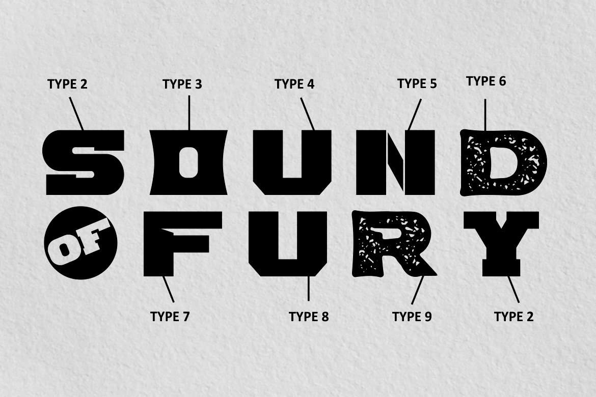
Marseilazi is a versatile family built around a consistently strong and commanding typographic structure. Its nine versions include serif, sans serif, sport, rough, slab, stencil, cut, and other display directions, allowing a brand to maintain one bold personality across several campaigns. This variety makes it practical for identity systems that need logos, headlines, merchandise, posters, and promotional materials with coordinated but non-repetitive typography.
PROS: Nine coordinated styles, commanding weight, flexible personality, and broad branding potential.
BEST FOR: Sports, entertainment, films, apparel, corporate campaigns, posters, and strong brand identities.
2. The Bold Street

The Bold Street translates the expressive appearance of urban graffiti into a usable display font. Its irregular painted character, street-art energy, and collection of 54 ligatures help designers create lettering that feels less mechanical and more individually composed. It is particularly effective for brands that need an energetic visual language connected to music, youth culture, skateboarding, streetwear, or independent art.
PROS: Urban character, 54 ligatures, expressive texture, and memorable handmade energy.
BEST FOR: Streetwear, music, skate culture, posters, apparel, wall graphics, and youth campaigns.
3. Boldest

Boldest is a fat, playful display font with distinctive rounded shapes and a highly visible silhouette. It comes in standard and decorative styles, supported by alternates that allow designers to vary selected letters and create more customized compositions. Its cheerful, exaggerated construction makes it suitable for branding that needs to feel bold without becoming serious or intimidating.
PROS: Two styles, playful proportions, alternative characters, and immediate display impact.
BEST FOR: Children’s products, entertainment, merchandise, invitations, posters, social media, and playful packaging.
4. Crust Cream Bold Font

Crust Cream uses wide, heavy letterforms with rounded corners, compact spacing, solid strokes, and small carved details. These features create a strong but friendly identity that can dominate packaging or storefront graphics without feeling overly aggressive. Its combination of modern clarity, retro warmth, and appetite appeal makes it especially useful for food and beverage branding.
PROS: Chunky structure, friendly geometry, high shelf visibility, and memorable food-brand character.
BEST FOR: Bakeries, dessert shops, cafés, snacks, beverages, street food, menus, and retail packaging.
5. Last Show Bold Retro Script Font
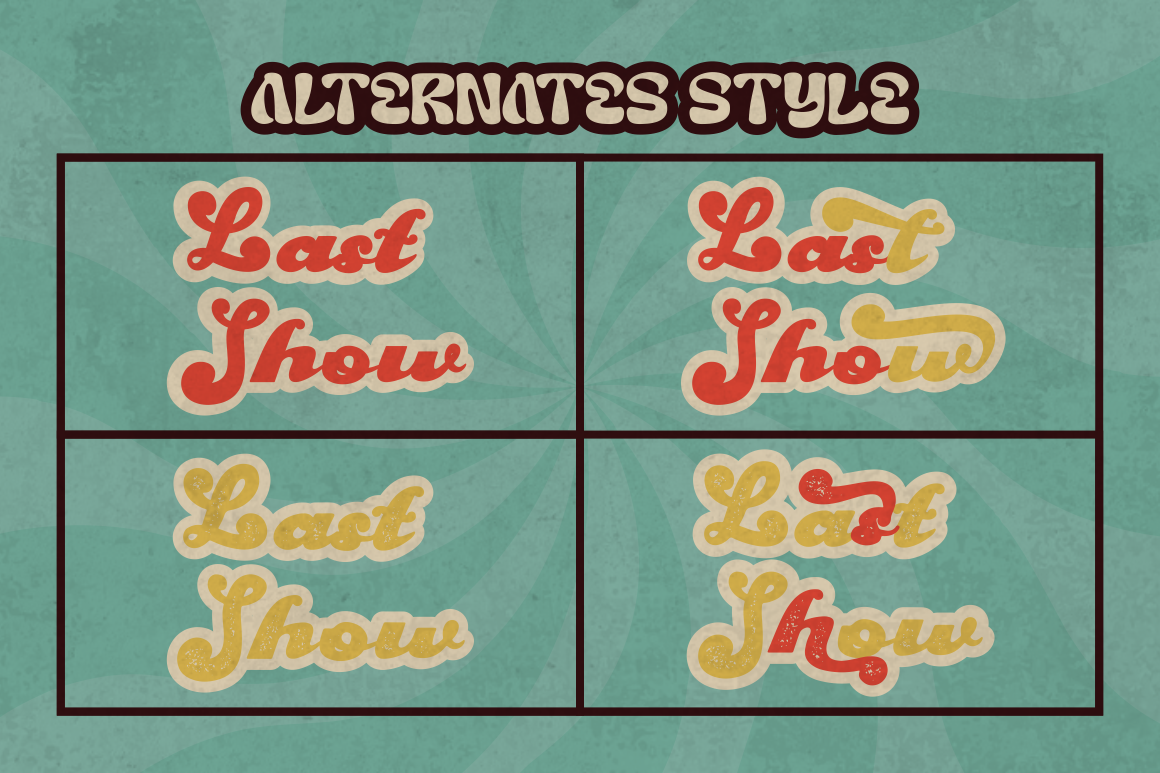
Last Show combines bold serif construction with groovy vintage influences and expressive script-like movement. It includes clean and textured versions, along with alternative characters that help designers create varied wordmarks and headlines. The result provides enough visual weight for modern promotional use while retaining the charismatic personality of retro posters, packaging, and entertainment graphics.
PROS: Clean and rough versions, retro personality, alternative characters, and strong headline presence.
BEST FOR: Fashion, music, cafés, invitations, nostalgic packaging, magazines, posters, and lifestyle brands.
Comparison
| Font | Visual Personality | Strongest Application | Ideal Brand Direction |
|---|---|---|---|
| Marseilazi | Strong and versatile | Complete display systems | Sports and corporate campaigns |
| The Bold Street | Urban and expressive | Graffiti-inspired headlines | Streetwear and music |
| Boldest | Playful and chunky | Fun logos and merchandise | Kids and entertainment |
| Crust Cream | Friendly and appetizing | Food packaging and signage | Cafés and culinary brands |
| Last Show | Groovy and nostalgic | Retro wordmarks and posters | Fashion and lifestyle |
Common Mistakes When Using Modern Bold Fonts
The first mistake is making every piece of text bold. When headings, descriptions, prices, buttons, and captions all have similar visual weight, the hierarchy disappears. Bold typography becomes effective through contrast. Reserve the strongest style for the information that deserves immediate attention, then use lighter or simpler typography for supporting content.
Another mistake is choosing a typeface only because it looks powerful in a specimen image. The actual brand name may contain letter combinations that create awkward spacing, unclear counters, or an unbalanced silhouette. Test the real words, punctuation, numbers, uppercase, lowercase, and available alternates. Review the design on small labels, mobile screens, printed packaging, and monochrome applications before approving it.
The final mistake is using boldness as a substitute for brand strategy. A heavy font can attract attention, but it cannot explain whether the business is technical, playful, luxurious, rebellious, or nostalgic. Shape, texture, spacing, color, photography, and supporting typography must communicate the same direction. The strongest result comes from choosing a bold font whose personality genuinely matches the product and audience.
Conclusion
Effective modern bold fonts combine visual strength with clear strategic purpose. They can establish hierarchy, improve brand recognition, attract attention, and give logos or campaigns a memorable emotional direction.
Choose the category that reflects the brand: geometric for precision, rounded for warmth, condensed for efficient impact, textured for urban energy, or retro serif for nostalgic confidence. Keep headlines concise, provide adequate spacing, maintain contrast, and pair expressive display typography with a simpler supporting font.
Fonts from PutraCetol Studio offer several distinct approaches to bold branding. Marseilazi provides a versatile multi-style system, The Bold Street adds urban expression, Boldest creates playful energy, Crust Cream supports friendly food identities, and Last Show brings retro charisma into contemporary layouts. Used thoughtfully, each can transform a simple message into a powerful and recognizable visual statement.
Explore these fonts and many more at PutraCetol.com to build a business identity that looks professional, trustworthy, and memorable.
Additionally, if you want to explore some free typography options, you can check out Putracetol Studio on Dafont. Happy reading and designing!