
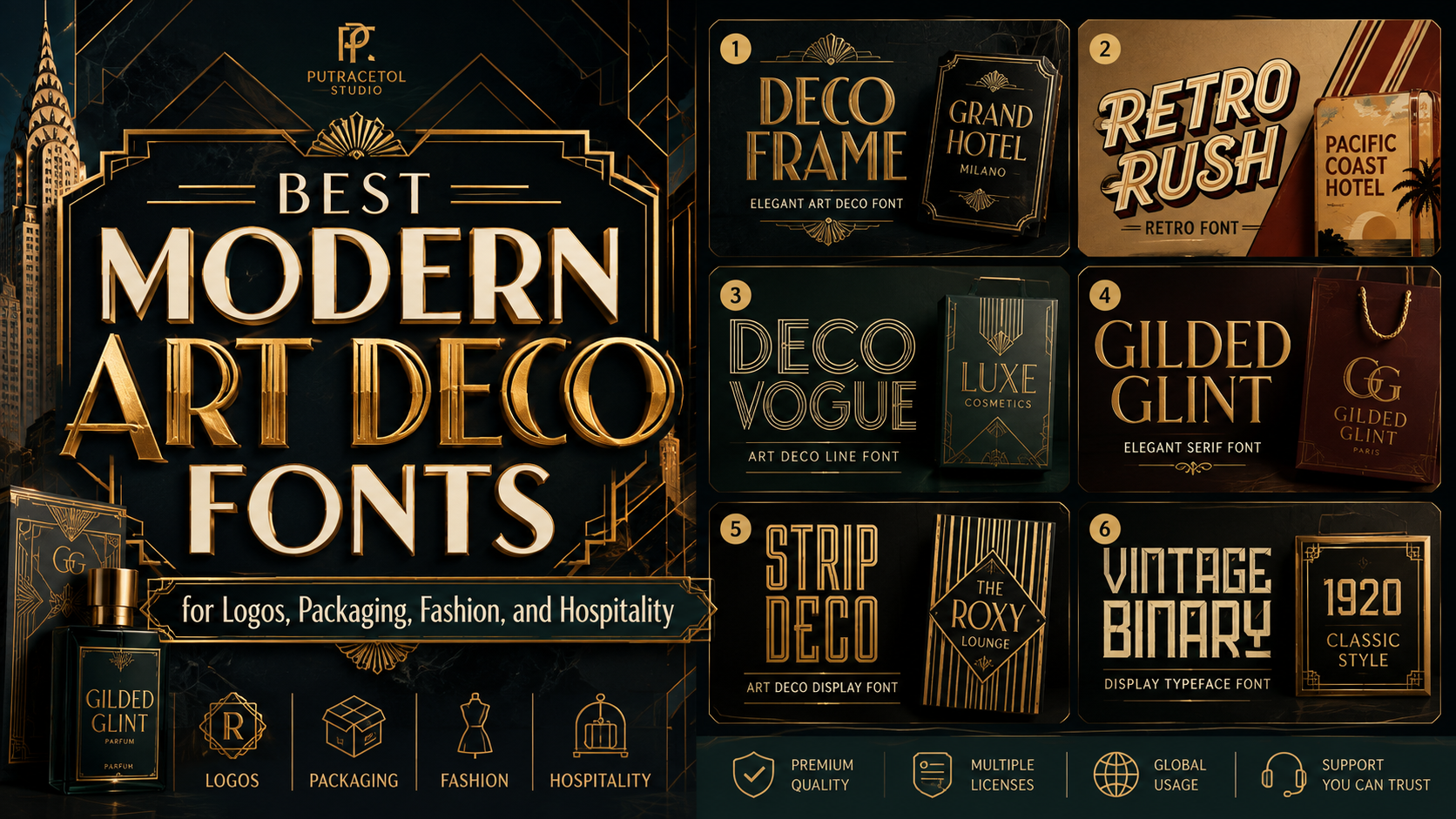
Art Deco typography remains one of the most recognizable visual styles in graphic design. Its geometric construction, elongated proportions, symmetry, sharp details, and decorative rhythm communicate confidence, glamour, and modern luxury.
The style originally became prominent during the 1920s and 1930s, when designers combined influences from fine art, architecture, new industrial materials, and machine-age culture. Unlike the flowing natural forms of Art Nouveau, Art Deco often relied on controlled geometry, streamlined shapes, stylized ornament, and bold visual structure.
Modern Art Deco fonts preserve that sense of refinement while adapting it for contemporary branding. Designers now use cleaner spacing, simplified decoration, modern file formats, OpenType alternates, and improved digital performance to make the style suitable for logos, websites, packaging, editorial layouts, social media, and international campaigns.
This makes Art Deco especially valuable for brands that want to appear premium without relying on generic minimalist typography. A strong modern Deco typeface can give a boutique hotel a cinematic identity, make a perfume package feel more luxurious, or bring a distinctive sense of occasion to a restaurant, fashion campaign, wedding invitation, or cultural event.
This guide introduces six of the best modern Art Deco fonts from PutraCetol Studio. Each offers a different interpretation of geometric elegance, from delicate line typography and decorative frames to bold neon structures and vintage ornamental forms.
Initial Suggestion
Define the Type of Art Deco Identity You Need
Art Deco is not one fixed aesthetic. Some typefaces feel architectural and structured, while others communicate fashion, nightlife, romance, or vintage entertainment.
Before choosing a font, decide whether the brand should feel:
- Luxurious and exclusive
- Geometric and architectural
- Retro and energetic
- Elegant and editorial
- Cinematic and dramatic
- Decorative and nostalgic
A luxury skincare brand may need refined thin strokes, while a nightclub or entertainment campaign could benefit from bolder multi-line lettering.
Use Art Deco Fonts for Display Typography
Most Deco-inspired fonts work best at larger sizes where their geometric details remain visible.
Use them for:
- Logos
- Product names
- Packaging headlines
- Hotel signage
- Editorial covers
- Event posters
- Website hero sections
- Social media campaigns
- Invitations
- Film and exhibition titles
For body paragraphs, prices, product descriptions, and interface text, pair the display font with a simpler serif or sans-serif.
Create Contrast Without Losing Consistency
Modern Art Deco branding often works best when one expressive font carries the main identity and a neutral companion handles practical information.
Strong pairings include:
- Art Deco display with a geometric sans-serif
- Elegant Deco serif with a clean grotesque
- Multi-line display with a minimalist body font
- Decorative capitals with a restrained modern serif
The supporting typeface should not compete with the Deco font. Its role is to create clarity and let the primary typography remain memorable.
Test Thin Lines and Decorative Details
Art Deco fonts frequently use fine strokes, outlines, inner lines, and elongated forms. These details can look elegant on a large poster but disappear on small packaging or mobile screens.
Always test the typeface on:
- Small product labels
- Mobile website headers
- Printed business cards
- Embossed packaging
- Foil stamping
- Backlit signage
- Low-resolution social images
A font may need a larger minimum size, increased tracking, or a simpler alternate version for smaller applications.
Review OpenType Features and Licensing
Alternates, ligatures, and stylistic forms can transform a standard word into a more distinctive logo. Test the actual brand name before purchasing to see how the available characters interact.
Also confirm that the selected license covers the intended use. Desktop graphics, website embedding, merchandise, editable templates, apps, and large corporate campaigns may require different permissions.
Jump to Recommended Fonts
1. Deco Frame Elegant Art Deco Font
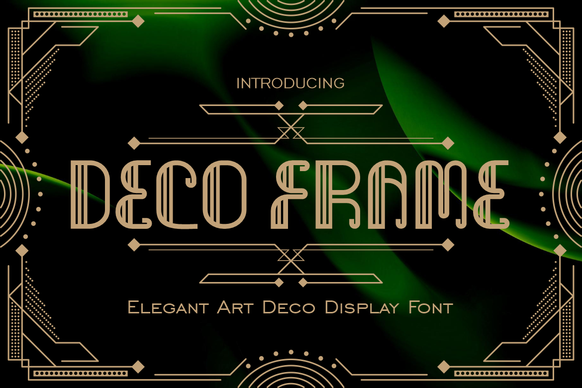
Deco Frame offers a refined interpretation of classic Art Deco through tall proportions, slim strokes, curved terminals, and disciplined vertical forms. Its linear detailing creates a decorative rhythm that feels luxurious without becoming excessively ornate. The result is a polished display font that can bring drama to a headline while retaining a graceful and controlled silhouette.
Its strongest selling point is the balance between softness and geometry. This allows Deco Frame to move comfortably between contemporary luxury branding and vintage-inspired visual systems.
PROS
- Tall and elegant letterforms
- Strong geometric precision
- Refined linear detailing
- Clear silhouette at display sizes
- Suitable for modern and vintage themes
BEST FOR
- Luxury logos
- Boutique hotels
- Fashion campaigns
- Perfume packaging
- Editorial titles
- Wedding invitations
2. Retro Rush Retro Font

Retro Rush combines Art Deco structure with vintage neon and retro-futuristic energy. Its bold multi-line construction, symmetrical forms, and layered internal details create an electric personality that draws from both 1920s elegance and 1980s visual culture.
This hybrid style makes Retro Rush especially valuable for brands that want Deco glamour without appearing overly formal. It can create strong visual impact in entertainment, nightlife, music, gaming, and event-focused projects.
PROS
- Distinct multi-line construction
- Strong symmetry and geometry
- Retro neon personality
- Bold headline performance
- Combines vintage and futuristic influences
BEST FOR
- Nightclub branding
- Music festivals
- Entertainment posters
- Retro gaming projects
- Fashion events
- Neon-inspired logos
3. Deco Vogue Art Deco Line Font
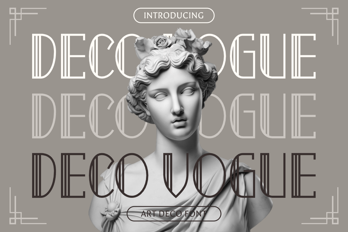
Deco Vogue uses elongated proportions, thin vertical lines, smooth curves, and clearly defined terminals to create a light and fashionable Deco appearance. Its narrow spacing and structured linework produce a sophisticated rhythm that feels ideal for premium editorial and boutique branding.
Compared with heavier Art Deco fonts, Deco Vogue feels airy and refined. It is especially effective when a project needs glamour, prestige, and visual elegance rather than aggressive impact.
PROS
- Tall and narrow structure
- Delicate line-based construction
- Elegant symmetry
- Strong fashion-editorial personality
- Clean and contemporary appearance
BEST FOR
- Fashion magazines
- Beauty branding
- Boutique catalogs
- Art exhibitions
- Luxury signage
- Wedding stationery
4. Gilded Glint Elegant Serif Font

Gilded Glint brings Art Deco sophistication into a more traditional serif structure. Its elegant character makes it useful for projects that need luxury and historical atmosphere without relying entirely on geometric outline lettering.
This font works particularly well when paired with gold foil, dark backgrounds, marble textures, or refined editorial photography. It gives designers a more flexible option for brands that want to feel upscale, timeless, and professionally established.
PROS
- Elegant serif personality
- Strong luxury associations
- More versatile than decorative outline fonts
- Suitable for modern editorial systems
- Works well with premium materials and finishes
BEST FOR
- Jewelry branding
- Luxury restaurants
- Premium cookware
- Editorial layouts
- Wine and beverage labels
- High-end product packaging
5. Strip Deco
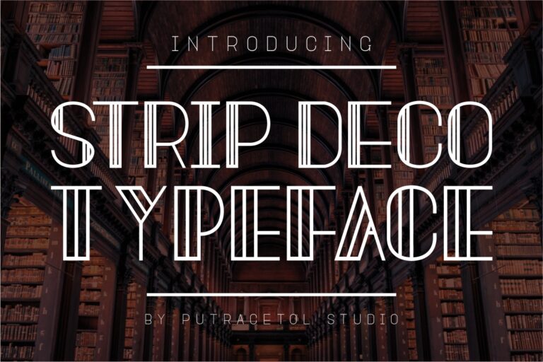
Strip Deco translates classic Art Deco into strict, clean, and streamlined letterforms. Its structured display design includes uppercase and lowercase characters, numerals, punctuation, and alternate glyphs, giving designers more flexibility when developing logos and promotional titles.
The package includes two visual versions, allowing the font to adapt across more branding situations. Its disciplined geometry makes it especially useful for businesses that want Deco character while maintaining a crisp, modern appearance.
PROS
- Strict and clean geometric lines
- Alternative characters
- Two included visual styles
- Uppercase and lowercase support
- OTF, TTF, and WOFF formats
BEST FOR
- Corporate logos
- Apparel graphics
- Product packaging
- Restaurant branding
- Social media headlines
- Merchandise and labels
6. Vintage Binary Display Typeface Font
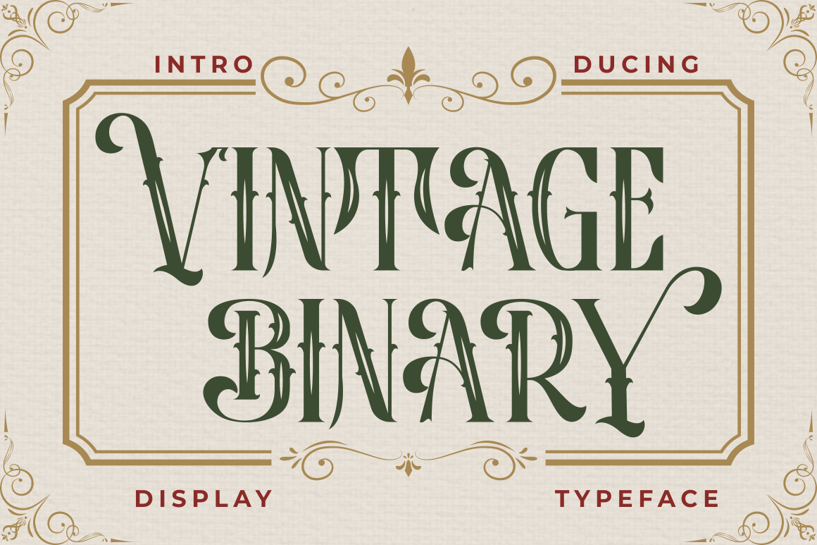
Vintage Binary combines classic display typography with ornamental strokes and decorative accents. Its nostalgic personality evokes vintage badges, emblems, signage, and poster lettering, while OpenType alternates and ligatures give designers opportunities to create customized-looking compositions.
Unlike the cleaner modern options in this list, Vintage Binary leans more strongly into decorative heritage. It is ideal when a project needs Art Deco influence with additional vintage character and visual storytelling.
PROS
- Decorative vintage personality
- OpenType alternates and ligatures
- PUA-encoded characters
- OTF, TTF, and WOFF files
- Strong logo and emblem potential
BEST FOR
- Vintage logos
- Hotel emblems
- Restaurant badges
- Product labels
- Event posters
- Heritage-inspired packaging
Comparison
| Font | Main Style | Visual Personality | Strongest Feature | Best Application |
|---|---|---|---|---|
| Deco Frame | Elegant Deco display | Refined and luxurious | Tall linear detailing | Luxury branding |
| Retro Rush | Multi-line retro display | Electric and energetic | Neon-inspired layered forms | Entertainment |
| Deco Vogue | Line-based Art Deco | Fashionable and airy | Elongated narrow proportions | Editorial design |
| Gilded Glint | Elegant serif | Timeless and premium | Flexible luxury character | Packaging |
| Strip Deco | Clean Deco display | Structured and modern | Alternates and two versions | Logo systems |
| Vintage Binary | Ornamental display | Nostalgic and decorative | Ligatures and vintage accents | Heritage branding |
Best Overall Modern Art Deco Font
Deco Frame offers the strongest balance of geometric Deco character, modern elegance, and premium branding versatility.
if you want Best for Fashion and Editorial Design
or you want Best for Entertainment and Nightlife
And there are Best for Luxury Packaging
Best for Vintage Branding
Best for Logos
Common Mistake
One common mistake is treating every Art Deco project as a literal recreation of the 1920s. Excessive gold, black backgrounds, sunburst patterns, decorative borders, and geometric ornaments can make branding feel theatrical rather than modern. Contemporary Art Deco design works best when historical influences are simplified and combined with clean layouts, restrained color palettes, modern photography, and generous spacing.
Another mistake is using a decorative Deco font for every element of the design. Thin lines, unusual proportions, and ornamental details can reduce readability in long paragraphs or small product information. Use the Art Deco font for identity and emphasis, then pair it with a practical supporting typeface for body copy, navigation, descriptions, and legal text. This allows the project to maintain its glamorous character without sacrificing usability.
Designers also frequently overlook production limitations. Fine internal lines may disappear when embroidered, embossed, laser-cut, or printed at small sizes. Decorative ligatures can become unclear when a logo is reduced for a social media avatar or mobile header. Test the chosen font in realistic conditions, simplify complex alternates when necessary, and create responsive logo versions for different sizes.
Conclusion
The best modern Art Deco fonts combine historical glamour with contemporary design discipline. They preserve the geometry, symmetry, elongated forms, and decorative confidence associated with the original movement while adapting those qualities for current branding, packaging, editorial, hospitality, fashion, and digital applications.
Deco Frame offers refined geometric elegance, while Deco Vogue delivers a lighter fashion-led interpretation. Retro Rush introduces neon energy, Gilded Glint provides timeless serif luxury, Strip Deco creates clean architectural structure, and Vintage Binary brings decorative heritage into logos and packaging.
The right choice depends on the personality your brand needs to express. Use thin line fonts for elegance, multi-line designs for energy, structured geometry for modern professionalism, and ornamental typefaces for nostalgic storytelling.
Art Deco typography is most effective when it becomes part of a complete visual system rather than a decorative shortcut. Combine it with intentional spacing, suitable supporting fonts, careful production testing, and a clear brand strategy.
Explore these six modern Art Deco fonts at PutraCetol.com and use them to create logos, editorial covers, packaging, fashion campaigns, hotel identities, event graphics, and digital experiences with a luxurious and timeless visual voice.
Explore these fonts and many more at PutraCetol.com to build a business identity that looks professional, trustworthy, and memorable.
Additionally, if you want to explore some free typography options, you can check out Putracetol Studio on Dafont. Happy reading and designing!