
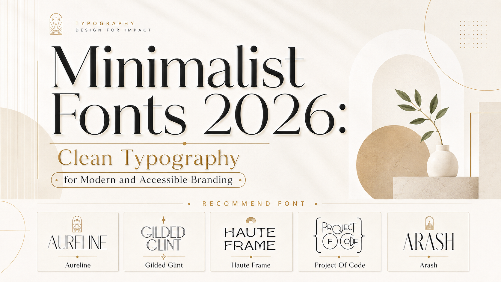
The most effective minimalist fonts 2026 are not simply thin typefaces placed on white backgrounds. Their value comes from communicating the right message with fewer visual elements, stronger hierarchy, and more deliberate use of space.
Begin by deciding what the typography needs to accomplish. A fashion label may need elegance and editorial confidence. A technology startup could require clarity with a subtle experimental edge. A skincare company may want a softer premium personality, while a digital product needs typography that remains readable across navigation, forms, dashboards, and small mobile screens.
A useful minimalist typography brief should define:
- The desired brand personality
- The primary audience
- The most important applications
- The amount of text involved
- The level of visual distinction required
- Accessibility and readability needs
- Digital and print production conditions
Minimalism is successful when every typographic decision has a clear role. Removing elements without improving communication creates emptiness, not clarity.
What Do Minimalist Fonts Mean in 2026?
Minimalist typography in 2026 combines clean construction, controlled character, generous space, and practical readability. It avoids unnecessary visual noise while giving brands enough personality to remain recognizable.
This direction is not limited to neutral sans serifs. Contemporary minimalist systems may include elegant serifs, condensed fashion fonts, geometric display faces, or modern typefaces with carefully selected alternates.
Current 2026 design forecasts also emphasize expressive, oversized, and storytelling-led typography. This means minimalism is no longer defined by making every brand quiet or visually identical. It increasingly works as a disciplined framework in which one distinctive typographic element receives attention while the surrounding system remains calm and functional.
A modern minimalist identity may therefore use:
- One expressive serif for the logo
- One neutral sans serif for functional information
- A restrained color palette
- Generous margins
- Strong scale contrast
- Limited decorative effects
- Consistent alignment and spacing
The result can feel elegant and memorable without becoming visually crowded.
Why Minimalist Typography Remains Valuable
It Makes the Message Easier to Find
Minimalist typography uses hierarchy to show viewers what matters first. A prominent product name, concise supporting statement, and clear CTA create a faster reading path than a design containing several competing headings and decorative details.
This is especially useful in ecommerce, digital products, and social campaigns where people make decisions quickly.
A strong hierarchy may use:
- A distinctive display font for the main headline
- A simpler typeface for the explanation
- A semibold functional style for the CTA
- Smaller supporting text for technical or legal information
The design does not need many font families. Contrast can come from size, weight, spacing, case, and position.
It Gives White Space a Functional Role
White space is not merely unused background. It separates content groups, establishes rhythm, and helps important elements receive attention.
A luxury package may use space around the product name to increase perceived refinement. A software dashboard can use consistent gaps to distinguish navigation, metrics, charts, and actions. An editorial layout may use wide margins to make a distinctive serif title feel more important.
The amount of space should reflect the relationship between elements. Related content should remain visually connected, while different sections need enough separation to be understood as independent groups.
It Supports Flexible Brand Systems
A restrained typographic system can adapt across packaging, websites, social media, presentations, signage, and advertising without requiring a complete redesign for every format.
The primary display font provides recognition. The supporting typography creates consistency and handles practical communication.
This is particularly useful for startups and growing businesses that need one identity to support several products, customer groups, or campaigns.
It Can Improve Digital Usability
Clean typography can make digital interfaces easier to scan, but the font choice alone does not guarantee accessibility. Size, spacing, line length, contrast, hierarchy, and responsive behavior all affect the final experience.
WCAG 2.2 specifies a contrast ratio of at least 4.5:1 for normal text and 3:1 for qualifying large text. Interfaces should also continue working when users increase line height, paragraph spacing, letter spacing, or word spacing.
Minimalist interfaces should therefore avoid pale grey text, excessively thin strokes, tiny labels, and subtle controls that disappear against white or neutral backgrounds.
Major Minimalist Font Trends for 2026
1. Refined Serifs With Modern Proportions
Serif typography is becoming an important alternative to the generic geometric sans serifs that have dominated digital branding.
Modern minimalist serifs use controlled contrast, clean curves, elongated proportions, and carefully reduced ornamentation. They communicate heritage and trust while remaining suitable for contemporary packaging, editorial layouts, websites, and logos.
This direction works especially well for:
- Fashion
- Beauty
- Jewelry
- Hospitality
- Consulting
- Publishing
- Premium food
- Personal brands
The serif adds emotional character, while the wider layout provides the minimalist discipline.
2. Quiet Sans Serifs With Distinctive Details
Minimalist sans serifs in 2026 do not need to be anonymous. A subtle ligature, unusual terminal, compact width, or geometric cut can create recognition without reducing clarity.
These typefaces are useful for technology, architecture, creative agencies, digital products, and contemporary retail.
The best examples remain understandable in one color and do not depend on gradients, shadows, or complex visual effects.
3. Editorial Minimalism
Editorial minimalism uses large typography, controlled photography, clear grids, and substantial negative space.
Instead of filling a page with several decorative elements, the headline becomes the main visual composition. A high-contrast serif, narrow fashion font, or contemporary display sans can turn a few words into a complete brand moment.
This style is especially suitable for fashion campaigns, magazines, portfolio websites, fragrance packaging, and luxury ecommerce.
4. Warm Minimalism
Minimalism is increasingly moving away from cold white, grey, and black combinations. Warm cream, sand, soft brown, muted burgundy, dusty green, and natural textures can make a restrained identity feel more human.
Typography supports this direction through softened curves, moderate contrast, and subtle vintage references.
A warm minimalist system can feel calm without appearing sterile, making it valuable for wellness, handmade products, hospitality, skincare, and lifestyle branding.
5. Heritage Forms With Contemporary Styling
Designers are revisiting classic poster lettering, elegant serifs, and vintage proportions while presenting them through cleaner layouts.
The historical reference gives the identity depth, while modern spacing and color prevent it from appearing outdated.
This creates useful opportunities for brands that need to communicate both experience and relevance, including hotels, restaurants, consultancies, publishers, and premium product businesses.
6. Responsive and Adaptable Digital Typography
Minimalist digital typography must work across phones, tablets, laptops, dashboards, and large screens.
Responsive type should scale according to the layout while continuing to respect user preferences and zoom settings. Google’s web typography guidance emphasizes that typography should respond not only to the viewport but also to the user’s device, network, and accessibility needs.
Variable fonts can provide several weights or widths through one flexible font file, potentially reducing the need to load many separate font files. However, designers should still use only the styles required by the interface and test performance under real conditions.
Minimalist Serif vs. Minimalist Sans Serif
Both categories can support minimalist branding, but they create different emotional expectations.
| Direction | Main Impression | Common Applications |
|---|---|---|
| Minimalist serif | Refined, trustworthy, editorial, and timeless | Fashion, beauty, publishing, hospitality, and premium packaging |
| Geometric sans serif | Precise, modern, efficient, and technical | Startups, SaaS, architecture, finance, and digital products |
| Condensed display font | Focused, fashionable, and space-efficient | Posters, magazine covers, labels, and social campaigns |
| Experimental minimalist font | Progressive, creative, and distinctive | Design studios, technology, culture, and innovation brands |
| Heritage-modern serif | Established, warm, and crafted | Food, hotels, consulting, and lifestyle products |
The correct choice depends on the product and audience rather than a universal rule about which category appears more modern.
How to Use Minimalist Fonts in Branding
Build the Logo Around Recognition
A minimalist logo often depends heavily on typography because it contains fewer supporting graphics.
Test the real business name and examine:
- The first and final letters
- Repeated characters
- Spacing between difficult combinations
- Uppercase and lowercase alternatives
- The complete wordmark silhouette
- Performance at small sizes
Use alternate glyphs and ligatures only when they improve the wordmark. A minimalist logo usually becomes stronger through one memorable detail rather than several customized letters.
Create Responsive Logo Versions
Prepare several variations rather than forcing one wordmark into every placement:
- Full horizontal logo
- Stacked logo
- Compact wordmark
- Initial or monogram
- Monochrome version
- Simplified small-scale version
Thin lines, double-line details, and elongated terminals may work beautifully on packaging or a website hero but become unclear inside a social profile icon.
Use a Limited Color Palette
Minimalist typography benefits from disciplined color.
A useful system may contain:
- One primary background color
- One main text color
- One brand accent
- Functional colors for digital states
Black and white can create strong contrast, but softer combinations may feel more distinctive. Consider charcoal and cream, navy and ivory, burgundy and blush, or forest green and parchment.
The accent should identify the most important brand or interface action rather than decorate every heading and icon.
Minimalist Fonts for Packaging
Packaging must communicate both brand personality and practical product information.
Use the distinctive font for:
- Brand name
- Product line
- Collection name
- Flavor or variant
- Short premium statement
Use a simpler supporting font for:
- Ingredients
- Instructions
- Weight
- Warnings
- Legal information
- Contact details
Minimalist packaging does not mean making every label extremely small. The product name should remain recognizable from a reasonable viewing distance, while required information must remain clear under actual printing conditions.
Test delicate strokes on the intended material. Fine serifs may disappear on textured paper, small foil stamping, fabric labels, or low-resolution printing.
Minimalist Typography for Fashion and Beauty
Fashion and beauty brands often use typography as the central identity element.
A tall serif can create editorial elegance. A condensed sans serif can feel modern and architectural, while a distinctive ligature may give the wordmark a more customized appearance.
The strongest layouts often combine:
- Large display title
- Restrained photography
- Wide margins
- Minimal copy
- Controlled alignment
- One subtle decorative detail
Avoid assuming that luxury requires extremely thin lettering. A typeface still needs enough stroke strength to remain visible across ecommerce thumbnails, product labels, and mobile screens.
Minimalist Typography for Digital Interfaces
Display fonts and interface fonts have different responsibilities.
A distinctive PutraCetol font may work effectively for a landing-page hero, product logo, campaign banner, or editorial title. Navigation, forms, tables, dashboards, and instructions usually require a simpler typeface designed for repeated reading.
A practical digital pairing might use:
- Display serif for the website hero
- Neutral sans serif for navigation
- Semibold sans serif for buttons
- Regular sans serif for body copy
- Tabular numerals for metrics and financial data
Use live text rather than embedding essential information permanently inside images whenever possible. Live text can be resized, translated, searched, and interpreted by assistive technologies more effectively.
A Practical Minimalist Font Selection Process
Step 1: Define the Emotional Direction
Choose three qualities that describe the brand.
Examples include:
- Calm, intelligent, and precise
- Elegant, artistic, and premium
- Warm, established, and trustworthy
- Modern, innovative, and unconventional
- Feminine, refined, and approachable
Step 2: Identify the Font’s Role
Decide whether the typeface will be used for a logo, display heading, packaging title, interface text, editorial content, or several applications.
Do not expect an expressive display font to handle every role equally well.
Step 3: Test Real Content
Use the actual brand name, product titles, headlines, prices, dates, and multilingual characters required by the project.
A font may look attractive in a curated specimen while producing awkward spacing in the real wordmark.
Step 4: Compare Standard and Alternate Glyphs
Begin with the normal character set. Introduce ligatures, swashes, or stylistic alternatives only when they improve the complete design.
Minimalism depends on editing. The presence of many OpenType options does not mean every option should be used simultaneously.
Step 5: Test at Actual Size
Evaluate the typeface on:
- Mobile screens
- Product labels
- Posters
- Social thumbnails
- Packaging mockups
- Dark and light backgrounds
- Monochrome applications
- Printed samples
Step 6: Select a Functional Companion
Pair the display font with a typeface that supports comfortable reading.
The pair should have enough contrast to establish hierarchy but enough visual compatibility to feel like one identity.
Step 7: Confirm Licensing and Technical Requirements
Choose coverage according to the real application, including logo use, static graphics, packaging, webfont embedding, applications, advertising, or customer-editable products.
The visual choice and license choice should be finalized before the complete brand system enters production.
Jump to Recommended Fonts
Aureline | Gilded Glint | Haute Frame | Project of Code | Arash
1. Aureline Elegant Serif Font
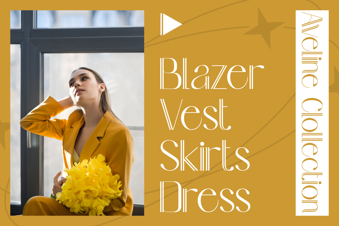
Aureline combines clean elongated characters with subtle curves and a distinctive double-line serif treatment. Its construction gives minimalist compositions an elegant focal point while preserving enough visual detail to make logos and large editorial headings feel recognizable. The font includes refined ligatures and 276 glyphs, providing room for controlled customization without requiring a visually crowded layout.
PROS: Distinctive double-line serifs, elongated proportions, refined ligatures, elegant visual rhythm, and strong luxury appeal.
BEST FOR: Fashion logos, wedding branding, premium packaging, magazine covers, beauty campaigns, invitations, and sophisticated editorial design.
2. Gilded Glint Elegant Serif Font
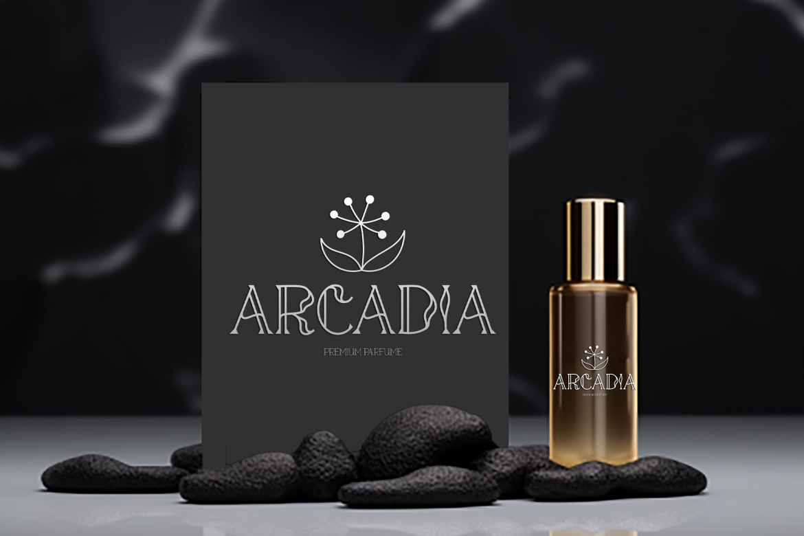
Gilded Glint balances flowing curves with sharper geometric serifs, creating a combination of softness and confident structure. Its two coordinated styles and 263 glyphs give designers flexibility for product names, campaign titles, and selected alternate treatments. It works particularly well when minimalist branding needs a more artistic and luxurious personality rather than complete neutrality.
PROS: Two styles, graceful curves, sharp serif contrast, broad glyph selection, and memorable premium character.
BEST FOR: Luxury fashion, jewelry, cosmetics, editorial covers, movie titles, wedding stationery, product packaging, and dramatic minimalist headlines.
3. Haute Frame Fashion Font
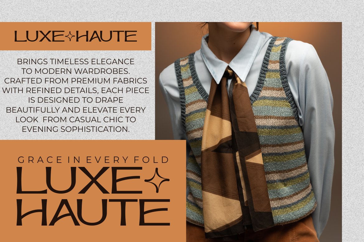
Haute Frame uses tall proportions, thin-to-medium strokes, soft curves, and spacious character forms to create a clean editorial rhythm. Elongated terminals and selected decorative transitions add fashion personality while the balanced spacing keeps large headlines polished. Its combination of minimalist elegance, geometric influence, and subtle Art Deco character makes it especially effective for premium visual systems.
PROS: Tall space-efficient structure, graceful curves, polished spacing, fashionable details, and strong uppercase impact.
BEST FOR: Fashion labels, luxury cosmetics, jewelry packaging, beauty studios, magazine titles, boutique branding, posters, and lifestyle campaigns.
4. Project of Code Display Sans Font
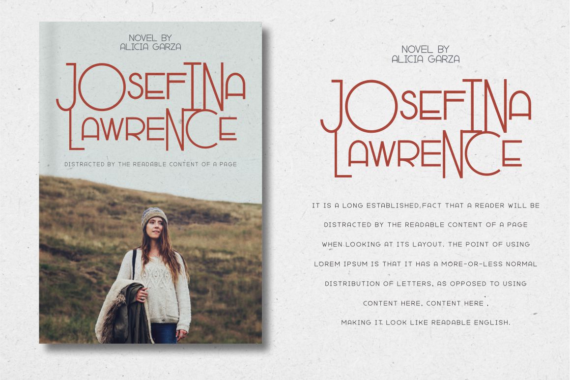
Project of Code is a contemporary display sans with a cleaner geometric foundation and a collection of quirky ligatures and alternate glyphs. It gives minimalist technology and creative branding a more recognizable voice than a completely neutral corporate sans serif. Its OpenType options include swashes, stylistic sets, contextual alternatives, and ligatures, allowing designers to create selected signature moments while keeping the wider composition restrained.
PROS: Contemporary sans serif construction, unusual ligatures, extensive OpenType options, multilingual Latin support, and strong creative flexibility.
BEST FOR: Startup branding, technology campaigns, creative agencies, magazine titles, modern logos, posters, digital products, and advertising.
5. Arash Modern Serif Font

Arash brings vintage poster influence into a cleaner contemporary serif structure. Its contrast between classic character and modern styling gives minimalist brands a warmer and more established personality, while alternate glyphs and ending swashes provide options for refining individual wordmarks. The font works especially well when a project needs editorial sophistication without appearing overly formal or traditional.
PROS: Modern-vintage balance, numerous alternates, ending swashes, multilingual support, and versatile display character.
BEST FOR: Brand identities, packaging, book covers, hospitality, consulting, lifestyle products, editorial headlines, merchandise, and social campaigns.
Comparison
| Font | Typographic Direction | Minimalist Personality | Strongest Application | Recommended Supporting Font |
| Aureline | Decorative modern serif | Refined, delicate, and luxurious | Fashion logos and premium packaging | Neutral geometric sans serif |
| Gilded Glint | Artistic elegant serif | Graceful, bold, and expressive | Beauty, jewelry, and editorial campaigns | Clean humanist sans serif |
| Haute Frame | Fashion-oriented display font | Spacious, editorial, and polished | Fashion, cosmetics, and magazine titles | Minimal grotesk or modern sans |
| Project of Code | Contemporary display sans | Progressive, creative, and technical | Startups, agencies, and digital campaigns | Quiet interface sans serif |
| Arash | Heritage-modern serif | Warm, established, and stylish | Hospitality, publishing, and lifestyle branding | Simple geometric sans serif |
Common Mistakes
The first mistake is assuming that minimalist typography must be thin, grey, and almost invisible. Extremely light strokes can disappear on mobile screens, textured packaging, low-quality printing, or bright displays. Pale typography may look elegant in a large mockup while becoming uncomfortable in real use. Minimalism should reduce visual noise without reducing clarity. Use sufficient weight, visible contrast, open spacing, and a hierarchy that makes the most important content easy to identify.
The second mistake is applying one display font to the entire brand system. Aureline, Gilded Glint, Haute Frame, Project of Code, and Arash can create distinctive logos and headlines, but their expressive details may become distracting in long paragraphs, navigation, forms, product instructions, or dense dashboards. Assign the display font a focused role and pair it with functional typography for repeated reading. The identity becomes stronger when each typeface has a clear responsibility rather than competing for attention.
The final mistake is confusing white space with unfinished design. Randomly enlarging margins or removing information can make related elements feel disconnected and force users to scroll unnecessarily. Space should reveal hierarchy, group related content, and protect important actions. Test the system with real product names, long headlines, translated content, error messages, prices, and mobile layouts. Also confirm contrast, zoom behavior, font loading, production quality, and license coverage before approving the final identity.
Conclusion
The strongest minimalist fonts 2026 combine simplicity with recognizable character. They use clean structure, deliberate spacing, and controlled details to help brands look modern without becoming generic.
Minimalist typography in 2026 is also more flexible than the all-neutral identities associated with earlier digital branding. Elegant serifs, heritage references, fashionable proportions, and experimental ligatures can all belong inside a minimalist system when they are used with discipline.
Aureline offers refined double-line elegance, while Gilded Glint combines graceful curves with geometric authority. Haute Frame supports sophisticated fashion and beauty identities, Project of Code gives modern digital brands a more creative sans serif voice, and Arash blends vintage personality with contemporary clarity.
Fonts from PutraCetol Studio can become distinctive focal points across logos, packaging, fashion campaigns, editorial layouts, and digital brand experiences. Use them for the moments where personality matters most, then support them with clear hierarchy, accessible contrast, functional companion typography, and enough space for the message to breathe.
Minimalism is not the absence of design. It is the discipline of keeping the elements that communicate most effectively.
Explore these fonts and many more at PutraCetol.com to build a business identity that looks professional, trustworthy, and memorable.
Additionally, if you want to explore some free typography options, you can check out Putracetol Studio on Dafont. Happy reading and designing!