
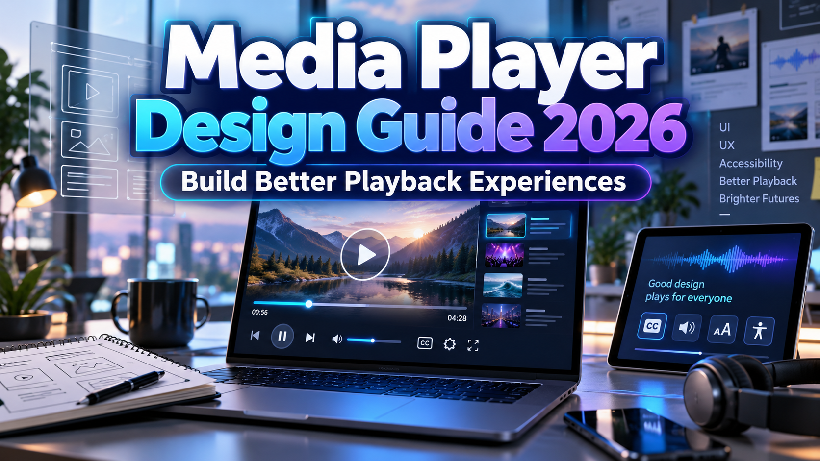
Media Player Design Guide 2026: Make Playback Clear, Accessible, and Branded
Start With the Audience’s Task
A useful media player design guide 2026 begins with what people need to accomplish. Watching a product demonstration, studying a recorded lecture, and listening to a podcast require different priorities.
For a learning platform, consider chapters, playback speed, and searchable transcripts. For a product video, prioritize an obvious play button and accessible viewing. Add features only when they solve a real task.
The aim is not the smallest possible control bar. It is an interface people can understand without guessing.
Essential Media Player Design Principles
Keep Playback Controls Predictable
Make play and pause obvious, show elapsed time, and provide seeking for content that supports it. Group less frequent settings without burying captions.
Update accessible labels to reflect actions, such as “Pause” during playback. W3C recommends clear labels, visible focus, keyboard support, and adequate contrast for media-player interfaces.
For live streams, distinguish “Live” from recorded duration and offer seeking only when replay is available.
Support Keyboard and Screen-Reader Use
Test play, pause, settings, and timeline controls without a mouse. Keep controls available while they have keyboard focus, and prevent menus from trapping users.
Timeline sliders need meaningful names, values, and keyboard interaction. W3C’s slider pattern supports arrow-key adjustments and describes using understandable time values rather than unexplained numbers. Test custom sliders with touch-based assistive technology as well.
Make the Content Accessible Too
A keyboard-friendly interface cannot compensate for missing captions. Provide synchronized captions covering speech and meaningful sounds. Review AI-generated captions for accuracy, speaker identification, and timing before publication.
Offer transcripts, including for prerecorded audio-only content. Transcripts complement video captions rather than replace them. For prerecorded video, provide audio description when important visual information is not already conveyed in the soundtrack. Plan live captioning separately when broadcasting events.
Design for Touch and Changing Screens
Reorganize controls on smaller screens instead of shrinking everything. Preserve the video’s proportions, avoid covering captions, and test landscape and portrait layouts.
WCAG 2.2 AA generally specifies pointer targets of at least 24 by 24 CSS pixels, subject to spacing and other exceptions. Prefer larger controls where practical.
For a narrow mobile player, move secondary settings into a labeled menu while keeping essential actions accessible.
Protect Contrast and Typography
WCAG AA generally requires 4.5:1 contrast for ordinary text and 3:1 for qualifying large text. Essential visual cues identifying custom controls and their states generally need 3:1 against adjacent colors, with defined exceptions.
Video backgrounds constantly change, so place controls on a stable surface rather than trusting one poster-frame preview.
Explore PutraCetol Studio typography for episode titles, thumbnails, and branded headers. Keep timestamps, captions, and settings in a readable companion font.
Respect Playback Choice and Connection Quality
Prefer deliberate playback over unexpected sound. Browser autoplay policies can block audible playback, so provide a visible play action and handle rejected playback requests.
Use a poster image, reserve the player’s dimensions, and choose loading behavior deliberately. HTML’s preload setting is a browser hint, not a guaranteed download limit.
Design distinct paused, loading, buffering, ended, and error states. Explain failures plainly and provide a retry action instead of an endless spinner.
Comparison
Choose the simplest implementation that meets your requirements. W3C recommends considering existing players developed for accessibility rather than rebuilding every feature yourself.
| Approach | Suitable Starting Point | Main Responsibility |
|---|---|---|
| Native browser controls | Straightforward media embeds | Test browser behavior and content alternatives |
| Established accessible player | Courses and publisher libraries | Verify configuration, captions, and updates |
| Custom interface | Specialized branded experiences | Own interaction, compatibility, and accessibility testing |
Common Mistakes
The first mistake is hiding functionality to create a cleaner screenshot. Tiny icons, hover-only controls, and disappearing menus can make an attractive player frustrating. Review the complete interaction, including keyboard focus, settings navigation, caption selection, and recovery from errors.
Another mistake is treating branding as permission to redesign familiar controls beyond recognition. Apply identity through color, spacing, typography, and surrounding artwork. Keep essential actions understandable and avoid promotional overlays that cover controls or interrupt important information.
The final mistake is testing only fast connections and perfect footage. Include slow networks, missing caption tracks, long titles, mobile screens, and assistive technology. Track playback-start failures, buffering, and task completion alongside engagement; a high completion rate alone does not demonstrate an accessible experience.
Conclusion
A strong media player design guide 2026 balances visual identity with dependable behavior. Start with the audience’s task, make controls predictable, provide accessible content, and test real playback conditions.
Use PutraCetol Studio fonts where brand personality matters, while protecting clarity in everyday controls. The best player lets people focus on the story, lesson, or product instead of struggling with the interface.
Explore these fonts and many more at PutraCetol.com to build a business identity that looks professional, trustworthy, and memorable.
Additionally, if you want to explore some free typography options, you can check out Putracetol Studio on Dafont. Happy reading and designing!