
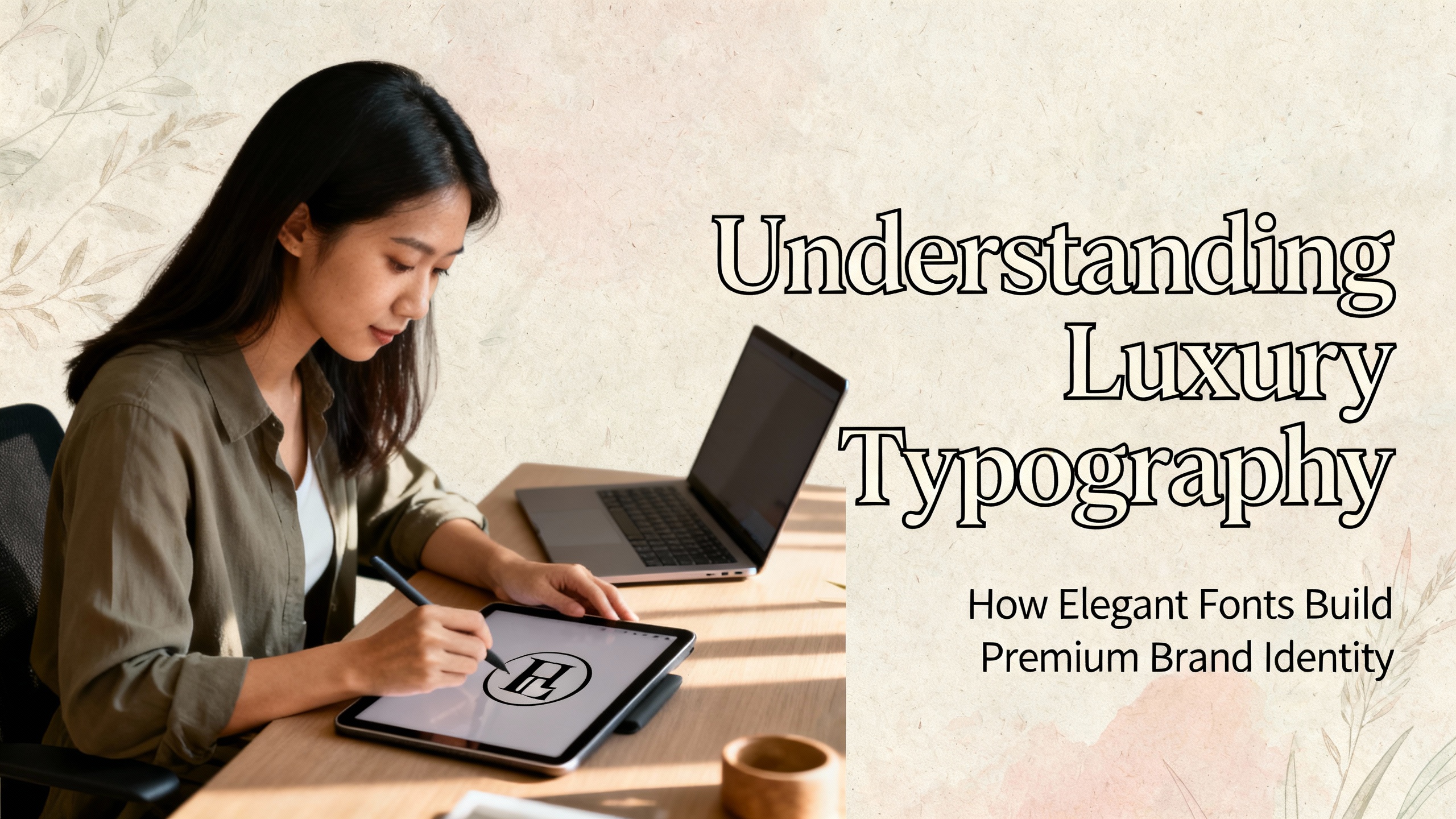
Typography does more than display text it shapes perception. For premium brands, typography becomes a key strategy for expressing exclusivity, elegance, and sophistication. This is where luxury typography comes into play. Luxury typography focuses on refined typefaces designed to evoke a sense of high class, artistry, and premium value. Whether used in fashion, cosmetics, hospitality, or luxury retail, the right typeface can instantly elevate a brand’s visual identity.
This article explores what luxury typography means, how global brands use it, and how designers can select premium fonts from Putracetol.com to craft an elegant brand experience.
What Is Luxury Typography?
Luxury typography refers to a category of typefaces intentionally crafted to express elegance, exclusivity, and refinement. These fonts often feature delicate details, balanced shapes, and harmonious proportions. They create visual cues that signal premium quality and timeless sophistication.
Refined Typography
Luxury fonts typically include:
- Smooth, polished lines
- Thin or tapered strokes
- Symmetrical proportions
- Carefully crafted ligatures
- Elegant serif structures
These subtle design elements work together to create a feeling of grace and quality. Even in minimalist designs, luxury typography adds a high-end finish.
Creates an Exclusive Impression
Luxury typography helps brands stand apart. A refined font communicates exclusivity before a customer reads a single word. It makes packaging, logos, menus, websites, and advertisements look more polished and desirable.
Reinforces Brand Identity
Industries that rely heavily on branding fashion, beauty, hospitality, jewelry, art use luxury typography to strengthen their visual presence. Premium typefaces communicate the brand’s promise: quality, craftsmanship, and exclusivity.
This is why typography is one of the most powerful tools in shaping how audiences perceive premium brands.
Global Brands Using Luxury Typography
Luxury typography is everywhere in high-end branding. Some of the world’s most famous luxury labels rely on specific typographic strategies to communicate elegance, heritage, and exclusivity.
Gucci & Chanel
Both brands use bold but simple typography. Their stacked black lettering creates a strong visual identity. The absence of decorative elements actually increases the luxurious feel, minimalism becomes the symbol of strength and exclusivity.
Prada
Prada often uses sleek geometric serif fonts. Their typography is clean, modern, and balanced, emphasizing simplicity while maintaining sophistication. The sharp serifs and high contrast strokes reinforce a refined, contemporary aesthetic.
Louis Vuitton
Louis Vuitton uses classic serif fonts that evoke tradition and timeless elegance. Their typography balances heritage with modernity, reinforcing the brand’s premium identity.
These examples show that luxury typography isn’t limited to ornate designs. Sometimes elegance lies in simplicity, structure, and proportion.
Recommended Luxury Fonts from Putracetol.com
Putracetol.com offers a curated collection of premium fonts that embody the principles of luxury typography. These typefaces have been used in branding for national films, podcasts, restaurants, and even gaming brands. Here are standout recommendations:
Fujisan – Elegant and Neat

Fujisan features refined shapes and smooth proportions, making it ideal for Japanese-themed designs, wellness brands, or boutique businesses. Its calm elegance reflects thoughtful craftsmanship.
Summer Roadtrip – Geometric and Refined

This font offers clean, geometric strokes and balanced spacing. It has even been used for a national comedy film, proving its versatility across creative industries.
Black Crest – Wavy and Ocean-Inspired
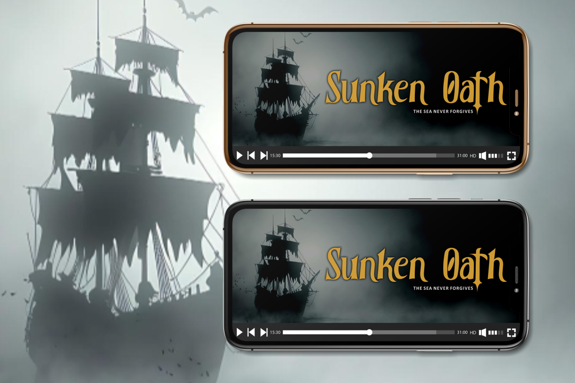
Black Crest carries a unique wavy aesthetic inspired by ocean movement. A global gaming brand once adopted this font, demonstrating its creative and high-impact potential.
Nadishaq Arabic Style – Elegant, Cultural Typography
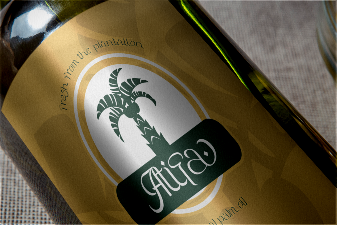
Perfect for Arabic-themed branding or artistic projects, Nadishaq blends cultural influence with premium styling. It has been used in the logo for a national podcast, proving its effectiveness in real branding scenarios.
Sweete Line – Feminine and Dramatic
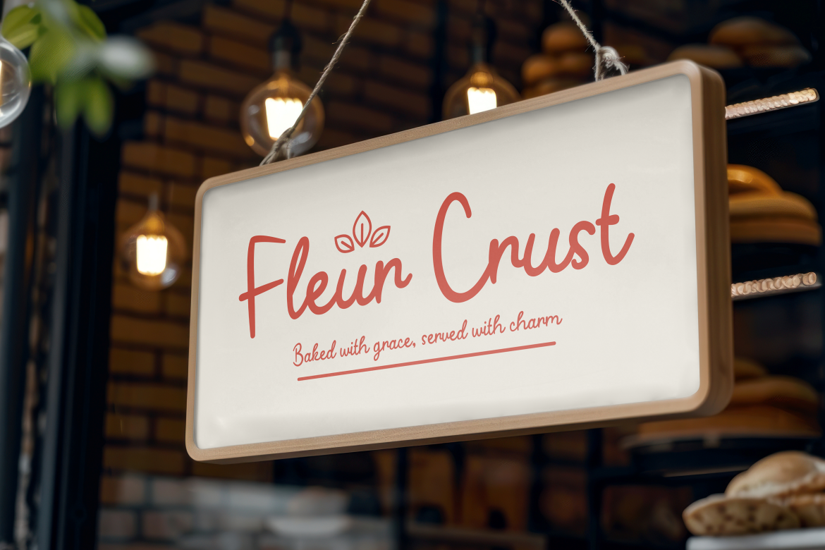
Sweete Line is expressive, soft, and elegant perfect for fashion, beauty, or artistic branding. A national singer selected this font for a song title, highlighting its emotional and aesthetic appeal.
Marie Clarie – Elegant Handwriting Style
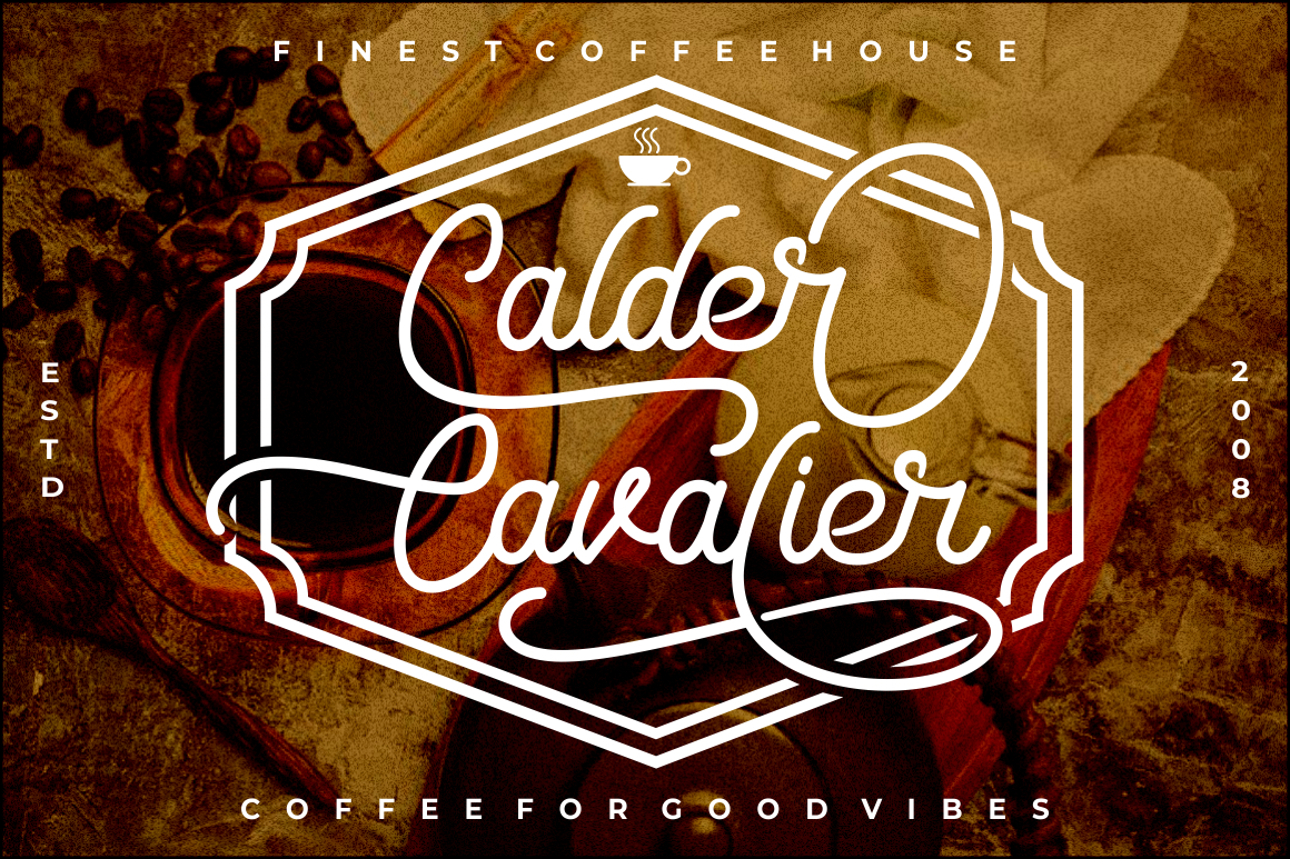
Marie Clarie offers a premium, fluid script style ideal for food branding, restaurants, and boutique hospitality businesses. Its elegant curves deliver a warm, high-end feel.
Conventri – Modern Sans Serif with Geometric Elegance
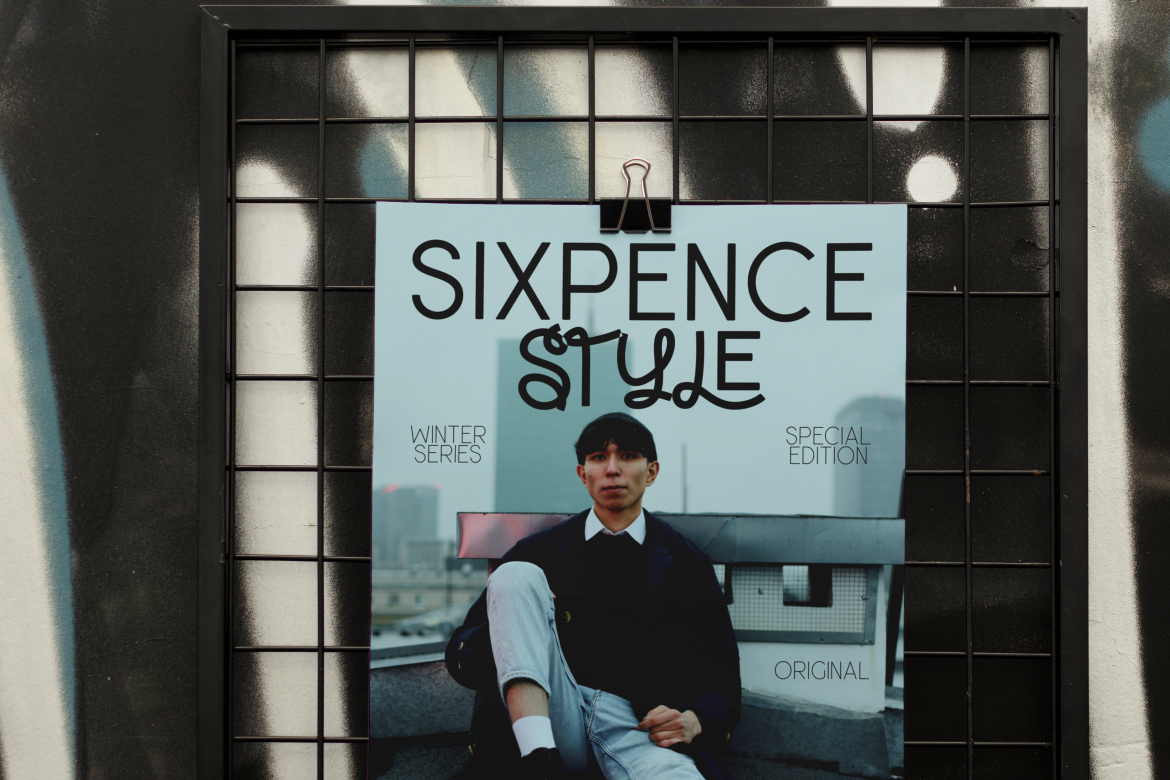
Conventri stands out with its clean lines and contemporary shapes. It is ideal for corporate branding, editorial layouts, or lifestyle businesses needing a modern luxury aesthetic.
Each of these fonts captures the essence of luxury typography while offering flexibility for diverse branding needs.
Why Luxury Typography Works
Luxury typography carries psychological and visual influence. It elevates brand identity by shaping how customers feel before interacting with the product or service.
Enhances Perceived Value
Elegant typography signals quality. Customers subconsciously perceive brands with refined typefaces as more professional, trustworthy, and premium.
Improves Visual Recognition
Luxury fonts have distinctive structures that make them memorable. A unique serif style or elegant script stroke can become a key visual signature.
Creates Emotional Connection
Fonts influence mood. Thin serifs feel timeless and graceful, while flowing handwriting fonts feel warm and expressive. Luxury typography leverages these emotions to connect with audiences.
Supports Minimalist Aesthetics
Many premium brands rely on minimalist design. Luxury fonts shine in simple layouts, often letting typography become the central visual element.
How to Choose the Right Luxury Typography for Your Brand
Selecting a luxury font involves more than choosing something elegant. It must align with the brand’s message, audience, and design strategy.
1. Match Typography with Brand Personality
Is your brand modern, classic, feminine, bold, or artistic?
- Modern brands benefit from geometric sans-serifs like Conventri.
- Feminine brands may prefer emotional scripts like Sweete Line or Marie Clarie.
- Heritage-inspired brands thrive with refined serif styles like Fujisan.
2. Ensure Readability
Even luxury typography must remain legible. Avoid overly decorative elements when designing logos, packaging, or headers.
3. Use Consistent Typography Across Media
Whether on websites, menus, business cards, or packaging, the font should create a unified brand experience.
4. Combine Fonts Strategically
Pair luxury display fonts with simple body text fonts for balance. For example, Fujisan works beautifully as a title font when paired with a minimalist sans serif for body copy.
5. Keep It Timeless
Luxury typography should last for years. Choose refined designs that avoid overly trendy elements.
Conclusion
Luxury typography is more than beautiful lettering, it is a strategic visual tool that helps brands appear exclusive, confident, and elegant. Through refined design, balanced proportions, and subtle artistic details, luxury typefaces elevate the entire brand experience.
With the curated collection from Putracetol.com, designers gain access to premium fonts like Fujisan, Summer Roadtrip, Black Crest, Nadishaq Arabic Style, Sweete Line, Marie Clarie, and Conventri. These typefaces help brands build a sophisticated visual presence that feels both modern and timeless.
Explore more luxury fonts at Putracetol.com and discover the typography that will define your next premium project.
Thank you for taking the time to read this article. If you are looking for more great articles, feel free to visit Putracetol Blog
Additionally, if you want to explore some free typography options, you can check out Putracetol Studio on Dafont. Happy reading and designing!