
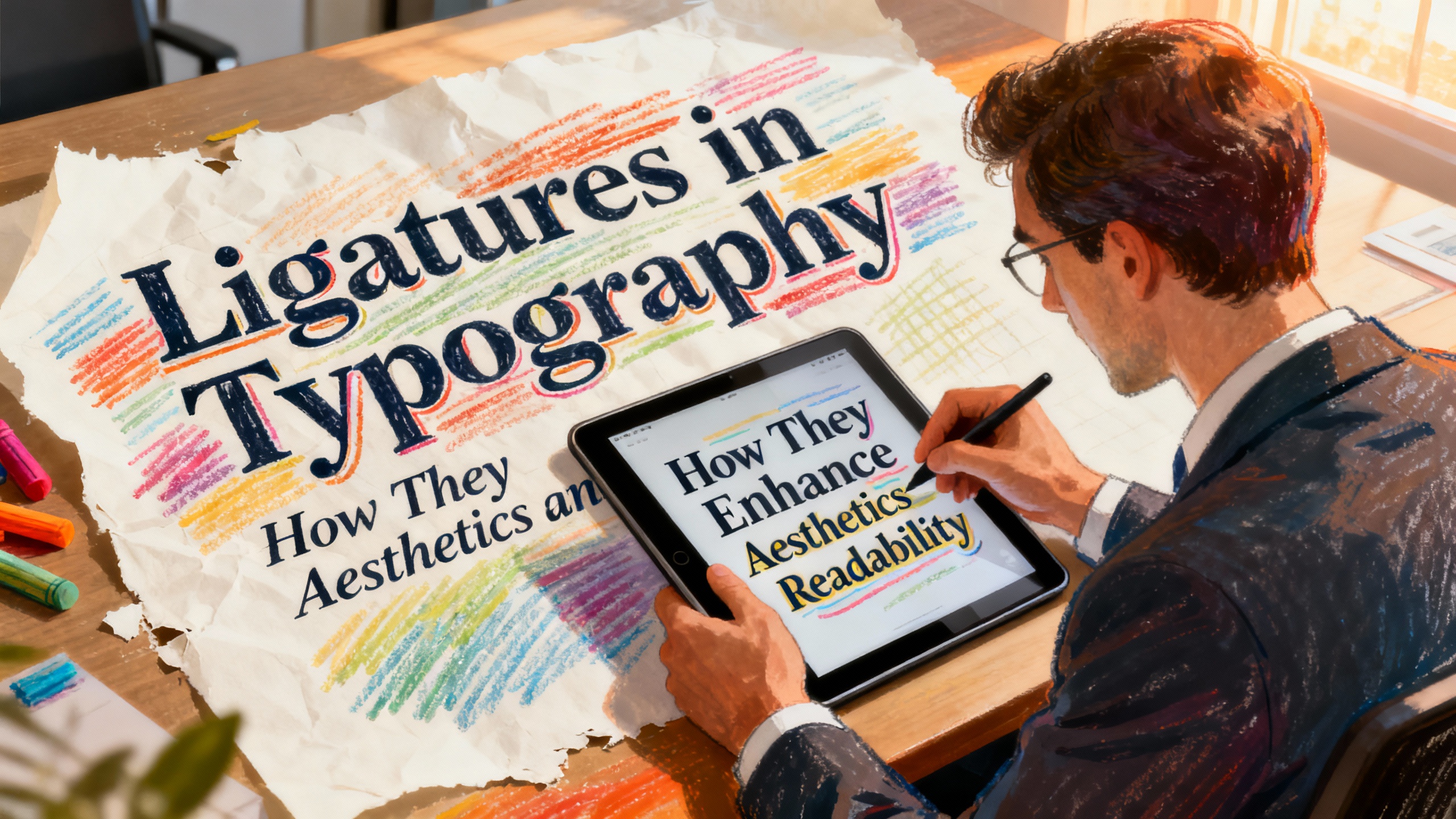
Typography is one of the most important elements in design, shaping the way audiences read, feel, and engage with written content. Among the many typographic features that improve text presentation, ligatures are one of the most timeless and functional. Despite their subtle appearance, ligatures play a major role in enhancing both readability and aesthetics.
This article explores what ligatures in typography are, how they function in design, and why they remain a valuable element in modern branding and digital communication. Whether you’re creating a logo, crafting editorial layouts, or choosing a font for branding, understanding ligatures will help elevate your work.
What Are Ligatures?
A ligature is a special character formed by combining two or more letters into a single, stylistic glyph. These combinations are designed to correct spacing issues, improve flow, and enhance the visual look of text.
Common Ligature Examples
Typical letter combinations include:
- fi
- fl
- ff
- ffi
- ffl
These combinations exist because certain letters naturally collide when placed next to each other. Ligatures solve this issue with smoother, visually cohesive forms.
Aesthetic Purpose
Ligatures prevent awkward shapes or collisions between letters. For instance, the dot on an “i” might clash with the terminal of an “f,” creating visual noise. A custom ligature replaces that collision with a clean, unified shape.
Historical Roots
Ligatures have been around since the early days of manuscript writing. Medieval scribes used them to beautify handwritten texts, speed up writing, and maintain stylistic consistency in manuscripts. Today, these refined forms carry the same charm only now they appear in digital fonts.
Functions of Ligatures in Design
Ligatures combine beauty and function, making them valuable across branding, print, and digital interfaces.
Improve Readability
Ligatures eliminate spacing issues that slow down the eye while reading. By removing visual disruptions, they produce smoother text flow, especially in long-form and editorial content.
Convey Professionalism
Clean, intentional typography suggests expertise. Ligatures enhance the overall polish of the design, making text appear well-crafted and sophisticated. This is especially important in:
- Corporate branding
- Editorial content
- Luxury design
- High-end packaging
Strengthen Visual Identity
Custom ligatures can become a signature element of a brand. Many luxury logos use unique letter combinations as part of their wordmark, creating a recognizable and memorable style.

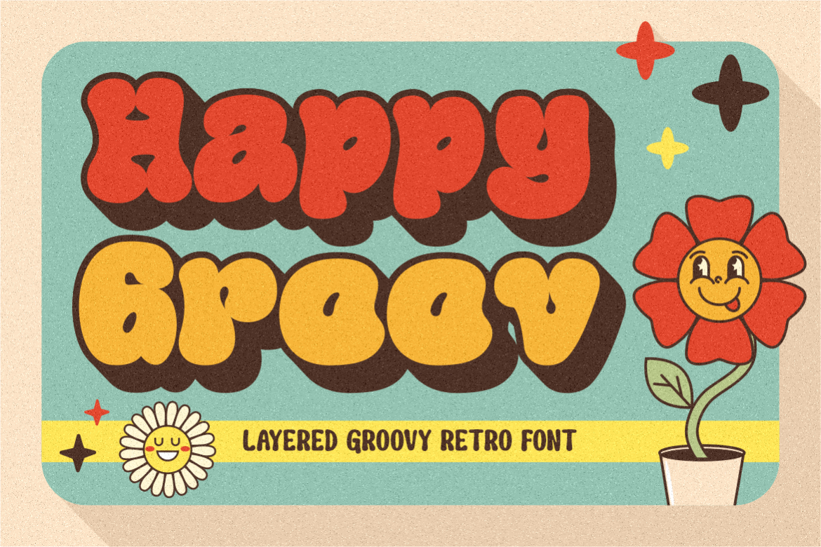
For example, brands using fonts from Putracetol.com such as Luxerna Display, Happy Groov, or Violense can incorporate ligature variations to create elegant custom lettering. These fonts often include built-in ligatures or stylistic alternatives that make wordmarks more expressive.
Add Artistic Value
Ligatures aren’t only functional they are artistic. Designers use them to add personality, innovation, and creativity to typography. Stylized ligatures create rhythmic connections between letters, adding movement and character to the text.
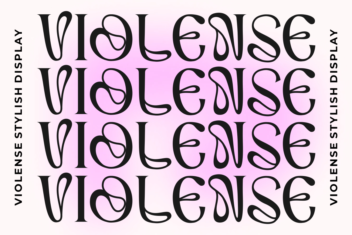
Examples of Ligature Usage from Putracetol.com
Modern fonts often come with automatic or discretionary ligatures to improve text quality. Putracetol.com offers many typefaces that support ligature usage and enhance visual identity.
Logo and Branding
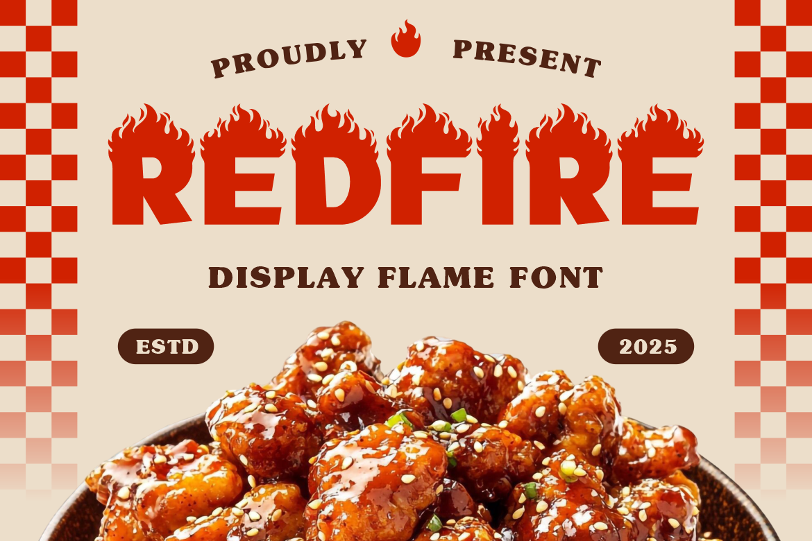
Ligatures shine brightest in logo design. A unique connection between two letters can transform a simple wordmark into a memorable symbol. Fonts like Luxerna Display or Redfire lend themselves well to custom ligature styling in brand logos.
Editorial Design
Magazines, books, and long-form reading materials depend on readability and smooth text flow. Ligatures help remove awkward spacing issues, especially in serif or display fonts.
Modern Digital Fonts
Many contemporary typefaces now include automatic ligatures built into their OpenType features. They activate by default in programs like Adobe Illustrator, InDesign, and Figma.

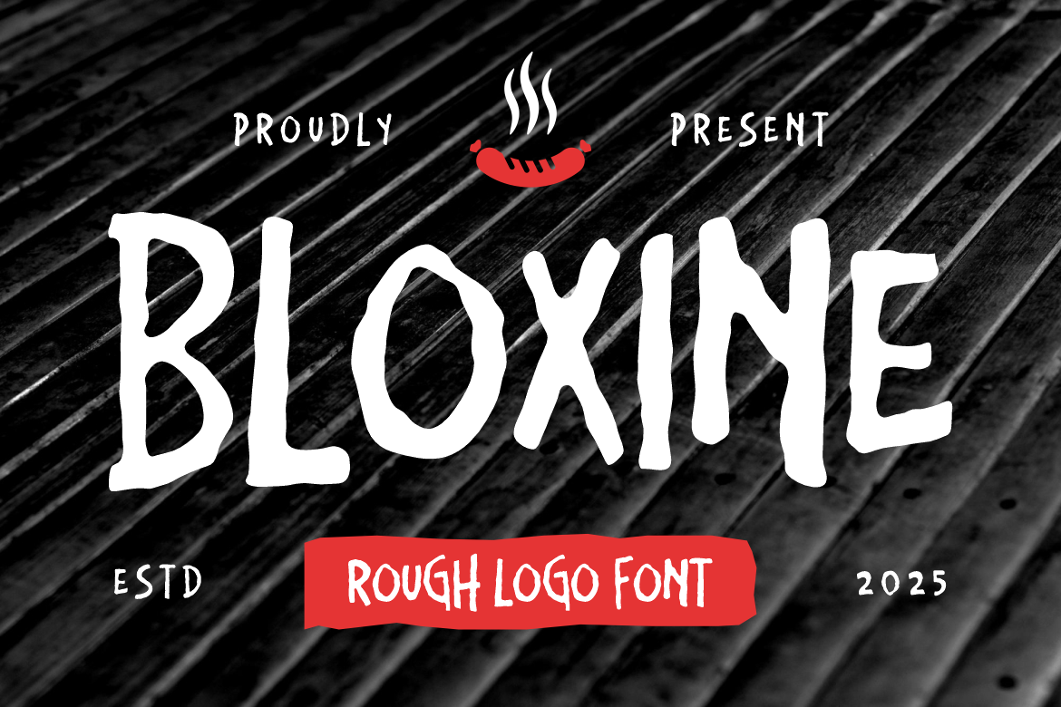
Fonts on Putracetol.com such as Faded Glory, Happy Groov, and Bloxine support typographic refinement through ligature options or stylistic sets, making them ideal for designers who want advanced typography.
Why Ligatures Are Important in Modern Typography
Although they originated centuries ago, ligatures remain crucial in contemporary design for several reasons:
They Improve Visual Harmony
Ligatures create a consistent flow between letters, especially in serif fonts where strokes interact more closely. They help maintain visual rhythm across a block of text.
They Reflect Attention to Detail
When a designer uses ligatures effectively, it shows an elevated level of refinement. Clients and audiences may not consciously notice ligatures, but they feel the difference in quality.
They Support Branding and Aesthetic Style
A custom ligature can make a logo feel more unique and intentional. Even minimalistic brands benefit from one or two signature letter connections that make the wordmark stand out.
They Work Across Print and Digital Applications
Whether in print (books, posters, packaging) or digital (websites, apps, UI), ligatures function seamlessly to improve readability and aesthetics.
Tips for Using Ligatures Effectively
Ligatures can enhance your typography, but they must be used with intent. Here are practical guidelines:
Use Ligatures for Serif and Display Fonts
These styles typically benefit most from ligatures because of their decorative strokes and letter collisions.
Avoid Overusing Decorative Ligatures
Too many stylistic ligatures may reduce readability, especially in body text. Reserve decorative ligatures for:
- Logos
- Headlines
- Large typographic compositions
Test Across Different Sizes
Ensure the ligature remains legible in small or medium sizes, especially when used in branding or packaging.
Pair with Appropriate Secondary Fonts
Ligatures shine best when paired with fonts that contrast or complement them. For example, using Happy Groov for display text and a simple sans-serif for body copy creates visual balance.
Review OpenType Settings
Some fonts include multiple ligature variations. Enable or disable them using software settings to achieve your desired look.
Ligatures as a Branding Tool
Many luxury and high-end brands turn ligatures into iconic symbols. The smooth, artistic connection between letters becomes part of the brand signature, much like a monogram.
Using fonts from Putracetol.com that include stylistic alternates such as Luxerna Display, Violense, or Faded Glory designers can craft personalized ligature combinations that elevate the wordmark beyond standard typography.
A well-designed ligature can:
- Increase brand memorability
- Add sophistication
- Reinforce brand personality
- Support logo longevity
Conclusion
Ligatures are a subtle but powerful feature in typography. They improve readability, enhance aesthetics, and bring elegance to both digital and print designs. From logo creation to editorial layouts, ligatures help designers achieve a polished, professional look that resonates with audiences.
With the curated font collection from Putracetol.com, designers can explore typefaces that support ligatures and advanced typographic features giving them the tools to craft beautiful, cohesive, and elevated designs.
Whether you’re working on branding, print, or digital content, ligatures serve as an essential component in producing refined and visually appealing work.
Explore more premium corporate fonts at Putracetol.com to elevate your visual identity.
Thank you for taking the time to read this article. If you are looking for more great articles, feel free to visit Putracetol Blog
Additionally, if you want to explore some free typography options, you can check out Putracetol Studio on Dafont. Happy reading and designing!