
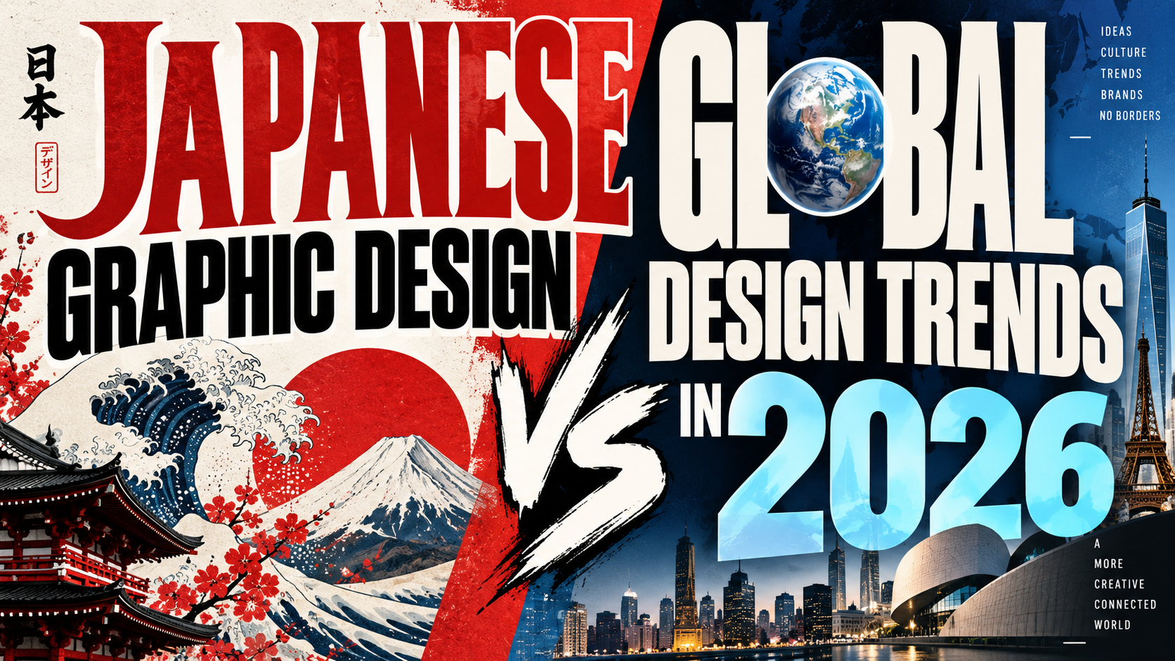
Graphic Design Japan vs the World 2026: Different Visual Languages, Shared Creative Future
Study Principles, Not Surface Style
The best way to approach graphic design Japan vs the world 2026 is to avoid treating either side as one fixed aesthetic. Japanese design includes quiet minimalism, precise information systems, expressive poster art, commercial pop, experimental typography, and craft traditions. Global design is equally diverse.
Instead of copying familiar motifs, study hierarchy, rhythm, negative space, symbolism, typography, and the relationship between tradition and contemporary culture.
What Makes Japanese Graphic Design Distinctive?
Japanese graphic design can move between reduction and visual intensity. Historical poster work combines precise structure, personal expression, and reinterpretations of traditional motifs.
Japan’s sporting pictograms for the 1964 Tokyo Olympics also helped establish an influential visual language for communication across language barriers.
Minimalism Is Only Part of the Story
Japan is frequently associated with restraint, simplicity, and negative space. Those qualities matter, but they do not explain the entire landscape.
Designers such as Tadanori Yokoo represent another direction: dense compositions, eclectic imagery, historical references, pop culture, and strong color. Japanese graphics can therefore be calm and structured in one context, then loud and layered in another.
Typography and Writing Systems
Japanese visual communication may combine kanji, hiragana, katakana, Roman letters, and numerals, creating varied proportions, textures, and hierarchy.
For international designers, the lesson is not to imitate Japanese characters. Instead, observe how typography can function as image, rhythm, and information simultaneously.
For Japan-inspired branding in Latin script, designers can explore PutraCetol Studio display fonts. Actual Japanese-language content should use typefaces with proper Japanese glyph coverage.
Tradition Meets Contemporary Culture
Japanese design often reinterprets historical references without presenting them as museum artifacts. Calligraphic gestures, ukiyo-e-inspired flatness, traditional patterns, seasonal symbolism, and craft materials can coexist with photography, digital interfaces, fashion, or futuristic graphics.
This tradition-modern dialogue now has parallels worldwide. Adobe’s 2026 forecast highlights local and cultural flavor alongside expressive typography, organic imperfection, collage, immersive visuals, and maximalist layouts.
What Global Design Looks Like in 2026
There is no single international style. Global branding moves between minimalist systems, bold editorial typography, nostalgic graphics, tactile textures, AI-assisted surrealism, cinematic storytelling, and maximalist composition.
Canva’s 2026 trend research similarly emphasizes human imperfection, tactile texture, structured simplicity, cinematic drama, regional visual revival, and DIY aesthetics.
This creates a convergence: global design is increasingly interested in local identity and human texture, while Japanese design shows how culturally specific references can coexist with internationally understandable systems.
How Designers Can Combine Both Perspectives
Start with communication. For multilingual campaigns, study Japan’s pictogram tradition. For emotional work, explore the contrast between clean structure and expressive imagery.
Use grids without making every composition rigid. Let negative space establish hierarchy, and introduce cultural references only when they genuinely support the brand.
A contemporary tea brand might combine restrained packaging, tactile paper, seasonal color, and precise typography. A music campaign could use layered imagery, oversized type, and energetic color while maintaining a disciplined grid.
Comparison
| Japanese Design Tendency | Global 2026 Tendency |
|---|---|
| Precision and visual economy | Styles range from minimal to maximal |
| Tradition-modern dialogue | Growing interest in local identity |
| Strong pictogram legacy | Cross-platform visual communication |
| Multiple writing systems | Multilingual and responsive typography |
| Craft and material sensitivity | Tactile and imperfect visual trends |
| Restraint and expressive density | Minimalism, collage, surrealism, maximalism |
Common Mistakes
The first mistake is reducing Japanese graphic design to white space, red circles, brush lettering, and minimalist packaging. Those references may be recognizable, but copying them without context produces a stereotype. Study posters, information systems, typography, packaging, editorial work, and contemporary digital culture before deciding what is relevant.
Another mistake is treating “global design” as a Western commercial opposite to Japanese restraint. International design in 2026 is culturally diverse, and current trend research shows growing interest in local identity, handmade texture, maximalism, and emotional storytelling. Compare design philosophies and communication strategies rather than searching for one superior style.
The final mistake is using Japanese-looking Latin typography as though it were Japanese-language typography. A display font can evoke an atmosphere for an English headline, but that does not mean it supports Japanese characters or authentic typesetting. For bilingual projects, use appropriate native-script fonts and knowledgeable language or cultural reviewers.
Conclusion
Graphic design Japan vs the world 2026 is less about choosing one aesthetic over another and more about understanding different ways of organizing meaning.
Japanese graphic design offers lessons in precision, pictograms, typographic rhythm, tradition-modern dialogue, and the deliberate use of both restraint and visual density. Global design in 2026 is becoming more culturally specific, tactile, experimental, and human.
Designers can combine these lessons through careful research, clear hierarchy, respect for writing systems, and purposeful typography. PutraCetol Studio fonts can support distinctive Latin-script branding, posters, packaging, and digital campaigns while the broader visual system carries the cultural story responsibly.
Explore these fonts and many more at PutraCetol.com to build a business identity that looks professional, trustworthy, and memorable.
Additionally, if you want to explore some free typography options, you can check out Putracetol Studio on Dafont. Happy reading and designing!