

Italian cuisine is deeply rooted in tradition, family, and cultural heritage. At the same time, modern dining audiences expect more than authentic flavors alone. They seek experiences that feel relevant, visually appealing, and aligned with contemporary lifestyles. This shift has made branding an essential element in shaping how Italian restaurants are perceived before guests even step inside.
This article explores a branding project for a contemporary Italian restaurant, developed to balance elegance, warmth, and modernity. The visual identity is designed to communicate refined simplicity while remaining welcoming and approachable. Crafted by Putracetol.com, the branding demonstrates how Italian tradition can coexist with modern design principles to create a cohesive and memorable restaurant identity.
The Role of Branding in Contemporary Italian Dining
In today’s competitive dining scene, branding is not decoration—it is communication. A restaurant’s visual identity sets expectations, defines atmosphere, and influences emotional connection. For Italian restaurants, this task is especially nuanced. The brand must respect culinary heritage while avoiding outdated or overly decorative visuals.
Contemporary Italian restaurant branding focuses on:
- Clean and modern presentation
- Warm and inviting emotional tone
- Subtle references to Italian culture
- Consistency across physical and digital experiences
When executed correctly, branding becomes an extension of the dining experience itself.
Identity Concept from Putracetol.com
The identity concept behind this project centers on balance. The brand avoids extremes, choosing neither rigid minimalism nor heavy traditional ornamentation. Instead, it blends modern clarity with cultural warmth.
Contemporary and Elegant
The foundation of the identity is refined simplicity. Modern typography, clean layouts, and balanced spacing create a calm and elegant visual language. Every element is intentional, ensuring the brand feels premium without appearing distant or cold.
This contemporary approach helps the restaurant appeal to:
- Urban professionals
- Design-conscious diners
- Younger audiences seeking elevated dining experiences
Elegance is expressed through restraint rather than excess.
Warm and Welcoming Atmosphere
Italian dining culture is centered around hospitality and togetherness. To reflect this, the visual identity uses warmth as a guiding principle. Colors, typography, and graphic elements are selected to create a friendly, relaxed mood.
Warmth in branding encourages:
- Longer dining experiences
- Emotional comfort
- A sense of familiarity and trust
The design ensures that guests feel invited rather than intimidated.
Balance of Tradition and Modernity
Rather than directly copying classic Italian visuals, the branding references tradition subtly. Proportions, typography rhythm, and color choices echo Italian heritage without relying on clichés.
This balance ensures:
- Timeless relevance
- Cultural authenticity
- Visual freshness
The restaurant feels rooted in Italian culture while remaining unmistakably modern.
Visual Consistency Across Touchpoints
Consistency strengthens brand recognition and trust. The identity system is designed to be flexible yet cohesive across:
- Logo usage
- Menus and tableware
- Exterior and interior signage
- Promotional materials
- Digital platforms and social media
Each touchpoint reinforces the same brand personality and visual tone.
Key Design Elements
Clean Typography
Typography plays a central role in contemporary Italian restaurant branding. Clean, readable fonts ensure clarity while communicating sophistication. The typography system avoids unnecessary decoration, focusing instead on proportion and balance.
Clean typography supports:
- Easy menu navigation
- Clear brand messaging
- Visual harmony across layouts
It allows the food, space, and experience to remain the focus.
Warm Color Palette
The color palette draws inspiration from Italian dining spaces—warm neutrals, soft earthy tones, and gentle contrasts. These colors enhance the feeling of comfort and hospitality.
A warm palette:
- Complements food presentation
- Creates inviting interiors
- Enhances brand memorability
The colors work consistently across print, packaging, and digital media.
Simple and Versatile Logo
The logo is designed to be elegant, memorable, and adaptable. Simplicity ensures that the logo remains effective across various sizes and applications, from signage to menu covers.
A simple logo:
- Improves recognition
- Supports long-term brand use
- Integrates seamlessly with other design elements
It acts as a quiet but confident symbol of the restaurant’s identity.
Supporting Graphics
Supporting graphic elements add depth and cohesion without overwhelming the design. Used sparingly, they reinforce the contemporary tone and provide visual interest.
These elements help:
- Create hierarchy
- Guide attention
- Strengthen overall consistency
The result is a visual system that feels complete and intentional.
Font Recommendations from Putracetol Studio
Typography is essential in expressing both modernity and warmth. The following fonts from Putracetol Studio align well with contemporary Italian restaurant branding.
Pizzalia

Pizzalia brings a subtle Italian character while remaining playful and refined. It works well for menu highlights, headings, or brand accents that need personality.
Nipsey
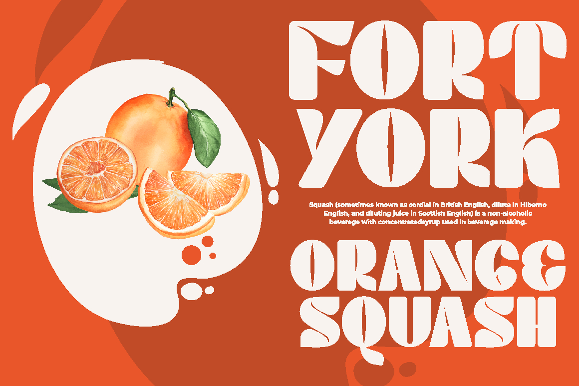
A clean and modern typeface designed for readability. Ideal for menus, informational text, and signage where clarity is essential.
Warm Toast
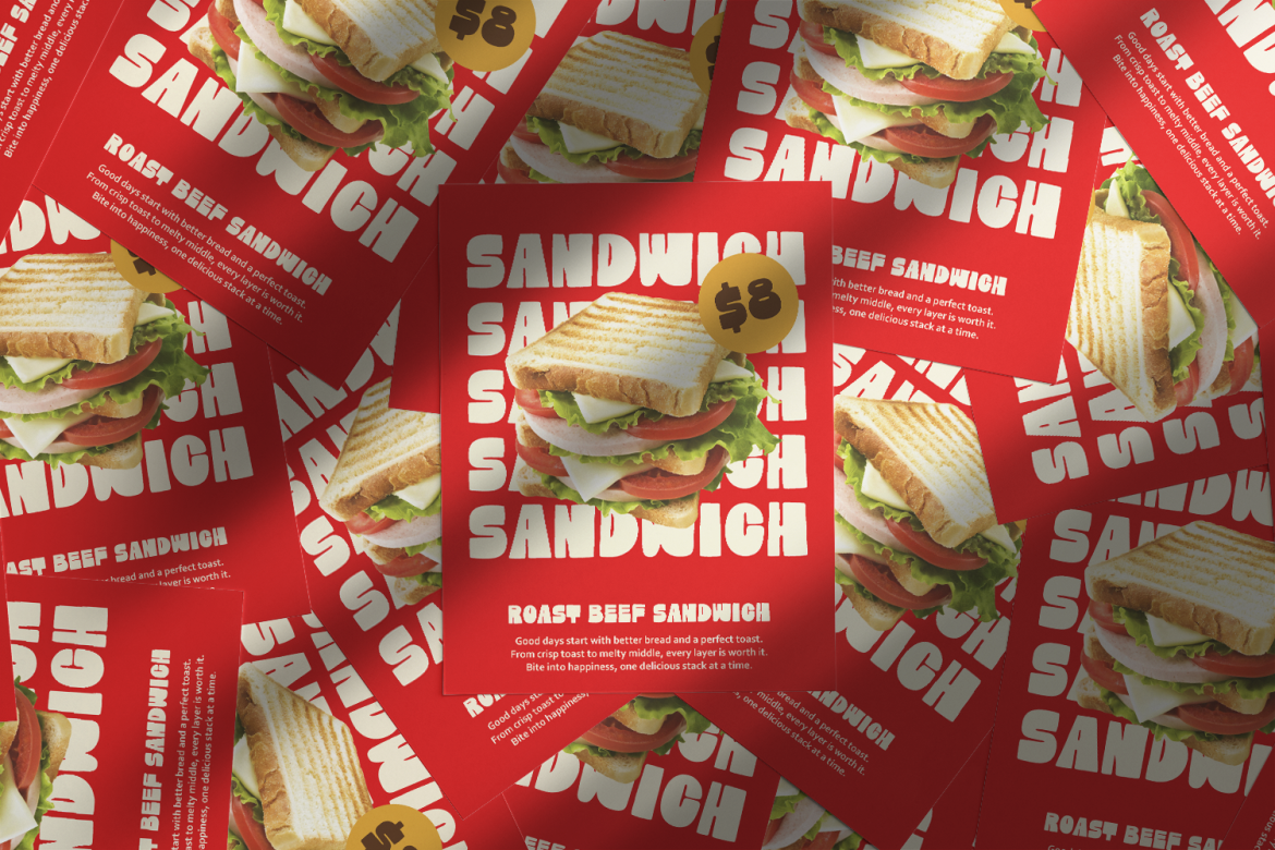
As the name suggests, Warm Toast delivers friendliness and softness. This font is suitable for welcoming messages, casual content, and supporting text.
Virtus Verona
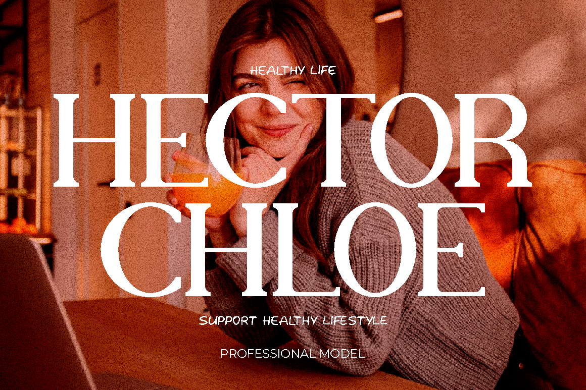
Inspired by Italian character and structure, this font adds a sense of heritage while maintaining a modern feel. Ideal for logos and key brand statements.
Charm Man
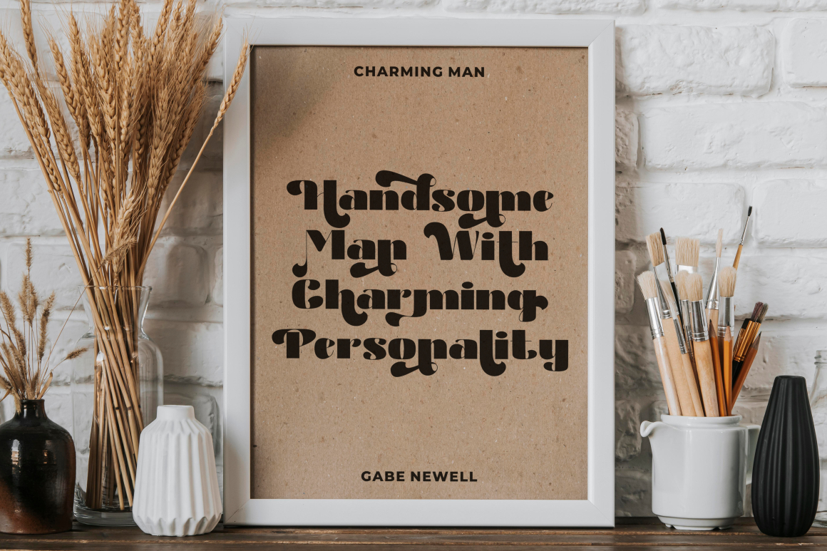
An expressive font that adds personality without overpowering the design. Works well for promotions and creative applications.
Together, these fonts create a flexible typography system that supports hierarchy, contrast, and emotional tone.
Why Contemporary Branding Works for Italian Restaurants
Modern diners value authenticity, but they also respond to thoughtful design. Contemporary branding helps Italian restaurants:
- Stand out in competitive markets
- Appeal to design-aware audiences
- Communicate quality visually
- Build emotional connection before the first bite
Branding becomes part of the storytelling, shaping expectations and enhancing the dining experience.
Applications Across the Restaurant Brand
The branding system is designed for real-world usability and scalability, including:
- Printed menus and drink lists
- Packaging and takeaway materials
- Interior and exterior signage
- Social media content
- Website and digital ordering platforms
Each application maintains visual consistency while adapting to its context.
Conclusion
The contemporary Italian restaurant branding project by Putracetol.com demonstrates how thoughtful design can bridge tradition and modernity. Through clean typography, warm color palettes, a simple logo, and consistent visual language, the restaurant presents itself as elegant yet approachable.
This branding approach positions the restaurant as a modern culinary destination that respects Italian heritage while embracing contemporary dining culture. By focusing on clarity, warmth, and balance, the identity enhances not only visual appeal but the overall guest experience.
Thank you for taking the time to read this article. If you are looking for more great articles, feel free to visit Putracetol Blog
Additionally, if you want to explore some free typography options, you can check out Putracetol Studio on Dafont. Happy reading and designing!