
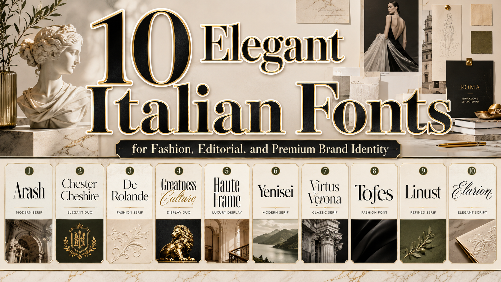
Italian fonts are often associated with elegance, artistic confidence, classical proportion, and refined visual storytelling. Although “Italian fonts” is not a formal type classification, the phrase commonly describes typefaces influenced by Italy’s long history of printing, Renaissance publishing, luxury fashion, architecture, and expressive graphic design.
Italy has made a foundational contribution to typography. In late-15th-century Venice, Aldus Manutius commissioned Francesco Griffo to develop an early italic typeface, helping establish a typographic form that remains essential today. Centuries later, Giambattista Bodoni transformed book design through geometric letter construction, carefully controlled spacing, generous margins, and a neoclassical preference for elegant simplicity.
For contemporary designers, Italian-inspired typography can take several forms. A high-contrast serif may suggest Milanese fashion and luxury publishing. A flowing script can communicate romance, craftsmanship, or Mediterranean warmth. A clean modern display font may reference contemporary Italian architecture, product design, and premium hospitality.
The fonts in this guide are contemporary typefaces selected for their ability to support those Italian-inspired design directions. Virtus Verona explicitly draws its name and concept from Verona, while the other recommendations reflect qualities such as editorial elegance, classical structure, fashionable contrast, artistic alternates, and sophisticated font pairing.
Initial Suggestion
Choose the Italian Aesthetic You Want to Express
Before selecting a font, define what “Italian style” means for your project. Italian visual culture is broad, so different brands may require completely different typographic personalities.
A luxury fashion label may need tall, high-contrast letterforms with dramatic spacing. A restaurant or boutique hotel may benefit from a warmer serif or romantic script. An architecture studio may prefer disciplined geometry, while a wedding or lifestyle brand could use a complementary script-and-serif duo.
Separate Heritage from Stereotype
Italian typography does not have to rely on exaggerated restaurant lettering, decorative flags, or obvious cultural symbols. A more sophisticated approach is to draw from the principles behind Italian design:
- Balanced proportion
- Confident simplicity
- High-quality craftsmanship
- Expressive details
- Editorial hierarchy
- Controlled use of ornament
- Strong relationships between text and white space
Bodoni’s work is a useful historical example. His pages emphasized type itself, supported by generous spacing and restrained composition rather than unnecessary decoration.
Use Display Fonts Selectively
Many Italian-style fonts are designed to create impact in logos, packaging titles, magazine covers, invitations, and advertising headlines. They may not be suitable for long paragraphs or small interface text.
A practical typography system often combines:
- One distinctive display font for identity
- One neutral supporting font for body copy
- Optional script or italic accents for emotional emphasis
Check OpenType and Language Support
Alternates, ligatures, swashes, and multilingual characters can greatly expand the creative value of a font. However, not every typeface includes the same features. Review the glyph set, test your actual business name, and confirm licensing before committing to packaging, a website, or an international campaign.
Jump to Recommended Fonts
1. Arash Modern Serif Font
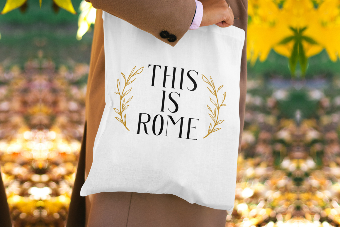
Arash is a modern serif family that balances polished elegance with practical flexibility. Its six styles provide different levels of weight and emphasis, allowing designers to build a more complete identity rather than relying on one static display face. The combination of contemporary construction and recognizable serif details makes it effective for premium branding that needs to feel sophisticated without becoming overly traditional.
Pros
- Six styles for flexible hierarchy
- Refined modern serif construction
- Strong readability in display layouts
- Suitable for cohesive brand systems
Best For
- Fashion branding
- Restaurant identities
- Luxury packaging
- Editorial covers
- Boutique hotels
- Premium product labels
2. Chester Chesire Elegant Font Duo

Chester Chesire combines a flowing script with an elegant serif, giving designers two coordinated voices within one family. Its classic-meets-modern personality works especially well when a project needs both formal structure and personal expression. The family also includes alternative characters that can add variation and help create a more distinctive logo or invitation design.
Pros
- Coordinated script and serif styles
- Rich alternative characters
- Elegant and luxurious personality
- Useful across print and digital media
Best For
- Wedding invitations
- Fashion editorials
- Boutique branding
- Premium stationery
- Beauty campaigns
- Romantic packaging
3. De Rolande Luxury Elegant Display Typeface

De Rolande is designed for brands that want a formal, luxurious, and timeless presentation. Its OpenType alternates and ligatures provide greater control over wordmarks and headline compositions, while its multilingual support makes it useful for broader commercial applications. The typeface performs particularly well where typography must communicate refinement immediately.
Pros
- OpenType alternates and ligatures
- Comprehensive multilingual support
- Strong luxury positioning
- OTF, TTF, and WOFF formats
Best For
- Luxury fashion
- Cosmetics
- Jewelry packaging
- High-end hospitality
- Magazine titles
- Premium advertising
4. Greatness Culture Stylish Duo Font
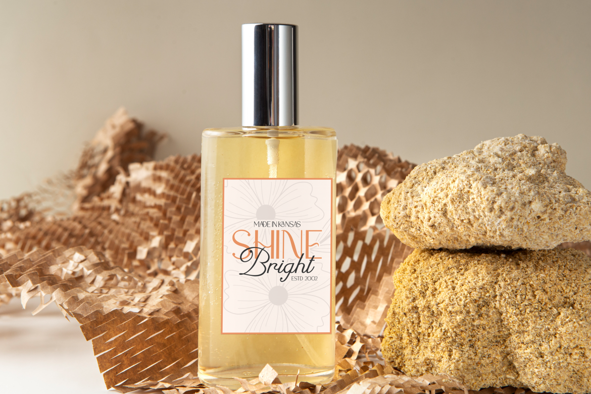
Greatness Culture pairs a sleek sans-serif with a flowing script, creating a flexible combination of modern clarity and expressive elegance. The sans-serif can establish hierarchy and structure, while the script adds warmth to logos, taglines, packaging, or promotional details. This makes the duo useful for brands seeking a sophisticated Italian lifestyle mood without becoming excessively formal.
Pros
- Script and sans-serif combination
- Built-in contrast for brand hierarchy
- Modern yet expressive
- Suitable for luxury and lifestyle work
Best For
- Lifestyle brands
- Fashion campaigns
- Café identities
- Premium packaging
- Creative studios
- Social media branding
5. Haute Frame Fashion Font
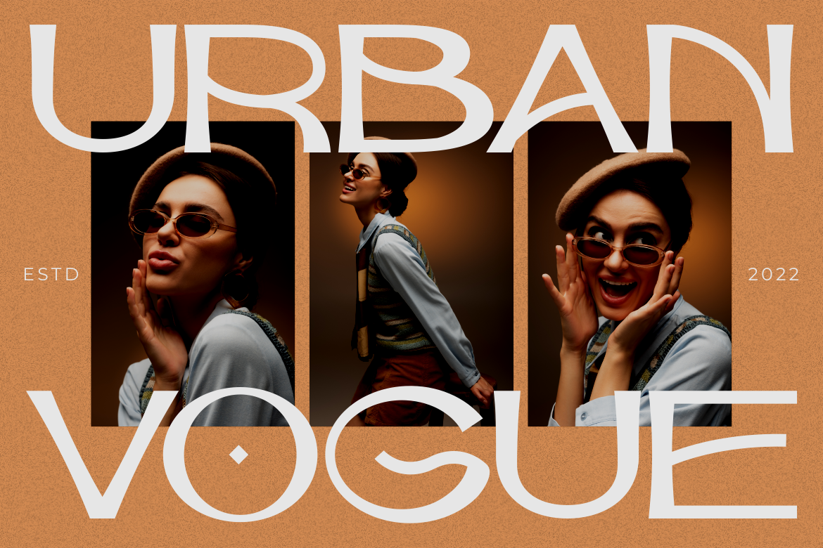
Haute Frame reflects the polished visual language of contemporary fashion publishing. Its tall proportions, restrained stroke contrast, soft curves, spacious forms, and subtle Art Deco influence create an editorial personality that feels elegant and modern. It is particularly effective for brands inspired by Milanese fashion, luxury cosmetics, or minimalist Italian interiors.
Pros
- Tall, fashionable proportions
- Editorial and Art Deco influences
- Sophisticated spacing
- Strong uppercase and lowercase character
Best For
- Fashion houses
- Beauty studios
- Perfume packaging
- Magazine mastheads
- Jewelry brands
- Luxury portfolios
6. Yenisei Modern Serif Font
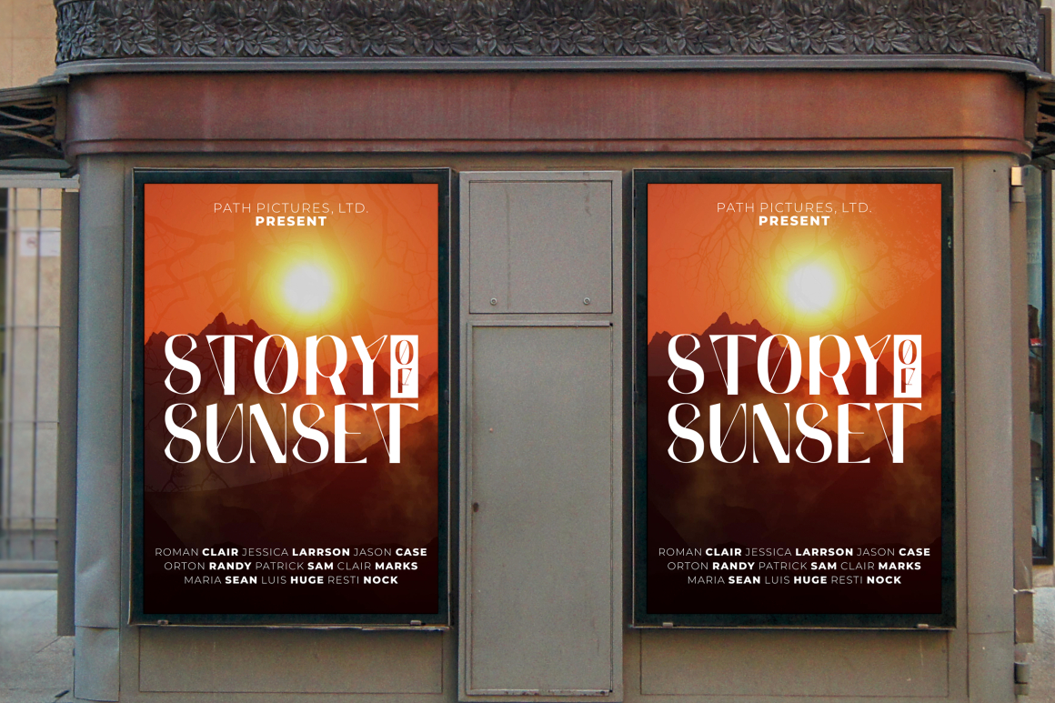
Yenisei blends luxury serif influences with modern typographic styling. Its OpenType features include numerous alternates, ligatures, and end swashes, giving designers room to create elegant custom-looking words without manually redrawing letters. The result works well for artistic branding that needs both classical refinement and a more expressive finish.
Pros
- Numerous stylistic alternates
- Ligatures and end swashes
- Elegant modern-serif structure
- Strong decorative flexibility
Best For
- Logo design
- Fashion packaging
- Editorial headlines
- Art books
- Greeting cards
- Premium merchandise
7. Virtus Verona Duo Font
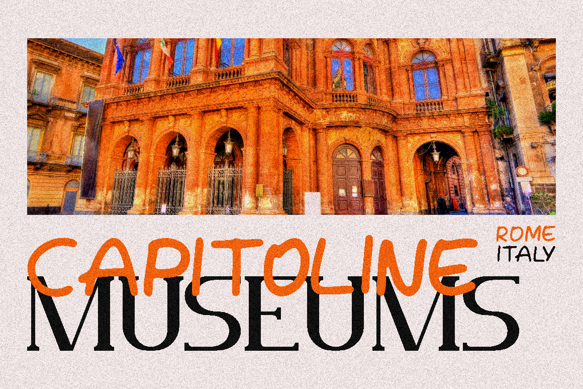
Virtus Verona is the most explicitly Italian-inspired option in this collection. Its concept references Verona, a city associated with romantic architecture and cultural heritage, while the family combines a flowing script with a clean sans-serif. That pairing allows a brand to move between romance and modern simplicity without losing visual consistency.
Pros
- Direct Verona-inspired concept
- Coordinated script and sans-serif
- Romantic yet contemporary
- Highly versatile across applications
Best For
- Italian restaurants
- Destination weddings
- Boutique hotels
- Travel branding
- Romantic packaging
- Lifestyle products
8. Tofes Modern Serif Font

Tofes is a clean modern serif designed to communicate elegance, class, and professional polish. Its OpenType alternates and ligatures give designers options for refining logos and headlines, while multilingual support expands its usefulness for international branding. Tofes is a strong choice when the project needs Italian-style refinement without excessive ornamentation.
Pros
- Clean modern construction
- OpenType alternates and ligatures
- Multilingual support
- Versatile professional appearance
Best For
- Corporate luxury brands
- Restaurant menus
- Packaging design
- Logo systems
- Real estate branding
- Editorial projects
9. Linust Display Modern Font
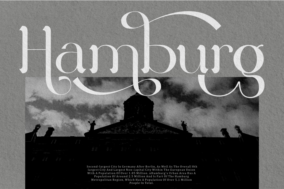
Linust offers a contemporary display style with a broad selection of alternative characters. Its clean modern structure can support minimalist Italian-inspired branding, while the alternates allow selected words to feel more exclusive and customized. It works best in large applications where its refined details and modern visual rhythm can remain visible.
Pros
- Extensive alternative characters
- Modern, polished structure
- Strong display performance
- Flexible for logo customization
Best For
- Hotel branding
- Architecture studios
- Modern restaurants
- Creative portfolios
- Website hero sections
- Premium product campaigns
10. Elarion Elegant Serif Font

Elarion uses tall letterforms, refined contrast, soft terminals, and balanced proportions to create a calm yet confident editorial identity. Its uppercase characters provide presence for logos, while its lowercase forms offer a softer tone for secondary headlines and campaign copy. The overall style suits brands that want understated luxury rather than highly decorative typography.
Pros
- Tall and graceful proportions
- Refined stroke contrast
- Balanced headline spacing
- Strong uppercase and lowercase relationship
Best For
- Editorial branding
- Wine and food packaging
- Luxury labels
- Beauty products
- Boutique businesses
- Sophisticated advertising
Comparison
| Font | Main Style | Visual Personality | Key Advantage | Best Application |
|---|---|---|---|---|
| Arash | Modern Serif Family | Refined and versatile | Six coordinated styles | Complete brand systems |
| Chester Chesire | Script and Serif Duo | Romantic and luxurious | Alternative characters | Weddings and fashion |
| De Rolande | Luxury Display | Timeless and formal | OpenType and multilingual support | Premium packaging |
| Greatness Culture | Script and Sans Duo | Modern and expressive | Built-in typographic contrast | Lifestyle branding |
| Haute Frame | Fashion Display | Editorial and sophisticated | Tall fashion-led construction | Fashion and beauty |
| Yenisei | Modern Serif | Artistic and elegant | Alternates, ligatures, swashes | Logos and covers |
| Virtus Verona | Script and Sans Duo | Romantic and Italian-inspired | Flexible two-font pairing | Hospitality and weddings |
| Tofes | Modern Serif | Clean and professional | Multilingual versatility | Corporate luxury |
| Linust | Modern Display | Minimal and contemporary | Alternative characters | Architecture and digital |
| Elarion | Elegant Serif | Calm and premium | Refined contrast | Editorial and packaging |
Best Overall Italian-Inspired Font
Virtus Verona is the most direct choice for an Italian-themed project because its concept explicitly references Verona and combines romantic script lettering with a clean modern sans-serif.
If you want Best for Italian Fashion Branding
or you want Best for Luxury Editorial Design
Best for Romantic and Hospitality Branding
Best for Modern Italian Minimalism
Common Mistake
One common mistake is assuming that any elegant serif automatically communicates authentic Italian design. High contrast and decorative curves may create a luxurious impression, but Italian-inspired branding depends on the entire visual system. Spacing, photography, color, layout, materials, and tone all influence whether a brand feels refined or merely ornamental. A strong Italian-style identity often uses restraint, allowing carefully selected typography and generous white space to create the sense of quality.
Another mistake is combining multiple decorative fonts without establishing clear roles. A script, high-contrast serif, and experimental display font may each look attractive independently, but using all three at equal strength creates competition and weakens hierarchy. A better system assigns one font to the logo or primary headlines, another to supporting information, and a neutral text face to longer content. Font duos such as Chester Chesire, Greatness Culture, and Virtus Verona simplify this process because their styles were designed to complement each other.
A third mistake is using an Italian-style display font without testing readability, language support, or production conditions. Thin fashion strokes may disappear in small labels, elaborate swashes can become unclear on mobile screens, and an incomplete character set may create problems for international campaigns. Always test the actual business name, product descriptions, prices, accented characters, and packaging dimensions before final approval.
Conclusion
Italian fonts represent more than one visual style. Their appeal comes from a broad typographic legacy that includes Renaissance publishing, the development of italic type in Venice, Bodoni’s disciplined neoclassical pages, romantic script traditions, fashion editorial design, and modern experimentation.
For a directly Italian-inspired identity, Virtus Verona offers the clearest connection through its romantic concept and coordinated font pairing. Haute Frame, Elarion, and Arash work beautifully for fashion and luxury branding, while De Rolande, Yenisei, and Tofes bring refined serif character to editorial and packaging projects. Designers who need more contrast and flexibility can turn to the duo systems in Chester Chesire and Greatness Culture, while Linust offers a cleaner contemporary direction.
The best choice depends on the story your brand needs to tell. Use elegant typography with intention, support it with thoughtful spacing and visual hierarchy, and choose OpenType features that add distinction without reducing clarity.
Explore these typefaces from PutraCetol Studio to create logos, packaging, fashion campaigns, editorials, hospitality identities, and digital experiences with a polished Italian-inspired character.
Explore these fonts and many more at PutraCetol.com to build a business identity that looks professional, trustworthy, and memorable.
Additionally, if you want to explore some free typography options, you can check out Putracetol Studio on Dafont. Happy reading and designing!