

Learning how to identify fonts on websites is a valuable skill for graphic designers, brand strategists, developers, and anyone studying contemporary typography. A well-chosen website font can reveal how a brand communicates personality, builds hierarchy, improves readability, and creates consistency across digital touchpoints.
There are several ways to investigate website typography. A browser extension can reveal font information by hovering over text. Developer tools can show the CSS declaration and the typeface actually rendered by the browser. Image-based services can analyze screenshots, while mobile applications can help identify lettering found on posters, packaging, signs, and other physical objects.
The distinction between a declared font and a rendered font is especially important. A CSS rule may contain several names in a font stack, but the browser could display a fallback because the preferred webfont failed to load, lacks a required character, or is unavailable on the user’s device. Chrome DevTools includes a Rendered Fonts section specifically for confirming which font was used to display the selected text.
This guide explains how to identify fonts from live websites and flattened images, how to verify the result, and how to turn typographic research into useful design inspiration. It also introduces a collection of free fonts from PutraCetol Studio for branding, packaging, editorial work, posters, and digital projects.
Initial Suggestion
Start by Identifying the Source Type
The correct method depends on what you are examining.
First Use a browser extension when the text is selectable on a live website. Second Use developer tools when you need the most technically reliable answer. Use an image-matching service when the typography appears inside a screenshot, banner, canvas, video frame, SVG illustration, or flattened image. Use a mobile app when the lettering comes from a photograph or real-world object.
Method 1: Use a Browser Extension
A browser extension is the fastest option for everyday typography research. WhatFont allows users to activate the extension, hover over website text, and click an element to reveal more information about its styling. Font Finder can also inspect the selected element and report the rendered family, size, weight, line height, spacing, color, and other CSS properties.
A simple workflow is:
- Install and activate the extension.
- Open the website you want to study.
- Hover over the relevant headline, menu, or paragraph.
- Click the text to reveal additional details.
- Record the family, weight, size, line height, and letter spacing.
Extensions are ideal for quick inspiration gathering, competitor research, and design audits. However, the reported family should still be verified when accuracy matters.
Method 2: Inspect the Website Code
Developer tools provide the most dependable method for live web text.
In Chrome:
- Right-click the text and select Inspect.
- Open the Computed section.
- Search for
font-family. - Scroll to Rendered Fonts.
- Review the typeface, source, and glyphs used by the selected element.
The font-family declaration shows the intended font stack, while Rendered Fonts confirms what the browser actually displayed. Chrome can also produce a CSS Overview showing the fonts used across a page and their occurrences by size, weight, and line height.
Firefox offers a dedicated Fonts view inside its Inspector. It can display fonts applied to a page, provide editable samples, and expose controls for supported variable-font axes.
Method 3: Upload a Screenshot to a Font Identifier
When text is part of an image, CSS inspection cannot reveal the font. Capture a clear screenshot and upload it to a visual font-matching service.
WhatTheFont compares uploaded lettering against a large typeface database and returns suggested matches with editable previews. Font Squirrel Matcherator accepts JPG, GIF, and PNG images and allows users to confirm the characters detected in the sample.
For better results:
- Crop closely around one line of text.
- Use a high-resolution image.
- Remove unrelated graphics where possible.
- Correct strong perspective distortion.
- Separate different font styles into individual samples.
- Include several distinctive letters rather than one character.
- Avoid heavy shadows, outlines, textures, and overlapping objects.
Image tools usually provide likely matches, not guaranteed identification. Compare the suggested fonts using distinctive glyphs such as a, g, R, Q, M, numerals, ampersands, and punctuation.
Method 4: Identify Fonts on a Mobile Device
Adobe Capture can analyze typography through a mobile camera or an existing image and recommend visually similar fonts that can be added to a Creative Cloud account. Adobe Fonts also provides visual search for identifying type from uploaded images.
Mobile identification is useful when studying:
- Storefront signage
- Product packaging
- Printed magazines
- Restaurant menus
- Event posters
- Vehicle graphics
- Museum labels
- Outdoor advertisements
Take the photograph as straight as possible, use even lighting, and keep the text sharp. Glare, curved packaging, blur, and extreme angles can reduce matching accuracy.
Verify the Result Before Using It
Do not approve a result based on the name alone. Check:
- Uppercase and lowercase construction
- Available weights and italics
- Numerals and punctuation
- Ligatures and alternate glyphs
- Language support
- Font width and spacing
- The foundry or original designer
- Desktop, webfont, application, and commercial licensing
An identified font may also be a customized wordmark rather than an unchanged retail typeface. In those cases, a matching tool may find the original family or a visually similar alternative, but not the exact modified logo.
Jump to Recommended Fonts
The current PutraCetol Freebies catalog lists the following individual fonts as free, and the studio’s free-font page states that its Freebies collection is available for personal and commercial use. Free does not mean unrestricted, so review the current Freebies License on each product page before using a font in client work, trademarks, products for sale, websites, applications, or high-volume campaigns.
1. Zambeza Display Font

Zambeza is a modern display typeface influenced by vintage poster lettering and elegant typography. Its OpenType alternates and end swashes let designers create varied letter combinations, making it useful when a discovered website style feels distinctive but the original font is unavailable. It offers enough personality for a signature headline while remaining adaptable across branding applications.
PROS
- Vintage and modern influences
- OpenType alternate characters
- Decorative end swashes
- Strong headline presence
BEST FOR
- Brand logos
- Editorial titles
- Vintage-inspired packaging
- Posters
- Fashion campaigns
2. Vidage Elegant Serif Typeface Font
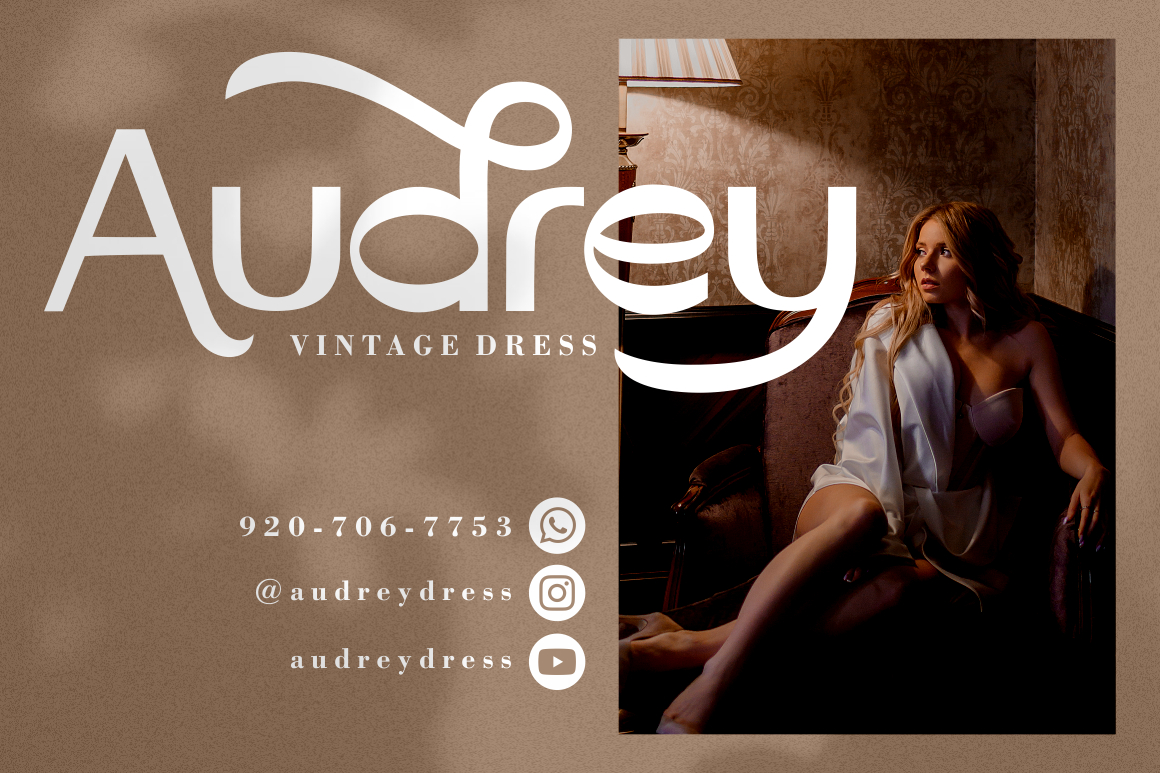
Vidage combines the impact of a display face with an elegant serif structure. Its bold modern construction and alternative characters provide flexibility for creating sophisticated logos, packaging, invitations, and editorial headlines. This is a strong option when your font research points toward high-contrast luxury typography.
PROS
- Elegant serif construction
- Alternative characters
- Bold display personality
- Broad creative versatility
BEST FOR
- Luxury branding
- Beauty packaging
- Wedding stationery
- Magazine covers
- Premium product labels
3. Behooved Ligature Serif Font

Behooved is a characterful serif with soft forms and a strong retro-groovy personality. It includes swashes, stylistic and titling alternates, plus standard and discretionary ligatures, giving designers multiple ways to personalize a wordmark. It works particularly well when you want the visual richness of customized website typography without drawing every letter manually.
PROS
- Extensive ligature options
- Swash and titling alternates
- Strong but approachable character
- Retro-meets-traditional styling
BEST FOR
- Logo design
- Lifestyle branding
- Magazine imagery
- Wedding invitations
- Social media campaigns
4. Holian Script Font
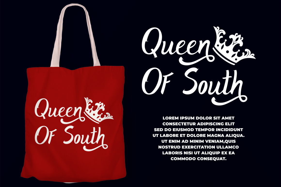
Holian is a bold script inspired by magazine titles, posters, and streetwear lettering. Its heavy, modern strokes create a handwritten feeling with enough visual strength for logos and large promotional text. It is a practical alternative when you identify an energetic brush or script style on a website but need a legally available font for your own project.
PROS
- Bold handwritten construction
- Strong streetwear personality
- High visibility in display sizes
- Flexible across print and digital media
BEST FOR
- Streetwear logos
- Apparel graphics
- Event posters
- Product packaging
- Social media promotions
5. Velant Unique Experimental Font
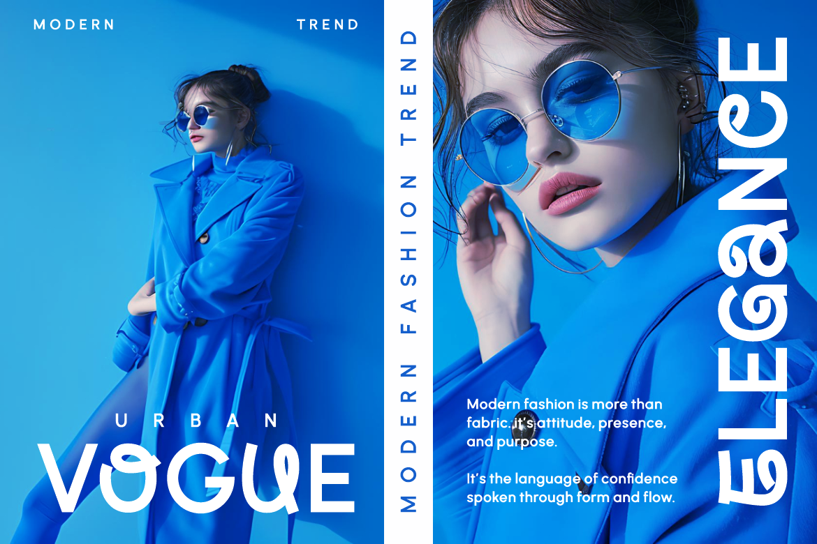
Velant is a modern experimental display font built around bold forms, controlled spacing, smooth curves, and deliberately unconventional details. Its generous x-height supports readability at medium and large sizes, while alternate characters help designers customize logos and titles. Multilingual support and a balance between originality and function make it suitable for international creative projects.
PROS
- Experimental but readable
- Alternative characters
- Multilingual support
- Distinctive contemporary rhythm
BEST FOR
- Creative studios
- Startup branding
- Fashion campaigns
- Product packaging
- Editorial headlines
6. Freebies PutraCetol Studio 10-Font Collection
The Freebies PutraCetol Studio package is a collection of ten fonts rather than a single family. It gives beginners and small businesses a broader starting library for testing different typographic directions before committing to a larger identity system. Because the styles are collected under one product, it is especially useful for mood boards, learning exercises, early brand concepts, and rapid creative exploration.
PROS
- Ten fonts in one collection
- Useful for style experimentation
- Budget-friendly creative resource
- Suitable for learning font pairing
BEST FOR
- Design students
- Small-business mood boards
- Branding drafts
- Social media templates
- Typography practice
7. Majasty Elegant Stylish Serif Font

Majasty is an elegant serif that combines sleek lines, refined curves, and a balance of classical and contemporary qualities. Its polished appearance can elevate logos, invitations, packaging, posters, magazines, and business communication. It is a useful free alternative when your research reveals an editorial or luxury serif with a sophisticated visual tone.
PROS
- Classic and contemporary balance
- Refined serif details
- Professional visual presence
- Versatile across industries
BEST FOR
- Editorial branding
- Cosmetics
- Boutique businesses
- Premium invitations
- Luxury packaging
8. Nitro Nova Race Font

Nitro Nova uses sharp angles, precise curves, and sleek tech-inspired construction to communicate movement and racing energy. Its design is strong enough for automotive identities while remaining versatile for posters, packaging, event graphics, and bold headlines. OpenType alternates or ligatures add further customization possibilities.
PROS
- Strong sense of motion
- Sharp modern geometry
- OpenType alternates or ligatures
- High-impact display performance
BEST FOR
- Automotive branding
- Motorsport events
- Gaming graphics
- Sports packaging
- Technology campaigns
9. Grader Shave Modern Futuristic Font
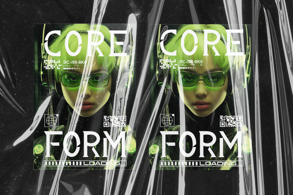
Grader Shave reinterprets serif typography through sharp geometry, clean cuts, coded symmetry, and a progressive science-fiction influence. It creates a precise technological appearance while retaining enough classical structure to feel controlled and professional. Its uppercase characters, numerals, punctuation, and multilingual support make it useful for forward-looking international campaigns.
PROS
- Distinct futuristic serif style
- Sharp, controlled construction
- Multilingual support
- Memorable technological identity
BEST FOR
- Esports branding
- Technology startups
- Science-fiction posters
- Game titles
- Digital product campaigns
Comparison
Font Identification Method Comparison
| Method | Best Source | Speed | Reliability | Main Limitation |
|---|---|---|---|---|
| Browser extension | Selectable website text | Very fast | Good | May require rendered-font verification |
| Chrome or Firefox DevTools | Live website | Moderate | Very high | Requires basic CSS knowledge |
| WhatTheFont | Screenshot or photograph | Fast | Moderate to high | Returns visual matches, not guaranteed proof |
| Font Squirrel Matcherator | Clean image sample | Fast | Moderate to high | Depends heavily on crop quality |
| Adobe Capture | Real-world text and mobile images | Fast | Good for discovery | Often suggests similar rather than exact fonts |
| Manual glyph comparison | Any source | Slow | Very high when done carefully | Requires typographic knowledge |
Browser extensions are best for exploration, while developer tools are strongest for confirming live webfonts. Image services are necessary for rasterized text, but the result should always be checked manually against multiple characters.
Recommended Free Font Comparison
| Font | Style | Distinctive Feature | Strongest Application |
|---|---|---|---|
| Zambeza | Modern vintage display | Alternates and end swashes | Posters and logos |
| Vidage | Elegant display serif | Modern bold character | Luxury branding |
| Behooved | Ligature serif | Rich OpenType variations | Custom-looking wordmarks |
| Holian | Bold script | Streetwear-inspired strokes | Apparel and events |
| Velant | Experimental display | Unconventional readable forms | Creative branding |
| 10-Font Collection | Mixed collection | Multiple styles in one pack | Exploration and learning |
| Majasty | Stylish serif | Refined classic-modern balance | Editorial and beauty |
| Nitro Nova | Race display | Speed-driven geometry | Automotive and sport |
| Grader Shave | Futuristic serif | Sharp sci-fi construction | Technology and gaming |
Common Mistake
One of the most common errors is assuming that the first name in a CSS font-family rule is definitely the font visible on screen. Websites frequently use fallback stacks, and different characters within the same element can even be rendered from different typefaces when the primary font lacks a glyph. Check the Rendered Fonts section in Chrome or the Fonts panel in Firefox before documenting the result.
Another mistake is uploading a cluttered screenshot and immediately accepting the first suggested match. Image identifiers can be confused by logos, custom lettering, perspective, shadows, textures, low resolution, and modified glyphs. Crop the sample carefully, compare several distinctive letters, check multiple services, and consider that the original may be a customized typeface or hand-drawn wordmark rather than an unchanged retail font.
The final mistake is treating identification as permission to copy or use the font. Discovering a typeface name does not grant a desktop, webfont, application, trademark, merchandise, or commercial license. Download from the original designer or an authorized distributor, review the applicable terms, and never extract font files directly from a website for reuse. The same principle applies to free resources: use the official PutraCetol download page and confirm the current Freebies License rather than relying on copies from unofficial font-sharing sites.
Conclusion
The most reliable way to identify fonts on websites is to use a layered workflow. Begin with a browser extension for quick discovery, confirm live text through developer tools, use an image-matching service when the lettering is flattened, and verify the result by comparing distinctive glyphs, weights, spacing, and available character sets.
Typography research should not end with discovering a font name. Study why the typeface works, how it is paired, where hierarchy changes, and how spacing, color, scale, and layout support the overall design. That analysis will teach you more than simply copying a website’s font choice.
When the original typeface is unavailable, unsuitable, or outside your budget, explore legally offered alternatives. Zambeza, Vidage, Behooved, Holian, Velant, Majasty, Nitro Nova, Grader Shave, and the PutraCetol ten-font collection provide a wide range of free creative directions, from elegant serif branding to experimental, handwritten, racing, and futuristic typography.
Use these fonts as foundations for original logos, packaging, campaigns, editorial designs, and digital content. The goal is not to reproduce another website exactly, but to understand its typographic strategy and apply those lessons to a distinctive identity of your own.
Explore these fonts and many more at PutraCetol.com to build a business identity that looks professional, trustworthy, and memorable.
Additionally, if you want to explore some free typography options, you can check out Putracetol Studio on Dafont. Happy reading and designing!