
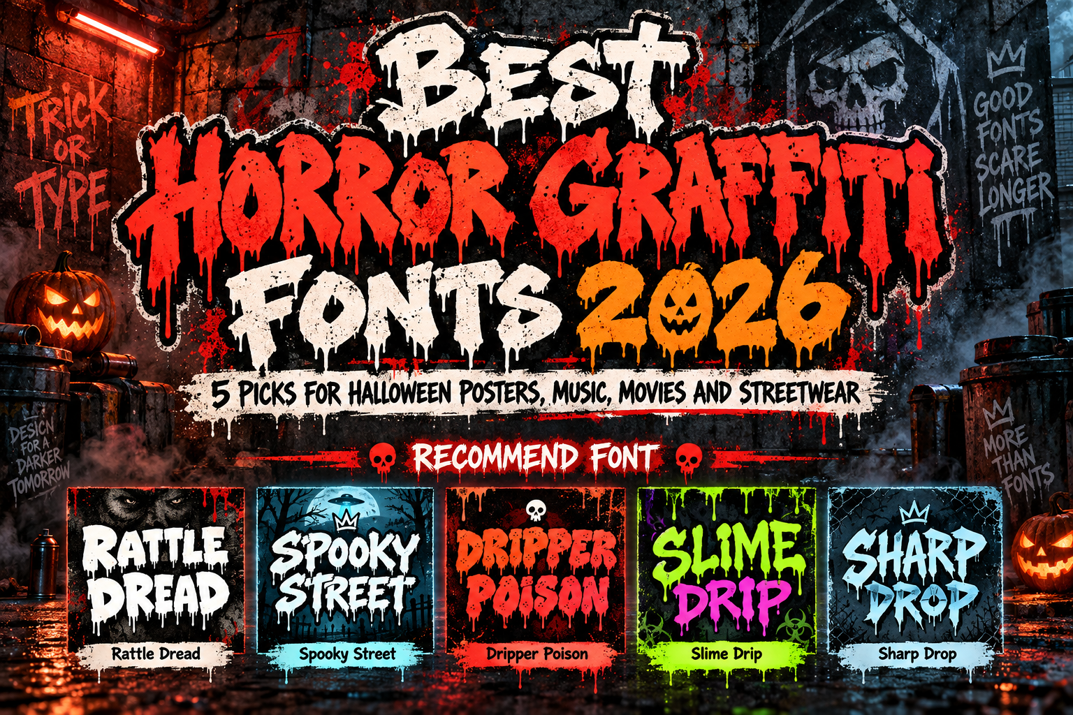
Best Horror Graffiti Fonts 2026: 5 Picks for Halloween
Give your next Halloween campaign a voice before anyone reads the details. Whether you are designing a horror-film poster, an underground album cover, or a streetwear collection, start by deciding how the lettering should make people feel.
For designers exploring the best horror graffiti fonts 2026, this guide compares five PutraCetol options by visual character and creative application not download rankings.
Initial Suggestion: Start With the Story
Choose a mood before adding effects. A haunted attraction might call for threatening shapes, while a monster-themed snack launch could take a playful direction. Test your actual headline rather than relying on a sample alphabet.
Use the graffiti font for the main message and a neutral sans serif for dates, credits, and calls to action. For example, try “Midnight Outbreak” as the display title, with venue information underneath in simpler lettering. This follows the practical approach of reserving expressive graffiti typography for focal elements rather than lengthy text.
Jump to Recommended Fonts
1. Rattle Dread
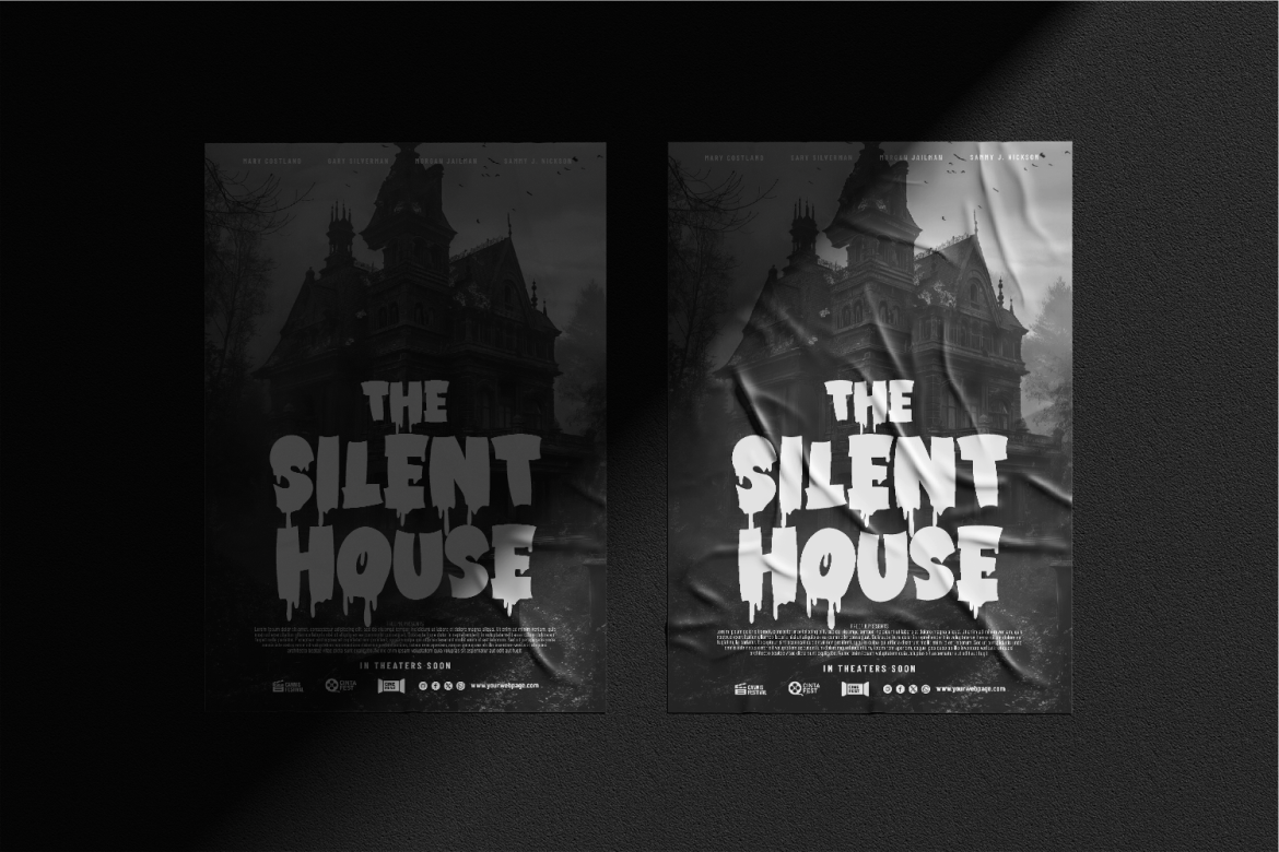
Rattle Dread combines chunky, irregular capitals with pointed cuts and pronounced drips, giving short titles a weighty, unsettling presence. Alternate characters introduce extra bleeding details, while multilingual support adds flexibility for campaign work. Consider it for an escape-room identity or horror poster where the title should carry much of the atmosphere.
PROS: Heavy visual impact, dramatic alternates, multilingual support.
BEST FOR: Haunted attractions, horror posters, and dark streetwear.
2. Spooky Street

Spooky Street uses warped contours, rough edges, and irregular geometry to suggest frantic, handmade lettering. Its distressed character makes it worth exploring for underground music artwork, punk-inspired graphics, and unsettling film titles. For a fictional horror EP called “Last Exit,” try a large title against a restrained background rather than surrounding it with competing textures.
PROS: Expressive distortion and a raw, distressed personality.
BEST FOR: Album covers, punk posters, and haunted-house branding.
3. Dripper Poison
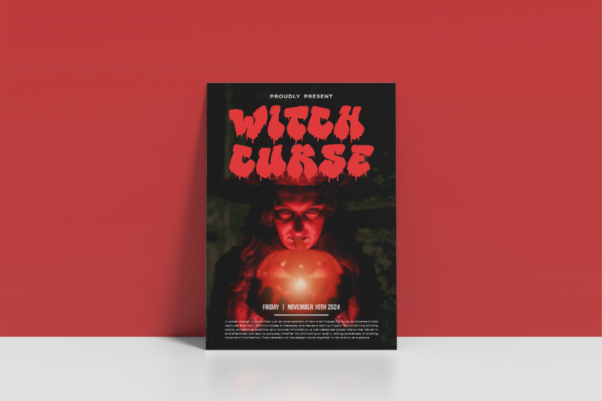
Dripper Poison pairs substantial strokes with uneven edges and hanging drips, bringing a spray-painted character to horror lettering. Explore it when your concept sits between Halloween imagery and urban music culture. Try a zombie-event poster or illustrated sticker series where the dripping letterforms can become the central visual feature.
PROS: Bold silhouettes and an integrated dripping effect.
BEST FOR: Music promotions, Halloween graphics, and merchandise.
4. Slime Drip
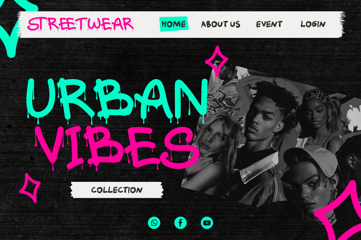
Slime Drip uses fluid, melting strokes and monoline-style graffiti lettering for a more playful direction. Its mischievous character offers an alternative to purely threatening typography, especially for concepts involving goo, monsters, or youthful street culture. Consider it for a fictional “Monster Melt” drink label or Halloween sticker collection that should feel energetic rather than terrifying.
PROS: Fluid shapes and a playful melting personality.
BEST FOR: Youthful packaging, stickers, and lighter Halloween campaigns.
5. Sharp Drop

Sharp Drop emphasizes fractured forms, angular cuts, and dripping details, offering a harsher direction than fluid slime lettering. Its broken, uneven structure suggests a confrontational character for horror comics, game covers, and dramatic movie titles. For a fictional film called “After the Sirens,” test the title alone before adding supporting imagery.
PROS: Angular character, bold strokes, and dripping accents.
BEST FOR: Horror-film titles, comic covers, and gaming artwork.
Comparison: Match the Font to Your Project
Use this editorial comparison to narrow your shortlist:
| Font | Visual direction | Suggested application |
|---|---|---|
| Rattle Dread | Heavy, threatening | Haunted-event branding. |
| Spooky Street | Distressed, chaotic | Underground album covers. |
| Dripper Poison | Bold, paint-like drips | Urban Halloween promotions. |
| Slime Drip | Fluid, playful | Monster-themed packaging. |
| Sharp Drop | Jagged, fractured | Horror-film titles. |
For a practical test, set the same two-word title in each font at matching sizes. Compare its overall shape, spacing, and readability before adding imagery. Choose the lettering that supports your concept without depending on extra decoration.
Common Mistakes to Avoid
One common trap is making every line equally dramatic. Reserve horror graffiti lettering for the main message and keep supporting copy calm. Avoid combining several decorative fonts in one layout. Before export, reduce the design to a phone-sized preview and ask someone to read the headline without prompting. Review letter spacing, the openings inside characters, and any drips that collide with nearby text.
Another mistake is treating every horror project alike. Establish whether your audience should feel amused, uneasy, or genuinely threatened, then choose accordingly. Develop the lettering in a simple composition before adding glow, splatter, or background grunge. Test both print and digital versions when relevant, and review the font’s license for your intended commercial use before publishing.
Conclusion
Your best horror graffiti fonts 2026 shortlist should help you find the right kind of fear—not simply the most decoration. Match the lettering to your story, test it at delivery size, and protect readability. Explore these five fonts on PutraCetol Studio to give your next poster, cover, or Halloween campaign a distinctive typographic identity.
Explore these fonts and many more at PutraCetol.com to build a business identity that looks professional, trustworthy, and memorable.
Additionally, if you want to explore some free typography options, you can check out Putracetol Studio on Dafont. Happy reading and designing!