
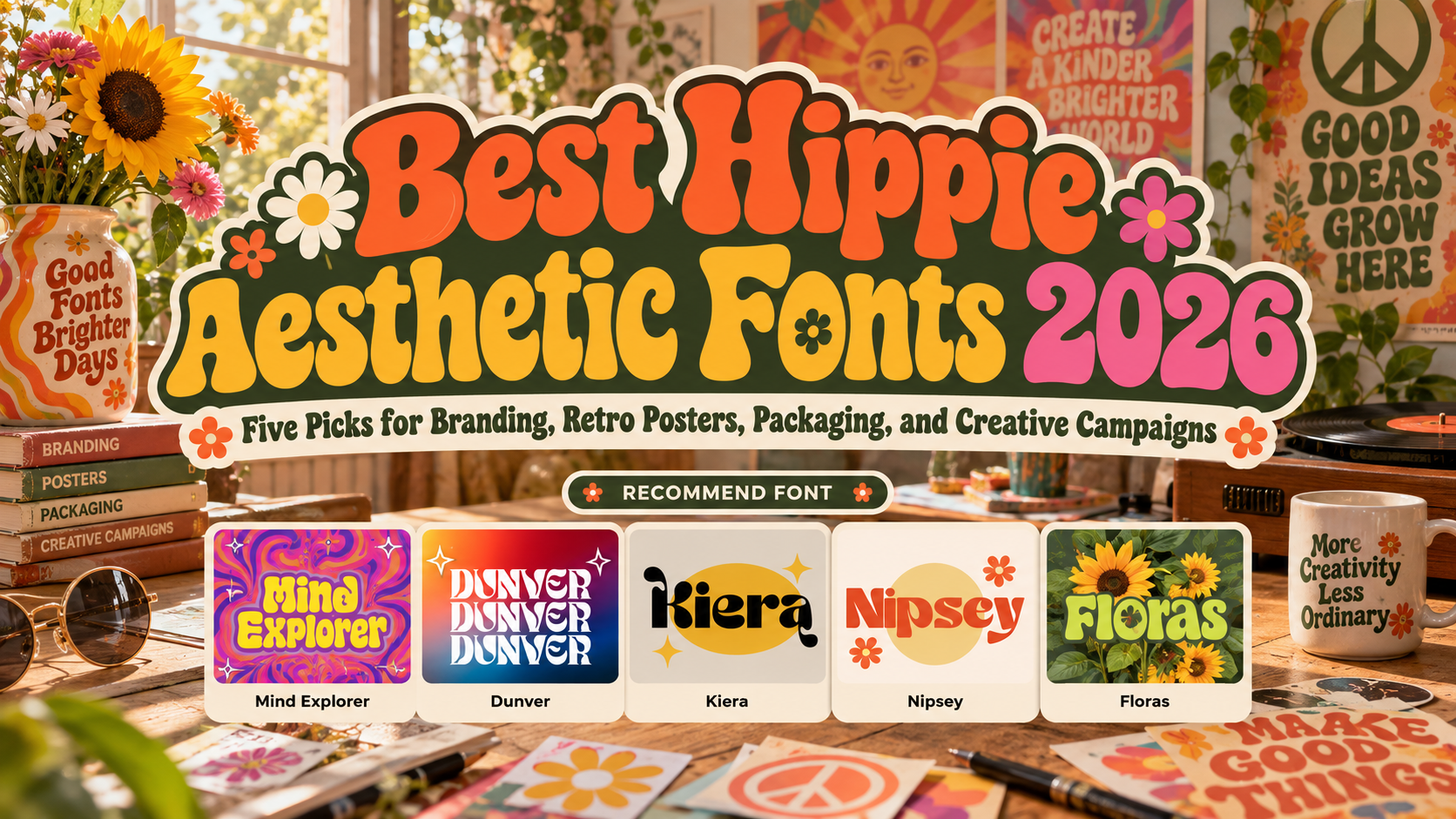
Best Hippie Aesthetic Fonts 2026: Give Retro Design a Fresh Voice
Choose the Personality Before the Palette
Choosing the best hippie aesthetic fonts for 2026 begins with a creative direction. Should the brand feel psychedelic, playful, earthy, or elegantly unconventional? A music festival and an artisan skincare label can share retro inspiration without looking identical.
Use the chosen typeface for a name, headline, or collection title. Pair it with a simpler reading family for descriptions, prices, dates, and instructions. Build the identity around the message rather than adding flowers, rainbows, and distorted lettering everywhere.
What to Test Before Choosing
Set your actual wording and compare a poster, package label, and mobile preview. Check repeated letters, punctuation, and required accented characters.
Start in one color. Adjust spacing before adding outlines or textures, and ask someone unfamiliar with the project to read the title. Keep decorative alternates only where they improve the composition.
Jump to Recommended Fonts
1. Mind Explorer Psychedelic Font

Mind Explorer draws on 1960s album covers and music posters, combining thick, rounded letterforms with curled details and unusual internal spaces. Alternates and ligatures provide options for tightly composed, expressive titles. For a fictional music gathering, try “Open Horizons” as the main headline, letting the lettering carry the psychedelic personality while the lineup stays straightforward.
PROS: Rounded weight, expressive curves, customizable letter combinations.
BEST FOR: Music posters, album covers, festival merchandise, and playful lifestyle branding.
2. Dunver Display Typeface Font

Dunver combines substantial strokes, pointed serif details, and sweeping curves, creating a sharper alternative to inflated psychedelic lettering. Its structured forms offer a way to introduce retro personality without making every element look handmade. Try it for a fashion label’s collection name, paired with clean product photography and a restrained cream-and-rust palette.
PROS: Strong contrast, sculpted curves, confident title structure.
BEST FOR: Fashion packaging, boutique identities, editorial covers, and contemporary retro campaigns.
3. Kiera Display Typeface Font
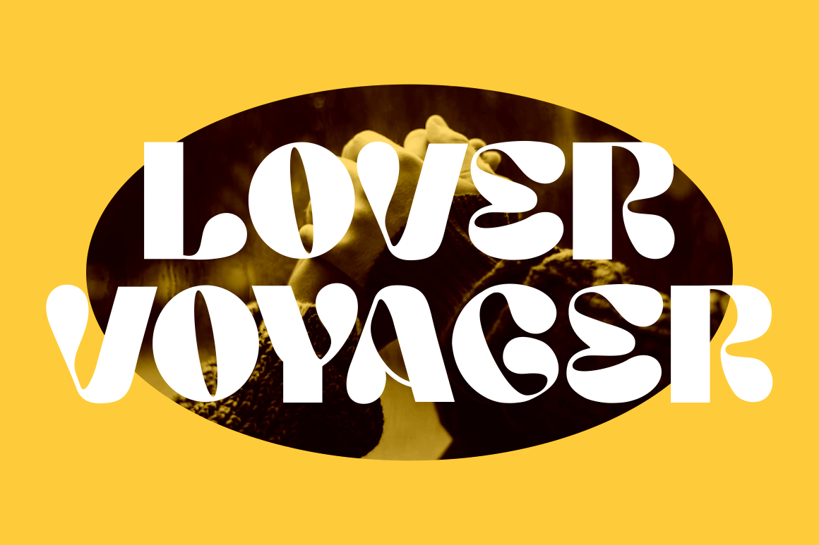
Kiera balances thick stems with bulbous curves and playful, droplet-like terminals, giving its lettering a decorative but organized character. Its alternates and ligatures offer additional ways to shape a short wordmark. For a bohemian accessories brand, test one expressive capital beside simpler supporting text rather than decorating every letter and surrounding space.
PROS: Playful terminals, substantial forms, flexible alternate characters.
BEST FOR: Accessories, beauty packaging, creative studios, invitations, and lifestyle posters.
4. Nipsey Display Font

Nipsey takes inspiration from 1970s music albums and posters, with swashes, stylistic alternates, and ligatures supporting a customizable retro voice. Its appeal lies in arranging distinctive letter combinations rather than depending on added vintage effects. For a record shop, develop a compact name treatment and repeat it across shopping bags, event graphics, and social announcements.
PROS: Seventies inspiration, swash options, adaptable display lettering.
BEST FOR: Record shops, apparel, music campaigns, café identities, and merchandise.
5. Floras Display Typeface Font
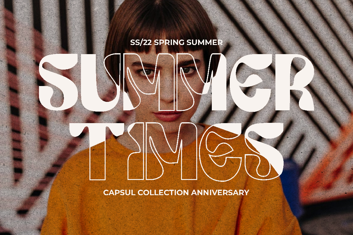
Floras revisits 1960s music-poster and album-cover inspiration through three styles: Regular, Display One, and Display Two. Swashes, alternate characters, and ligatures let designers explore different levels of expression within the family. Try it for an artisan market identity, comparing treatments across a poster and product tag before choosing which version leads the system.
PROS: Three styles, decorative options, coordinated retro character.
BEST FOR: Artisan markets, creative packaging, greeting cards, cultural events, and boutique campaigns.
Comparison
Use these suggested directions to build a shortlist, not as rigid genre rules.
| Font | Suggested Creative Direction | First Application to Test |
|---|---|---|
| Mind Explorer | Full psychedelic expression | Festival headline |
| Dunver | Structured retro elegance | Fashion collection label |
| Kiera | Playful bohemian styling | Accessories wordmark |
| Nipsey | Music-led seventies nostalgia | Record-shop identity |
| Floras | Coordinated decorative variety | Artisan-market campaign |
Common Mistakes
The first mistake is using every retro cue at once. Choose one dominant element, then support it with a limited palette and relevant imagery. Try burnt orange and cream for a quieter direction or violet and yellow for stronger contrast. Keep important wording distinct from decorative backgrounds.
Another mistake is treating a free-spirited aesthetic as permission to ignore usability. Keep long copy and essential information straightforward. For motion graphics, reveal the headline, then give viewers a stable reading moment. Test prints and exported videos rather than approving only enlarged artwork.
The final mistake is assuming bohemian styling automatically communicates inclusion or sustainability. Support those values through real practices and accurate messaging. Before production, verify language coverage and licensing for the intended users, merchandise, advertisements, websites, and other applications.
Conclusion
The best hippie aesthetic fonts 2026 should help your project feel distinctive without turning the message into a puzzle. Choose the emotional direction, refine the actual wording, and build consistent layouts around it.
Explore these five PutraCetol Studio fonts for your next brand, poster, or campaign. Make nostalgia the starting point for original design, not a substitute for a clear creative idea.
Explore these fonts and many more at PutraCetol.com to build a business identity that looks professional, trustworthy, and memorable.
Additionally, if you want to explore some free typography options, you can check out Putracetol Studio on Dafont. Happy reading and designing!