
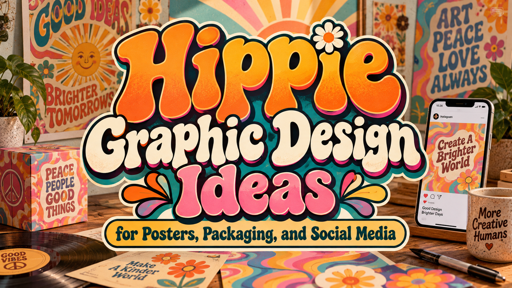
Hippie Design Inspiration 2026: Retro Freedom, Modern Clarity
Choose a Personality, Not a Costume
Begin with the experience your brand should offer. A lively music festival, thoughtful craft business, and relaxed lifestyle label need different interpretations of hippie aesthetics.
Choose three guiding qualities, such as adventurous, welcoming, and handmade. Use them to judge every font, color, illustration, and layout decision.
Understand the Visual Roots
A useful reference is Victor Moscoso’s The Wildflower (NR 9), created in 1967 and held by SFMOMA. Its saturated colors and stylized floral shapes provide a concrete example to study rather than relying on a generic “vintage” moodboard.
Examine how lettering, illustration, and surrounding shapes share the composition. Then sketch an original arrangement with your own subject. Borrow the principle of integration, not the artwork.
What Makes the Direction Relevant in 2026?
Adobe’s 2026 design forecast highlights exaggerated lettering, organic imperfection, warm visual styles, and layered collage. These are reported creative directions, not proof that hippie styling will improve every brand’s sales.
The practical opportunity is to combine expressive retro elements with present-day clarity. Keep the character in prominent brand moments while making purchasing, navigation, and essential information straightforward.
Build a Modern Hippie Visual System
Let Typography Become the Main Illustration
Try rounded display lettering, exaggerated curves, or a flowing headline. Arrange the actual brand name before adding effects, and compare a compact wordmark with a more expressive campaign title.
PutraCetol Studio offers retro, handwritten, and playful font directions for this exploration.
Pair the selected display face with a quieter reading family. Keep menus, product descriptions, dates, and prices easy to understand.
Give Color a Defined Role
Test two different palettes: burnt orange, avocado green, and cream for an earthy direction; violet, coral, and yellow for a brighter interpretation.
Choose one dominant color, supporting tones, and a clear text color. Do not assume saturation guarantees legibility. For web text, WCAG AA generally requires 4.5:1 contrast for ordinary text and 3:1 for qualifying large text, with defined exceptions.
Illustrate a Story, Not a Symbol Collection
Draw motifs connected to the business: a fictional tea brand could use curling leaves, a winding garden path, and a distinctive flower. A music event might explore sound waves that become organic shapes.
Repeat a consistent line weight and shape family. Let one illustration lead while secondary patterns support it. Avoid filling every empty area with decorative stars or rainbows.
Add Texture Without Hiding the Message
Adobe’s forecast identifies hand-rendered lettering, earthy textures, and visible collage layers as contemporary design directions.
Try scanning your own painted marks, torn paper, or ink impressions. Keep texture away from small lettering and detailed product images. For motion, test a gentle ripple or a brief reveal, followed by a stable moment that lets the audience read.
Apply the System Across Real Touchpoints
Imagine a fictional artisan market called “Open Fields.” Build its identity around a rounded wordmark, a cream-and-rust palette, and one original flower illustration.
Use the largest expression on event posters. Simplify the motif on tote bags and small labels. For social content, alternate artist introductions, process photographs, and practical visitor information.
For students, turn this into a three-format exercise: poster, package, and mobile announcement. Explain what changes between formats and which visual rules remain consistent.
Comparison
These are creative directions to test, not fixed audience categories.
| Direction | Visual Ingredients | Suggested Application |
|---|---|---|
| Psychedelic energy | Curving type, vivid contrast | Music and event posters |
| Earthy bohemian | Warm tones, botanical drawing | Artisan packaging |
| Refined retro | One expressive headline, generous space | Lifestyle branding |
| Handmade collage | Original textures, irregular frames | Editorial and social campaigns |
Common Mistakes
The first mistake is using every retro reference simultaneously. Choose one dominant idea and remove elements that compete with it. Test your title at thumbnail size and ask someone unfamiliar with the project to identify the message.
Another mistake is confusing a welcoming appearance with actual inclusion or sustainability. Support those values through accessible communication and honest product information. Research unfamiliar cultural motifs rather than treating them as anonymous decoration, and create original imagery instead of copying recognizable historical posters.
The final mistake is approving only a polished mockup. Check printed samples, mobile crops, long product names, and motion exports. Verify permissions for fonts, photographs, and illustrations before distributing the campaign.
Conclusion
The most useful hippie design inspiration for 2026 combines expressive freedom with deliberate communication. Start with a clear personality, create original imagery, and balance adventurous typography with readable information.
Explore PutraCetol Studio fonts to give your next identity, package, or poster a distinctive voice. Let the finished design feel imaginative and welcoming while remaining useful to the people encountering it.
Explore these fonts and many more at PutraCetol.com to build a business identity that looks professional, trustworthy, and memorable.
Additionally, if you want to explore some free typography options, you can check out Putracetol Studio on Dafont. Happy reading and designing!