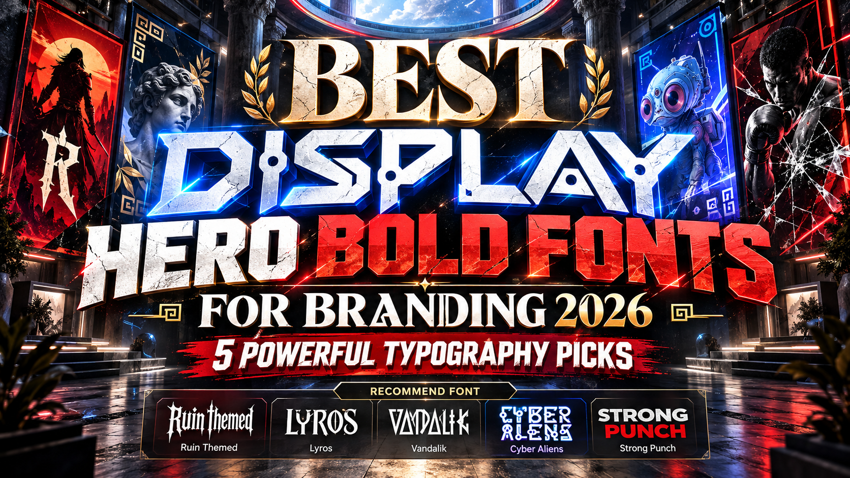
Best Display Hero Bold Fonts for Branding 2026
A hero section often has only a few seconds to establish a brand’s personality.
Before visitors read product details or explore a navigation menu, they usually encounter one dominant image and one large headline. That makes hero typography one of the most influential visual elements in contemporary branding.
The best display hero bold fonts for branding 2026 are designed to perform at large sizes. They use distinctive silhouettes, substantial weight, unusual proportions, or memorable details to make short messages impossible to overlook.
The goal is not simply to make words bigger. Strong hero typography should communicate something about the brand before the audience finishes reading the headline.
For gaming, sports, entertainment, fashion, technology, and campaign-driven brands, an expressive display font can effectively become part of the identity itself.
Initial Suggestion: Keep Hero Typography Short
Bold display fonts perform best with concise language.
A headline such as “ENTER THE RUINS,” “BUILT TO WIN,” or “BEYOND EARTH” gives distinctive letterforms enough space to create visual impact. Long paragraphs set in the same font usually weaken that effect.
Think of hero typography as a poster embedded inside the brand experience.
Use the bold display font for the main statement, logo, campaign phrase, or section title, then pair it with a quieter sans serif or serif for supporting text, navigation, descriptions, and calls to action.
Always test the actual brand name or headline because unusual letter combinations can dramatically change the balance of display typography.
Jump to Recommended Hero Bold Fonts
1. Ruin Themed Logo Game Font
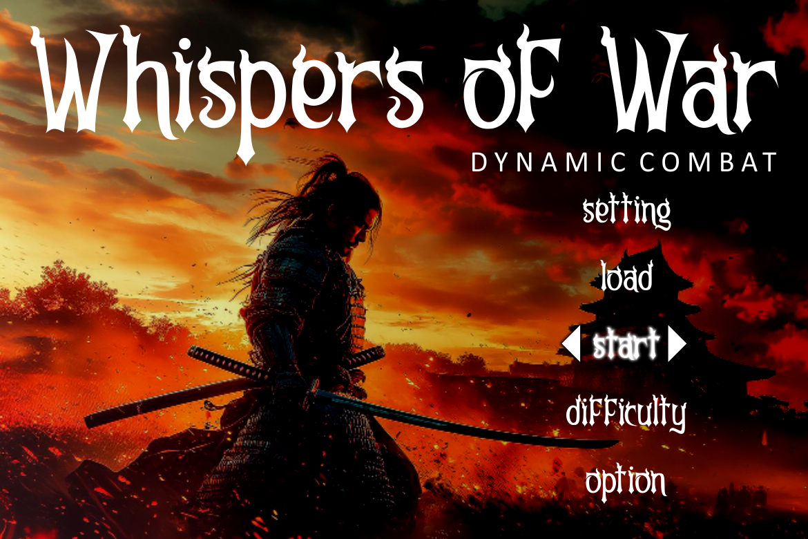
Ruin is built for visual authority. Its tall proportions, strong vertical emphasis, thick primary strokes, narrower internal curves, sharp terminals, angular cuts, and controlled distressed details produce an aggressive but structured silhouette. PutraCetol designed it particularly for game titles, logos, cinematic storytelling, posters, covers, and large promotional typography. PutraCetol Studio
That combination makes Ruin especially effective when a hero headline needs to suggest danger, power, fantasy, or adventure without sacrificing recognition at large sizes.
PROS: Commanding proportions, strong contrast, dark fantasy character, excellent headline presence.
BEST FOR: Gaming brands, action campaigns, fantasy entertainment, cinematic posters, bold website heroes.
2. Lyros Greek Font
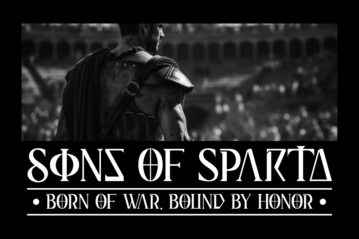
Lyros draws on classical Greek inscriptions and stone-carved lettering but translates those references into a clean contemporary display structure. Tall characters, strong verticals, sharp angles, solid strokes, precise geometry, and carefully cut terminals create a monumental appearance that feels heroic rather than ornamental. PutraCetol Studio
Its biggest branding advantage is the combination of heritage and modern clarity. It can communicate mythology, strength, history, and premium authority without looking like a direct reproduction of an ancient inscription.
PROS: Monumental silhouette, strong geometry, high large-size clarity, timeless heroic personality.
BEST FOR: Luxury campaigns, mythology themes, entertainment, cultural projects, premium hero sections.
3. Vandalik 2 Type Greek Font

Vandalik offers a more experimental interpretation of Greek-inspired typography. It combines narrow vertical construction with triangular forms, runic-like curves, straight bars, sharp angled cuts, and subtle handmade irregularities. The result feels historical and symbolic while remaining distinctly contemporary. PutraCetol Studio
Compared with Lyros, Vandalik feels less monumental and more mysterious. Its unconventional anatomy makes it valuable for brands where the typography itself needs to become a recognizable visual signature.
PROS: Distinctive construction, narrow hero-friendly proportions, symbolic personality, strong cultural atmosphere.
BEST FOR: Fantasy brands, movie titles, thematic packaging, editorial campaigns, mythology-inspired identities.
4. Cyber Aliens Futuristic Sci-Fi Font

Cyber Aliens moves hero typography completely into the future. Its characters are influenced by cybernetic interfaces, alien scripts, circuitry, geometric structures, experimental loops, and coded visual systems. PutraCetol positions the typeface for posters, gaming, movie titles, technology branding, experimental packaging, and science-fiction projects. PutraCetol Studio
Because the letterforms are intentionally unconventional, it works best in short statements where visual personality is more important than extended readability.
PROS: Highly distinctive sci-fi identity, bold construction, experimental alternates, immediate technological mood.
BEST FOR: AI brands, gaming, futuristic products, tech events, science-fiction entertainment.
5. Strong Punch Sport Font
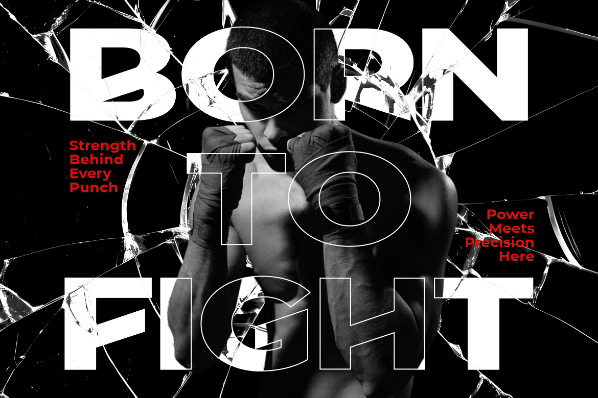
Strong Punch delivers the most athletic personality in this collection. It combines wide heavy letters, sharp cuts, thick construction, angled details, and a sense of forward motion that communicates speed, pressure, strength, and competition. PutraCetol recommends it for gym branding, fight posters, boxing events, tournament graphics, sports products, advertising, and website hero text. PutraCetol Studio
Its cleaner structure also makes it more adaptable than a highly thematic sports font. It can support campaigns that need power without looking chaotic.
PROS: Heavy weight, strong readability, dynamic angles, competitive energy.
BEST FOR: Sports branding, gyms, fitness products, tournaments, energy brands, action campaigns.
Comparison: Which Hero Bold Font Fits Your Brand?
| Font | Main Personality | Strongest Branding Direction |
|---|---|---|
| Ruin | Dark, powerful | Gaming and fantasy |
| Lyros | Monumental, heroic | Premium and cultural |
| Vandalik | Mythical, experimental | Entertainment and thematic brands |
| Cyber Aliens | Futuristic, unconventional | Technology and sci-fi |
| Strong Punch | Athletic, energetic | Sports and fitness |
Ruin provides the strongest dark-fantasy impact, while Lyros is more refined and monumental. Vandalik offers symbolic character, Cyber Aliens pushes toward experimental futurism, and Strong Punch is the clearest choice for competitive energy.
How to Use Bold Hero Typography Effectively
Large display lettering needs contrast and space.
Avoid surrounding the headline with too many competing illustrations, gradients, badges, buttons, and effects. A distinctive font becomes more powerful when the composition gives it room to dominate.
Scale also matters. Hero typography can fill a large portion of the screen or poster, but individual words should remain recognizable. Adjust line breaks deliberately rather than allowing responsive layouts to divide phrases randomly.
For branding, consider repeating the same hero typeface across campaign graphics, social posts, packaging, event visuals, and promotional materials. Consistency turns an interesting font into a recognizable brand asset.
Common Mistakes
One common mistake is using bold display typography everywhere. A font designed for enormous headlines may become difficult to read in menus, buttons, captions, or paragraphs. Let the hero font establish personality, then switch to a simpler supporting typeface for functional communication.
Another mistake is choosing the most dramatic font without considering the brand. Cyber Aliens may be visually impressive, but it would be a poor fit for a conservative financial consultancy. Strong Punch creates immediate athletic energy but would feel equally misplaced in delicate luxury cosmetics. Typography should amplify positioning, not fight it.
Finally, avoid relying on excessive effects to make the headline feel powerful. Outlines, shadows, glows, distortions, and textures can quickly compete with already distinctive letterforms. Start with the font itself, scale it confidently, refine spacing, then add effects only when they contribute to the concept.
Conclusion
The best display hero bold fonts for branding 2026 turn typography into a major visual asset.
Ruin creates dark cinematic power, Lyros communicates monumental authority, Vandalik adds mythical individuality, Cyber Aliens brings futuristic experimentation, and Strong Punch delivers athletic intensity.
Explore these fonts at PutraCetol Studio and use them where branding needs its strongest first impression: logos, website hero sections, campaigns, posters, packaging, social graphics, and promotional headlines.
The best hero font is not simply the boldest one. It is the typeface whose shape, rhythm, and personality communicate the brand before the audience reads anything else.
Explore these fonts and many more at PutraCetol.com to build a business identity that looks professional, trustworthy, and memorable.
Additionally, if you want to explore some free typography options, you can check out Putracetol Studio on Dafont. Happy reading and designing!