
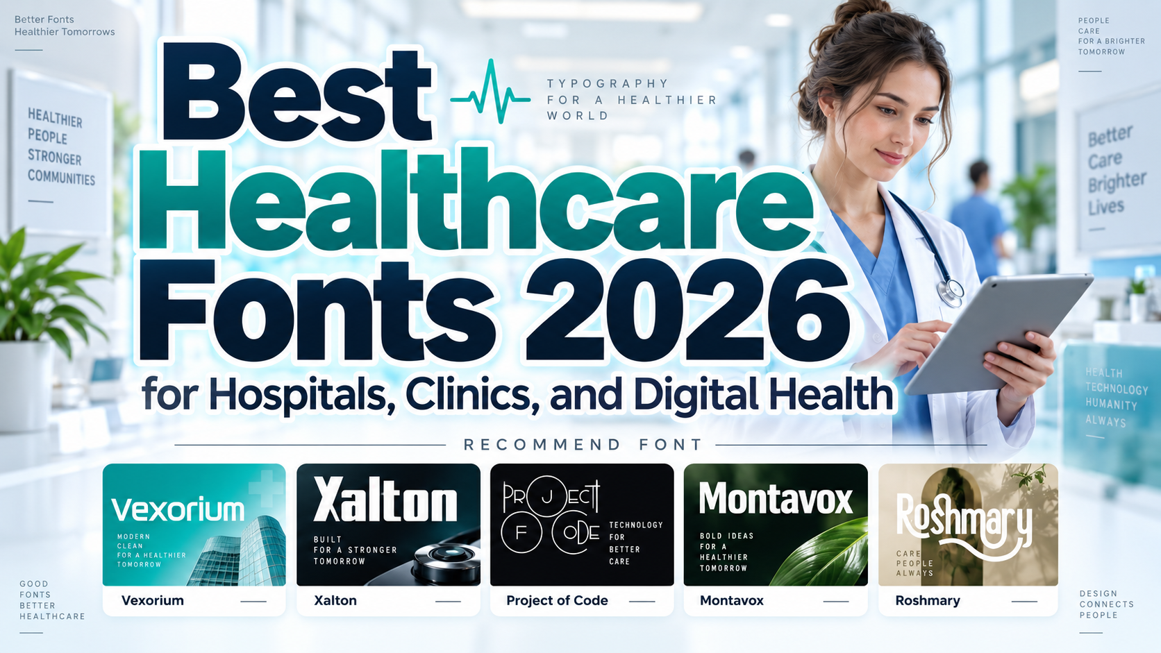
Best Healthcare Fonts 2026: Brand Personality With Patient Clarity
Separate Branding From Clinical Reading
Choosing the best healthcare fonts for 2026 starts with deciding where the letters will appear. A clinic logo, patient leaflet, appointment form, and emergency sign require different typography decisions.
Treat these five fonts as branding and headline candidates, not a clinical readability ranking. Use expressive lettering for identity and promotional moments, then select a tested reading family for instructions, forms, and medical information.
For example, a telehealth brand might use a distinctive wordmark above a straightforward “Book an appointment” interface. The brand stays recognizable without making the next step harder to understand.
Build an Accessible Typography System
Test real department names, contact details, appointment times, and punctuation. Compare uppercase I, lowercase l, and the numeral 1, then inspect O and 0. Check every language the organization serves rather than assuming “multilingual” means complete coverage.
For digital text, WCAG 2.2 AA generally requires contrast of at least 4.5:1 for normal text and 3:1 for qualifying large text, with specified exceptions. Contrast alone does not establish accessibility; unusual or thin letterforms can still be difficult to read.
Jump to Recommended Fonts
1. Vexorium Modern Experimental Font
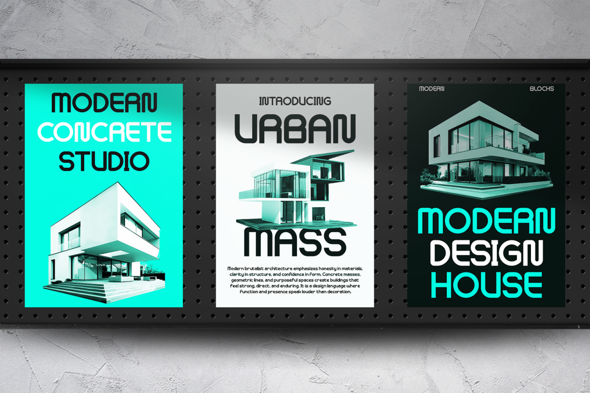
Vexorium combines tall proportions, rounded corners, consistent strokes, and architectural geometry with experimental details. Its distinctive construction is most effective at large display sizes, giving healthcare innovators an alternative to conventional corporate lettering. Consider it for a digital-health launch or research presentation, while keeping patient-facing explanations in a quieter companion font.
PROS: Architectural character, rounded detailing, distinctive headline presence.
BEST FOR: Digital-health identities, innovation campaigns, research presentations, and website hero titles.
2. Xalton Corporate Logo Font

Xalton uses thick, upright strokes, clean edges, and strong geometric construction balanced by rounded inner counters. Its structured silhouette offers a confident direction for healthcare organizations that want their name to feel established and contemporary. Try it for a short clinic wordmark or pharmaceutical presentation cover rather than squeezing it into dense informational layouts.
PROS: Strong geometry, consistent weight, confident visual structure.
BEST FOR: Clinic logos, healthcare groups, pharmaceutical branding, and corporate campaign headings.
3. Project Of Code Display Sans Font
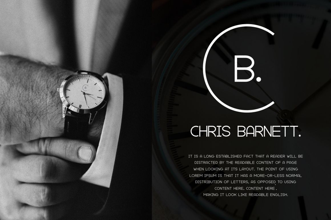
Project Of Code is a contemporary display sans with distinctive ligatures and alternate characters. Its OpenType features provide options for customized lettering, making it useful when a healthcare startup needs recognizable campaign typography. Select the clearest forms for public communication and reserve decorative combinations for short brand statements, not appointment instructions.
PROS: Customizable alternates, ligature options, contemporary display character.
BEST FOR: Health-technology pitches, educational campaign titles, editorial covers, and startup branding.
4. Montavox Corporate Logo Font
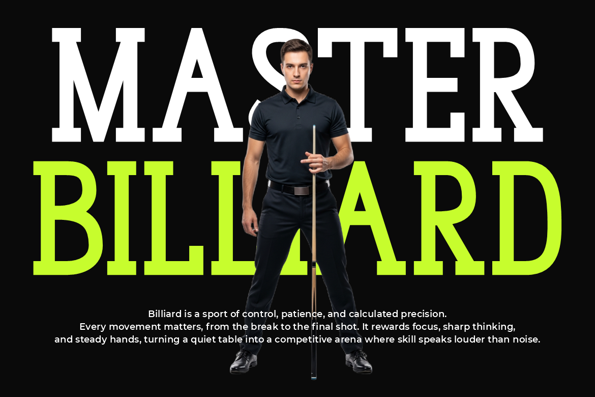
Montavox is a slab serif, not a minimalist sans serif. Thick stems, rectangular serifs, upright proportions, and Regular and Bold options give it a substantial, structured presence. Consider its more assertive personality for sports-medicine or rehabilitation branding, where strong headline typography can support an active visual identity without relying on futuristic effects.
PROS: Substantial serifs, structured proportions, two weight options.
BEST FOR: Sports-medicine identities, rehabilitation campaigns, institutional titles, and presentation covers.
5. Roshmary

Roshmary is a bold, clean display sans serif with ligatures, alternate glyphs, and multilingual support. Its simple foundation provides a useful starting point for an approachable clinic identity, while alternate forms offer selective customization. Pair restrained lettering with clear language and respectful imagery rather than expecting the font alone to communicate empathy.
PROS: Clean display forms, flexible alternates, multilingual character support.
BEST FOR: Clinic wordmarks, community-health campaigns, brochure covers, and educational social graphics.
Comparison
| Font | Visual Direction | Suggested Branding Role |
|---|---|---|
| Vexorium | Experimental geometry | Digital-health innovation |
| Xalton | Bold corporate display | Organizational identity |
| Project Of Code | Customizable display sans | Distinctive campaigns |
| Montavox | Structured slab serif | Active, substantial branding |
| Roshmary | Clean display sans | Approachable clinic identity |
Common Mistakes
The first mistake is treating a professional appearance as proof of readability. Evaluate actual materials with patients, caregivers, and staff, including older adults and people with low vision. Review printed leaflets, distant signs, mobile screens, and enlarged text rather than approving only large brand mockups.
Another mistake is activating every alternate or ligature. Keep names distinctive, but avoid unusual joins in phone numbers, department labels, medication information, and instructions. Before rollout, document approved font roles and confirm licensing for the intended users, websites, applications, printed materials, and advertising.
Conclusion
The best healthcare fonts for 2026 should strengthen identity without complicating care communication. Start with one branding candidate, pair it with a dependable reading family, and test the complete system in realistic conditions.
Explore these PutraCetol Studio options using your actual organization name and campaign copy. Let typography express personality where appropriate, while clarity, consistency, and patient needs guide every essential message.
Explore these fonts and many more at PutraCetol.com to build a business identity that looks professional, trustworthy, and memorable.
Additionally, if you want to explore some free typography options, you can check out Putracetol Studio on Dafont. Happy reading and designing!