
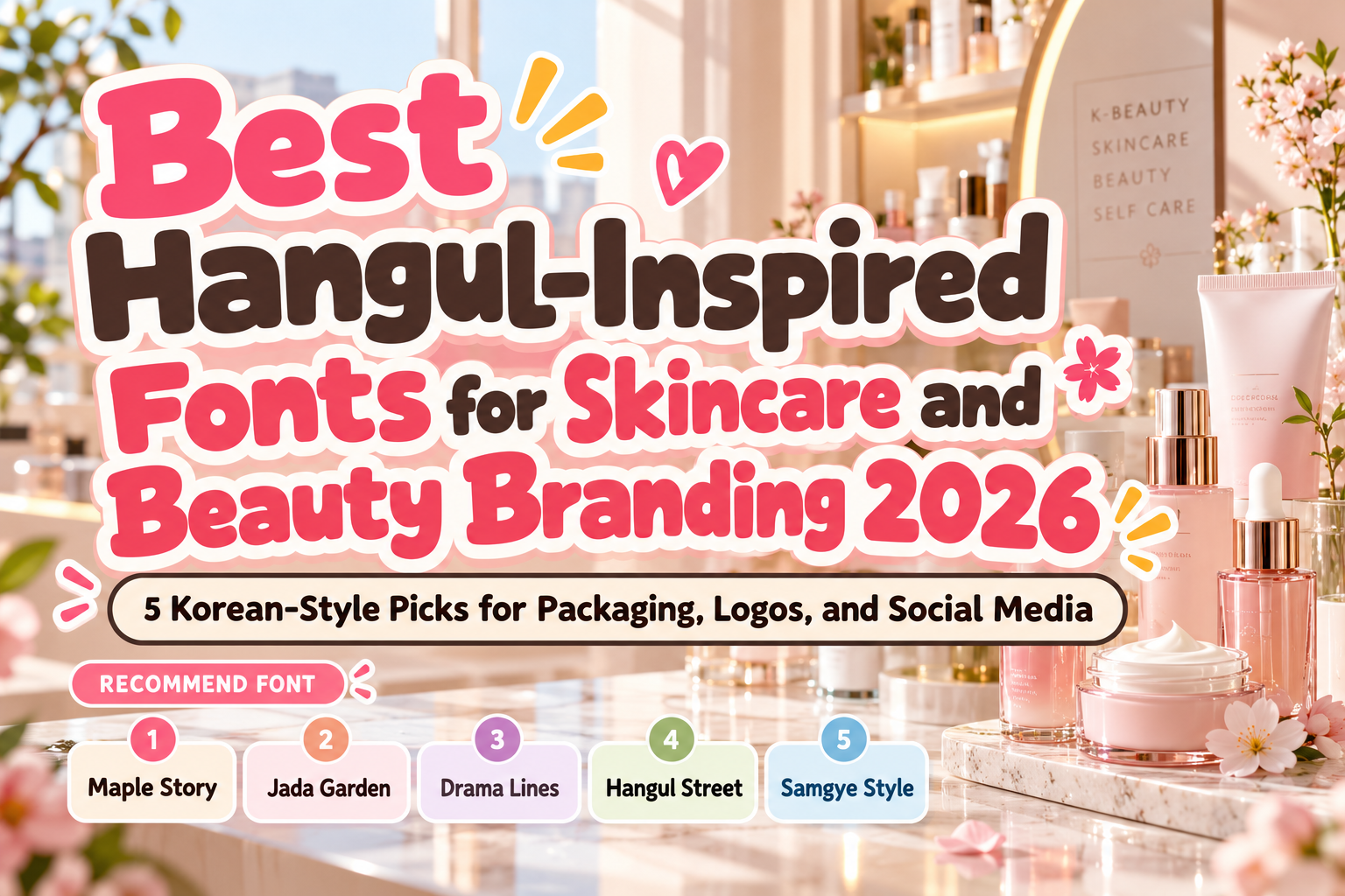
Best Hangul-Inspired Fonts for K-Beauty Branding 2026
K-beauty branding has become recognizable far beyond Korea through a distinctive combination of clean packaging, soft color systems, playful experimentation, editorial photography, and highly controlled typography.
Typography is especially important because a cosmetic package has limited space to communicate personality.
The best Hangul-inspired fonts for K-beauty branding 2026 can introduce visual references to Korean culture while still working with Latin-language brand names aimed at international customers. Their unusual structures, rounded geometry, calligraphic influences, and block-like forms can help a skincare or cosmetics brand stand apart from generic minimalist competitors.
One distinction is essential, however: Hangul-inspired does not automatically mean Hangul-supported. A Latin display typeface can borrow visual ideas from Korean lettering without containing Korean syllable glyphs. Current PutraCetol character maps for fonts such as Drama Lines and Hangul Street primarily show Latin and extended Latin characters, so native Korean copy should be checked separately before production.
Decide Which Side of K-Beauty You Want to Express
K-beauty does not have one visual style.
A premium serum may need restrained typography and generous whitespace. A sheet-mask brand can be colorful and playful. A Gen Z lip product might use bold street-influenced lettering, while a botanical skincare line could benefit from softer brush-inspired forms.
Start with the brand personality before selecting the font.
Then test the actual product name on bottles, tubes, cartons, social posts, and ecommerce thumbnails. A distinctive font should remain recognizable when the package is photographed at small sizes.
Jump to Recommended Hangul-Inspired Fonts
1. Maple Story Korean Font
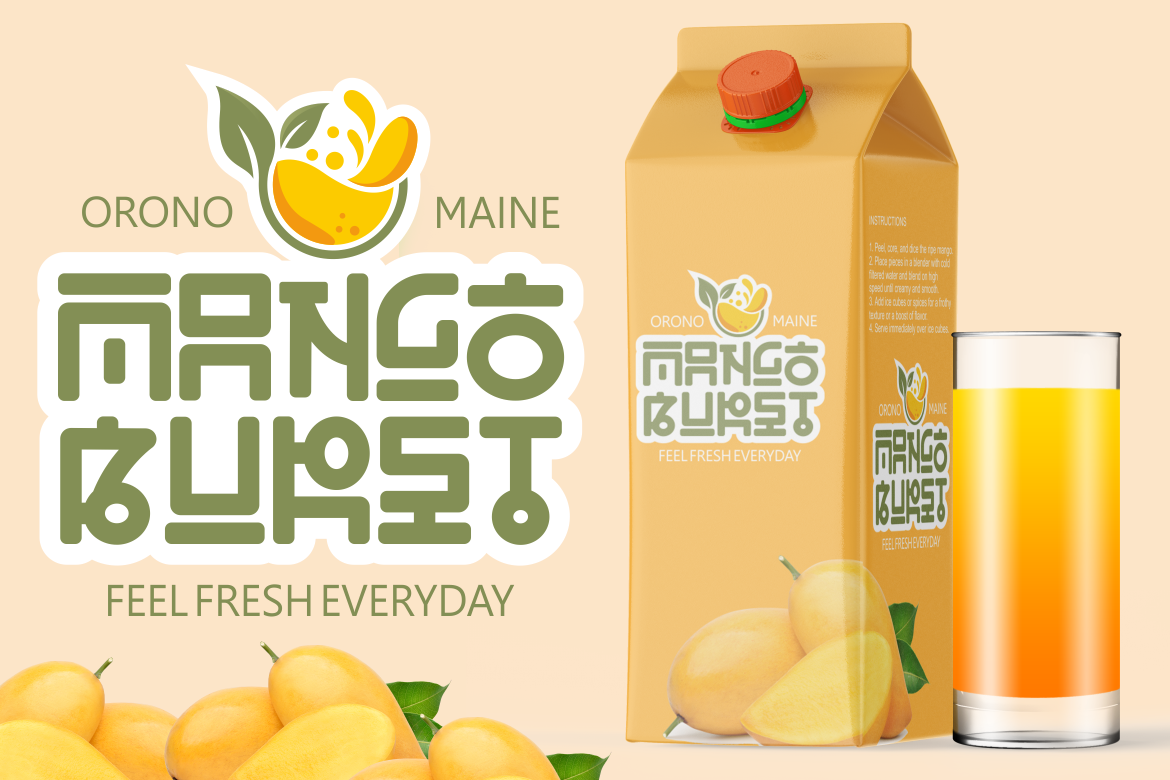
Maple Story offers a Korean-inspired display direction with an approachable cultural personality. PutraCetol describes it as a Korean-style font intended to capture Korean charm through its lettering, making it suitable when a brand wants an obvious Korean-inspired identity rather than completely neutral international typography.
For beauty branding, its expressive character can work well on collection names, limited-edition packaging, promotional graphics, and playful cosmetics aimed at younger audiences.
PROS: Recognizable Korean-inspired character, expressive display presence, friendly visual tone.
BEST FOR: Sheet masks, lip products, youthful skincare, beauty campaigns, social graphics.
2. Jada Garden Korean Style Font
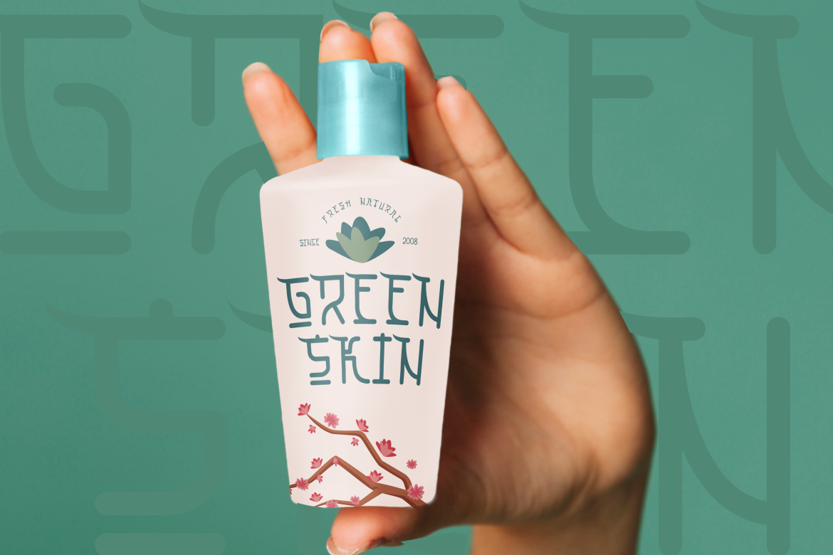
Jada Garden takes a softer and more handcrafted approach. Its design draws from Korean and Asian brush-stroke aesthetics while adding playful, quirky character. The family also provides alternate forms and ligatures that can be mixed to create more individual wordmarks and packaging titles.
That flexibility makes Jada Garden especially interesting for K-beauty brands wanting warmth rather than strict clinical minimalism.
PROS: Brush-inspired forms, playful personality, alternates, ligatures, customizable wordmarks.
BEST FOR: Botanical cosmetics, cute beauty brands, handmade skincare, gift sets, lifestyle campaigns.
3. Drama Lines Korean Font

Drama Lines is a stronger choice for brands seeking a more elegant and editorial Korean-inspired direction. Its tall construction, geometric foundations, and decorative terminal loops combine contemporary minimalism with references to Korean calligraphic rhythm. PutraCetol positions it for branding, packaging, posters, magazines, movie titles, and K-pop-inspired visual work.
For K-beauty, those proportions can create sophisticated vertical packaging and fashion-oriented campaign headlines without looking overly traditional.
PROS: Tall proportions, geometric structure, distinctive loops, modern editorial character.
BEST FOR: Premium skincare, fragrance, fashion-beauty collaborations, editorial campaigns, elegant packaging.
4. Hangul Street Korean Style Font

Hangul Street moves away from elegance and toward contemporary Korean street culture. Its thick strokes, compact wide proportions, rounded corners, open counters, and tight spacing create a bold visual block that feels youthful and energetic. PutraCetol specifically connects the design with modern Korean street branding, pop culture, packaging, social graphics, and entertainment.
This makes it ideal for trend-driven cosmetics that want stronger shelf presence rather than understated luxury.
PROS: Bold visibility, rounded geometry, compact proportions, youthful energy.
BEST FOR: Gen Z cosmetics, lip tints, colorful skincare, pop-up campaigns, social-first beauty brands.
5. Samgye Style Bold Korean Style Font
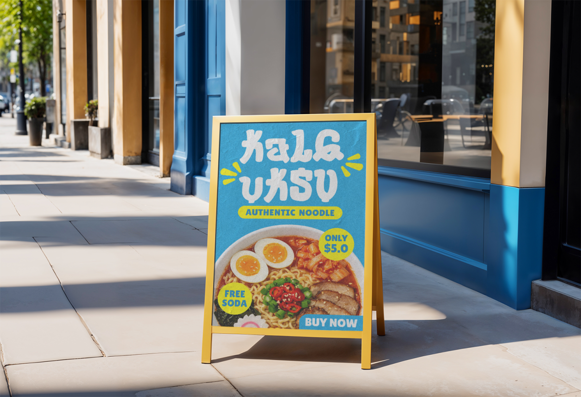
Samgye Style uses thick, rounded, slightly irregular letterforms inspired by Korean street-food culture. Its soft organic curves and handmade edges create a friendly, energetic personality while the heavy strokes preserve visibility in packaging and promotional headlines.
Although originally positioned strongly toward food-related branding, those same characteristics can translate effectively into playful beauty identities where warmth and personality matter more than luxury restraint.
PROS: Heavy rounded forms, handmade energy, strong visibility, approachable personality.
BEST FOR: Fun cosmetics, youth brands, novelty beauty products, stickers, campaign graphics.
Comparison: Which Korean-Inspired Font Fits K-Beauty Best?
| Font | Main Personality | Best Beauty Direction |
|---|---|---|
| Maple Story | Friendly, expressive | Youthful K-beauty |
| Jada Garden | Soft, handcrafted | Botanical and playful |
| Drama Lines | Elegant, geometric | Premium skincare |
| Hangul Street | Bold, pop-driven | Gen Z cosmetics |
| Samgye Style | Rounded, energetic | Fun product branding |
Drama Lines is the strongest choice for refined K-beauty packaging, while Hangul Street delivers the most contemporary pop impact. Jada Garden works well for softer brands, Maple Story offers approachable Korean-inspired character, and Samgye Style suits playful campaigns.
How to Make Korean-Inspired Typography Feel Premium
Do not rely on the font alone to communicate Korea.
Combine typography with disciplined spacing, thoughtful color, photography, packaging materials, and culturally informed art direction. Soft neutrals can create a clinical skincare mood, while saturated color and glossy photography can push the same typography toward youthful cosmetics.
For actual Korean-language copy, verify native Hangul glyph support and ask a Korean reader or designer to review the typography. A foreign-look Latin font should never be treated as a substitute for properly designed Korean text.
Common Mistakes
A common mistake is equating any Korean-inspired lettering with authentic Korean typography. Visual inspiration and language support are different things. If ingredients, product names, instructions, or campaign messages must appear in Korean, use a typeface with genuine Hangul coverage and check spacing and line breaks with a native-language reviewer.
Another mistake is using every Korean visual reference at once. Hangul-like lettering, pastel gradients, K-pop imagery, stickers, hearts, and decorative icons can quickly make a brand feel stereotyped. Strong branding usually selects a few references and combines them with a clear product strategy.
Finally, avoid using highly expressive display fonts for ingredient lists or instructions. Reserve them for logos, collection names, headlines, and packaging focal points. Functional information should remain simple and readable.
Conclusion
The best Hangul-inspired fonts for K-beauty branding 2026 can give beauty packaging and campaigns a distinctive cultural direction without sacrificing contemporary appeal.
Maple Story feels friendly, Jada Garden adds handcrafted softness, Drama Lines brings editorial elegance, Hangul Street delivers pop-driven energy, and Samgye Style introduces bold playful character.
Explore these options through PutraCetol Studio, test them with your actual product names, and pair them with clean supporting typography.
The strongest K-beauty identity does not simply look Korean. It translates cultural inspiration into a coherent, modern brand that can communicate confidently to a global audience.
Explore these fonts and many more at PutraCetol.com to build a business identity that looks professional, trustworthy, and memorable.
Additionally, if you want to explore some free typography options, you can check out Putracetol Studio on Dafont. Happy reading and designing!