
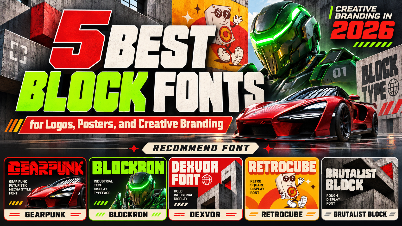
Best Block Fonts 2026: 5 Powerful Fonts for Bold and Creative Branding
Bold typography has the power to transform simple words into unforgettable visual statements. From sports branding and industrial packaging to futuristic gaming graphics, block fonts communicate strength, confidence, and immediate visual impact.
The best block fonts 2026 feature substantial strokes, geometric construction, strong proportions, and distinctive letterforms that command attention.
Whether you’re designing a professional logo, promotional poster, product packaging, or athletic merchandise, choosing the right block typeface can establish a powerful brand personality while keeping your message recognizable.
Make Bold Typography Work for Your Brand
Successful block typography begins with understanding the personality behind your design.
Industrial fonts communicate durability and engineering precision, while futuristic block lettering introduces innovation and technological energy. Retro square fonts offer a nostalgic personality, and rough brutalist styles create rebellious visual expressions.
For example, a gaming company might choose mechanical lettering with angular cuts, while a lifestyle brand could benefit from rounded geometric blocks.
Combine your selected font with strong contrast, controlled spacing, and a focused color palette to create headlines that feel powerful without becoming visually overwhelming.
Jump to Recommended Block Fonts
Explore these five distinctive block typefaces from PutraCetol Studio, each offering a different approach to bold, geometric, and high-impact typography.
1. Gearpunk Futuristic Cyberpunk Mecha Font

Gearpunk is a futuristic block display font inspired by mechanical engineering, cyberpunk aesthetics, and robotic armor construction. Its heavy geometric letterforms feature sharp angles, diagonal slashes, and distinctive cutouts that create an impressive machine-built appearance. The combination of solid shapes and carefully positioned negative spaces introduces movement and technical precision, making the lettering feel powerful without relying on decorative textures. Gearpunk is particularly effective for brands seeking an aggressive technological identity with memorable sci-fi character and strong visual presence.
PROS: Mechanical geometry, sharp angular cuts, distinctive negative spaces, futuristic visual character.
BEST FOR: Gaming logos, esports branding, sci-fi posters, technology products, cyberpunk merchandise, and futuristic packaging.
2. Blockron Industrial Tech Display Font
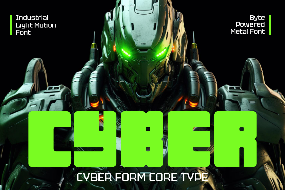
Blockron delivers a strong industrial personality through substantial square letterforms, uniform strokes, and carefully structured geometric proportions. Its slightly rounded corners soften the rigid construction while maintaining a confident mechanical appearance. Unlike heavily decorated futuristic fonts, Blockron emphasizes solid architecture and minimal visual distractions, giving its lettering a clean, engineered personality. This combination of geometric precision and industrial strength makes it especially attractive for technology companies and brands seeking bold typography that communicates reliability, innovation, and modern performance.
PROS: Bold square construction, consistent stroke weight, subtle rounded corners, clean industrial geometry.
BEST FOR: Technology branding, industrial packaging, robotics companies, sci-fi headlines, engineering logos, and digital advertising.
3. Dexvor Bold Industrial Display Font

Dexvor is a powerful industrial display typeface characterized by tall proportions, heavy strokes, and rigid angular construction. Its narrow counters, mechanical cuts, and sharp corners create a commanding visual rhythm inspired by machinery and industrial architecture. The strong vertical structure gives headlines an authoritative presence while allowing designers to maintain a compact and organized composition. Dexvor offers an excellent option for businesses that want their typography to communicate durability, technical expertise, and confidence through expressive block lettering.
PROS: Tall block proportions, thick mechanical strokes, sharp geometric cuts, commanding industrial character.
BEST FOR: Automotive branding, manufacturing companies, engineering campaigns, construction signage, industrial posters, and technical product packaging.
4. Retrocube Retro Square Display Font
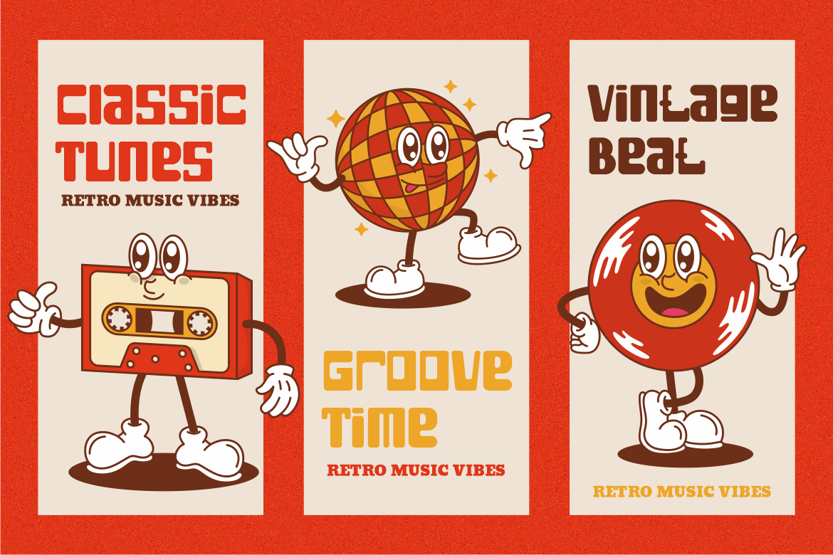
Retrocube combines classic retro influences with modern geometric construction to create a bold, approachable display font. Its wide square letterforms, substantial strokes, and consistent proportions establish a solid visual presence, while softly rounded interior shapes introduce a friendly personality. The balanced construction makes Retrocube feel nostalgic without appearing outdated, offering designers a distinctive alternative to aggressive industrial typography. Its combination of vintage charm and geometric simplicity makes it particularly appealing for creative brands that want memorable headlines with warmth and confidence.
PROS: Wide square geometry, consistent heavy strokes, rounded inner spaces, friendly retro personality.
BEST FOR: Retro logos, lifestyle branding, music posters, product packaging, creative studios, and vintage-inspired merchandise.
5. Brutalist Block Rough Display Font
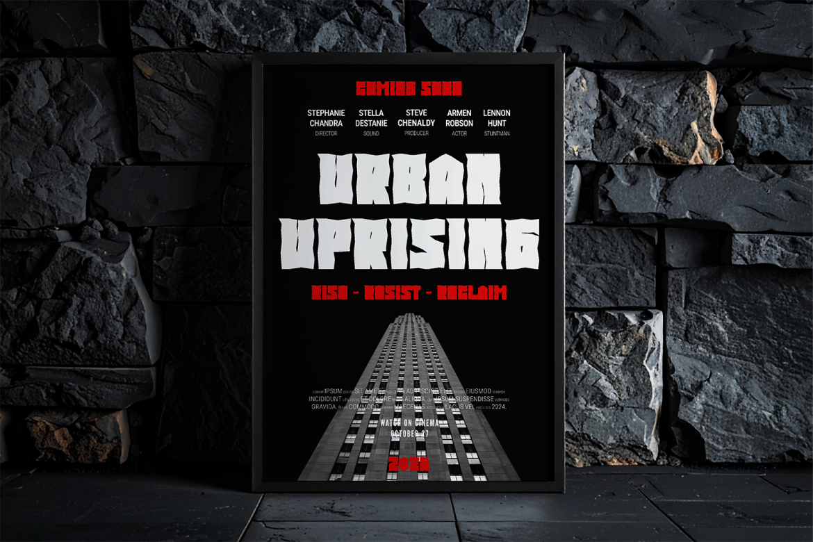
Brutalist Block brings raw visual power through massive letterforms, irregular cuts, and rigid geometric shapes. Its dense structure and intentionally rough edges create an energetic appearance inspired by brutalist aesthetics, urban culture, and industrial design. Unlike clean geometric fonts, Brutalist Block embraces imperfections that give every headline a rebellious, uncompromising personality. Its forceful proportions make it especially effective for projects requiring an intense visual identity that communicates strength, movement, and confidence.
PROS: Massive block construction, rough irregular edges, aggressive proportions, distinctive urban personality.
BEST FOR: Gym branding, boxing promotions, streetwear, skateboarding graphics, music festivals, and action posters.
Comparison: Which Block Font Should You Choose?
Each block typeface communicates a distinctive personality and branding direction.
| Font | Visual Personality | Best Branding Direction |
|---|---|---|
| Gearpunk | Futuristic, mechanical | Gaming and cyberpunk |
| Blockron | Geometric, industrial | Technology and engineering |
| Dexvor | Tall, bold, technical | Automotive and manufacturing |
| Retrocube | Retro, square, friendly | Lifestyle and creative brands |
| Brutalist Block | Rough, powerful, rebellious | Sports and streetwear |
How to Use Block Typography Effectively
Use block fonts for short, impactful text such as brand names, promotional headlines, event titles, and product labels.
Pair expressive block lettering with a clean sans-serif font for supporting information. Test character spacing, contrast, and readability across printed packaging, merchandise, and digital layouts.
Common Mistakes When Using Block Fonts
One common mistake is assuming that thicker typography always produces stronger branding. Although heavy letterforms attract attention, overly condensed spacing, complicated geometric cuts, and excessive decorative effects can reduce readability. This becomes particularly problematic when typography appears on small product labels, mobile advertisements, or crowded promotional banners. Designers should evaluate letter spacing, counter shapes, and visual hierarchy before finalizing a composition. Strong block typography works best when bold shapes support the message rather than overpower it.
Another mistake is choosing a block font without considering the brand’s personality. Futuristic mechanical lettering may suit gaming companies but feel inappropriate for nostalgic lifestyle products. Similarly, rough brutalist typography can communicate rebellious energy but may conflict with brands seeking a polished corporate identity. Designers should establish consistent typography guidelines, select complementary supporting fonts, and verify that their license covers intended commercial applications, including logos, merchandise, printed products, and digital advertising.
Conclusion
The best block fonts for 2026 combine powerful construction, distinctive visual character, and strong branding potential.
Gearpunk delivers futuristic mechanical energy, Blockron introduces clean industrial precision, and Dexvor communicates technical strength. Retrocube offers approachable retro geometry, while Brutalist Block creates an aggressive urban personality.
The ideal block font should reflect your audience, creative direction, and desired brand identity while remaining recognizable across different applications.
Explore these premium block typefaces at PutraCetol Studio and discover bold typography that gives your next branding project a confident, memorable visual presence.
Explore these fonts and many more at PutraCetol.com to build a business identity that looks professional, trustworthy, and memorable.
Additionally, if you want to explore some free typography options, you can check out Putracetol Studio on Dafont. Happy reading and designing!