
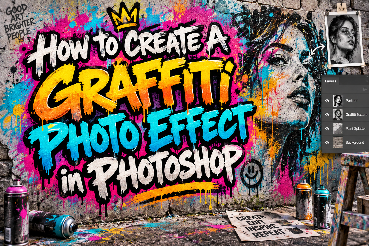
Photoshop Graffiti Effect Tutorial 2026: Turn a Photo Into Digital Street Art
Build the Effect Non-Destructively
The best Photoshop graffiti effect tutorial 2026 workflow begins with an editable master. Do not permanently destroy the original portrait while experimenting with contrast, color, or texture.
Convert the image to a Smart Object through Layer > Smart Objects > Convert to Smart Object. Photoshop preserves the original image data, while compatible filters can remain editable as Smart Filters.
Choose a photograph with a recognizable silhouette, readable facial features, and reasonably clear separation from the background. High-contrast lighting often translates more effectively into stencil-inspired artwork than an image dominated by similar midtones.
Create the Main Graffiti Portrait
1. Isolate the Subject
Use Select Subject to detect the primary person or object, then refine difficult edges with Select and Mask. Photoshop currently supports device or cloud processing for Select Subject, and the selection can be refined before it becomes the basis of your composition.
Add a layer mask rather than deleting the background. This makes it easier to restore missing hair, clothing, or accessories later.
2. Simplify the Photograph Into Graphic Shapes
Add a Black & White adjustment layer first and refine the tonal separation. Then experiment with Threshold or Posterize as separate adjustment layers.
Threshold converts the photograph into high-contrast black and white, making it useful for bold stencil-style imagery. Posterize reduces the number of tonal levels and preserves several simplified value groups, which can create a more illustrated result. Adobe supports both as adjustment layers, allowing non-destructive editing.
For a raw stencil look, start with Threshold. For a more colorful mural with shadows and midtones, try Posterize with a small number of levels.
3. Introduce a Controlled Color Palette
Create new Solid Color layers or use a Gradient Map to replace neutral tones with your chosen palette. Photoshop’s Gradient Map maps grayscale values to gradient colors, making it especially useful after simplifying the portrait.
For an urban campaign, try black, warm cream, vivid red, and one electric blue accent. Avoid introducing ten colors simply because graffiti can be colorful. A limited palette usually makes the portrait and typography easier to recognize.
Duplicate selected shape or portrait layers and offset them slightly to create registration-shift effects reminiscent of screen printing.
Make the Artwork Feel Painted on a Wall
4. Add a Real Surface Texture
Place a legally sourced photograph of concrete, brick, plaster, or another suitable wall beneath the artwork. Keep the texture visible enough to establish the environment without overwhelming the subject.
Try Multiply, Overlay, or Soft Light when combining paint textures and artwork. Photoshop’s blending modes change how pixels from different layers interact: Multiply produces darker results, while Overlay and Soft Light can preserve or enhance underlying highlights and shadows.
Adjust opacity instead of forcing every layer to 100%.
5. Use Displacement for Surface Irregularity
For more convincing integration, create a grayscale copy of the wall texture and save it as a flattened Photoshop file. Apply Filter > Distort > Displace to the graffiti artwork and select that texture as the displacement map.
Photoshop’s Displace filter shifts image content based on tonal information in the map, helping flat artwork follow variations in the surface.
Begin with conservative displacement values. Excessive distortion can destroy faces and typography instead of making them appear painted.
6. Add Controlled Imperfection
Create separate layers for splatter, worn edges, overspray, drips, or dry-brush marks. Use masks so you can remove effects that become distracting.
Realistic imperfection should vary. Identical drips repeated around every edge tend to look like a digital preset rather than applied paint.
Add Typography and Branding
Graffiti-inspired typography can strengthen posters, album covers, fashion campaigns, and social graphics. Explore PutraCetol Studio for bold, brush, rough, or experimental display fonts that complement an urban visual direction.
Use the expressive font for a short campaign phrase or brand name, then keep dates, product details, and calls to action in a simpler companion typeface.
Transform typography separately from the portrait so you can resize or replace it without rebuilding the artwork.
Export for the Final Medium
Keep the layered PSD as the master file. For social media, export an appropriately sized PNG or JPEG and inspect it on a phone. For print, confirm dimensions, resolution, bleed, and color requirements with the printer before creating the final file.
Do not judge the design only at 200% zoom. Graffiti effects depend on the balance between fine texture and recognizable large shapes.
Comparison
| Technique | Visual Result | Best Use |
|---|---|---|
| Threshold | Hard black-and-white stencil | Bold posters and portraits |
| Posterize | Simplified tonal blocks | Colorful mural effects |
| Gradient Map | Controlled recoloring | Campaign color systems |
| Displacement | Surface-following distortion | Concrete and brick mockups |
| Blend Modes | Texture integration | Weathered paint effects |
Common Mistakes
The first mistake is adding texture before the portrait has a strong silhouette. Grunge brushes, drips, and wall cracks cannot fix weak tonal separation. Build the image in simple black and white first and make sure the face or object remains recognizable before adding surface effects.
Another common mistake is making every element equally distressed. If the portrait, headline, background, and logo all contain heavy scratches and splatter, hierarchy disappears. Keep one dominant texture treatment and allow important information to stay cleaner.
The final mistake is flattening the project too early. Preserve Smart Objects, masks, adjustment layers, and editable text. This makes the artwork easier to adapt for another campaign color, social format, or client revision without rebuilding the entire composition.
Conclusion
A strong Photoshop graffiti effect tutorial 2026 combines image simplification, controlled color, realistic texture, and non-destructive editing.
Start with a clear photograph, use Threshold or Posterize to establish the graphic structure, integrate it with a real wall through blending and displacement, then add imperfection selectively.
Combined with distinctive PutraCetol Studio typography, the technique can transform portraits into compelling urban posters, branding visuals, social campaigns, and contemporary digital street art.
Explore these fonts and many more at PutraCetol.com to build a business identity that looks professional, trustworthy, and memorable.
Additionally, if you want to explore some free typography options, you can check out Putracetol Studio on Dafont. Happy reading and designing!