
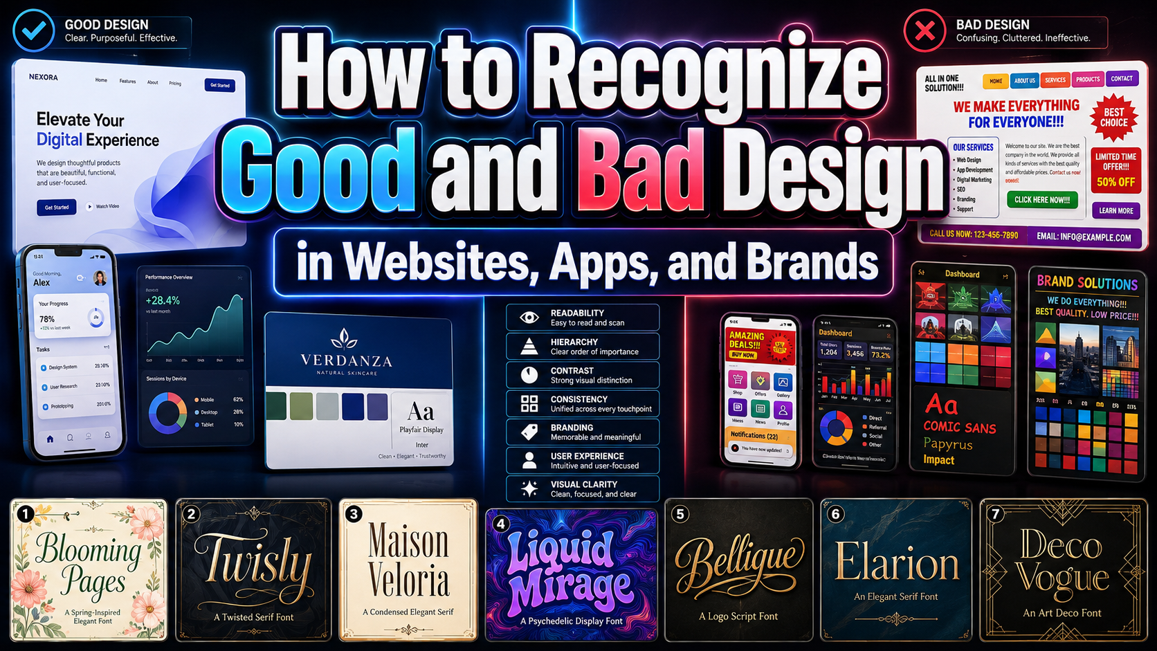
Before redesigning an entire product, examine one high-value journey, such as finding information, creating an account, completing checkout, or submitting a request. Watch where users pause, backtrack, select the wrong control, or ask for help. The clearest difference in Good vs Bad Design often appears not in visual polish, but in how much interpretation the interface demands.
Good design makes the next step visible, follows familiar patterns, provides timely feedback, and keeps the user’s goal central. Bad design asks people to decode controls, remember hidden rules, or recover from unexpected behavior.
What Good Design Actually Means
Don Norman’s work separates an object’s possible actions from the cues that help people recognize those actions. In interfaces, controls should be perceivable, meaningful, and discoverable. Familiar conventions, clear wording, and a coherent conceptual model help users understand what they can do and predict what will happen next.
Dieter Rams approached the same challenge through product discipline. His principles describe good design as innovative, useful, understandable, unobtrusive, honest, long-lasting, carefully resolved, environmentally responsible, and “as little design as possible.” Innovation should strengthen usefulness rather than become an end in itself.
Together, these ideas suggest that good design does not require users to admire the designer’s decisions. It allows them to complete their goals naturally, confidently, and with minimal interruption.
Good Design Feels Obvious, Not Empty
An obvious interface does not need to be visually boring. It communicates purpose without forcing users to experiment. A primary button looks actionable and states its outcome. Navigation remains consistent across pages. A loading state confirms that the system is working. A successful payment produces a clear confirmation, while a destructive action provides a warning or recovery path.
Visual creativity can still appear in typography, illustration, motion, color, and brand expression. The important distinction is that decoration should strengthen hierarchy and meaning, not compete with essential controls.
A distinctive typeface may be ideal for a campaign headline, for example, but a checkout button should still look and behave like a checkout button. Originality is most valuable when it reinforces communication instead of replacing it.
Bad Design Increases Cognitive Load
Hidden navigation, unexplained icons, inconsistent labels, weak contrast, dense forms, vague error messages, and unpredictable interactions all require extra mental effort. W3C cognitive accessibility guidance recommends clear layouts, meaningful headings, visible cues, and easy-to-follow navigation. WCAG 2.2 also provides testable criteria for making digital content more accessible.
Consider an ecommerce checkout form. Good design requests only necessary information, groups related fields, preserves entered data, places errors beside the relevant field, and reveals the total before purchase.
Bad design resets the form after an error, hides extra costs, uses an ambiguous final button, or leaves the customer uncertain whether payment succeeded. These problems increase hesitation and abandonment because the user must repeatedly stop and interpret the system.
Evaluate the Complete Experience
Designers, developers, product managers, and brand strategists should collaborate before visual decisions become fixed. The team should define the user goal, interaction model, content hierarchy, technical constraints, accessibility requirements, and brand voice together.
The design should then be evaluated through task completion, errors, hesitation, abandonment, support questions, and conversion. A beautiful screen that prevents users from completing the intended task is still bad design. A modest interface that works clearly, consistently, and inclusively is often the stronger product.
Jump to Recommended Fonts
Blooming Pages | Twisly | Maison Veloria | Liquid Mirage | Bellique | Elarion | Deco Vogue
Expressive typography can make a product memorable, but good UX requires restraint. Use a distinctive display font for logos, campaign headings, packaging, or editorial moments. Pair it with a highly readable typeface for navigation, body copy, forms, instructions, and accessibility-critical information.
1. Blooming Pages Spring Font
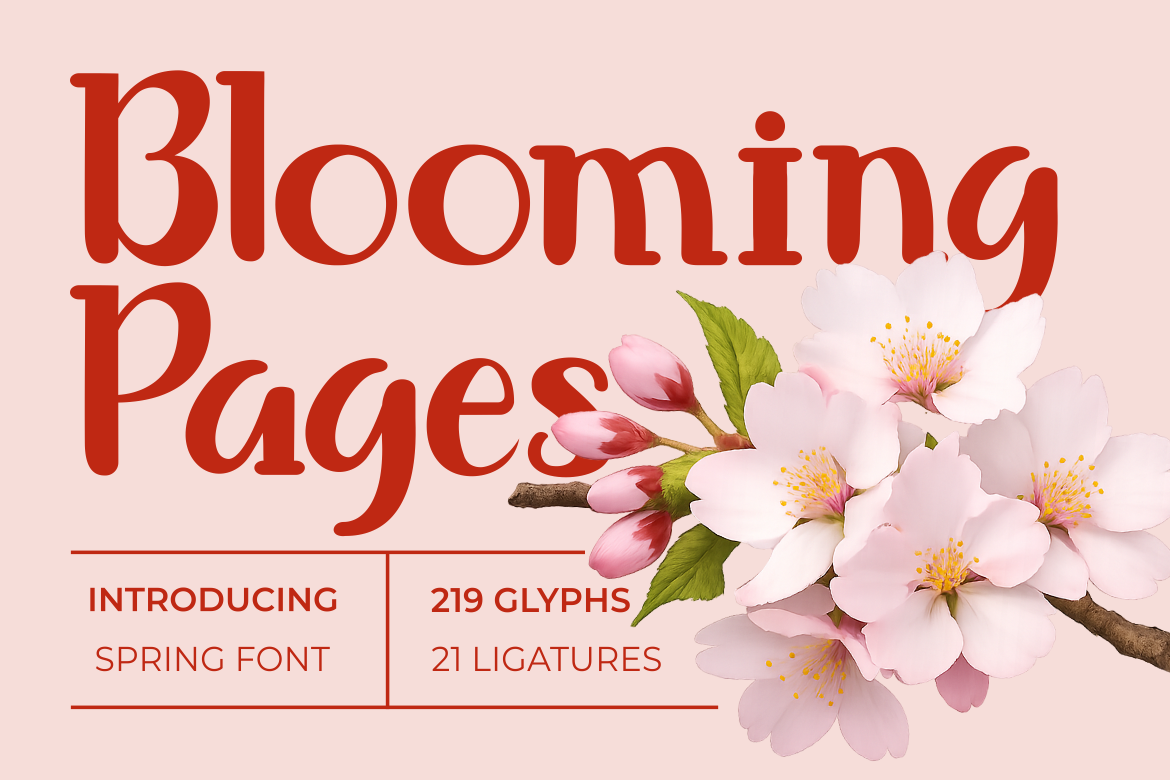
Blooming Pages combines a tall, slender serif structure with soft curves, rounded terminals, and decorative alternates. Its botanical and romantic personality adds warmth without losing an orderly silhouette, making it valuable when a brand needs elegance with an approachable tone.
PROS: Graceful hierarchy, warm personality, decorative options, and space-efficient proportions.
BEST FOR: Boutique branding, wellness, floral businesses, invitations, packaging, and editorial covers.
2. Twisly Twisted Serif Font
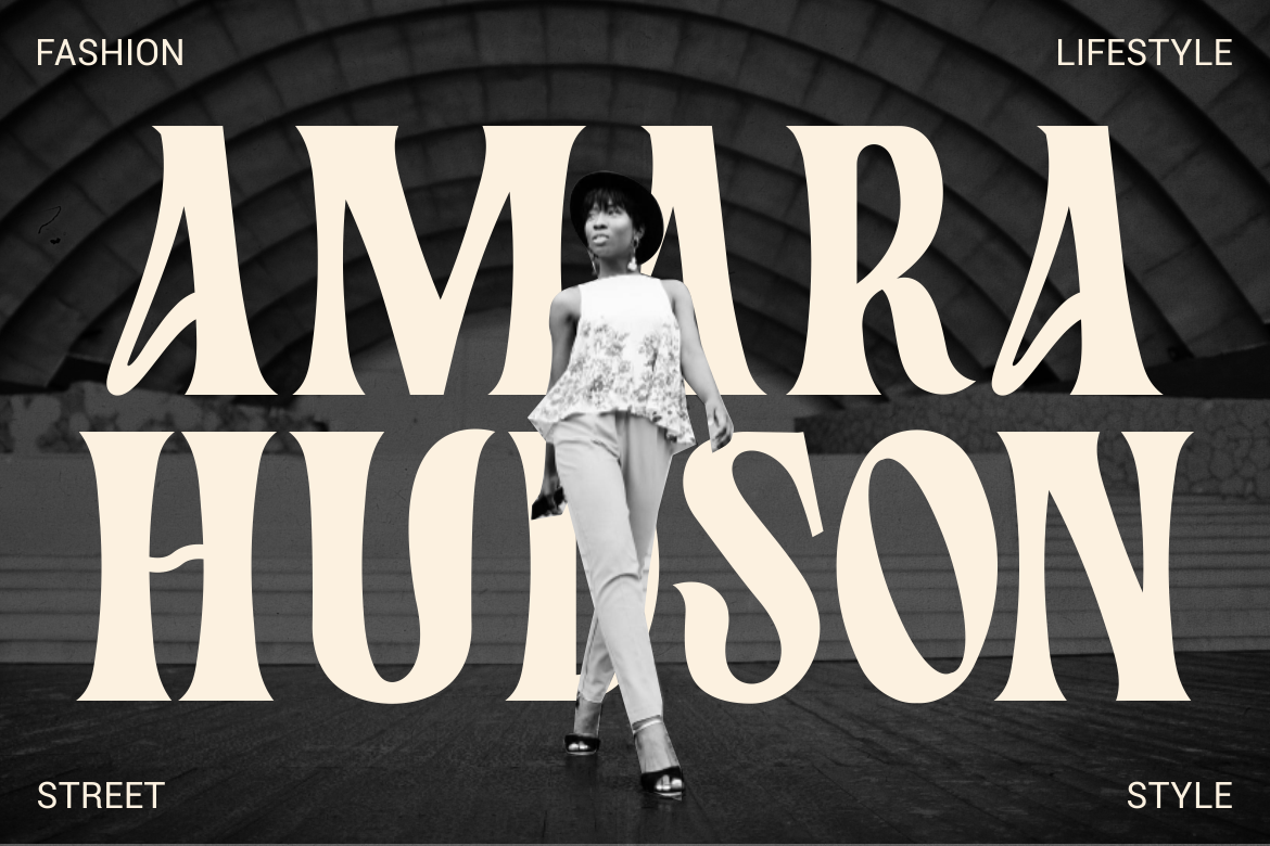
Twisly begins with a refined high-contrast serif and introduces curved distortions, unusual terminals, and a slightly condensed rhythm. The result feels sophisticated and experimental, giving fashion or cultural projects a recognizable voice while remaining effective for large display text.
PROS: Distinctive structure, premium mood, strong headline recognition, and editorial character.
BEST FOR: Fashion brands, magazines, beauty campaigns, book covers, posters, and creative studios.
3. Maison Veloria Condensed Font

Maison Veloria uses tall, narrow forms, smooth strokes, and subtle vintage details to create a polished identity in limited space. Longer names can remain visually controlled on labels, menus, mobile banners, and signs, which makes the font practical as well as elegant.
PROS: Space-saving width, refined rhythm, clear display presence, and broad branding flexibility.
BEST FOR: Hospitality, artisan products, cafés, premium retail, menus, signage, and packaging.
4. Liquid Mirage Psychedelic Style Font
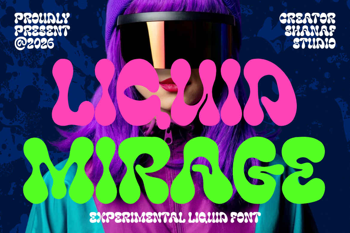
Liquid Mirage features thick rounded strokes, melting curves, and inflated shapes inspired by liquid movement and psychedelic graphics. Its expressive silhouette turns typography into a focal image, making it ideal for projects where energy, experimentation, and visual impact are central to the message.
PROS: High visual impact, fluid movement, unconventional personality, and memorable display forms.
BEST FOR: Music, festivals, nightlife, beverages, entertainment, album covers, and experimental campaigns.
5. Bellique Logo Script Font
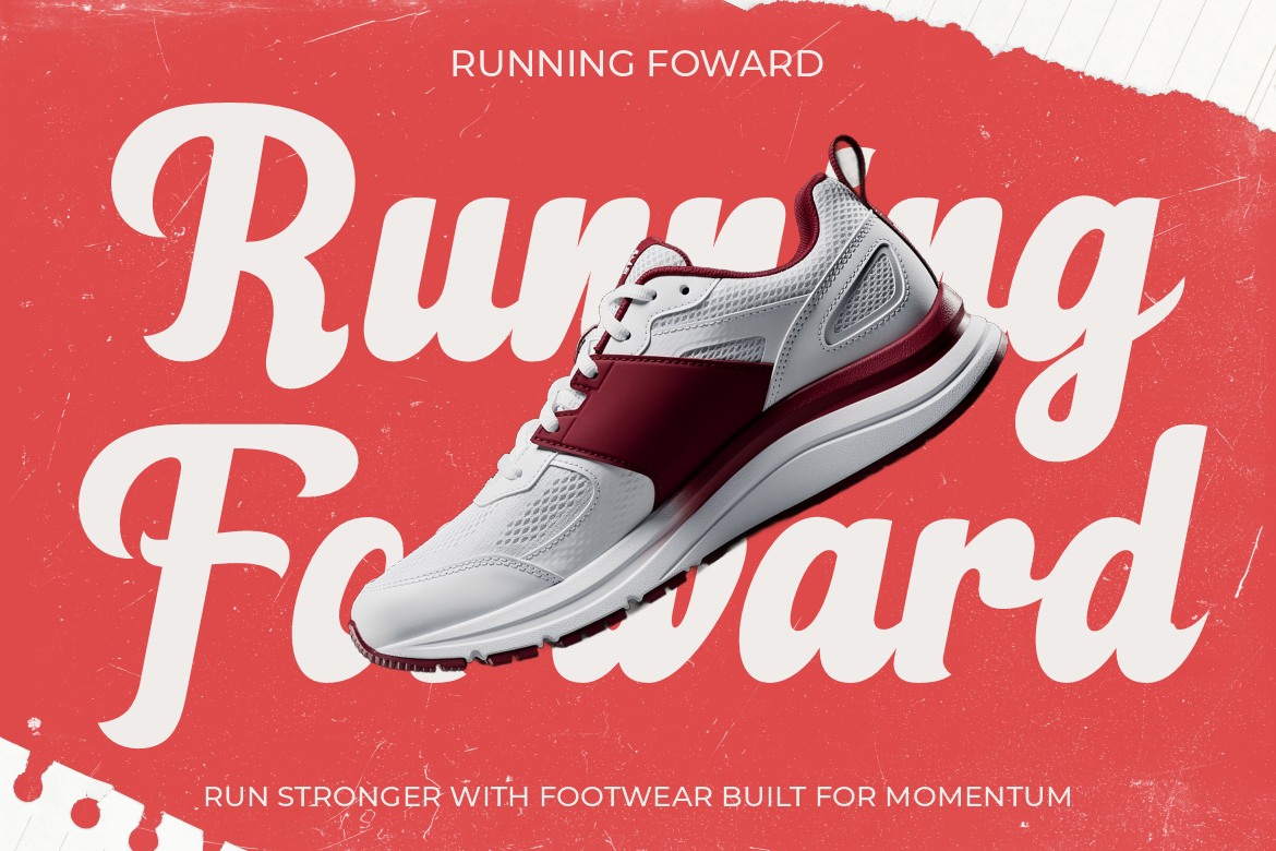
Bellique is a bold connected script with smooth curves, confident terminals, and an energetic baseline. Its flowing construction creates movement while keeping brand names readable at display sizes, giving active and performance-focused identities a strong human signature.
PROS: Dynamic rhythm, bold logotype presence, smooth connections, and energetic character.
BEST FOR: Sports, footwear, fitness, active lifestyle brands, packaging, and promotional headlines.
6. Elarion Elegant Serif Font

Elarion pairs tall letterforms with refined contrast, graceful curves, and balanced spacing. Its uppercase creates confident branding, while the calmer lowercase supports editorial compositions, making it useful for identities that need heritage, trust, and contemporary polish.
PROS: Strong readability, elegant contrast, calm authority, and versatile uppercase and lowercase.
BEST FOR: Luxury brands, galleries, architecture, hotels, beauty, jewelry, and premium packaging.
7. Deco Vogue Art Deco Line Font
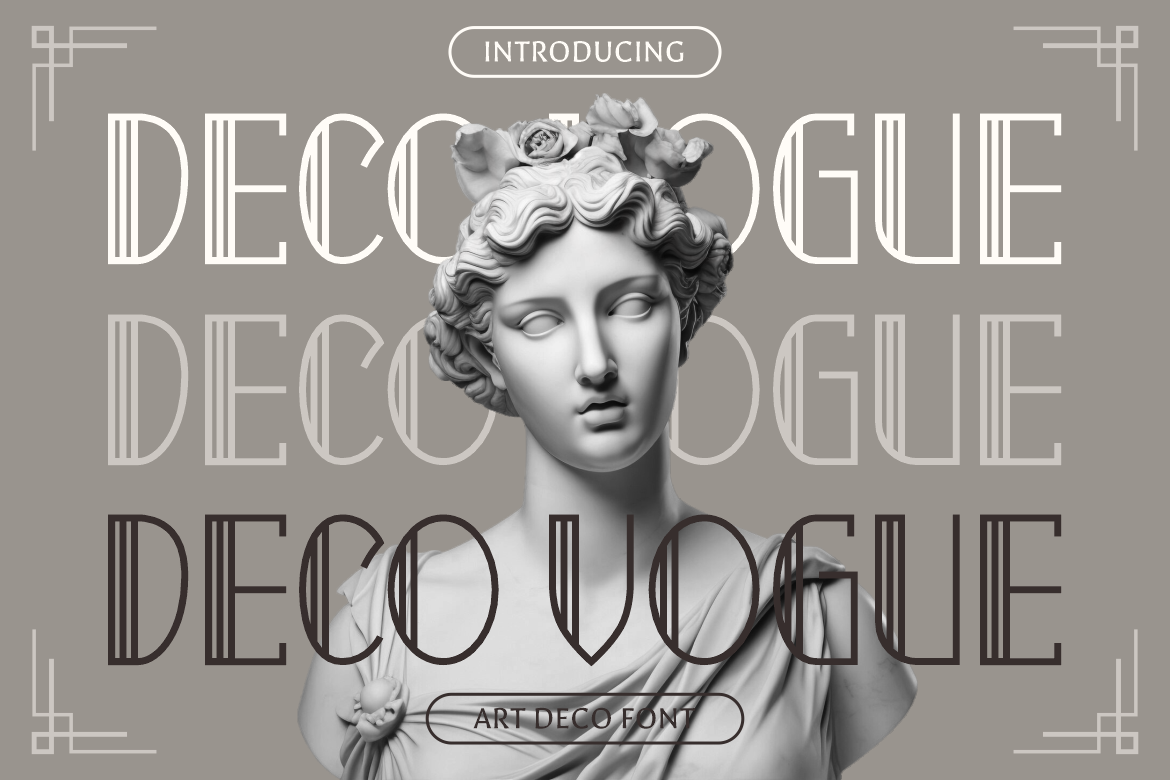
Deco Vogue uses elongated proportions, narrow spacing, geometric lines, and controlled curves influenced by Art Deco. Its light linear construction feels architectural and glamorous, helping premium titles stand out without the visual weight of a heavy display face.
PROS: Distinctive geometry, elegant line work, airy appearance, and strong luxury positioning.
BEST FOR: Editorial titles, architecture, exhibitions, luxury events, boutique branding, and film graphics.
Comparison
| Font | Visual Personality | Strongest Role | Use With Care |
|---|---|---|---|
| Blooming Pages | Soft and botanical | Elegant brand storytelling | Keep flourishes away from small UI text |
| Twisly | Refined and experimental | Fashion and editorial headlines | Avoid using it for long paragraphs |
| Maison Veloria | Condensed and polished | Space-limited branding | Increase spacing at very small sizes |
| Liquid Mirage | Fluid and psychedelic | High-impact campaigns | Reserve it for short display copy |
| Bellique | Energetic and expressive | Logos and active brands | Do not use it for instructions |
| Elarion | Classic and sophisticated | Premium identity systems | Pair it with a neutral interface font |
| Deco Vogue | Geometric and glamorous | Art Deco titles and signage | Test thin lines at small sizes |
Common Mistakes
The first mistake is confusing minimalism with removing useful information. Rams’s idea of “less, but better” does not justify hiding labels, flattening every control, or removing feedback simply to make a screen look clean. When users cannot distinguish a button from ordinary text or understand what an icon means, visual reduction has become functional loss. Remove elements that do not support the task, but preserve every cue required for confident action.
Another mistake is designing only the ideal static screen. Real products include loading states, empty results, validation errors, long names, translated text, slow connections, keyboard navigation, small screens, and interrupted sessions. A layout may look excellent in a presentation and fail when real content or technical behavior appears. Designers and developers should define these states together, then test the complete journey with representative users rather than evaluating isolated screens.
The final mistake is allowing brand expression to overpower communication. An experimental font may create a memorable hero section, but using it for navigation, legal text, form labels, or long paragraphs can reduce readability and trust. Build hierarchy deliberately. Use expressive typography where personality matters, select a simpler companion for functional content, maintain adequate contrast, and test the system at actual sizes across devices.
Conclusion
Good vs Bad Design is ultimately a comparison between support and friction. Good design makes purpose, action, status, and recovery understandable. Bad design transfers the designer’s unresolved decisions to the user through ambiguity, inconsistency, and unnecessary cognitive load.
Norman’s interaction principles and Rams’s disciplined restraint remain valuable because they place usefulness before decoration. The best products are not merely attractive. They are predictable when familiarity matters, informative when users need guidance, and expressive without obstructing essential actions.
Typography from PutraCetol Studio can add a distinctive visual voice to that foundation. Whether a project needs botanical softness, editorial experimentation, condensed elegance, psychedelic energy, expressive movement, luxury refinement, or Art Deco structure, the right display font can strengthen the identity while the wider design system protects clarity, inclusion, and usability.
Explore these fonts and many more at PutraCetol.com to build a business identity that looks professional, trustworthy, and memorable.
Additionally, if you want to explore some free typography options, you can check out Putracetol Studio on Dafont. Happy reading and designing!