
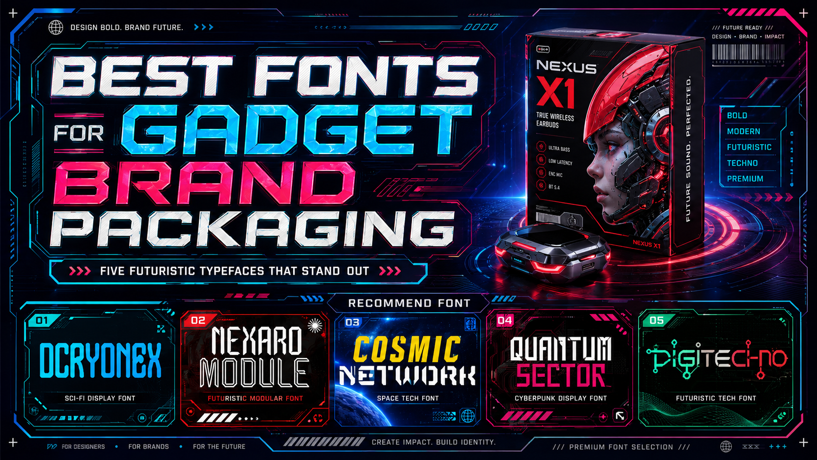
Best Fonts for Gadget Brand Packaging: Typography for Modern Technology Products
The best gadget packaging communicates innovation before the customer even opens the box.
Typography plays a major role in creating that first impression. A geometric science-fiction font can make a gaming accessory feel powerful and advanced. A modular display typeface may help an artificial intelligence device appear precise, while a cleaner futuristic font can give a premium wearable or smartphone a more refined identity.
However, technology packaging cannot depend on appearance alone. Customers still need to identify the brand, product model, compatibility, technical specifications, storage capacity, color variant, and important instructions without unnecessary effort.
That is why the best fonts for gadget brand packaging must balance two priorities: a memorable technological personality and practical readability.
Initial Suggestion: Separate the Brand Font From the Technical Font
Do not force one futuristic display font to handle every word on the package.
A stronger packaging system normally uses at least two typographic roles:
- Display font for the logo, product family, model name, and campaign statement
- Functional font for compatibility, technical specifications, instructions, dimensions, and regulatory information
For example, a wireless-earbuds package could use a distinctive cyber-style font for:
NEXA PULSE X2
Then use a clean sans serif for:
Bluetooth 5.4
Active Noise Cancellation
Up to 36 Hours Battery Life
Compatible With iOS and Android
This contrast gives the packaging a recognizable personality without making customers decode practical information through highly stylized letterforms.
Adobe recommends prioritizing readability, hierarchy, and scalability alongside visual style when selecting typography. Those principles are particularly relevant to gadget packaging because the same identity may need to perform on a box, product label, website, advertisement, and small ecommerce thumbnail.
What Makes a Font Suitable for Gadget Packaging?
Strong Recognition at a Glance
Technology products often appear beside many competing devices with similar photography and color palettes. A distinctive display font can help the product family become recognizable before the customer reads every detail.
Recognition may come from:
- Angular terminals
- Modular construction
- Circuit-inspired details
- Geometric cuts
- Extended horizontal strokes
- Condensed proportions
- Monospaced rhythm
- Unusual but controlled counters
- Mechanical symmetry
The typography should create a recognizable silhouette without turning the product name into an unreadable symbol.
Clear Model Numbers and Technical Characters
Gadget branding depends heavily on letters, numbers, symbols, and abbreviated product codes.
Test combinations such as:
X2 ProS10 UltraRX-7505GUSB-CWi-Fi 74K120Hz20W256GB
Pay particular attention to characters that can look similar:
- Uppercase
I, lowercasel, and number1 - Uppercase
Oand number0 - Letter
Band number8 - Letter
Sand number5 - Hyphen and minus sign
If the chosen display font has highly stylized numerals, use it for the product name only and move specifications into the functional typeface.
Enough Weight for Printing
Thin futuristic lines can look elegant on a large digital preview but disappear on a small package, textured paper, metallic substrate, or low-cost print process.
A gadget display font should have enough stroke weight to survive:
- Small packaging panels
- Matte lamination
- Spot varnish
- Foil stamping
- Embossing
- Ecommerce thumbnails
- Retail shelf distance
- Social advertisements
Test the real product name at the actual printed size rather than evaluating only a large monitor preview.
A Personality That Matches the Product
Not every technology brand should look cyberpunk.
Different gadgets require different visual directions.
| Product Category | Suitable Typographic Personality |
|---|---|
| Premium smartphone | Clean, precise, and restrained |
| Gaming accessory | Bold, angular, and energetic |
| Fitness wearable | Modern, compact, and active |
| Smart-home device | Friendly, minimal, and reliable |
| AI hardware | Modular, intelligent, and futuristic |
| Audio equipment | Rhythmic, technical, and immersive |
| Rugged outdoor gadget | Industrial, solid, and durable |
| Creator equipment | Professional, innovative, and expressive |
A highly aggressive esports font may weaken a healthcare wearable, while an overly minimal typeface could make a gaming device look generic.
Build a Clear Packaging Hierarchy
Typography should help customers understand the product in the correct order.
A practical gadget-package hierarchy may look like this:
Level 1: Brand Name
The brand should remain recognizable across every product category.
It may use a custom wordmark, display font, or carefully modified typeface.
Level 2: Product Family
Examples include:
- Nova Series
- Quantum Audio
- Motion Gear
- NexCore
- SmartLink
This level helps connect several models under one recognizable system.
Level 3: Model Name
The model name can receive the most expressive treatment when it acts as the primary product identifier.
Examples include:
- X7 Pro
- Module One
- Pulse Max
- Sector Mini
- CryoPad S
Level 4: Main Benefit
Use a short statement explaining why the product matters:
- AI-Powered Performance
- Studio-Quality Wireless Audio
- Built for Competitive Gaming
- Precision Health Tracking
- Rapid Charging Anywhere
Level 5: Technical Information
Specifications should use the most functional typography:
- Storage
- Connectivity
- Battery capacity
- Device compatibility
- Dimensions
- Included accessories
- Warranty
- Safety information
This hierarchy lets the futuristic font attract attention while the supporting family maintains trust and clarity.
Display Fonts vs. Functional Fonts for Technology Packaging
Futuristic Display Fonts
Use them for:
- Logo
- Product series
- Model name
- Campaign headline
- Limited-edition title
- Front-panel feature phrase
Their role is identity and differentiation.
Functional Sans Serif Fonts
Use them for:
- Product specifications
- Compatibility
- Setup instructions
- Legal information
- Barcode labels
- Serial-number areas
- Warranty text
- Website addresses
- Multilingual copy
Their role is fast and accurate reading.
Monospaced Supporting Fonts
A restrained monospace can be useful for:
- Model codes
- Technical values
- Firmware references
- Specifications
- Serial numbers
- Data-oriented graphics
However, using monospace for long explanatory text may make the package feel overly technical. Use it strategically.
Choosing Fonts for Different Gadget Categories
Smartphones and Tablets
Smartphone packaging usually benefits from clean sophistication.
The brand name and product model should feel premium, while storage capacity, device color, network compatibility, and included components must remain easy to identify.
Use restrained futuristic details rather than filling every character with circuit lines or angular cuts.
A useful system could combine:
- Modular display font for the model
- Neutral sans serif for information
- Monospace accent for storage and model codes
Wearables and Smartwatches
Wearables sit between technology, health, fashion, and lifestyle.
The font should feel modern without becoming cold. Rounded corners or controlled geometric details can create a more approachable personality.
For fitness-oriented products, a slightly condensed structure can suggest movement and efficiency. For premium wellness devices, a quieter futuristic wordmark may communicate greater trust.
Gaming Accessories
Gaming products can support more aggressive typography.
Key features may include:
- Sharp terminals
- Pixel-inspired cuts
- Wide geometric forms
- Modular letter construction
- Strong outlines
- High-contrast color
This direction works for keyboards, mice, controllers, headsets, cooling equipment, and gaming laptops.
Keep technical information separate from the most extreme display treatment.
Audio Products
Headphones, speakers, microphones, and earbuds can use typography inspired by rhythm, signals, networks, waves, or digital interfaces.
A structured techno font may help communicate precision, while a more experimental cyber font can support entertainment and gaming audio.
The package should still clearly show battery life, connectivity, driver size, microphone features, and platform compatibility.
Smart-Home Products
Smart-home technology should usually feel simple, reliable, and approachable.
Avoid typography that makes setup appear complicated or intimidating.
Use a clean technological wordmark with modest customization, then support it with highly readable instructions and icon labels.
Charging Devices and Accessories
Power banks, chargers, cables, adapters, and hubs often depend on model numbers and technical specifications.
Clarity is critical because customers need to compare:
- Wattage
- Port type
- Charging standard
- Cable length
- Device compatibility
- Input and output values
The display font can establish the product family, but numerical information should remain exceptionally clear.
Use Typography to Communicate Product Positioning
Premium Technology
Use:
- Wider spacing
- Restrained display details
- Dark neutrals
- Metallic accents
- Clean alignment
- Generous negative space
The typography should feel confident enough that it does not need several effects.
High-Performance Gaming
Use:
- Angular display forms
- Strong weight
- Neon or high-contrast accents
- Dark backgrounds
- Mechanical visual details
- Compressed headline arrangements
The package can feel intense while still presenting specifications clearly.
Sustainable Electronics
Use a contemporary technological font without relying only on green color.
Support the positioning through:
- Specific material information
- Repairability
- Reduced packaging
- Recycled content
- Energy efficiency
- Product longevity
Typography can make the identity modern, but environmental claims need evidence.
Youth and Lifestyle Technology
Use more rounded or playful futuristic typography.
Bright colors, unusual geometry, and shorter product names can create a more accessible personality for portable speakers, phone accessories, creator tools, and wearable gadgets.
Pair Futuristic Fonts With Color and Material
Black and Electric Blue
Creates a clear technological and performance-oriented identity.
Suitable for:
- Gaming
- AI products
- Cybersecurity
- Audio
- Computing accessories
White and Metallic Silver
Feels cleaner and more premium.
Suitable for:
- Smartphones
- Wearables
- Smart-home devices
- Minimal accessories
Charcoal and Neon Green
Creates a cyber, esports, or performance-focused atmosphere.
Use the neon accent sparingly so it continues to direct attention.
Navy and Cyan
Feels technical but less aggressive than black and neon.
Useful for professional electronics, networking products, and business devices.
Warm Grey and Orange
Can make technology feel more approachable and human.
Suitable for creator equipment, portable products, and lifestyle gadgets.
Packaging Finishes and Futuristic Typography
Typography interacts with the physical material.
Foil Stamping
Silver, holographic, or colored foil can emphasize a product name or model.
Avoid very fine font details because small gaps may not reproduce cleanly.
Spot UV
A glossy layer over matte packaging can highlight a wordmark without introducing another color.
This works especially well with bold geometric letterforms.
Embossing and Debossing
Raised or recessed typography can make premium gadget packaging feel more tactile.
Use clear silhouettes and sufficient stroke weight.
Metallic Ink
Metallic ink can strengthen a futuristic identity, but contrast should remain strong enough for practical reading.
Matte Lamination
Matte surfaces support premium minimalism, although very dark matte packages can make low-contrast grey text difficult to see.
Test the Font in Real Buying Conditions
A gadget package needs to perform in more than one environment.
Test the design:
- On a retail shelf
- As an ecommerce thumbnail
- On a mobile product page
- Under bright store lighting
- In grayscale
- Against light and dark backgrounds
- On a printed prototype
- At the smallest specification size
- Beside competing packages
The front panel may work beautifully at full size while losing impact when viewed as a small online listing.
Create separate promotional crops when the complete package hierarchy cannot survive a reduced format.
Typography for Digital Gadget Advertising
The packaging font can also become part of:
- Social-media campaigns
- Product-launch videos
- Ecommerce banners
- Trade-show graphics
- Technology presentations
- YouTube thumbnails
- Product microsites
- Retail displays
Keep one recognizable typographic feature across these channels.
It might be:
- A distinctive
A - Extended horizontal cuts
- Square counters
- Modular linework
- Wide tracking
- One repeated ligature
Consistency builds recognition more effectively than changing to a different futuristic font for every advertisement.
Accessibility and Readability
Futuristic typography often uses narrow counters, split strokes, outlines, and geometric interruptions. These details can reduce readability when the font becomes small or the contrast is weak.
For screen-based product pages and digital promotions, WCAG 2.2 requires contrast of at least 4.5:1 for normal text and 3:1 for qualifying large text.
Use stronger contrast for:
- Prices
- Technical specifications
- Compatibility
- Warranty information
- Calls to action
- Setup instructions
The logo can remain highly expressive. Functional information should not require the same effort to understand.
A Practical Font-Selection Workflow
Step 1: Define the Product Personality
Choose three qualities.
Examples include:
- Premium, intelligent, and precise
- Fast, competitive, and cyber-inspired
- Minimal, dependable, and advanced
- Modular, technical, and industrial
- Youthful, digital, and expressive
Step 2: Test the Real Product Name
Type:
- Brand name
- Product family
- Model number
- Feature headline
- Storage capacity
- Compatibility statement
A typeface may look excellent with one short word but become awkward with a long model name.
Step 3: Compare Standard and Alternate Glyphs
Use alternates only where they improve the wordmark.
Too many customized characters can make the product name look like a coded message.
Step 4: Build the Design in One Color
Confirm the silhouette and spacing before introducing gradients, foil, glow, outlines, or textures.
Step 5: Select the Functional Companion
The supporting font should provide clear numerals, symbols, weights, and multilingual coverage.
Step 6: Create a Printed Prototype
Print the front, side, and back panels at actual size.
Check whether:
- Small text remains visible
- Model numbers are distinguishable
- Thin lines survive
- Icons align with labels
- Product hierarchy remains clear
Step 7: Confirm Licensing Coverage
Match the font license to the real production plan. Packaging quantity, registered logo or trademark use, webfont embedding, digital advertising, application use, and customer-editable products can require different coverage. PutraCetol’s current license selector distinguishes these uses rather than treating every commercial application as identical.
Jump to Recommended Fonts
Cryonex Sci-Fi Font | Nexaro Module Futuristic Sci-Fi Font | Cosmic Network Techno Font | Quantum Sector Cyberpunk Techno Font | Digitechno
1. Cryonex Sci-Fi Font

Cryonex combines tall, condensed proportions with medium-bold strokes, angular terminals, and rounded internal corners. Its compact construction can give gadget model names a strong futuristic presence without consuming excessive horizontal space, making it useful for narrow package panels, device labels, and vertical promotional layouts. The balance between sharp outer geometry and softer internal forms helps it feel technological without becoming completely hostile.
PROS: Condensed proportions, strong display weight, angular terminals, compact product-name layouts, and clear science-fiction character.
BEST FOR: Smartphones, wearable devices, compact electronics, gaming accessories, charging products, model-number systems, posters, and technology launch campaigns.
2. Nexaro Module Futuristic Sci-Fi Font

Nexaro Module is built around sleek angles, mechanical symmetry, modular linework, elongated vertical forms, and sharp terminals. Its circuitry and spacecraft-inspired construction gives technology packaging an engineered, next-generation personality that works especially well for products centered on robotics, artificial intelligence, gaming, or advanced hardware. Uppercase, lowercase, numbers, punctuation, and OpenType options also provide flexibility when building a wider promotional system.
PROS: Modular construction, mechanical symmetry, vertical efficiency, OpenType features, and strong high-tech identity.
BEST FOR: AI devices, robotics, gaming hardware, cyber-defense products, VR accessories, futuristic packaging, technology startups, and concept-product branding.
3. Cosmic Network Techno Font

Cosmic Network combines sharp geometric lines, condensed spacing, angular cuts, and a structured computer-inspired rhythm. Its forms feel closely connected to networks, data, code, artificial intelligence, and connected-device systems, making it particularly useful for brands that want a technological identity without excessive visual disorder. The font can lead product names and campaign headlines while a cleaner companion handles small technical information.
PROS: Structured digital rhythm, sharp geometry, compact spacing, clear network association, and versatile headline performance.
BEST FOR: Routers, smart-home hubs, network devices, AI platforms, data products, wireless accessories, technology magazines, and connected-device packaging.
4. Quantum Sector Cyberpunk Techno Font
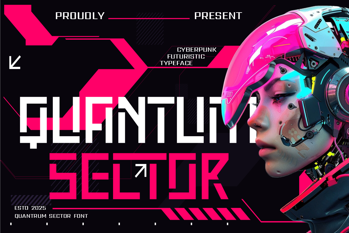
Quantum Sector uses bold angular strokes, pixel-inspired edges, modular shapes, sharp symmetry, and square-based proportions. These qualities create a high-energy cyberpunk identity that can make gaming, virtual-reality, and performance hardware feel powerful and current. Its complete uppercase, lowercase, numerical, and punctuation system makes it practical for coordinated packaging, promotional titles, esports graphics, and product-series branding.
PROS: Strong angular structure, pixel-inspired details, clear numerals, modular consistency, and immediate cyberpunk impact.
BEST FOR: Gaming mice, keyboards, headsets, VR hardware, esports products, graphics cards, performance accessories, cyber-themed apparel, and digital launch graphics.
5. Digitechno

Digitechno is a futuristic display typeface inspired by modern digital technology, circuitry, and science-fiction aesthetics. Its strong readability and alternate glyphs make it useful for designers who want a recognizable technological wordmark without pushing the letters too far toward abstraction. The font is available in desktop and webfont-oriented formats and includes uppercase, lowercase, numbers, punctuation, symbols, and alternate characters.
PROS: Readable futuristic construction, alternate glyphs, broad character support, adaptable branding use, and established digital personality.
BEST FOR: Consumer electronics, gadget logos, digital services, software products, product covers, promotional posters, websites, UI-related branding, and general technology packaging.
Comparison
| Font | Main Visual Direction | Strongest Packaging Role | Ideal Gadget Category | Main Advantage |
|---|---|---|---|---|
| Cryonex | Condensed sci-fi | Compact product and model names | Wearables, phones, chargers, small devices | Saves horizontal space |
| Nexaro Module | Modular mechanical sci-fi | Engineered premium identity | AI, robotics, VR, advanced hardware | Strong modular recognition |
| Cosmic Network | Network and data techno | Connected-product branding | Routers, hubs, smart home, data devices | Organized digital rhythm |
| Quantum Sector | Cyberpunk and pixel techno | High-impact performance packaging | Gaming, esports, VR, PC accessories | Bold competitive energy |
| Digitechno | Readable futuristic display | Flexible general gadget branding | Electronics, software, audio, accessories | Broad usability and clarity |
Best for Compact Packaging
Cryonex is the most practical choice when a long product name must fit onto a narrow package panel.
Best for AI and Robotics
Nexaro Module provides the strongest modular and engineered visual language for advanced hardware and artificial intelligence products.
Best for Connected Technology
Cosmic Network naturally supports products involving networks, data, connectivity, and smart ecosystems.
Best for Gaming Products
Quantum Sector offers the greatest visual aggression and cyberpunk energy for esports and performance hardware.
Best All-Purpose Futuristic Option
Digitechno provides a flexible balance between technological character and practical readability.
Common Mistakes
The first mistake is using the futuristic display font for every piece of packaging copy. Angular cuts, modular strokes, pixel details, and sci-fi alternates may create an excellent model name, but they can slow down the reading of compatibility lists, warranty information, measurements, and setup instructions. Build a deliberate hierarchy in which the display font owns the brand and product identity while a clean supporting family handles functional communication. The more experimental the logo becomes, the calmer the technical layer should be.
Another common mistake is making the packaging look futuristic through effects rather than typography and structure. Neon glows, holographic gradients, circuit patterns, chrome surfaces, and dark backgrounds can create an immediate technology mood, but combining all of them often produces visual noise. Begin with the wordmark, hierarchy, spacing, and product information in black and white. Introduce one or two distinctive treatments only after the package remains clear without them. A strong font and disciplined layout usually communicate more confidence than several unrelated digital effects.
The final mistake is approving the design only through a large three-dimensional mockup. Fine cuts may disappear in print, dark grey specifications can become difficult to read on black matte packaging, and wide product names may be unreadable in ecommerce thumbnails. Test flat panels at actual size, inspect important numbers, create a printed prototype, and review the package beside competitors. Confirm the correct licensing coverage before production as well, particularly when the font will appear in registered logos, large packaging quantities, websites, advertisements, software, or other embedded applications.
Conclusion
The best fonts for gadget brand packaging combine visual innovation with practical clarity.
A technology package should attract attention, communicate the product category, and help customers identify the exact model and key benefits without unnecessary effort. The display font creates recognition, while the supporting typeface makes specifications, compatibility, and instructions easy to understand.
DCryonex provides a compact science-fiction structure for smaller products and narrow layouts. Nexaro Module delivers an engineered modular identity for artificial intelligence, robotics, and advanced hardware. Cosmic Network supports connected devices and data-oriented brands, while Quantum Sector creates the high-energy cyberpunk character needed for gaming and esports. Digitechno offers a more flexible futuristic direction for general consumer electronics and digital branding.
Fonts from PutraCetol Studio can help technology founders, packaging designers, marketers, and electronics brands move beyond generic geometric typography. Each typeface offers a different interpretation of the future rather than one repetitive cyber aesthetic.
Choose the font according to the product’s real personality. Test the product name, model number, specifications, print size, and ecommerce presentation before final approval. Use futuristic letterforms where identity matters and functional typography where accuracy matters.
When font, hierarchy, color, packaging material, and product positioning support the same idea, the box becomes more than protection for the device.
It becomes the customer’s first experience of the technology.
Explore these fonts and many more at PutraCetol.com to build a business identity that looks professional, trustworthy, and memorable.
Additionally, if you want to explore some free typography options, you can check out Putracetol Studio on Dafont. Happy reading and designing!